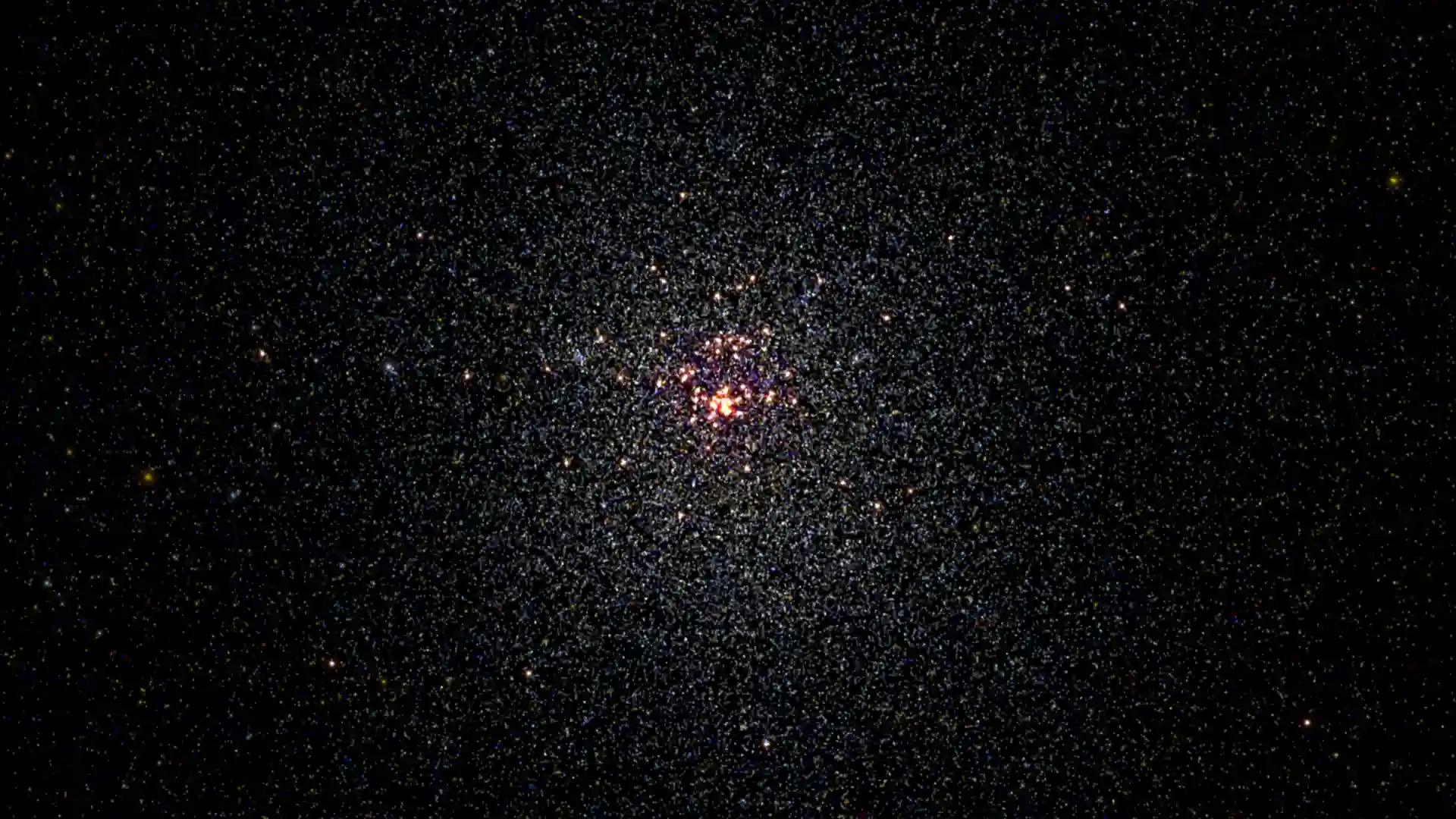
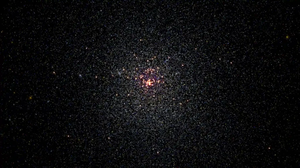
100,000 Stars does something the web rarely manages: it turns scale into feeling. You open a page in your browser, start near the Sun, and within minutes you are moving through the local stellar neighborhood, then out into a Milky Way that suddenly makes Earth feel laughably small. The official experiment describes itself as an interactive visualization of over 100,000 nearby stars, launched as a Chrome Experiment in November 2012. That sounds tidy and technical. The real experience is stranger and better. It feels like stumbling into a museum piece, a data visualization, a gentle astronomy lesson, and a small act of digital theater at the same time.
Table of Contents
What hits first is not the information. It is the sense of proportion. Plenty of websites show you facts about space. Very few make your body register the distances. 100,000 Stars does that by pulling your viewpoint outward in layers. You start with the Sun and the orbits of the planets. You move past the Oort Cloud. You reach nearby named stars. Then the whole thing keeps widening until the point is no longer any one object, but the absurd size of the neighborhood itself. Google’s original launch post even framed the tour as a quick trip through some of the best perspectives in the galaxy, which is exactly how it feels when the site is at its best.
A browser demo that still embarrasses newer work
A lot of modern interactive sites are louder than this and much less memorable. They load in a blast of gradients, demand your email, and flatten into nothing five minutes later. 100,000 Stars is the opposite. It has almost no interest in selling itself. It opens, trusts you to be curious, and then rewards that curiosity with motion, restraint, and a very old-fashioned belief that exploration is enough. That confidence still feels fresh.
Part of that comes from the way the project was built. Michael Chang from Google’s Data Arts Team described it as a Chrome Experiment built with THREE.js and CSS3D. The technical postmortem makes clear that this was not just a pretty skin on top of a chart. The team was working through rendering problems, field-of-view shifts, labels in 3D space, color ramps for stars, and music playback, all in service of a browser experience that could move from a tiny solar-system view to a broad galactic one without breaking the spell.
That matters because you can feel the craft even if you never read a word of the case study. The site has the rhythm of something made by people who cared about atmosphere as much as correctness. The public description says the star positions are real while the galaxy view is an artist’s rendition. That turns out to be the right balance. It is grounded enough to teach you something, but stylized enough to stay beautiful. A stricter scientific interface might have become homework. This one stays openable.
The scale shift is the hook
The guided tour is not a gimmick. It is the thing that makes the site legible. Space is too big to understand from a static image, and too abstract to understand from a table. The tour solves that by giving your eye a route. It starts with something familiar, then keeps widening the frame until the familiar disappears into context. By the time you are looking at the thicker band of the Milky Way, you are not admiring a map anymore. You are adjusting to a new unit of thought.
This is where 100,000 Stars becomes more than a nice educational toy. It is a lesson in interface sequencing. It knows that humans do not understand vast systems all at once. We understand them by anchoring to one point and then losing that point on purpose. The Sun is your anchor. The zoom is the lesson. The galaxy is the punchline.
Chang’s postmortem explains that even the field of view changes as you pull outward, widening to take in more of the galaxy and narrowing as you move inward toward a star. That sounds like a technical footnote until you use the site and realize how much of the illusion depends on it. The camera is doing teaching work. The design is quietly telling your brain how to read depth, distance, and relative scale.
It teaches without ruining the mood
The site’s smartest decision is that it never becomes pushy. When you zoom in, you can find 87 major named stars and get short information panels. The live site shows these as compact cards with text and imagery, and the Sun entry explicitly notes that its description is excerpted from Wikipedia. The information is there when you want it, but it never drags the whole experience into textbook mode.
That restraint is harder to pull off than it looks. Many educational web projects either hide the substance behind flashy effects or drown the effects in explanation. 100,000 Stars stays balanced. It gives you enough naming, enough labels, enough context, then gets out of the way and lets the view do the rest. The result is that you come away feeling like you learned something even if you mostly spent your time gliding around glowing points in the dark.
Why this site earns a click
| What stands out | Why it matters |
|---|---|
| The guided zoom from the Sun to the Milky Way | It turns astronomical scale into something you can actually feel |
| Real nearby star positions with a stylized galaxy backdrop | It stays grounded without becoming dry |
| Named stars and info panels | It gives the experience handles, not just spectacle |
| Color, motion, and soundtrack working together | It feels composed, not merely rendered |
| No account, no feed, no friction | You can open it and be somewhere else in seconds |
That compact mix is why the project still lands. It is not just “pretty for its time.” It is structured with unusual discipline, and that discipline is what keeps the beauty from evaporating after the first zoom.
The data story helps too. The public-facing experiment rounds things to “over 100,000 nearby stars,” but Chang’s write-up says the underlying data set contained exactly 119,617 stars, with 87 individually identified ones called out through a CSS marker overlay. He found that data in the HYG database, which combines material from the Hipparcos catalog, the Yale Bright Star Catalog, and the Gliese/Jahreiss catalog. That is a lovely detail because it reveals what the project really is: not fantasy dressed up as science, but careful data selection wrapped in cinematic presentation.
Why the illusion still works
A big part of the answer is color. Chang wrote that each star’s color was driven by the astronomical color index, with cooler stars tending red and hotter ones tending blue or purple. That sounds like a rendering detail, but it changes the emotional texture of the whole thing. The galaxy is not a flat spray of identical dots. It has temperature, variety, and a faint sense of life. Even when you do not know the astrophysics, your eye reads difference.
Then there is the soundtrack. Google’s launch post noted that the experiment used WebGL, CSS3D, and Web Audio, and that the music came from Sam Hulick, known to many players from Mass Effect. Chang’s case study goes further and names the track as “In a Strange Land,” cut music Hulick let the team use. That choice was perfect. The site does not just look like a navigable star map from a science-fiction game. It feels like one, which gives the educational layer a strange advantage. People stay longer inside moods than inside lessons.
The labels matter more than you might think as well. Chang describes using CSS3D transforms and billboarding tricks so text could exist in the same spatial world as the stars. On paper that is engineering trivia. On screen it is the difference between a scene and an interface. The names feel placed, not pasted. They belong to the world you are moving through. That is one reason the whole project still feels less like a page and more like a vessel.
Who will care about this most
Space nerds will like it, of course, but that is the easy answer. The more interesting audience is anyone who misses when the web felt exploratory rather than extractive. 100,000 Stars belongs to that older internet tradition where a browser could be a place for wonder, not just transactions and content funnels. You opened something because it was worth seeing, not because an algorithm pushed it at you.
Designers should look at it because it understands pacing. Product people should look at it because it knows what to leave out. People who build educational tools should look at it because it teaches without acting like a teacher. And anyone who has forgotten that a website can still produce a genuine physical feeling should look at it because this one does. You can feel your sense of scale being stretched.
There is also a more specific pleasure here for anyone interested in web history. Chrome Experiments produced a lot of flashy work, but not all of it aged well. Some pieces now read as tech demos first and experiences second. 100,000 Stars survived because it was never only a demo. The technology was part of the point, yes, but the deeper point was perspective. That survives browser cycles.
A small masterpiece from the ambitious web
The thing I admire most about 100,000 Stars is that it feels finished. Not polished in the corporate sense. Resolved. It knows exactly what it wants to show you, exactly where to begin, and exactly how much explanation is enough. That kind of completeness is rare online. A lot of sites feel expandable forever, as if they were launched halfway through becoming themselves. This one feels like someone had the idea, built the right shape for it, and stopped.
That may be why it lingers. You do not leave thinking about a feature list. You leave thinking about relative size, distance, insignificance, beauty, and how unusual it is for a browser tab to hand you all of that without demanding anything back. The web still produces good work, but it does not often produce this kind of quiet grandeur.
If Web Radar exists to point at places people did not know were out there and say, open this, it is hard to find a cleaner example. 100,000 Stars is not hidden because it lacks quality. It is hidden because the web has become terrible at preserving and recirculating its own wonders. This one deserves to be reopened.
Author:
Jan Bielik
CEO & Founder of Webiano Digital & Marketing Agency
This article is an original analysis supported by the sources cited below
100,000 Stars
Official live experience page for the visualization, including the interactive star map and in-site information panels.
100,000 Stars by Google Data Arts Team
Official Experiments with Google entry confirming the project framing, launch period, feature summary, and core description.
Making 100,000 Stars
Primary technical postmortem by Michael Chang covering the data source, rendering approach, labels, field of view, color mapping, and music details.
Explore the stellar neighborhood with your browser
Original Google Chrome Blog launch post describing the tour, the zoomable layers from the Sun outward, and the technology stack behind the experiment.
Current version of the HYG Stellar database
Official repository page for the HYG database used as the project’s star-data foundation.
| Citing this article? Brief excerpts are welcome. Please credit Webiano.digital, name the author where stated, and include a link to https://webiano.digital and to this original article. Full or substantial republication requires prior written permission. Read our Copyright and Content Use Policy. |