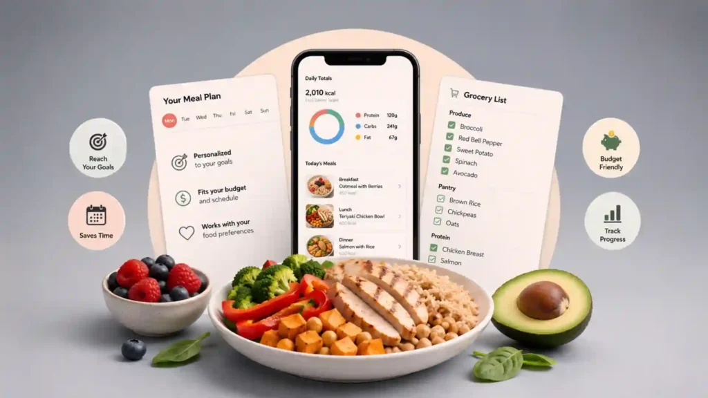
Eat This Much is built around a tiny, stubborn truth: most diet plans fail long before dinner because the plan never turns into food. People download calorie trackers, set macro targets, save healthy recipes, buy too many vegetables, and still end up staring into the fridge with the same blank expression. The gap is not motivation. The gap is translation. A calorie target is not lunch. A protein goal is not a grocery list. A diet preference is not Tuesday’s dinner after work. Eat This Much exists for that gap, and its whole pitch is unusually direct: tell it what you want to eat, what you are trying to hit, how many meals you want, and it generates the plan. The official homepage calls it an automatic meal planner that creates personalized plans from food preferences, budget, and schedule, then ties that to a calorie calculator, weekly plans, grocery lists, and more.
Table of Contents
The phrase “put your diet on autopilot” could have been throwaway wellness copy, but here it is close to the actual product idea. Eat This Much does not start with beautiful recipe cards and ask you to build a life around them. It starts with constraints. Calories. Macros. Preferred diet. Meal count. Foods you dislike. Grocery needs. Leftovers. Cooking time. Budget. Then it does the dull part most people do badly when tired: turning nutritional intent into something cookable. That is why the site is more interesting than another meal-planning app. It treats eating as logistics, not inspiration. Inspiration is nice on Sunday morning. Logistics is what matters at 7:42 p.m. when a person is hungry, annoyed, and considering delivery again.
The homepage demo is revealing because it asks for the kind of inputs a human actually has in mind. Preferred diet can be “anything,” keto, Mediterranean, paleo, vegan, or vegetarian; meal count can be adjusted; calories sit at the center; macros are visible right away. It also points unsure users toward a calorie calculator, which means the site knows many people arrive with a goal but not a number. That is a small but important design choice. Plenty of diet tools assume the user already speaks fluent nutrition. Eat This Much is more mechanical. It wants numbers because numbers let it generate meals. It wants preferences because preferences keep the plan from becoming punishment. It wants structure because structure is what makes the week survivable.
The clever part is not that it has recipes, because the web is drowning in recipes. The clever part is that it tries to answer a much more useful question: what should I eat today so I land near my target without thinking about every bite? A recipe site gives you options. A tracker records what already happened. Eat This Much tries to sit before both of those moments, when the day is still movable. That makes it feel less like a diary and more like a dispatch system for food. You are not only logging the outcome. You are creating the outcome before hunger starts negotiating with you.
The rare diet tool that starts with the boring part
Most food apps are built around desire, and that is why they are fun to browse but weak when life gets messy. They show glossy bowls, stacked sandwiches, dramatic pasta, and perfect prep containers. Eat This Much is less seductive. It starts with the boring part: how many calories, how much protein, how many meals, which diet style, what schedule, what budget. That sounds dry until you remember that dry is exactly what diet planning needs. The emotional part of eating is already powerful enough. The missing part is usually a system that keeps the math, shopping, and meal choices from collapsing every afternoon.
The origin story on the About page is refreshingly plain. The team says they started Eat This Much in 2012 because they kept buying random groceries out of habit, then standing in front of the fridge wondering what to make, while also wanting to hit diet goals without obsessing over every meal. That matters because it frames the product correctly. This is not a mystical wellness assistant. It is a grocery-store regret machine running backward. It asks: what would you need to buy so your future self is not improvising with half a cucumber, peanut butter, and a vague promise to “eat better tomorrow”?
The best product ideas often come from a repeated private annoyance, and this one has that smell. A person who has never tried to eat toward a target thinks the hard part is knowing what is healthy. A person who has tried knows the hard part is repetition. You need breakfast again. Then lunch again. Then dinner again. Then snacks, because the macros did not land right. Then a grocery list, because recipes without ingredients are fiction. Then adjustments, because Wednesday went sideways. Eat This Much is interesting because it accepts that eating is repetitive rather than trying to disguise it as a constant lifestyle reinvention.
There is an old internet charm in a tool that looks at a human habit and says: we can automate that ugly middle step. Not the eating. Not the judgment. Not the taste. The middle step. The planning layer. The site is part calculator, part recipe database, part schedule builder, part grocery list. It does not need to be glamorous to be useful. Its job is to reduce the number of food decisions a person has to make while still respecting the constraints that make those decisions personal. That is a difficult balance. Too much automation and the plan feels alien. Too much manual control and the app becomes another chore.
Eat This Much’s most appealing promise is that it turns “I should eat better” into a list of meals. That sounds obvious only because the phrasing is plain. In practice, it is the exact step where most people drift. They know the goal. They know the broad rules. They know they should shop before they are hungry. They even know roughly what foods fit their diet. Yet without a specific plan, the week becomes a chain of small negotiations. Eat This Much is made for people who want fewer negotiations. It does not remove choice, but it pushes choice into a calmer moment.
The service also has a useful skepticism built into it, even if quietly. On the homepage, after user testimonials, the company states that results are not guaranteed and that Eat This Much is a meal-planning tool, not a substitute for professional medical advice. That disclaimer is not just legal padding. It clarifies what the product is good at. It does not make anyone follow the plan. It does not know a person’s medical history. It does not replace a dietitian. It generates structure. For many users, structure is exactly the missing piece, but it should not be confused with care.
The free and paid split also says a lot about what the company thinks the product is. The pricing page lists free features such as daily meal-plan generation, food tracking, barcode foods, custom foods and recipes, and recurring foods. Premium adds weekly meal planning, automatic grocery lists, grocery delivery integration, automatic leftovers, weekly customization, saved weeks, and PDF sharing. The product is not merely selling recipes. It is selling continuity. A single day is easy to imagine. A whole week is where people start paying for help.
That weekly layer is where Eat This Much becomes more than a neat generator. Anyone can invent a healthy day. A protein oatmeal breakfast, a salad, salmon with vegetables, Greek yogurt, maybe a handful of nuts. The problem arrives when the same person needs seven days, a realistic grocery list, leftovers that do not rot, meals that repeat just enough, and a plan that survives one skipped lunch. Premium seems aimed at that friction. The paid features cluster around the parts of planning that are most annoying after the novelty wears off: shopping, leftovers, reuse, sharing, and week-level control.
This makes Eat This Much feel closer to a domestic operating system than a recipe app. Recipe apps trade in possibility. Eat This Much trades in commitment. Once a plan is generated and groceries are bought, the user has changed the environment. The fridge now matches the target. The list exists. The meals have names. That is a powerful shift because it moves diet effort from willpower to setup. Eating still requires choices, but the available choices become less chaotic.
The generator is the product
The generator is the thing to open first, because it explains the whole service faster than any marketing paragraph. You set a diet style, choose calories, pick meal count, look at macros, and ask the system to produce meals. The homepage lets users create a plan “in seconds,” and its interface foregrounds diet, calories, meals, and macro minimums before anything else. That ordering matters. The product begins with the target, not the meal photo. The user is asked to define the frame; then the app fills it.
A normal recipe search begins with appetite, which is why it can become a trap. Search “healthy dinner” and the web gives you hundreds of options, each with different serving sizes, nutrition estimates, prep times, ingredients, and assumptions. Search “high-protein vegetarian lunch” and you still have to check whether the meal fits your day. Eat This Much changes the starting point. It says: tell me the day, and I will suggest meals that fit inside it. That is a more constrained search, but it is also much closer to the real problem.
The App Store listing explains the free version in a way that reveals the product’s core philosophy. Free users can create a day’s meal plan and customize it; each meal can have different preferences; nutrition targets can be set as desired. Premium users get weekly plans and grocery lists by email, and the app lets them track what they did or did not eat, then readjust targets for the next week when reality drifts from the plan. The important word there is “readjust.” A rigid diet app breaks when a person deviates. A useful planner assumes deviation is normal.
That makes the app unusually honest about human behavior. People skip meals. People eat at restaurants. People get tired. People buy food they forgot they had. People change their minds. A plan that cannot absorb those facts becomes decorative. Eat This Much seems to understand that the value of automation is not perfection. It is recovery. A plan gives the user something to return to after a messy day, rather than forcing them to mentally rebuild the entire week.
The best generators are not magic; they are opinionated calculators with enough taste to be livable. Eat This Much has to solve a puzzle with calories, macros, ingredient availability, meal count, diet rules, disliked foods, cooking time, budget, pantry items, and leftovers. That is a lot of constraints. A human can solve it, but doing it repeatedly is draining. The app’s bet is that a generated plan that is 80 percent right and easy to edit beats a perfect plan that never gets written. That is a very internet-native kind of usefulness: not replacing judgment, but giving judgment a starting point.
There is also a quiet psychological advantage in having the plan appear from outside your own head. When people build diet plans manually, they often argue with themselves. Too strict. Too boring. Too much cooking. Too little protein. Too many snacks. A generator changes the mood. It offers a draft. You can reject it, swap a meal, pin something familiar, adjust a portion, or regenerate. The user becomes an editor instead of a blank-page planner. That is a much easier role to play after work.
This is why the “swap” and “regenerate” logic matters so much. The pricing page mentions endless regeneration for finding a new option when a meal does not fit or does not sound good. That feature may look small, but it is central to making automation tolerable. A meal planner that produces one sacred plan is brittle. A planner that keeps producing alternatives becomes conversational. It lets the user say, “Not that,” without starting over.
The tool also recognizes that people rarely want total novelty. The pricing page describes recurring dishes that let users put favorites on repeat while the generator works around them. That is one of the more human details in the product. Diet culture often worships variety, but real people survive on reliable defaults. The same breakfast. The same protein. The same lunch bowl. The same snack that prevents chaos. Eat This Much’s recurring foods acknowledge that repetition is not failure. It is how many diets become livable.
The calorie calculator extends that generator logic to the target itself. Eat This Much’s calculator asks for units, sex, height, weight, age, body fat estimate, and activity level, then explains that activity choice heavily affects suggested targets. The calculator is not the most unusual part of the site; calorie calculators are everywhere. Its usefulness comes from being connected to the planner. Once a target exists, the system can turn it into actual meals. A calculator alone gives a number. Eat This Much tries to give the number a menu.
The supported diet page adds another piece of the product’s personality. Eat This Much says it supports many eating styles, but its goal is to help users eat the way they want and in the right amounts, not to declare the “right” way to eat. It lists presets such as keto, vegan, vegetarian, paleo, Mediterranean, low carb, low fat, high protein, gluten free, and others. That stance is important. The site is not selling one diet tribe. It is selling a planning engine that can be pointed at several diet tribes.
That flexibility is more useful than it sounds because people’s diets are rarely clean categories. Someone may be mostly vegetarian but not vegan. Someone may want Mediterranean-ish dinners but high-protein breakfasts. Someone may want low-carb weekdays and more normal weekends. Someone may avoid gluten but not follow any branded diet. Presets are helpful for onboarding, but the interesting part is the custom layer beneath them. A meal planner that only works for a textbook diet becomes useless the moment a person’s real preferences show up.
The product’s long-term appeal depends on whether the generated meals feel like something a person would actually eat. That is the hard part. Math is easier than taste. A plan that hits macros but repeats sad combinations will not last. A plan that tastes good but misses targets becomes just another recipe feed. Eat This Much lives between those two failures. Its best use case is not the person who wants gourmet surprise every night. It is the person who wants food that is good enough, structured enough, and adjustable enough to remove daily decision fatigue.
What stands out inside the planner
| Feature | Why it matters | Best fit |
|---|---|---|
| Automatic meal generation | Turns targets into meals instead of leaving users with numbers | Macro-focused eaters |
| Weekly plans | Moves diet planning from single-day intent to real-life rhythm | Busy planners |
| Grocery lists | Connects recipes to shopping, where many plans fail | Home cooks |
| Virtual pantry | Uses food already on hand before it becomes waste | Budget-minded users |
| Recurring foods | Makes repetition intentional rather than lazy | Habit builders |
| Recipe clipper | Pulls favorite recipes into the planning engine | People with existing favorites |
The table shows the real shape of Eat This Much: it is strongest when the user already wants structure but does not want to build every part manually. It is less about discovering the prettiest dinner and more about turning constraints into a week that can be shopped, cooked, repeated, and adjusted.
Why it feels different from recipe apps
Recipe apps mostly ask, “What looks good?” Eat This Much asks, “What fits?” That single difference changes the whole experience. “What looks good?” is fun until the recipe has 17 ingredients, 700 calories, 14 grams of protein, and no relationship to the rest of the day. “What fits?” is less romantic, but it respects the reality of eating toward a goal. A meal has to fit calories, macros, time, groceries, leftovers, budget, appetite, and tolerance for repetition. That is why Eat This Much feels more like planning software than food media.
The app is also built against the exhaustion of calorie tracking. The App Store description makes a sharp contrast: normal calorie trackers force users to add foods one by one, while an automatic planner pre-enters the plan so users mainly follow it. This is a meaningful product distinction. Tracking after the fact is accounting. Planning before the fact is architecture. Both have a place, but they create different habits. Accounting tells you what happened. Architecture changes what is likely to happen.
Anyone who has used a food tracker knows the tiny grind hidden inside “just log it.” Search the food. Pick the closest entry. Check serving size. Weigh the portion. Correct the barcode item. Adjust the recipe. Repeat. Do it again tomorrow. The more complex the meal, the more annoying the log becomes. Eat This Much does not remove all tracking, but it changes the default. If the planned meal is already in the day, the user’s task is simpler: follow, mark, adjust, or swap. That matters because friction decides whether a habit survives.
The Google Play listing also leans heavily into generation and filtering. It describes meal plans that meet calorie and macro targets, nutrition targets for weight loss, maintenance, or muscle, diet styles such as paleo, keto, vegetarian, vegan, and Mediterranean, food and recipe filters for allergies and dislikes, and cooking-time settings for each meal. Those details show that the app is not only counting. It is trying to honor practical constraints. The cooking-time setting is especially smart because a perfect 90-minute dinner is useless on a 20-minute night.
The browser extension pushes the product into an even more interesting direction. The Chrome Web Store listing for Eat This Much Recipe Clipper says it imports recipes from around the web into a user’s Eat This Much account, then lets the generator incorporate those recipes into plans; premium users can build weekly plans with leftovers and grocery lists. That feature solves a common weakness of generated meal plans: people already have favorites. They do not want a system that ignores the chili they cook every Sunday or the tofu recipe they trust.
A meal planner gets much stronger when it accepts the user’s existing food life. Without recipe import, the app risks becoming a parallel universe. The user has their real meals, then the app has its suggested meals, and the two never meet. A recipe clipper bridges that. It lets the user feed the system with meals they already like. Then automation becomes less alien because it can schedule familiar food. That is a better model than asking people to abandon their own kitchen history for a database.
This is also where Eat This Much feels like a web product in the best old sense. It is not trying to keep all food inspiration inside its own walls. The browser extension says: found something elsewhere? Bring it in. That is a healthy posture for a tool. The web is already the world’s biggest cookbook, chaotic as it is. A planning engine that can absorb outside recipes becomes more useful than a closed recipe library. It stops competing with the web and starts organizing it.
The professional product adds another angle, though it is not the main reason most readers will click. Eat This Much Pro is aimed at trainers, coaches, dietitians, and nutrition professionals. The Pro page lists client dashboards, custom plans, branding, app access for clients, reusable meal plans, and emailed plans or grocery lists. That tells us the product has a second life as infrastructure for people who sell meal planning as part of a service. When a consumer app also serves professionals, the planning logic usually has more depth than a casual recipe app.
The Pro version reveals the product’s strongest commercial insight: meal planning does not scale well when done by hand. A trainer can write one meal plan manually. Ten clients are harder. Fifty clients become a spreadsheet swamp. Eat This Much Pro tries to make that process repeatable while still allowing customization. Even if you never touch the professional tier, its existence says something about the core engine. The company believes the hard part is not merely presenting food. The hard part is producing plans fast enough to match individual targets.
The design is not trying to become a food social network, and that restraint is welcome. There is no obvious push to follow influencers, collect likes, or turn dinner into performance. The center of gravity remains the plan. That may make the interface feel less glamorous than newer AI food apps or glossy recipe platforms, but it also keeps the product honest. Many people do not need a community around oatmeal. They need to know whether oatmeal fits breakfast and what groceries to buy before Monday.
The product does have a slightly utilitarian mood, and that is probably a feature rather than a flaw. Some food apps make eating feel aspirational. Eat This Much makes it feel schedulable. The emotional difference is huge. Aspirational tools are great for browsing and bad for maintenance. Schedulable tools become part of the week. If the user wants cinematic cooking, this is not the point. If the user wants fewer food decisions, it starts to make sense quickly.
There is a cultural reason this kind of tool sticks in the mind. The web has given us infinite food choice, but not better food planning. We can find five thousand overnight oat recipes in seconds and still forget to buy oats. We can read arguments about keto, vegan, Mediterranean, fasting, protein timing, seed oils, artificial sweeteners, and fiber, then eat whatever is easiest because the fridge is empty. Eat This Much is interesting because it does not add more food discourse. It reduces the distance between a plan and a shopping cart.
The pantry idea is quietly clever
The virtual pantry is one of the most underrated ideas in Eat This Much because it starts from the food people already own. The homepage says users can add existing food to a virtual pantry, and the algorithms will prioritize using it. That is a small line with large consequences. Many meal plans fail because they pretend every week begins with an empty kitchen and a clean budget. Real kitchens contain half-used rice, frozen vegetables, eggs nearing their date, leftover sauce, and a suspiciously large amount of mustard. A good planner should see that.
Pantry-aware planning changes the emotional feel of the app. Without it, meal planning can become an excuse to buy more ingredients while wasting the old ones. With it, the plan starts to feel grounded. It asks what is already there and builds from that. That is better for budgets, better for food waste, and better for user trust. A tool that tells you to buy quinoa while ignoring the rice in your cupboard may be mathematically correct but domestically stupid.
The pricing page expands this idea under “cost-saving pantry,” saying the pantry lets users track what they have on hand and see meal suggestions that use those items. That is exactly the kind of feature that rarely gets people excited in a product demo but makes a tool stay useful after week three. Diet planning is not only “what should I eat?” It is also “what should I do with the ingredients I already paid for?” Eat This Much is stronger because it notices that second question.
The grocery list features complete the loop. The homepage says weekly meal review automatically updates the grocery list, with delivery integrations such as Instacart and AmazonFresh mentioned on the page. The pricing page says Premium includes automatic grocery lists, grocery delivery integration, and automatic leftovers. The point is not that grocery lists are new. The point is that the list is generated from meals that were generated from targets. That chain is the product. Goal becomes meals. Meals become ingredients. Ingredients become shopping. Shopping becomes a stocked kitchen. A stocked kitchen makes the next meal easier.
This chain matters because diet failure often happens at the store, not at the table. Buy random food and you will cook random meals. Buy ingredients for a plan and the plan has a chance. Eat This Much understands that grocery shopping is not separate from nutrition; it is the supply side of nutrition. The app’s automatic list is useful because it prevents the plan from staying abstract. It tells the user what needs to enter the house before the week begins.
Leftovers are another quietly important feature because they respect how real cooking works. The pricing page lists automatic leftovers as a Premium feature. That may not sound exciting, but leftovers are where meal planning often becomes practical. Cooking every meal fresh is a fantasy for many people. Cooking once and eating twice is normal life. If a planner cannot schedule leftovers intelligently, it may push users toward too much cooking and too much waste. A planner that understands leftovers is less glamorous and more adult.
A good meal plan has to think in batches, not just plates. A chicken recipe is not only dinner. It may be tomorrow’s lunch. A pot of lentils may cover two meals and a snack. Rice, roasted vegetables, sauces, and proteins move across the week. Eat This Much’s leftovers feature matters because it turns meal planning into a week-level system instead of a gallery of isolated dishes. That is where the app becomes useful for people who cook at home and do not want to reinvent every meal.
The app also treats budget as part of the diet, which is rarer than it should be. The homepage’s main promise includes budget alongside preferences and schedule. Budget is often treated as a separate concern from nutrition, but in daily life it is inseparable. A plan that ignores cost becomes aspirational theater. Eat This Much’s budget framing suggests that the meal generator is trying to produce food the user can actually buy, not only food that fits macros on paper.
Budget-aware meal planning is especially useful because “healthy eating” is often presented through expensive defaults. Boutique proteins, specialty flours, obscure condiments, and tiny packaged snacks can turn a diet plan into a shopping bill with a moral halo. A planner that includes budget constraints has a better chance of staying connected to real kitchens. The most useful healthy meal is not the one with the prettiest ingredients. It is the one a person will buy, cook, eat, and repeat.
The supported diets page also shows how the app avoids locking users into a single ideological lane. Its list of diet types includes keto, vegan, vegetarian, paleo, Mediterranean, low carb, low fat, high protein, gluten free, and other plans. That is good because pantry and budget features become more complicated across diet types. A vegan pantry does not behave like a keto pantry. A high-protein budget plan does not look like a Mediterranean family week. The product needs enough flexibility to handle those differences without turning setup into homework.
Eat This Much becomes most appealing when you imagine the exact user who keeps trying to eat better but hates planning. Not the person who loves cooking for sport. Not the person who wants a perfect nutrition coach. The person who knows they need groceries, knows they need protein, knows takeout is eating the budget, and knows that “I’ll figure it out later” is a lie. For that person, pantry, grocery lists, leftovers, and recurring meals are not extra features. They are the whole reason the app deserves a tab on the home screen.
Where the autopilot works and where it gets strict
The word “autopilot” is attractive, but it deserves a careful reading. Eat This Much can generate the plan, but the user still has to choose constraints, buy food, cook meals, and decide what to do when life interrupts. The app is not a robot chef. It is closer to a planning assistant with a calculator brain. That distinction keeps expectations sane. The tool is strongest when the user is willing to follow a plan most of the time and edit it when needed. It is weaker for someone who wants food spontaneity every day.
The product’s strength is also its main source of friction: it cares about targets. If you like flexible eating with loose intuition, Eat This Much may feel too structured. The app wants numbers because it needs numbers to generate. Calories, macros, activity levels, meal counts, and diet types are not decoration. They are the input language. That can feel freeing to a macro-focused user and suffocating to someone who hates quantified food. The same feature that makes the tool useful for one person may make it wrong for another.
The app is best for users who already accept the premise that structure improves their eating. That includes people cutting weight, gaining muscle, managing protein intake, planning vegan meals with enough calories, reducing grocery waste, sticking to a budget, or building a repeatable meal rhythm. It may also suit people who do not care deeply about diet culture but hate the daily decision of what to eat. The app’s appeal is not only fitness. It is decision relief.
The risk is that generated plans can feel slightly uncanny when taste is not fully captured. A person’s food preferences are more subtle than checkboxes. They may like eggs but not at breakfast. They may eat chickpeas but not warm. They may enjoy tofu only when crispy. They may hate sweet lunches. They may want the same breakfast every day but varied dinners. A generator can learn some of this through swaps, filters, recurring foods, and custom recipes, but the first plan may not feel perfect. Users should expect to edit. Editing is part of the value, not a sign the tool failed.
The app’s own user reviews hint at this reality. One Google Play review praised the recipes, calorie intake, macros, food preferences, shopping list, delivery component, and pantry rotation, while also noting that some excluded items still appeared and substitutions were needed. That is a useful piece of texture. It suggests the app can be genuinely useful while still having generator quirks. No automatic planner should be treated as infallible, especially around allergies, dislikes, and dietary restrictions. Users with medical needs should check plans carefully.
That caveat is especially important because food is personal and sometimes clinical. Eat This Much itself says it is not a substitute for professional medical advice and that users should consult a medical professional before major diet changes. This is the right boundary. A meal planner can organize choices. It should not diagnose, prescribe, or override medical guidance. For someone with diabetes, kidney disease, eating-disorder history, allergies, pregnancy needs, or complex medication issues, an app-generated plan should be reviewed with appropriate care.
For the right user, though, the strictness is the appeal. A calorie tracker asks you to behave, then judges what happened. Eat This Much asks you to decide the rules before the day starts, then produces a path through them. That is a kinder structure for some people. The plan becomes a set of rails. You can step off, but the rails remain visible. The next meal does not require a moral reset. It is already there.
The pricing model also makes sense only if the weekly features become part of the user’s routine. Free users get daily planning and tracking features; Premium, listed at $5 per month with annual subscription on the pricing page, adds week-level planning, grocery lists, delivery integration, leftovers, customization, saved weeks, and PDFs. A person who only wants occasional meal ideas may not need Premium. A person who wants the app to plan Sunday shopping and weekday eating may see the paid tier as the real product.
There is a nice honesty in the fact that Eat This Much does not pretend every user needs the same depth. A free daily generator is enough for experimentation. A weekly grocery workflow is for people ready to let the tool influence their shopping. Professional plans are for coaches and dietitians. That layering is sensible. It lets the product serve curiosity, habit, and business without forcing every user into the same complexity on day one.
The professional tier is also a reminder that meal planning is labor. Trainers and nutrition coaches charge for it because doing it well takes time. Eat This Much Pro lists plan generation, custom macros and restrictions, branded emails and PDFs, client dashboards, and different client-access models. Even if a consumer never pays for Pro, the page makes one thing clear: turning goals into meals is work. Eat This Much’s consumer app is a way to make that work less manual.
The app listings show that Eat This Much is not a tiny abandoned project. The App Store page lists Eat This Much as a free app with in-app purchases, made for iPhone and iPad, in Health & Fitness, with 22K ratings and a 4.7 rating shown on the listing. The homepage also displays iOS and Android rating counts, with over 22,000 iOS reviews and over 10,100 Android reviews. Ratings are not proof of nutritional quality, but they are a signal that many people have tried the workflow and found enough use to review it.
The Chrome extension is another sign of product maturity because it solves a secondary problem rather than only polishing the homepage. Recipe import is not a flashy onboarding feature. It is something users want after they start living with the product. The extension listing says imported recipes can be used in meal plans and that the generator will incorporate them into plans that hit nutrition targets. That is the kind of connective tissue that separates a useful tool from a demo.
Where Eat This Much may disappoint is in taste-led discovery. If someone wants lush recipe photography, chef-style technique, seasonal storytelling, or social browsing, this probably will not scratch that itch. The product is too practical. It wants to know what fits your day, not whether a recipe makes you feel like a weekend magazine cover. That practical mood is the point, but users should open it with the right expectation. This is not a place to wander beautifully. It is a place to decide.
The app may also feel too numbers-forward for people trying to repair a tense relationship with food. Calorie and macro targets are useful for some users and harmful for others. Eat This Much gives structure, but structure is not neutral for everyone. The best reader for this tool is someone who finds numbers calming rather than obsessive. Anyone who feels pulled into anxiety by tracking should treat the app cautiously or avoid it. A good tool in the wrong emotional context becomes a bad tool.
Still, the product deserves attention because it solves a problem that many prettier apps avoid. It is not chasing the fantasy that a recipe feed will fix a week. It knows the hard part is deciding, shopping, repeating, adjusting, and not letting one imperfect day destroy the plan. That makes it more grounded than most diet software. It is not glamorous, but neither is washing spinach, thawing chicken, or checking whether there is rice left. Useful food tools live in that unglamorous zone.
The internet lesson hiding inside the meal plan
Eat This Much is a reminder that the web’s best utilities often look obvious after someone builds them. Of course a meal planner should connect calories to meals. Of course meals should become grocery lists. Of course leftovers should be scheduled. Of course pantry food should be used before new groceries are bought. Of course favorite recipes should be imported. Yet plenty of people still manage all of this through memory, notes apps, screenshots, grocery receipts, and guilt. Eat This Much packages the obvious into one flow.
The service also shows a useful alternative to the current “AI assistant for everything” mood. Eat This Much does not need to sound like a chatbot to be smart. Its intelligence is in constraint handling. It takes structured inputs and returns a structured plan. That may be less flashy than conversational food advice, but it is often more useful. A chatbot can suggest dinner. A planner that knows your macros, pantry, budget, schedule, and grocery needs is doing a different job.
The most interesting internet products often shrink a recurring decision. Calendly shrank scheduling back-and-forth. Instapaper shrank the act of saving long reads. Pocket did something similar for links. Paprika and Plan to Eat organized recipes and grocery planning. Eat This Much shrinks the food decision loop around nutrition targets. It is not just “find a recipe.” It is “decide the week in a way that matches a measurable goal.” That is a narrower problem, which is why the product has teeth.
There is also a quiet anti-content message here. Food content keeps expanding, but the number of meals a person can actually cook stays stubbornly finite. Most people do not need more ideas. They need a plan that picks among ideas, checks the math, and tells them what to buy. Eat This Much is useful because it is not trying to maximize browsing. It is trying to end browsing. That is rare on a web built to keep people scrolling.
The app also respects a reality that many wellness products gloss over: eating well is administrative. It involves lists, costs, stock, timing, prep, cleaning, leftovers, repeat purchases, and boring defaults. A product that embraces administration may look less inspiring, but it stands a better chance of affecting daily behavior. Eat This Much makes food planning feel like project management for the body. That phrase may sound cold, but for the right person it is exactly the relief.
The independent-team detail adds to the charm. The About page says the product started in 2012, is now used by millions, and is still run by an independent team that uses the planner itself and keeps tweaking it from user feedback. That gives the site a different feel from a venture-backed wellness app trying to own every part of someone’s health identity. Eat This Much feels more like a tool that kept getting refined because the original annoyance never went away.
That longevity matters because diet apps often arrive with loud promises and disappear when the trend shifts. Eat This Much has lived through paleo waves, keto waves, macro tracking waves, vegan mainstreaming, grocery delivery growth, and the current AI-planning boom. Its core idea still holds because it was never tied to one food ideology. It was tied to a workflow problem. People still need to know what to eat and what to buy. That problem does not age out.
The product’s best audience may be people who are tired of starting over. Not beginners looking for motivation quotes. Not biohackers looking for microscopic control. People who know what they want their eating to look like but keep losing the thread during the week. Eat This Much gives those people a draft of the week. That draft may be imperfect, but an imperfect plan is often better than a perfect intention.
There is a special kind of internet pleasure in finding a tool that does one unfashionable thing well. Eat This Much is not trying to be a social platform, a food magazine, a medical authority, or a personality brand. It is a planner. It takes your constraints seriously. It produces meals. It makes lists. It repeats food. It uses leftovers. It imports recipes. It lets you swap. That is the kind of practical web object that earns a bookmark because it reduces a real annoyance rather than manufacturing a new habit.
The name itself is blunt in a way that suits the product. Eat This Much. Not “Nourishly.” Not “MacroZen.” Not a soft wellness abstraction. The name is almost a command from a spreadsheet with decent manners. It says the quiet part of diet planning out loud: quantity matters. Amount matters. The meal has to fit. That bluntness may be why the product feels memorable. It is not selling mystery. It is selling a measured plate.
The design challenge for Eat This Much is keeping automation from feeling like punishment. A generated plan has to be editable, familiar, and forgiving. The site’s emphasis on swaps, recurring foods, custom recipes, pantry use, leftovers, and different diets suggests the team understands that. Automation fails when it treats people as interchangeable. It works when it removes the repetitive parts while leaving room for preference. Eat This Much’s best features all point toward that second model.
The bigger lesson is that automation is most useful when it serves a pre-existing intention. If someone does not care about eating toward a goal, Eat This Much will not make them care. If someone does care but keeps getting buried under decisions, the app has a real opening. The product does not create the desire. It organizes it. That is a healthier promise than many wellness tools make, and probably why it feels worth opening.
Small questions before trying it
Yes, there is a free tier. The pricing page lists free daily meal-plan generation, food tracking, barcode foods, custom foods and recipes, and recurring foods. Premium adds the more week-shaped features: weekly plans, automatic grocery lists, delivery integration, automatic leftovers, saved weeks, and PDFs.
The strongest fit is a person who wants concrete meal decisions tied to calories, macros, food preferences, schedule, and budget. It is especially appealing for macro-focused users, home cooks who need grocery structure, people trying to reduce food waste, and anyone who keeps saying they will eat better but never turns that into a shopping list.
The supported diets page lists presets including keto, vegan, vegetarian, paleo, Mediterranean, low carb, low fat, high protein, gluten free, and more. The better way to think about the app is not as a keto app or vegan app, but as a generator that can be pointed toward different diet rules.
No. The site says it is not a substitute for professional medical advice and recommends consulting a medical professional before major diet changes. That boundary matters. It is a planning tool, not a medical service.
A tracker records what you ate. Eat This Much tries to plan what you will eat before the day happens. The App Store listing explicitly contrasts its automatic planner with trackers that require users to add foods one by one after the fact.
Yes. The Chrome extension listing says the Eat This Much Recipe Clipper imports recipes from the web into a user’s account, and those recipes can then be incorporated into meal plans. That is a useful feature for anyone who already has trusted meals and does not want the generator to ignore them.
It depends on whether weekly planning is the thing you actually need. A free day generator is enough to test the idea. Premium makes more sense when grocery lists, leftovers, saved weeks, delivery integration, and week-level customization become part of your routine. If you only want recipe ideas, it may be more structure than you need.
Author:
Jan Bielik
CEO & Founder of Webiano Digital & Marketing Agency
This article is an original analysis supported by the sources cited below
Eat This Much homepage
Official homepage for Eat This Much, used for the core product description, generator inputs, grocery-list framing, pantry feature, app rating claims, testimonials, and medical disclaimer.
Eat This Much pricing
Official pricing page, used for the free, premium, and professional feature breakdown, including weekly plans, grocery lists, leftovers, pantry, recurring foods, saved weeks, and Premium pricing.
Eat This Much about page
Official team and origin page, used for the founding story, the 2012 start, the independent-team framing, and the product’s original problem.
Eat This Much diet plan page
Official supported diets page, used for the list of diet presets and the site’s position that it helps users eat in their preferred style rather than promoting one correct diet.
Eat This Much calorie calculator
Official calorie calculator page, used for details on target-setting inputs such as units, sex, height, weight, age, body fat, and activity level.
Eat This Much on the App Store
Apple App Store listing, used for mobile app details, free and premium descriptions, iOS rating information, tracking language, and the distinction between planning and normal food logging.
Eat This Much on Google Play
Google Play listing, used for Android app context, user-review texture, support information, and feature descriptions around meal generation, macros, diets, filters, grocery lists, and cooking time.
Eat This Much Recipe Clipper on Chrome Web Store
Official Chrome Web Store publisher page, used for the recipe clipper feature, web recipe import, and how imported recipes connect back into Eat This Much meal plans.
| Citing this article? Brief excerpts are welcome. Please credit Webiano.digital, name the author where stated, and include a link to https://webiano.digital and to this original article. Full or substantial republication requires prior written permission. Read our Copyright and Content Use Policy. |