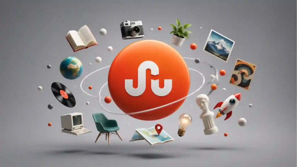
There used to be a button that could rescue a dead evening in one click. Not a search box. Not a feed. Not a homepage full of trending noise. A button. You pressed it, and the internet stopped acting like a filing cabinet or a shouting match. It became a hallway with strange doors. Some opened into brilliant essays. Some into obscure design blogs. Some into a page about squid, Icelandic maps, forgotten arcade cabinets, typographic experiments, or a photographer in Osaka with twelve readers and immaculate taste. StumbleUpon turned browsing into wandering, and wandering into a product.
Table of Contents
That is why people still talk about it with a kind of disproportionate affection. Even now, the old brand still carries the line “For the best of the web, one click at a time”, while the page points visitors toward Mix, whose pitch is to “Discover the gems of the web, personalized to you.” The wording alone tells the story. StumbleUpon felt like motion. Mix feels like sorting.
The odd part is not that millions miss it. The odd part is how many people under a certain age barely know it existed. StumbleUpon began in 2001 while Garrett Camp was in grad school, spread mostly through word of mouth, passed 30 million registered users by 2015, and by the time Camp announced the transition to Mix in 2018, he thanked 40 million people who had used it over the years. It was not a small cult toy. It was a real internet habit that left a real hole when it disappeared.
It solved a problem search never solved
Search is great when you know what you want. Social feeds are great when you want people, status, live conversation, or a stream of whatever your network is already amplifying. StumbleUpon handled a different mood entirely: you wanted something good, but you did not know what it was yet.
That sounds simple. It is not. Most internet products either demand intent or manufacture compulsion. StumbleUpon operated in the narrow middle ground between the two. You clicked “Stumble!” and landed on a page that matched your interests, shaped by categories, tags, and a running record of what you liked or disliked. Early on it worked through a browser toolbar, which sounds clunky now, but the basic interaction was almost absurdly elegant: one button, one verdict, next page. WIRED’s 2006 review captured the appeal well. It described a system where you chose interests, clicked the button, and got transported to a random page that fit your preferences.
That last detail matters. The pages were not really random. They were trained randomness. Enough unpredictability to feel alive, enough pattern to keep the junk rate low. That is a much harder balance than it looks.
Most recommendation systems today are optimized to keep you inside the same app, inside the same media format, inside the same endless loop. StumbleUpon was optimized to eject you outward. It was a launcher. A portal. A recommendation engine that did not treat the open web as a threat. It sent you away from itself. That sounds almost naïve now. It was also the point.
The product had another virtue that many newer systems accidentally destroyed: it asked very little of you. You did not need to build a public identity, learn creator etiquette, keep posting, perform expertise, or maintain a feed. You could use it passively for months and still get something from it. If you wanted, you could save pages, tag them, follow interests, and shape the engine. If you did not, you could just keep clicking. That low social pressure made it easy to love.
The design was smarter than it looked
A lot of products get remembered as magical when they were really just early. StumbleUpon deserves better than that. It was not memorable because it arrived in a softer, weirder internet. It was memorable because the product thinking was tight.
The button was the first smart choice. It turned discovery into a physical reflex. Search demands composition. Feeds demand scrolling. StumbleUpon gave you a single, repeatable gesture. That changed the tempo. Every click felt like a fresh draw from the web.
The thumbs-up and thumbs-down controls were the second smart choice. They were crude in the best way. There was no long rating scale, no essay-length review, no fiddly preference center. A fast binary response was enough to train the system and keep the user moving. That gave StumbleUpon a rhythm most discovery products still fail to match. It was not asking for your identity in full. It was learning your taste from tiny acts.
Then there was the way it mixed personal preference with community judgment. This is the part many people forget. StumbleUpon was not a pure machine system and not a pure editorial system either. Other users tagged, rated, and surfaced pages. The engine then used those signals to steer the next click. The result was a recommendation layer that often felt more human than search and less exhausting than social media.
What StumbleUpon got right
| Part of the product | What it did | Why people still miss it |
|---|---|---|
| One-button discovery | Turned browsing into a repeatable action | No query, no setup, no friction |
| Thumbs up and down | Trained taste in seconds | Fast feedback without homework |
| Interest-based surprise | Kept results weird but not useless | You got novelty with guardrails |
| Outbound links | Sent attention across the web | It explored the internet instead of trapping you |
That combination is why StumbleUpon still feels fresh when you describe it out loud. The mechanics were light, but they shaped a very specific emotional effect: you felt guided without feeling managed. That is rare. Most systems tilt too far toward chaos or too far toward control.
There was also a subtle generosity in the experience. StumbleUpon did not assume the destination had to be a huge publisher, a household name, or a polished media brand. It had room for pages that were a bit odd, slightly dated, wildly specific, or built by one person with a niche obsession. A feed built for advertiser safety tends to flatten taste. StumbleUpon often did the opposite. It rewarded rabbit holes.
That is why old users remember it less as a utility than as a mood. It made the web feel bigger than your habits. Bigger than your bookmarks. Bigger than your friends. Bigger than the same five platforms that now absorb so much online time.
It belonged to an internet that still leaked into itself
Part of StumbleUpon’s charm came from timing. It was built for a version of the web that had more loose edges.
Back then, the internet still produced large numbers of standalone places. Personal blogs. Side projects. Flash experiments. Single-purpose pages made by hobbyists. Gallery sites. Hand-coded curiosities. Tiny publications with one great archive and no growth team. Plenty of it was rough. Plenty of it was forgettable. But there was enough texture for a discovery engine to feel like a daily expedition.
Camp’s own 2018 note about shutting StumbleUpon down hinted at the larger shift. Internet access had expanded dramatically. Mobile phones and social media had changed how people spent time online. The number of platforms hosting and sharing content had exploded. He argued that the need for better filtering had only grown, even if the old StumbleUpon model was no longer the answer.
He was right about the problem. The web got bigger. Discovery got narrower.
That is the paradox younger users often miss when they hear older internet people talk about StumbleUpon with suspicious warmth. This is not just nostalgia for a discontinued app. It is nostalgia for a browsing condition. A feeling that the internet still had unclaimed pockets and side passages, and that you could actually reach them without knowing their names first.
Search does not do that well because search starts with language. If you cannot describe the thing, you cannot ask for it. Social feeds do not do it well because social platforms rank what already has momentum. StumbleUpon was built for pre-verbal curiosity. You were not saying, “Take me to this exact result.” You were saying, “Show me something worth my attention.”
That difference shaped the culture around it. Designers used it to shake up their visual references. Writers used it when their brain felt stale. Students wasted whole nights on it and then insisted it was research. People with broad but fuzzy taste loved it because it did not punish broad but fuzzy taste. You did not need to be an expert in a niche to enter it. You just had to be open to surprise.
For publishers and site owners, the relationship was messier and more thrilling. A StumbleUpon hit could dump a flood of traffic on an otherwise quiet page. Sometimes the visitors bounced fast. Sometimes the page found a real audience. Either way, it was one of the few systems that could suddenly reward a weird standalone URL with mass attention. The modern web still produces weird standalone URLs. It just does not celebrate them in the same way.
It died for reasons bigger than one company
StumbleUpon did not vanish because the idea stopped being good. It vanished because the environment around the idea changed, and because the business reality was less romantic than the product experience.
The company was acquired by eBay for $75 million in 2007, during a period when StumbleUpon had more than 2.3 million registered users and was serving millions of daily recommendations. Later, after years of changes and strategic drift, Camp moved to become majority shareholder again in 2015, saying difficult changes to the company and product would be needed. By May 2018, he announced the team would focus fully on Mix and transition StumbleUpon accounts over.
You can read that timeline in two ways. The simple way is to call it a rise-and-fall startup story. The more interesting way is to see it as a mismatch between a beloved behavior and a harsher internet economy.
StumbleUpon was built around outbound attention. That made it delightful for users and often useful for the broader web. It also meant the product’s magic happened after you left. The click was the experience, but the value spilled elsewhere. Modern platforms prefer the opposite arrangement. They want discovery, consumption, reaction, and ad inventory to happen in the same fenced space.
Mobile mattered too. StumbleUpon came from a toolbar era. Even though the company adapted over time, the original mental model belonged to desktop browsing, tabs, and open-ended surfing. Phones changed that. App ecosystems trained people to jump between a smaller set of closed environments. The internet became more vertical and more packaged. Discovery did not disappear. It became embedded inside giant platforms that wanted to own the whole chain.
Then there is the subtler problem: the open web itself started to thin out in the places where StumbleUpon once thrived. Not because independent sites disappeared entirely, but because many forms of expression moved into social platforms, newsletters, video apps, and walled communities. The stuff you might once have found on a weird blog now lives in an Instagram carousel, a Substack post, a private Discord, a TikTok clip, or a thread that search barely sees.
That left StumbleUpon in an awkward position. It was built to help people roam a web that was becoming less roamable.
Mix kept the mission but changed the feeling
The official successor is Mix, and you can still see the family resemblance. Camp described Mix in 2017 as a discovery product based on “what you like + who you know,” not a standard timeline feed. In the 2018 transition note, he said the new platform combined lessons from StumbleUpon with more contextual curation, collections, and a broader browser-and-smartphone-friendly setup. The current homepage still frames the service as a place to discover web gems tailored to you.
That all makes sense. It may even be the more reasonable product.
It is also not the same drug.
StumbleUpon’s signature feeling came from surrendering the steering wheel without fully giving up your taste. Mix shifts the center of gravity toward saving, organizing, collecting, and curating. That is cleaner. More legible. Easier to explain. It fits how people now manage content. But it loses the old punch of pure forward motion.
StumbleUpon said: click and trust the next page.
Mix says: build, collect, refine, follow, organize.
That sounds like a small difference. It is not. One is a wandering machine. The other is a curation system.
This is why so many supposed “StumbleUpon replacements” miss the point. They copy the category label but not the emotional architecture. Recommendation alone is not enough. Randomness alone is not enough. Curation alone is not enough. The old formula needed all three at once: speed, surprise, and just enough taste alignment to keep going.
That is hard to reproduce now because most modern product teams would sand off the strangeness. They would ask for tighter retention loops, safer content boundaries, cleaner monetization, more creator hooks, more obvious personalization, more on-platform actions. They would probably improve the business and damage the feeling.
StumbleUpon belonged to a moment when the best part of the experience could still be what happened somewhere else. That is one reason it feels old in the deepest sense. Not visually old. Structurally old. It came from a web that still believed sending people away could be the point.
The hole it left behind is still open
The case for StumbleUpon is not that it was perfect. It was not. It could misread you. It could get repetitive. It could send you from one fascinating page to three mediocre ones. It could waste an afternoon with almost criminal ease. That was never really the complaint.
The complaint is that the internet got better at recommendation and worse at discovery.
That sounds backwards until you sit with it. Recommendation today is powerful, immediate, and often uncannily accurate inside a given platform. Discovery in the older, wider sense is thinner. Too much of modern online life is built around finding more of the same format inside the same enclosure. You are not really wandering. You are being deepened.
StumbleUpon offered a different promise. It was a machine for lateral movement. Not “stay here longer.” Not “watch one more.” Not “engage.” Just: go somewhere you would not have gone on purpose.
That is why people still miss it in numbers that surprise anyone who never used it. They are not only missing a brand. They are missing a behavior the mainstream internet still has not restored. The web still produces obscure brilliance every day. Weird tools. Tiny archives. Single-topic masterpieces. Brilliant pages with terrible logos. Useful things made by people you will never hear interviewed on a podcast. What it lacks is a popular, joyful, low-friction way to throw yourself into that stream.
StumbleUpon was one of the few products that treated the internet as a place worth getting lost in.
That is the part millions remember.
That is the part many younger users never got to feel.
And that is why the web still has not replaced it.
Author:
Jan Bielik
CEO & Founder of Webiano Digital & Marketing Agency
This article is an original analysis supported by the sources cited below
StumbleUpon
The surviving StumbleUpon landing page preserves the old positioning and shows how the brand now funnels visitors toward Mix.
SU is moving to Mix
Garrett Camp’s 2018 announcement is the key primary source on the shutdown, the move to Mix, and the scale of StumbleUpon’s user base.
Changes at StumbleUpon
Camp’s 2015 post helps ground the later-stage company story, including his return as majority shareholder and his own view of why the product still mattered.
Mix.com is open to everyone
This post explains how Mix was positioned as a more modern successor built around recommendation, social signals, and curation rather than classic stumbling.
eBay’s StumbleUpon acquisition confirmed at $75 million
A strong period source for the company’s early scale and the eBay acquisition that shaped StumbleUpon’s next phase.
The Social Bookmarking Showdown StumbleUpon
A useful contemporary description of how the product actually worked in practice when the toolbar experience was central.
Goodbye, StumbleUpon, one of the last great ways to find good things online
A smart contemporaneous reflection on why StumbleUpon’s disappearance felt larger than a normal product shutdown.
| Citing this article? Brief excerpts are welcome. Please credit Webiano.digital, name the author where stated, and include a link to https://webiano.digital and to this original article. Full or substantial republication requires prior written permission. Read our Copyright and Content Use Policy. |