
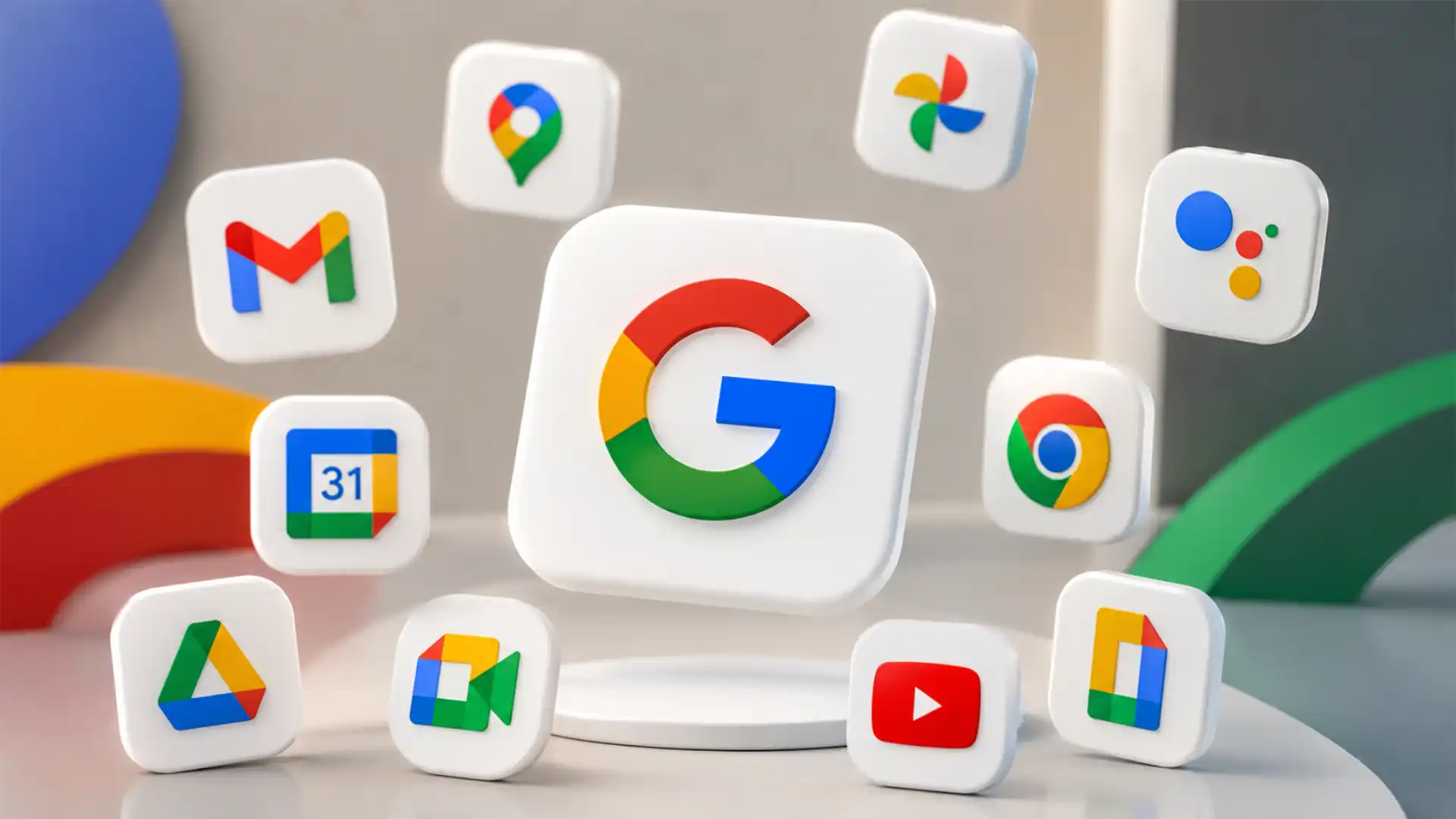
Google’s redesigned Workspace icons are not just a prettier launcher grid. The new Gmail, Drive, Docs, Sheets, Slides, Calendar, Meet, Chat, Keep, Tasks, Forms, Voice and Vids icons are part of a broader identity reset that started with Google’s gradient “G” and now reaches the tools people use every day. The change matters because Google’s icons sit at the point where branding, product navigation, memory, accessibility and workplace habit meet. When a company with billions of daily product interactions changes its icons, it changes the way people recognize work itself.
Table of Contents
Google’s icon change is already visible, but the strategy is larger than the icons
The rollout became widely visible in May 2026, especially in Google’s web app launcher and across parts of Android and iOS, according to multiple reports that tracked the redesigned assets as they appeared to users. The new icons replace the stricter flat, segmented, four-color style that defined the 2020 Google Workspace rebrand with softer gradients, rounder forms and more app-specific visual cues. The core shift is away from forced uniformity and toward recognizability inside a shared visual system.
Google has not framed the Workspace icon rollout as a standalone official announcement in the same way it announced the company-wide gradient “G” in September 2025. That distinction matters. The most reliable reading is that the Workspace icon redesign is a product-level rollout that extends a confirmed company identity direction. Google said in 2025 that the new gradient “G” would represent the company as a whole and visually reflect its evolution in the AI era; the Workspace icons now appear to translate that same gradient logic into Gmail, Drive, Calendar and the rest of the productivity suite.
The change also lands after years of criticism of Google’s 2020 Workspace icon system. When Google replaced the older Gmail envelope, Calendar square and Drive triangle language with a more uniform four-color family, the icons became cohesive but often harder to tell apart at speed. That complaint was not just aesthetic. It affected scanning behavior in tabs, app launchers, mobile home screens, browser shortcuts, admin consoles and workspaces where users depend on quick recognition. A unified brand system fails if the user has to pause to identify the tool.
The 2026 redesign appears to correct that mistake without abandoning Google’s identity. Gmail still reads as Gmail. Drive still uses a triangular structure. Calendar moves back toward a stronger blue identity. Docs, Sheets and Slides keep document-family relationships but gain softer depth. Meet, Chat, Keep and Tasks get silhouettes that are less rigid than before. The icons are not a return to the pre-2020 era, but they borrow one of that era’s strongest lessons: products need individual memory.
This is why the redesign deserves attention beyond the usual “new logo” cycle. Google is using color transitions, softer forms and product-specific shapes to bridge two demands that often fight each other: a single Google brand and quick app recognition. The redesign is a live test of whether a giant platform can look unified without making every app feel interchangeable.
The visible changes across Gmail, Drive, Docs and Calendar
The first thing users notice is the gradient. The old Workspace icons relied heavily on clean blocks of Google’s red, yellow, green and blue. The new versions blend those colors rather than placing them in hard-edged segments. Gmail’s “M” still resembles an envelope, but its color is softened by transitions. Drive’s triangular mark loses the same rigid color-block feel and puts more weight on a smoother green-yellow-blue mix. Calendar becomes more blue-centered, a move that helps it stand apart from the rest of the suite.
Docs, Sheets and Slides keep their family resemblance. They still signal document creation, spreadsheets and presentation work, but the updated icons look less like flat tags from the same template. The gradient treatment gives each one a surface-like quality, which matters at small sizes because a flat four-color outline can collapse into visual noise. The redesign does not remove the Google palette; it relaxes the old rule that every icon must use the palette in nearly the same way.
Calendar is one of the clearest examples of the new approach. Older Google Calendar versions were easier to spot because they used a strong blue field. The 2020 Workspace icon made Calendar part of the four-color family, but it also reduced that instant blue memory. The 2026 version brings more of that blue identity back while still fitting the gradient direction. That is a design correction, not nostalgia. Calendar is a glance-based product. Users do not search for it the way they search for an unfamiliar app; they expect their eye to find it almost automatically.
Drive is a harder case. The triangle is one of Google’s strongest product marks, but it must work against dense backgrounds, pinned tabs, sidebars and mobile folders. If the gradient softens the icon too much, the mark risks losing edge definition. If it stays too rigid, it fails to join the new system. The redesign tries to keep the triangle’s geometry while making its color language feel closer to the new Google “G.” Early coverage suggests mixed reactions because Drive’s identity depends so strongly on its angular silhouette.
Gmail has less room to change because its envelope-shaped “M” is already iconic. Google’s challenge is not to invent a new Gmail mark, but to modernize it without breaking recognition. The gradient works best when it reads as lighting on a familiar object rather than a decorative overlay. Gmail shows the safest side of the redesign: keep the silhouette, soften the color, preserve the memory.
Meet, Chat, Keep and Tasks test the system more aggressively. Meet’s camera shape, Chat’s speech bubble, Keep’s note form and Tasks’ checklist metaphor all need strong silhouettes because these apps compete with many similar tools in user memory. A yellow-heavy Meet icon or simplified Tasks mark may look pleasant in isolation, but the usability question is harsher: can a user find it quickly at 7:58 a.m. before a meeting starts?
That is the real benchmark. Product icons do not live in a brand presentation. They live in moments of impatience, habit and distraction. The redesigned Workspace icons succeed where they reduce hesitation and fail where they turn familiar products into attractive but vague symbols.
The 2020 Workspace icons created the problem Google is now correcting
Google’s 2020 Workspace rebrand had a clear strategic logic. The company wanted Gmail, Calendar, Drive, Docs, Sheets, Slides, Meet and Chat to look like parts of one connected work system rather than separate tools. Google said at the time that the new four-color icons reflected a more connected, flexible Workspace experience. The brand argument was coherent: if the product suite works together, the icons should look related.
The trouble was execution. The 2020 system made the family resemblance so strong that several icons became harder to distinguish. Gmail, Calendar, Drive and Meet all carried the same corporate color logic. Docs, Sheets and Slides gained similar document outlines. The result was a launcher grid where Google’s brand was unmistakable but the app identities were weaker. The icons answered “Is this Google?” faster than they answered “Which Google app is this?”
That distinction is not minor. Users do not usually open Gmail because they need to confirm it belongs to Google. They open Gmail because they need email. They open Calendar because they need a schedule. They open Drive because they need a file. In a mature ecosystem, brand ownership is already understood. The job of the icon is to get the user to the right function with minimal friction.
The design criticism that followed the 2020 refresh had a practical basis. People complained that the icons looked too similar, especially at small sizes. Those complaints showed up across design communities, Reddit threads and tech coverage. The tone varied, but the underlying issue was consistent: the icons had sacrificed too much individual character for system cohesion.
Google’s 2026 redesign looks like a tacit admission that the old compromise went too far. The company is not abandoning the idea of a family system. It is replacing a rigid family system with a softer one. Gradients, dominant colors and more distinct silhouettes give the icons room to breathe while keeping them inside Google’s visual world. The fix is not less branding; it is smarter hierarchy inside the branding.
The 2020 icons also arrived during a period when Google was pushing Workspace as a unified business product. Meet was rising during remote work. Chat was trying to claim space against Slack and Microsoft Teams. Docs, Sheets and Slides were no longer just lightweight web apps; they were collaboration infrastructure. A unified icon system made sense from a sales and product-positioning perspective.
But business positioning and user recognition are different problems. Sales pages benefit from unity. App launchers benefit from differentiation. Enterprise admins may want a suite to feel integrated. End users need to spot Gmail among 40 icons on a phone. The old Workspace system privileged the enterprise story over the daily task.
The new icons bring the balance closer to the user. They say: these products belong together, but they do not have to look like siblings wearing the same uniform. That is the central design lesson.
The gradient “G” set the direction before Workspace changed
The Workspace icons did not appear from nowhere. Google’s 2025 gradient “G” was the clearest signal that the company was moving away from hard color separations and toward a softer, more blended identity. Google said the brighter four-color gradient “G” would represent the whole company and reflect its evolution in the AI era. That official statement gives the Workspace redesign its strategic frame.
The old 2015 “G” was built from clean color segments. It matched the logic of Google’s 2015 identity refresh, which introduced a simpler sans-serif wordmark and a four-color “G” suited for screens, apps and small-device contexts. Google’s own 2015 design writing stressed scalability, accessibility and a system that could work across many interfaces.
The 2025 gradient “G” keeps the four colors but changes their relationship. Instead of separate fields, the colors flow into one another. That is not just a visual trend. It is a metaphor Google is clearly comfortable with: the company wants Search, Workspace, Android, Gemini, Photos, Maps, Home and other products to feel more connected by intelligence, context and assistance. Gradients let Google signal continuity rather than separation.
This matters because Google’s AI push is product-wide. Gemini now appears in Gmail, Docs, Drive, Sheets, Slides, Meet and other services. Google’s 2026 Workspace announcements emphasized voice capabilities in Gmail, Docs and Keep, Google Pics, AI Inbox and Gemini Spark. The company has also described broader Gemini integration in Workspace and across its product lineup. The icon redesign gives a visual grammar to an AI strategy that is already crossing product boundaries.
That does not mean every gradient is an AI feature. A gradient icon does not make Gmail smarter. But brand systems often translate product strategy into visual memory. The gradient “G” tells users that Google sees its products as part of one AI-era company identity. The Workspace icons bring that identity into the launcher, tab bar and mobile screen.
The risk is that “AI-era” design becomes a vague aesthetic. Many technology companies now use luminous gradients, soft glows and abstract color blends to imply intelligence, creativity or machine learning. If every AI product adopts the same visual language, the style can become generic. Google has an advantage because its four-color palette is unusually recognizable. The gradient works only because the colors were already Google’s.
This is why the Workspace icons are more than a trend. They are a conversion of long-owned brand equity into a newer visual mode. Google is not borrowing the gradient language of AI branding as much as it is applying gradient logic to colors it already owns.
The redesign is a usability story before it is a branding story
Icons are often discussed as decoration, but they are interface infrastructure. A product icon helps a user make a quick decision under visual pressure. It has to work in the app launcher, browser tab, dock, taskbar, notification shade, onboarding screen, admin panel, marketing page and search result. It has to survive dark mode, small sizes, low-end displays, themed icons and cluttered desktops. A good icon is remembered before it is admired.
Usability research supports that view. Nielsen Norman Group has long warned that icons are not universal and that visible labels reduce ambiguity, especially in navigation. Its 2024 guidance states that effective icons depend on recognizability and interpretation, and that teams should evaluate icons based on the questions they need answered.
Google’s Workspace icons sit in a difficult category because they are both logos and navigation aids. Gmail’s icon is a brand asset, but it is also a button people press dozens of times a day. Calendar’s icon is a brand asset, but it is also a time-management trigger. Meet’s icon is a brand asset, but it can become urgent when a user is late. Product icons must carry brand meaning without slowing task completion.
The 2020 Workspace icons leaned toward brand unity. The 2026 redesign appears to lean back toward recognizability. Gradients help only if they improve differentiation. A softer color transition can make an icon feel more modern, but it can also reduce contrast between adjacent colors. A rounder shape can feel friendlier, but it can also make icons more alike if every product receives the same soft treatment. The redesign’s success depends on the details, not the presence of gradients.
One practical improvement is the renewed use of dominant color. Calendar’s blue direction helps. Chat leaning green helps. Meet taking a more yellow-heavy path may help if the camera shape remains obvious. Docs, Sheets and Slides benefit from stronger family sub-identities because blue, green and yellow have long mapped to documents, spreadsheets and presentations in Google’s suite. Dominant color creates a shortcut that the eye can use faster than shape alone.
Silhouette is just as important. At small sizes, internal color details blur. The outline of the icon does more work. Gmail’s envelope “M,” Drive’s triangle, Calendar’s square page, Meet’s camera and Chat’s bubble need to remain recognizable without relying on color. This is where the redesign must be judged in real use, not in enlarged press images.
The best version of Google’s new icon system would make users think less. They would still feel the icons belong together, but they would not have to study them. That is the difference between brand coherence and brand fog.
Visual identity has become part of Google’s AI product narrative
Google’s AI strategy now touches Search, Workspace, Android, Gemini, developer tools and subscription products. At I/O 2026, Google framed its announcements around new models, agents and tools across building, searching, creating, shopping and work. Workspace announcements around the same period focused on voice features, AI Inbox, Google Pics and Gemini Spark. The redesigned icons arrived in that same climate, which makes the timing hard to treat as accidental.
Visual identity often changes when product meaning changes. In 2015, Google redesigned its logo because the company had moved beyond desktop search into phones, apps, voice and ambient computing. The new identity had to work on tiny screens, loading states and interactive surfaces. In 2025 and 2026, the shift is different. Google is not just moving across devices; it is moving across tasks through AI assistance.
That explains the gradient. It suggests flow, transition and blending. Those are useful metaphors for AI systems that move between email, documents, calendars, files, chats and meetings. Google wants Gemini to feel less like a separate app and more like a layer running through work. A rigid icon family from 2020 does not express that as well as a softer, blended system.
Still, the connection should not be overstated. The icons do not tell users what Gemini does. They do not explain AI Inbox or voice drafting. They do not guarantee that AI features are reliable, private or useful. The redesign is a narrative cue, not proof of product quality. It helps Google present its ecosystem as modern and connected, but the products still have to earn trust through performance.
The AI narrative also raises a branding problem. AI products often need clarity more than mystique. A user opening Gmail may not want a magical-feeling icon; they want control over messages, attachments and workflows. If AI branding becomes too atmospheric, it can make practical software feel less grounded. Google’s advantage is that Workspace remains anchored in familiar tools. Gmail, Drive and Calendar are not abstract AI surfaces; they are known utilities.
The redesigned icons work best when they add freshness without making the tools feel unfamiliar. Google’s challenge is to make Workspace look AI-era without making it feel like a new product suite users must relearn. The company has done this by keeping core metaphors intact. Gmail remains an envelope. Drive remains a triangle. Calendar remains a calendar tile. The gradient sits on top of recognition rather than replacing it.
That is the right order. In productivity software, continuity is not a weakness. It is part of trust.
Material 3 Expressive gives the icons a design-system backdrop
Google’s broader design direction also helps explain the icon change. Material 3 Expressive, Google’s evolution of Material Design, emphasizes vibrant color, adaptive components, motion, typography and contrasting shapes. Google has described Material 3 Expressive as a major update to Android and Wear OS, and Material’s own documentation presents it as an extension of the Material 3 design system.
The Workspace icons are not simply Material Symbols. Product icons have their own brand requirements. But the same climate is visible: more expression, more color variation, more emotion and less strict flatness. Google’s Material research page calls Material 3 Expressive the most researched update to its design system and connects it with emotion-driven user experience.
That matters because Google spent years associated with a clean, flat, systematized visual style. Material Design helped bring order to Android and app design, but strict systems can become visually conservative over time. Material 3 Expressive gives Google permission to loosen the grid without abandoning discipline. The Workspace icons show a similar move: soften the rules, keep the structure.
The gradient icons also fit Android’s personalization direction. Android 16 laid groundwork for Material 3 Expressive, and Google’s Android and Pixel updates have leaned into personalization, dynamic color and more responsive interfaces. Icons now live in environments where system themes, wallpapers, dark mode and adaptive surfaces matter.
The complication is that branded product icons and themed system icons often pull in opposite directions. A user may want a monochrome home screen. Google may want the Workspace icons to carry full brand color. Android’s themed icon system can reduce color identity, while Google’s new icons depend heavily on color transitions. That creates a tension between personalization and brand recognition.
Google cannot solve that tension with icon art alone. It has to decide when a product icon should obey the user’s theme and when it should preserve its full-color identity. This is especially delicate for Workspace because enterprise users often work across platforms where icon consistency matters. Gmail on Android, Gmail in Chrome, Gmail in iOS and Gmail in a browser tab should feel like the same product.
Material 3 Expressive gives Google a richer design vocabulary, but Workspace icons still need operational consistency. A beautiful icon that changes too much across surfaces can become harder to recognize.
The new icons shift from uniformity to family resemblance
The strongest design systems rarely make every element look identical. They create family resemblance. A viewer should sense that the pieces belong together without confusing one piece for another. Google’s old Workspace icons aimed for family resemblance but landed too close to uniformity. The 2026 icons attempt to widen the distance between apps while keeping a shared genetic code.
Family resemblance works through repeated features: color palette, corner radius, depth, geometry, line weight, lighting and motion behavior. Uniformity repeats too many of those features in the same way. The old Workspace icons had too many shared cues: the same four colors, similar outline logic, similar density and similar flatness. The new icons keep the palette and Google softness but vary dominant color, silhouette and gradient direction.
That distinction is easy to see in a launcher grid. When every icon uses red, yellow, green and blue with similar visual weight, the eye cannot build fast categories. When one icon is mostly blue, another mostly green, another yellow-heavy and another anchored by a strong envelope shape, recognition improves. The new system gives users more visual hooks.
This is not a rejection of consistency. It is a better form of consistency. In a product suite, consistency should reduce learning costs. It should not erase the differences users rely on. A calendar is not a spreadsheet. Email is not a video call. A note-taking app is not a task manager. Visual identity should respect those functional differences.
Google is also dealing with different levels of product maturity. Gmail and Drive are deeply established. Vids is newer. Tasks has a narrower role. Chat competes in a crowded collaboration category. The icon system has to help newer or less distinctive products inherit some Google trust while letting established products keep their memory. A rigid template cannot handle those differences well.
The new icons are more flexible because the gradient can be applied with different emphasis. Gmail can stay close to its familiar form. Calendar can reclaim blue. Meet can change color balance. Docs, Sheets and Slides can maintain their subfamily. Keep can preserve note-like warmth. Tasks can simplify. The shared system is still visible, but it no longer forces every product into the same visual contract.
This also makes the redesign more future-proof for Google’s expanding product set. Workspace now includes tools that did not have the same weight in 2020, including Vids and newer AI-driven experiences. A more expressive icon system gives Google more room to add products without making the launcher grid look like a set of near-duplicates.
The icon rollout shows the quiet power of the app launcher
Much of the early rollout was noticed in Google’s web app launcher, the grid accessible from the top-right corner of many Google pages, and in Chrome’s New Tab environment. That matters. The app launcher is a small piece of interface, but it is one of Google’s most important cross-product maps. It tells users what Google thinks belongs together.
The launcher is also a high-pressure design surface. Icons appear in a compact grid. Labels may be present, but users often scan visually first. The launcher mixes communication, storage, creation, meetings, notes, forms, videos and admin-adjacent tools. If the icons are too similar, the grid becomes slower. If they are too unrelated, the suite feels fragmented. The new icons have to work precisely there.
A redesign that starts in the launcher lets Google test recognition at the ecosystem level before every app surface changes. Users can see the new set together. Designers can observe which icons attract praise, confusion or complaints. Product teams can update app icons, favicons and platform assets in stages. The launcher is not a passive container; it is where the identity system proves whether it works as a set.
This staged rollout also explains why some users may see mixed icon states. A new icon can appear in the launcher while the app itself still shows an older asset in another surface. Reports in May 2026 noted that the new icons were visible in Google’s homepage launcher before fully replacing old versions inside each app.
Mixed states are common during large brand rollouts, but they create temporary confusion. Users may see a new Drive icon in one place and an old Drive icon in another. Admin documentation, help pages, screenshots, training materials and support guides may lag. That matters for schools, companies and public institutions where Google Workspace is taught, documented and managed at scale.
The app launcher is also where Google’s icon strategy meets competitors. Microsoft 365, Apple iCloud, Slack, Notion, Zoom, Dropbox and many smaller SaaS tools all compete for mental space. When a user moves between browser tabs and app grids, icons are cues in a busy work environment. Google’s icons need to feel modern, but their deeper job is to keep Google’s tools findable amid software clutter.
The rollout therefore reveals a broader truth: in mature ecosystems, small interface elements carry large strategic weight. A launcher icon is a brand, a navigation device and a habit trigger compressed into a few pixels.
Recognition beats novelty in everyday productivity software
Productivity tools are not fashion products. Users may appreciate a fresh visual style, but they punish unnecessary friction quickly. Gmail, Drive and Calendar are muscle-memory software. People open them while multitasking, under deadline pressure, during meetings, in classrooms, on phones, on work laptops and on shared displays. For this category, recognition is more valuable than novelty.
That does not mean the icons should never change. Old icons can become dated, inconsistent with new design systems or poorly suited to modern screens. The question is not whether redesign is allowed. The question is whether the new version preserves the recognition path users built over years.
Gmail is a textbook case. The envelope-shaped “M” is not just decoration; it is the mental shortcut for email. A radical Gmail icon would be costly because users do not want to relearn email access. Google wisely keeps the metaphor. The gradient changes the surface, not the concept. That is the safest kind of redesign for a mature product.
Calendar shows a different kind of recognition. It is tied less to one silhouette and more to color, page shape and date-grid association. Restoring stronger blue cues helps because users historically associated Google Calendar with blue. The new icon can feel fresher while reusing an older memory. That is not backward-looking. It is smart product memory management.
Drive depends heavily on geometry. Its triangular logo is unusual and strong, but it can become abstract if simplified too far. A triangle does not say “cloud storage” by itself. It says “Google Drive” because users learned it. The redesign must protect that learned association. If the gradient makes the triangle less crisp, Drive could suffer more than Gmail or Calendar.
Docs, Sheets and Slides rely on a family system inside the larger Workspace family. Users often identify them by color and document type: blue document, green spreadsheet, yellow presentation. The new icons should keep that mapping clear. If a user has to inspect the icon to distinguish Sheets from Slides, the redesign has failed.
The same principle applies to Meet and Chat. Both are communication tools, both appear in work contexts, and both can be time-sensitive. Meet needs a camera identity that is unmistakable. Chat needs a speech-bubble identity that does not disappear into generic messaging iconography. The gradient can help if it gives each product a stronger dominant color and a clearer figure-ground relationship.
Novelty may win a social media screenshot. Recognition wins daily use. Google’s redesign will be judged by the second measure.
Gradients solve one problem and introduce another
Gradients are useful because they create depth, warmth and motion without requiring complex illustration. They can make a flat icon feel alive. They can connect colors that once felt mechanically separated. They can signal modernity, especially in a brand system tied to AI, creativity and adaptive interfaces. Google’s new icons use gradients to soften the strictness of the 2020 Workspace family.
But gradients are not free. They can reduce clarity at small sizes. They can create muddy transitions when compressed. They can perform differently on low-quality displays. They can lose contrast in dark mode or when placed over colorful wallpapers. They can also make icons feel less precise if edges and internal forms are not carefully controlled.
This is where Google’s design history matters. Google has the scale and design infrastructure to test icons across surfaces. Material icon guidance emphasizes clarity and readability at different sizes and resolutions. Google’s own design systems have long treated scalability as a core requirement.
Still, gradient icons need especially careful production. The icon that looks rich in a 512-pixel preview may become a fuzzy mark in a 16-pixel favicon. Browser tabs are unforgiving. So are notification icons, app switchers and operating-system search results. Google must maintain enough silhouette strength that the gradient is a secondary cue, not the only cue.
Accessibility adds another constraint. WCAG’s non-text contrast guidance says meaningful visual cues and graphical objects need sufficient contrast against adjacent colors, with 3:1 often used for essential non-text elements. Icons used as functional interface elements must remain perceivable for users with low vision.
A product logo inside an app launcher is not always evaluated the same way as a custom UI control, but the principle still applies: if users rely on an icon to identify or activate a function, low contrast hurts. A soft gradient can look premium while making borders less distinct. The best gradients support the icon’s structure; the worst gradients blur it.
Google’s redesigned icons appear to use gradients mainly within recognizable shapes rather than as abstract blobs. That is the right direction. The gradient gives the family a new tone while the silhouette does the recognition work. The danger points will be the icons with weaker metaphors, especially tasks, forms, voice and newer Workspace products. Those need more than pretty color transitions.
Gradients also age. A visual style that feels fresh now can become a timestamp later. The safest way to prevent that is to keep the underlying icon geometry durable. Google’s old four-color “G” lasted because the form was strong. The gradient version updates the color relationship, not the basic mark. Workspace icons should follow the same rule.
Compact view of the redesign’s main trade-offs
Google Workspace icon redesign trade-offs
| Design choice | Main benefit | Main risk |
|---|---|---|
| Softer gradients | Makes the suite feel current and closer to Google’s gradient “G” | May reduce small-size clarity if contrast is weak |
| Stronger app-specific color cues | Helps users tell Calendar, Docs, Sheets and Slides apart faster | Could weaken the sense of a single Workspace family |
| Rounder, softer forms | Fits Material 3 Expressive and modern interface direction | May make icons feel less precise |
| Preserved core metaphors | Protects memory for Gmail, Drive, Calendar and Meet | Limits how radical the redesign can be |
| Staged rollout | Lets Google update surfaces gradually | Creates temporary inconsistency across apps and platforms |
The trade-off is clear: Google is trying to recover recognizability without losing ecosystem unity. The redesign works where the icon’s shape remains strong and the gradient supports a dominant product identity.
Google’s icon history explains the current move
Google has always changed its identity when the company outgrew an older interface era. The early Google wordmark belonged to a web-search company. The 2015 redesign belonged to a company present across phones, browsers, voice, apps and small screens. The 2025 gradient “G” belongs to a company trying to present AI as a layer across products.
The 2015 redesign was especially important because it replaced the old serif wordmark with a geometric sans-serif logo and introduced the four-color “G.” Google described the identity family as better suited to different devices and interactions. The design was simpler, more scalable and easier to animate.
That change matched the mobile era. A logo had to work in app icons, favicons, voice prompts, loading animations and tiny screens. The old desktop-first wordmark could not carry every context alone. The 2015 identity gave Google a modular system.
The 2020 Workspace icons were another kind of modular system. They took Google’s brand colors and applied them across productivity tools. The system was meant to signal integration, but it over-standardized. The icons became a visual proof of Workspace as a suite, but they weakened the individuality of tools within the suite.
The 2025 gradient “G” and 2026 Workspace icons correct the trajectory. They keep the modular idea but introduce more fluidity. The company is no longer just trying to prove that its products belong together. It is trying to show that they are connected by intelligence and use while still being distinct enough for daily navigation.
This pattern is common in mature technology brands. First, products proliferate. Then the company unifies them. Then users complain that unity has erased difference. Then the company introduces a more flexible system. Google is now in that third stage for Workspace.
The challenge is that Google’s product ecosystem is larger than ever. Search, Android, Chrome, Workspace, Gemini, YouTube, Maps, Photos, Home, Pixel and Cloud all need some relationship to the parent identity, but not all of them should look alike. Workspace has a special role because it is both consumer and enterprise software. A personal Gmail user and a Fortune 500 Workspace admin interact with the same visual family.
The current redesign is Google’s attempt to mature its identity from “everything uses Google colors” to “everything is recognizably Google, but each product keeps its own job.” That is a more difficult standard, and a better one.
The business reason behind better icon differentiation
A clearer icon system has direct business value. Workspace is not just a collection of free tools. It is a paid productivity platform, an enterprise collaboration suite, a school and university standard, and a distribution layer for Google’s AI features. When icons are easier to recognize, the suite feels easier to use. When the suite feels easier to use, adoption friction drops.
Google says more than 4 billion users rely on Workspace apps like Gmail, Docs and Drive. That scale turns small design changes into large behavioral effects. Even tiny reductions in hesitation can matter when repeated across billions of sessions.
The redesigned icons also help Google compete against Microsoft 365. Microsoft has spent years making Office and Microsoft 365 feel like a connected suite while preserving strong app identities such as Word, Excel, PowerPoint, Outlook and Teams. Google’s 2020 icons leaned harder into parent-brand unity than Microsoft’s app icons did. The 2026 redesign moves Google closer to a model where suite identity and app identity coexist.
This is especially relevant as AI features become subscription drivers. Google’s AI plans, Gemini integrations and Workspace Intelligence features need users to understand where capabilities live. If AI Inbox appears in Gmail, users still need Gmail to be instantly findable. If Gemini helps in Docs and Drive, those apps still need strong identities. AI does not eliminate the app layer; it often makes the app layer more valuable as a trusted place where work happens.
Enterprise training is another factor. Companies create onboarding decks, internal guides, IT support articles and security instructions around app names and icons. When icons are too similar, support friction increases. Employees may click the wrong tool, misunderstand instructions or miss app-specific features. A clearer icon system reduces that kind of low-grade confusion.
There is also a brand trust angle. Users are increasingly alert to phishing, impersonation and fake app experiences. Familiar icons help people confirm they are in the right environment. A redesign that changes too much too quickly can create uncertainty. That is why preserving core metaphors is commercially safer than radical reinvention.
For Google, a better icon system is not merely a design expense. It supports product discovery, enterprise usability, AI feature adoption and trust. The icon is small, but the business surface behind it is huge.
The redesign has to work for schools and enterprises, not just design blogs
Google Workspace is used in schools, nonprofits, small businesses and large organizations. These users often experience design changes differently from consumer tech fans. A designer may judge the new icons by aesthetic quality. A school administrator may judge them by whether teachers and students can still follow instructions. An IT department may care about screenshots, help docs and user confusion tickets.
That makes rollout management crucial. Large organizations often rely on visual references. “Click the blue Docs icon” or “open the Drive triangle” may appear in training material. If icons change gradually across accounts, devices or regions, people may see mismatched instructions. Google can reduce that pain with clear communication, consistent asset updates and support documentation.
The 2020 Workspace rebrand showed how disruptive icon changes can feel when many tools update together. Users who had no interest in brand strategy still had to relearn what their launcher looked like. The 2026 redesign may be easier because it restores stronger differentiation, but the first weeks can still feel disorienting.
Schools are a special case. Younger students often learn software visually before they learn product names. A child may identify Slides by its yellow icon or Drive by its triangle. Visual changes can interrupt classroom routines. On the other hand, stronger color cues can help once students adjust. The short-term cost is relearning; the long-term gain may be faster recognition.
Enterprises face a different issue: consistency across managed devices. Google apps may appear in Chrome, Android work profiles, iOS managed apps, Windows shortcuts and internal portals. If the icon set updates unevenly, the same product may look different across environments. That creates a support burden. It also makes security training harder because official icon recognition becomes less stable.
This is why icon redesigns should be treated as change management, not just visual refreshes. Google’s rollout through launcher surfaces may be efficient, but organizations still benefit from advance notice, asset libraries and side-by-side comparisons. The more Google Workspace becomes an AI-enabled enterprise platform, the more design changes affect operational workflows.
The redesign’s business success will depend partly on whether Google handles that operational layer. Users can adapt to new icons. They adapt faster when the transition is explained and the old-new mapping is obvious.
The new icons must survive small screens, browser tabs and favicons
Large icon previews can mislead. A redesign might look excellent in a press image and weak in real use. The harshest tests are tiny: browser favicons, pinned tabs, Android search results, iOS spotlight results, notification lists, compact sidebars and low-resolution remote desktops. Google’s icons must remain distinct in all of those environments.
Favicons are especially difficult because they strip away detail. A gradient that looks smooth at full size may become a blur. A shape with subtle internal divisions may collapse. Users often keep many Google tabs open at once: Gmail, Calendar, Docs, Sheets, Drive, Meet, Chat. If the favicons become less distinct, the redesign fails in one of its most common work contexts.
Pinned tabs increase the pressure because labels disappear. A user may pin Gmail, Calendar and Drive side by side. The icon must carry the whole recognition task. Nielsen Norman Group’s warning about visible labels matters here because pinned tabs remove the label by design.
Mobile home screens are different but equally demanding. Icons compete with apps from Apple, Microsoft, Meta, Slack, Zoom, Notion, banking apps, delivery apps and local services. A Google icon must stand out without looking alien. The new gradient style may help because it adds richness, but if several Google apps appear together, differentiation becomes the priority again.
Dark mode and themed environments create another test. Gradients can look different against dark backgrounds. Icons with pale transitions may lose edge clarity. Icons with saturated gradients may look too loud. Google’s design teams must tune assets for multiple backgrounds and masks.
Android adaptive icons add further complexity. Developers must follow launcher icon specifications, and Android has long supported adaptive shapes and foreground-background layers. Google’s own developer documentation points app makers toward Material product icon principles and adaptive icon requirements.
The Workspace redesign will be experienced through all of these technical filters. Users do not see a pure design file. They see assets rendered by browsers, operating systems, launchers, web apps, dark themes, high-DPI screens and accessibility settings. The real icon is the icon as rendered, not the icon as designed.
This is why the new system’s success will take time to judge. Early screenshots show direction. Daily use reveals durability.
Color psychology is less important than learned color memory
Design commentary often reaches for color psychology: blue means trust, green means growth, yellow means energy, red means urgency. Those associations can be useful, but they matter less here than learned product memory. Users know Docs as blue, Sheets as green and Slides as yellow because Google trained them that way for years. Calendar’s blue matters because users remember it, not because blue has one universal meaning.
The new icons appear to respect that learned memory more than the 2020 set did. Calendar becomes more blue-focused. Docs, Sheets and Slides keep their familiar color categories. Gmail’s red remains central to the “M” envelope. Drive keeps its distinctive multi-color triangle. The redesign’s strongest move is not psychological symbolism; it is respect for user habit.
Habit is a powerful asset. Technology companies often spend heavily to build it, then risk damaging it with redesigns that chase freshness. Google’s 2020 icons tested the limits of habit disruption. The 2026 icons look more careful. They freshen the system while preserving the cues that users already rely on.
This is especially important for products that have competitors with similar functions. Calendar apps often use calendar tiles. Email apps often use envelopes. Video apps often use cameras. Chat apps often use bubbles. The product-specific color memory helps Google’s version stand out within generic categories. A blue calendar tile may not be unique in the abstract, but Google Calendar’s blue history gives it a stronger claim in the user’s mind.
Color memory also works across languages. Google Workspace is used globally. Product names may be localized or pronounced differently, but icons travel more easily. A teacher in Slovakia, a student in Brazil and an employee in Japan may all recognize the same Drive triangle. Strong visual memory reduces dependence on text.
The risk is that gradients complicate color memory by blending hues. If Calendar is blue but also carries too much of the full Google palette, the blue signal weakens. If Meet becomes yellow-heavy but still contains multiple blended colors, the signal must be tested. The best icon color systems use gradients without muddying the dominant identity.
Google’s old four-color rule made every icon say “Google” loudly. The new system lets each icon say its own name first, then say Google second. That is the correct hierarchy for daily software.
The AI-era brand problem is trust, not sparkle
The phrase “AI era” appears in Google’s official explanation of the gradient “G.” It is a useful phrase for Google because the company is repositioning itself around Gemini and AI-powered products. But users do not judge AI-era software by gradient polish. They judge it by whether it saves time, respects data, reduces mistakes and stays under control.
That creates a risk for any AI-adjacent visual redesign. If the style feels too glossy, users may read it as marketing rather than clarity. Workspace users have practical needs. They want email handled correctly, documents preserved, meetings joined on time, files found quickly and calendar events accurate. AI features must serve those tasks. Icons should support that trust, not distract from it.
Google’s gradient approach is restrained compared with many AI brands. The icons still use familiar product forms. They do not become glowing abstract orbs. That restraint matters. The more abstract AI branding becomes, the less useful it is for productivity software.
Trust also depends on continuity. Gmail cannot suddenly look like a new unknown service. Drive cannot look like a generic cloud storage app. Calendar cannot lose its basic calendar identity. Google’s redesign preserves continuity enough that users can absorb the new visual style without doubting the product.
The deeper trust issue is data. Workspace AI features operate around emails, documents, files, meetings and workplace communication. Google has to communicate security, control and reliability through product behavior and policy, not icon design. But visual identity can still set tone. A clear, stable icon system suggests order. A chaotic or overly decorative system suggests noise.
The best AI-era brand systems will not be the ones that look most futuristic. They will be the ones that make complex products feel understandable. Google’s icons move in that direction if they improve recognition. They move away from it if gradients become decoration without clarity.
This is why the redesign should be judged by whether it helps people work. If users find apps faster, distinguish tools more easily and accept the updated system without confusion, it succeeds. If they merely notice that the icons look more “AI,” the redesign has done less useful work.
Compact timeline of Google’s icon identity shift
Google icon identity timeline
| Date | Change | Strategic meaning |
|---|---|---|
| September 2015 | Google introduced a new logo family and four-color “G” | Identity adapted to mobile, apps and small screens |
| October 2020 | Google introduced Workspace and four-color app icons | Suite unity became the main visual message |
| May 2025 | Gradient “G” began appearing in Google app contexts | Google started moving from separated colors to blended identity |
| September 2025 | Google announced the gradient “G” as company-wide | The gradient became official AI-era company branding |
| May 2026 | New gradient Workspace icons began rolling out widely | Product icons started following the new company identity |
The timeline shows a clear pattern: Google first made the parent brand more fluid, then extended that visual language into Workspace. The current redesign is the latest stage in a long identity migration, not an isolated icon refresh.
The redesign affects Google Discover, Search and answer-engine visibility indirectly
An icon redesign is not an SEO update. It will not directly change rankings, crawling or indexing. Still, brand presentation affects how people recognize results, screenshots, app listings, news coverage and product explainers. For a company like Google, visual consistency across articles, app stores, help pages and product surfaces can influence click confidence and brand memory.
News coverage of the redesign is also discoverable content. Users search questions such as “Why did Google icons change?”, “What are the new Gmail icons?”, “Did Google redesign Drive?”, and “Why do Google Workspace icons look different?” Articles that answer those questions clearly can rank in Search, surface in Google Discover and appear in AI-generated summaries. The topic has strong search intent because the change is visible to ordinary users.
For publishers, the correct framing is not “Google made icons prettier.” The richer framing is that Google is adjusting Workspace’s visual identity after years of complaints about icon similarity and after making the gradient “G” company-wide. That framing connects user confusion, product design, AI-era branding and Workspace strategy. It also gives answer engines extractable facts: rollout timing, affected apps, design changes, reason for the shift and user impact.
The redesign may also influence screenshots in support content. When icons change, old guides become stale. Publishers and companies that maintain Workspace tutorials need to update visuals and language. A guide telling users to click an old Gmail icon may still be understandable, but it loses polish and trust. Icon changes create a quiet maintenance burden across the web.
Search results may show favicons as brand cues. If Google’s own product pages and related sites update icons consistently, users see a more coherent identity. If third-party pages lag, screenshots and thumbnails may show old assets. That is normal during transitions, but it matters in visual search and AI summaries that draw from current pages.
Answer engines also prefer clarity around confirmed facts. As of May 26, 2026, the Workspace icon rollout is documented by tech publications and visible to users, while the official strategic anchor is Google’s 2025 gradient “G” announcement. A careful article should separate those two facts. The rollout is observed and reported; the AI-era explanation is official for the gradient “G” and reasonably connected to Workspace by visual continuity.
That distinction is exactly the kind of trust signal news analysis needs.
The design works only if it reduces cognitive load
Cognitive load is the mental effort required to process information and make decisions. In icon design, cognitive load shows up as hesitation: the user looks at a grid, pauses, scans again, and only then clicks. A bad icon system adds tiny pauses all day. A good one disappears into habit.
The 2020 Workspace icons increased cognitive load for some users because they made several Google apps visually similar. The 2026 icons attempt to reduce that load by restoring distinct visual cues. That is the right problem to solve. The measure of success is not whether users compliment the icons, but whether they stop thinking about them.
There are three main sources of cognitive load in app icons. The first is similarity. If two icons share too many features, users must compare them. The second is ambiguity. If a symbol does not clearly map to a product or function, users must interpret it. The third is inconsistency. If the same product looks different across surfaces, users must reconcile versions.
Google’s redesign addresses similarity by using stronger dominant colors and less rigid four-color segmentation. It addresses ambiguity by preserving core metaphors. It still risks inconsistency during rollout because old and new icons may coexist across web, mobile and app surfaces.
Labels reduce cognitive load, which is why UX guidance often recommends visible labels for icons. But icons still matter because labels are not always present, and users often process the image first. A well-labeled launcher can still feel slow if the icons are visually confusing. A clear icon system lets the label confirm rather than rescue recognition.
Cognitive load also changes by user type. A power user with pinned tabs may rely almost entirely on favicons. A new Workspace user may rely on labels. A child may rely on color. A person with low vision may rely on contrast and shape more than subtle gradient differences. Google’s icon system must serve all of these patterns.
That is why the redesign’s softer look must be balanced by strong form. If the gradient is too subtle or the silhouette too generic, cognitive load rises again. If the dominant color and shape are clear, the gradient becomes a pleasant extra rather than a burden.
Good productivity design does not demand attention. It gives attention back.
The old icons were consistent but not distinctive enough
Consistency is often treated as an automatic good in design, but consistency has a point of diminishing returns. Past that point, it becomes sameness. Google’s 2020 Workspace icons crossed that line for many users. They made the suite look integrated but reduced the visual distance between tools.
Distinctiveness matters because users build mental maps. They remember Gmail as red and envelope-like, Calendar as blue and date-like, Drive as triangular, Docs as blue document, Sheets as green spreadsheet, Slides as yellow presentation. When a redesign weakens those maps, it forces users to rebuild them.
The old icons were also constrained by a brand-first rule: every major app had to visibly carry Google’s four colors. That made sense on a brand slide. It was less helpful in a cramped launcher grid. A user looking for Sheets does not need to be reminded that Sheets is Google. They need the green spreadsheet cue.
The new icons loosen that rule. They still use Google colors, but not with equal weight everywhere. That is a more mature identity system. It understands that brand recognition can be inherited from context. If an icon appears inside a Google app launcher, it does not need to shout Google as loudly as a standalone app icon in an app store.
Distinctiveness is not the enemy of brand equity. It is what makes brand equity usable. Gmail is more valuable to Google when users can find it instantly. Drive is more valuable when its triangle remains unmistakable. Calendar is more valuable when the blue cue returns quickly to memory.
The challenge is to avoid overcorrecting. If every icon becomes too different, Workspace may feel fragmented. Google must keep shared visual principles: similar softness, related gradient behavior, compatible geometry, and the familiar palette. The new icons appear to aim for that middle position.
This middle position is harder than both extremes. A rigid template is easy to apply. Total freedom is easy to justify. Controlled differentiation requires judgment. Each icon must be tested as part of the set and as an individual product mark. The early redesign suggests Google is trying to do that work.
The real verdict will come after the novelty fades. If users stop complaining about confusing icons, the redesign will have solved the right problem.
Google’s redesigned icons also tell a story about platform maturity
Young products often need loud identity. Mature platforms need quiet clarity. Google Workspace has become infrastructure for work, education and personal organization. Its icons no longer need to introduce the products from scratch. They need to keep long-lived products legible in a changing ecosystem.
This is why the redesign feels less like a rebrand and more like a correction. Google is not renaming Workspace. It is not repositioning Gmail. It is not changing what Drive does. It is adjusting the visual signals around products whose roles are already understood.
Mature platforms also face accumulation. New products join the suite. Old products remain. AI features arrive. Surfaces multiply. Icons must scale across all of that without creating clutter. A flexible gradient-based system gives Google more room than the 2020 template, especially for newer apps like Vids or AI-driven tools that need to feel part of Workspace without copying Gmail or Docs.
Platform maturity also means serving different contexts at once. A consumer may use Gmail and Drive casually. A business user may live in Calendar, Meet, Docs and Sheets all day. A school may use Classroom, Drive and Docs as core learning tools. A developer may encounter Google icons through Cloud, Android or Workspace APIs. No single icon logic can serve every context perfectly.
The new Workspace icons suggest Google is learning to prioritize context. Communication tools need fast recognition. Content tools need family grouping. Storage needs a strong standalone mark. Scheduling needs a color cue. Newer creative tools need connection to the suite. A good system handles these differences instead of flattening them.
The redesign is a sign that Workspace is too mature for a one-rule-fits-all icon family. That is a healthy realization. Big platforms often become harder to use when design systems become doctrinaire. Google’s softer direction gives teams more room to solve product-specific problems.
There is also a competitive maturity angle. Microsoft, Apple and Adobe have all faced similar issues with suites. The larger the product family, the harder it is to keep icons both related and distinct. Google’s 2026 redesign puts it back into that classic platform-design problem, but with AI as an added layer.
A mature platform does not need every icon to prove the parent company’s ownership. It needs every icon to help users move.
The redesign may reduce the “sea of Google colors” problem
One of the strongest criticisms of the 2020 Workspace icons was the feeling that everything became a sea of red, yellow, green and blue. The palette was powerful, but overuse made it less useful. When every icon carries every color, color stops differentiating. It becomes wallpaper.
The 2026 redesign reduces that problem by giving products stronger color centers. The full Google palette remains, but it is not always distributed evenly. Calendar can be mostly blue. Sheets can stay green. Slides can stay yellow. Chat can lean green. Gmail can remain red-forward. This restores color’s job as a sorting mechanism.
Color overload is common in brand systems. A company finds a recognizable palette and applies it everywhere. At first, the result feels coherent. Later, users lose the ability to distinguish items within the system. The palette still signals parent brand, but it no longer helps navigation. Google’s 2020 icons reached that point.
The new gradients help by allowing color to shift in intensity. A product can belong to Google without using each color as a separate block. That gives designers more hierarchy inside the icon. A blue-heavy Calendar icon can still contain warmth or depth without becoming another equal four-color mark.
The danger is that gradients create a different kind of color noise. If the transitions become too luminous or too similar, the icons may still blur together. The solution is not gradient for its own sake. It is disciplined color hierarchy: one dominant product cue, supporting secondary tones, strong silhouette and enough contrast.
Google’s best icon redesigns are the ones that make color useful again. Useful color does not merely decorate. It tells the eye where to go.
This matters in mobile folders where several Google apps may sit together. If Gmail, Drive, Calendar, Docs, Sheets and Meet all show up in one folder, the user should be able to pick the right one by a mix of color and shape before reading labels. The old system made that harder. The new one should make it easier.
The “sea of Google colors” problem was self-inflicted. Google owned one of the strongest palettes in technology, then reduced its practical value by spreading it too evenly across too many icons. The redesign tries to restore the palette’s power by using it with more restraint.
The rollout sits beside a larger Workspace AI push
The timing of the redesign matters because Workspace itself is changing. Google has been adding Gemini features across Gmail, Docs, Drive, Sheets, Slides, Meet and other tools. In 2026, Google announced new voice capabilities in Gmail, Docs and Keep, Google Pics, AI Inbox and Gemini Spark. It also described Workspace Intelligence and deeper Gemini support across work products.
When a product suite gains new AI layers, its interface has to absorb more complexity. Users need to understand where work happens, where AI assistance appears, and which app contains which task. Strong icon identity becomes more important, not less. AI may connect products, but it does not eliminate the need to navigate them.
Workspace’s AI push also increases the value of cross-app continuity. Gemini may summarize Gmail threads, help draft Docs, interpret Drive files or assist in meetings. A user moving through those flows should feel that the tools are connected. The gradient identity supports that feeling. But each app still needs to remain identifiable because permissions, data types and work contexts differ.
AI features can also blur product boundaries. If Gemini can create content, retrieve files and answer questions across apps, users may become less sure where a task belongs. Icons then become anchors. Gmail is where messages live. Drive is where files live. Calendar is where time lives. Docs is where writing lives. The more AI crosses boundaries, the more those anchors matter.
The redesign’s strategic value is that it makes Workspace feel connected without dissolving the app map. That is exactly the balance Google needs as Gemini spreads through the suite.
There is also a subscription story. Google’s AI plans and Workspace business offerings depend on users seeing value in integrated AI features. Visual identity helps package that value. A modernized icon system makes the suite feel current at the surface level while product features do the deeper work.
Still, icons cannot solve AI adoption alone. Users will judge Gemini in Workspace by accuracy, latency, privacy controls, admin settings and usefulness. The new icons may make the suite feel refreshed, but the business case lives in the software. Google should treat the redesign as a supporting signal, not a substitute for product clarity.
Icon redesigns create emotional reactions because they disrupt habit
People react strongly to icon changes because icons are part of daily habit. A user may not think they care about Google Drive’s logo until it changes. Then the old visual shortcut disappears, and the user feels friction. That reaction is not irrational. It is a response to disrupted muscle memory.
The 2020 Workspace icons triggered this reaction because they changed several familiar products at once and made them more similar. The 2026 redesign may trigger a softer version because it changes visual texture and color relationships, but it also restores differentiation. Some users will still dislike it because any change to a daily tool can feel like an imposition.
Designers sometimes underestimate this emotional layer. They evaluate icons as systems; users experience them as habits. A redesign that looks rational in a brand audit can feel annoying in a Monday morning inbox. Google’s challenge is to make the new icons feel familiar quickly.
The safest path is continuity. Keep the metaphor. Keep the dominant color memory. Avoid changing all interaction patterns at once. Explain the rollout where needed. Google appears to follow the first two principles. The communication layer has been quieter, which may leave some users wondering why their icons changed.
The emotional response also depends on whether users feel the change solves a known problem. Many users disliked the 2020 icons for being too similar. A redesign that makes them easier to distinguish has a better chance of acceptance because it addresses a real pain point. Users forgive change faster when the benefit appears in daily use.
There is also a nostalgia effect. Older Google icons had stronger individual personalities. Some users miss that era because products felt simpler and more distinct. The new icons do not fully return to that style, but they borrow its lesson. They give each app more room to be itself.
Emotional reactions will settle over time. The first days of a redesign produce screenshots, rankings, complaints and praise. The lasting question is whether people can find their tools faster after the transition. If yes, the emotional resistance will fade. If no, complaints will persist because the redesign will have failed in the flow of work.
Google’s visual system is trying to look more human without losing machine precision
The new gradients and softer shapes make Google’s icons feel less mechanical. That fits the company’s Material 3 Expressive direction, which emphasizes emotion, color and more expressive interaction. Google’s design research around Material 3 Expressive frames the update as a bold design direction grounded in research.
This matters because enterprise software often struggles with personality. Too much personality can feel unserious. Too little can feel cold. Google Workspace historically benefited from being approachable compared with heavier office software. The 2020 icons made the suite cohesive but somewhat rigid. The new icons bring back warmth.
Human warmth in design comes from small choices: softer transitions, less harsh geometry, clearer metaphors, color that feels alive without becoming chaotic. The new icons use these cues. They look less like a set of engineering diagrams and more like app symbols that belong in a modern interface.
But Google cannot lose machine precision. Workspace handles work. Users need confidence that tools are reliable. If icons become too soft, they may feel less crisp. If gradients reduce edge clarity, the system may feel less disciplined. The best Google identity has always balanced playfulness with technical seriousness. The tilted “e” in the old logo, the four-color palette and the clean Product Sans era all tried to hold that balance.
The 2026 icons are strongest when they feel warmer but still exact. Gmail’s envelope can be soft and precise. Calendar’s blue tile can feel modern and readable. Drive’s triangle can use gradients without losing geometry. Docs, Sheets and Slides can gain depth without losing their simple document identities.
This balance also connects to AI. Google wants AI to feel helpful rather than alien. A warmer visual system supports that goal. But AI tools also need trust, control and explainability. Visual warmth cannot become vagueness. The icons should make products feel approachable, not magical in a way that hides function.
The redesign is therefore a tone adjustment. It makes Workspace less rigid and more expressive. The practical challenge is to keep the tone from interfering with recognition.
The new icons carry risk for accessibility if contrast is not handled carefully
Accessibility is not an afterthought in icon design. Users with low vision, color vision differences or cognitive processing differences rely on clear contrast, shape and labels. A redesign that depends too much on subtle gradients can create barriers. WCAG guidance on non-text contrast stresses that meaningful visual cues and graphical objects need enough contrast to be perceived.
Google’s icons are brand marks, but they often function as interactive targets. In app launchers and navigation surfaces, they help users identify and open tools. That makes perceptibility a practical requirement. A beautiful icon with poor contrast is a weaker interface element.
Color vision differences are especially relevant for a palette-heavy system. Red, green, yellow and blue may not separate equally for all users. If the icon relies on color alone, recognition suffers. Shape must carry meaning. Gmail’s envelope, Drive’s triangle, Calendar’s date tile and Meet’s camera help because they do not depend entirely on hue.
Gradients can both help and hurt. They can create contrast within an icon, making the form more dimensional. They can also create low-contrast zones where colors blend too softly. Designers need to test icons under simulated color vision conditions, low brightness, dark mode, grayscale and small sizes.
Labels remain an accessibility safeguard. A launcher with visible labels reduces ambiguity. But many surfaces lack labels or show them only after hover or long press. Pinned tabs are a common example. That makes the icon itself more responsible for recognition.
The redesign’s accessibility test is simple: users should not need perfect color perception or full-size previews to tell the apps apart. If the icons pass that test, the gradient system is robust enough for real work. If not, Google may need refinements.
Google has strong accessibility expertise and design infrastructure, but scale makes perfection difficult. Icons appear in many places controlled by different teams. Web launcher assets, Android launcher icons, iOS icons, favicons, help docs and product UI may not update together. Accessibility quality must be maintained across all of them.
The safest principle is redundancy: color, shape, label and context should all support recognition. The new icons appear to improve shape and dominant color redundancy compared with the 2020 set. That is promising. The gradients must not undermine that progress.
The redesign reveals a tension between brand control and user customization
Modern operating systems give users more control over visual themes. Android’s Material You and later Material 3 Expressive direction emphasize personalization, dynamic color and adaptive UI. Pixel updates have pushed expressive interface changes and theming options.
Brand icons, however, resist too much customization. Google wants Gmail to look like Gmail. Users may want all icons to match a monochrome theme. Enterprises may want managed consistency. Designers may want full-color gradients. These goals do not always align.
Android’s themed icons show the tension clearly. A themed home screen can make third-party and Google icons look more uniform, but it can also remove brand color cues. For a user who values a calm home screen, that is a benefit. For a user relying on color memory, it can make apps harder to find. Google’s new Workspace icons invest in color richness at the same time that platform personalization can suppress color.
The answer is choice, but choice adds complexity. Full-color icons maximize brand and recognition. Themed icons maximize personal aesthetic. Enterprise-managed icons maximize consistency. Accessibility settings may require stronger contrast. Google must support these needs without fragmenting recognition too far.
The new icon system shows Google’s brand preference: full-color, gradient-rich, expressive identity. Android’s broader direction shows the platform preference: adaptable, personal, context-aware surfaces. Google sits on both sides because it is both app maker and platform maker.
This dual role is unusual. Google designs icons for its own products while also designing the environment where icons live. That gives it control, but it also forces trade-offs. If Google makes its branded icons too dominant, Android personalization feels less complete. If Android themes flatten Google’s icons too much, Workspace recognition weakens.
The practical outcome will vary by surface. Enterprise Workspace users in browsers may mostly see full-color icons. Android users may see themed versions depending on settings. iOS users may see Apple’s icon customization rules. Browser tabs may show favicons. The icon system must survive all of those interpretations.
The redesign is therefore not a single visual event. It is a system that will be translated by platforms, themes and user preferences.
The strongest icons preserve metaphor while refreshing execution
The best redesigned icons usually keep the metaphor and change the execution. Gmail remains an envelope. Calendar remains a calendar. Drive remains a triangle. Meet remains a camera. Docs remains a document. These metaphors are not perfect descriptions of modern software, but they are learned, efficient and fast.
Metaphors matter because they compress meaning. A user does not need to read “Google Meet” if the camera symbol is clear and familiar. A spreadsheet icon can use a grid because users understand grids as tables. A calendar tile can show date structure. These are old visual ideas, but old ideas are not bad when they work.
The 2026 redesign’s advantage is that it does not chase novelty by replacing metaphors. It modernizes color and form. That is a conservative choice, but conservative redesign is often correct for widely used tools. The more familiar the product, the less the icon should fight memory.
Execution still matters. A stale icon can make a product feel neglected. A refreshed icon can signal continued investment. Google’s new gradients make the suite look more current and aligned with the gradient “G.” But because the metaphors remain, the change does not force a complete relearning.
The harder icons are those with weaker metaphors. Tasks, Forms, Voice and Vids are less universally distinctive than Gmail or Drive. A checklist, form sheet, phone waveform or video shape can look generic. These products need careful detail, not just gradient treatment. The redesign must give them enough personality to be found without making them visually noisy.
This is where family systems can help. A less famous product can borrow trust from the suite. If Tasks looks like part of Workspace, users may accept it more easily. But it still needs a clear task-specific cue. The same applies to Vids, which must signal video creation without being confused with Meet or YouTube.
Strong metaphors also help accessibility and localization. Icons that map to recognizable objects or actions travel better across languages. They are not universal, but they are faster than abstract symbols. Google’s decision to keep core metaphors is therefore practical as well as brand-safe.
The redesign works because it understands that execution can evolve while meaning remains stable.
Reaction to the redesign is likely to split between designers and daily users
Designers may praise the new icons for fixing the 2020 system’s sameness, adding depth and aligning Workspace with the gradient “G.” Daily users may care less about design rationale and more about whether they can still find Gmail. These reactions are both valid, but they evaluate different things.
Tech and design publications have generally framed the redesign as an improvement over the old icons, especially because it restores distinctiveness. Fast Company described the new Workspace icons as part of an “AI gradient” treatment, while Android Central noted the shift away from strict four-color styling and toward softer gradients.
User reactions are often more mixed. Some people welcome clearer colors. Others dislike losing the old look. Some prefer flat icons because they feel cleaner. Others like gradients because they feel less sterile. The split is expected. Icon design sits at the intersection of taste and function.
The important distinction is between preference and usability. A user may dislike the new style but still find apps faster. Another may like the style but confuse Meet and Chat. Google’s research should focus on task performance, not sentiment alone.
Social media reactions can distort the picture because annoyed users speak loudly. But complaints can still reveal real problems. The backlash to the 2020 icons was not just resistance to change. It identified a genuine recognition issue. Google should treat 2026 criticism the same way: separate taste complaints from clarity complaints.
The most useful feedback will come from repeated use across real contexts: pinned tabs, mobile folders, classroom instructions, enterprise launchers and support guides. A design system that survives those contexts is stronger than one that wins a screenshot poll.
The redesign may also become more accepted as all surfaces update. Mixed old-new states often make a rollout feel messier than the final system. Once the icons are consistent across web, mobile and documentation, users may adapt more quickly.
The likely outcome is moderate acceptance with pockets of criticism. That is normal for Google-scale design. The bigger question is whether complaints about icon similarity decline. If they do, Google will have solved the problem that mattered.
Workspace identity now has to carry both consumer and enterprise meanings
Google Workspace is unusual because its icons serve consumer habits and enterprise procurement at the same time. Gmail is a personal email app for many people and a business communication system for companies. Drive is personal storage and enterprise file infrastructure. Docs can be school homework, startup collaboration or corporate policy drafting.
The icon system has to feel friendly enough for consumers and serious enough for business. The 2020 icons pushed the suite toward corporate unity. The 2026 icons bring back more product character. That may help both audiences. Consumers get easier recognition. Enterprises get a suite that still feels integrated but less visually monotonous.
Enterprise buyers may not choose Workspace because of icons, but icons affect daily adoption after purchase. A tool that feels easier to navigate faces less resistance. A suite that feels visually coherent supports the impression of a mature platform. Good icon design does not close enterprise deals by itself, but poor icon design can make the product feel more frustrating after deployment.
Consumer users are more sensitive to habit and taste. They may not read Workspace announcements. They just see a changed Gmail or Drive icon. For them, continuity is crucial. Google’s decision to keep familiar metaphors protects consumer comfort.
The dual audience also affects AI branding. Business customers may be cautious about AI in email and files. Consumer users may be curious but wary. A flashy AI-style identity could make Workspace feel less stable. Google’s gradient icons are expressive but still grounded in familiar app forms. That helps keep the tone balanced.
Education adds a third audience. Schools need clarity, simplicity and training consistency. The redesigned icons may help students distinguish tools if the color cues are stronger, but only after the transition period. Google should support that audience with updated help resources.
Workspace identity therefore cannot be optimized for one group. It must carry personal familiarity, workplace seriousness and educational clarity. The new icons are an attempt to find that middle.
The redesign should make Google’s app family easier to extend
A rigid icon system becomes harder to extend as a product family grows. Every new product must fit the template, even if the template does not suit its function. Google’s 2020 Workspace style left limited room for new icons to feel distinct. The new gradient system is more expandable because it can vary dominant color, shape and depth.
This matters because Workspace is expanding around AI and media. Google Vids brought video creation into the suite. Google Pics, announced in 2026, adds image creation and editing. Gemini-driven features add assistant-like behavior across products. New experiences need icons that feel related to Workspace without being forced into a narrow four-color outline.
A flexible system also helps with sub-brands and feature icons. AI Inbox, Gemini side panels, voice features and Workspace Intelligence need visual cues. Not all of these require standalone app icons, but they do require coherent interface identity. The gradient language gives Google a way to connect them without making every feature look identical.
The risk is expansion without discipline. A flexible system can become inconsistent if teams interpret it too freely. Google must define rules: how gradients behave, how much color dominance each product can have, how silhouettes are built, how icons render at small sizes, and how AI-related features differ from core apps.
The value of the new system depends on controlled flexibility. Too little flexibility recreates the 2020 problem. Too much creates visual sprawl.
Material Design’s icon guidance and Google’s product icon specifications can support that discipline. Material Symbols and product-icon principles emphasize clarity, grid, shape and readability across sizes. Workspace icons need similar rigor, even though they are branded marks rather than generic UI symbols.
The expansion challenge will become more important if Google adds more AI-native Workspace tools. A product family with 10 icons can survive some inconsistency. A family with 25 app and feature icons cannot. The redesigned system gives Google more room, but it also raises the need for governance.
Google’s icon redesign is a product communication event
Every icon change communicates something, whether a company explains it or not. Users ask: Why did this change? Is the app different? Did I install the wrong thing? Is this official? Does the change mean new features are coming? Google’s quiet rollout leaves some of those questions to publishers, forums and users.
Google’s official 2025 gradient “G” post gave a clear message: the new company-wide mark reflects Google’s evolution in the AI era while keeping the four colors. The Workspace icon rollout would benefit from similarly clear explanation, even if shorter. Users do not need a brand essay. They need assurance that the apps are the same, the icons are official, and the design improves recognition.
Communication matters more because scams and fake apps exist. When a familiar icon changes, some users may wonder whether they are seeing a legitimate app. A clear rollout note helps. App store listings, Workspace admin updates and help center entries can reduce uncertainty.
The message should be practical: Google Workspace icons are being updated with a gradient look aligned with Google’s broader visual identity; core app names and functions are unchanged; rollout timing may vary by platform and account; users may temporarily see old and new icons in different places. That is the kind of plain explanation people need.
The best design rollout communication reduces surprise without overexplaining design theory. Google has enough brand power that users will adapt, but clear communication builds trust.
Publishers also have a role. News articles should avoid overstating the change as a full product overhaul. The apps are not being redesigned in function because their icons changed. The accurate story is a visual identity update across Workspace icons, tied to the broader gradient direction and likely meant to improve distinction after the 2020 icons drew criticism.
For admins and educators, communication should include side-by-side visuals. People learn icon changes faster when they see old and new versions together. Text descriptions alone are weaker.
Google’s rollout is visible enough to be news, but quiet enough that users may search for explanations. That search behavior is itself a sign that icon changes are communication events.
The redesigned icons may age better than the 2020 set
The 2020 Workspace icons aged quickly because the core criticism appeared almost immediately: they looked too similar. A design can survive taste shifts if it works well. It struggles if its usability problem is obvious from the start. The 2026 icons have a better chance because they address the main complaint while still aligning with Google’s current brand direction.
Whether they age well depends on restraint. Gradients can become dated if they feel tied to a specific visual trend. But Google’s gradients are grounded in its own palette, which gives them more durability. The colors are not generic neon AI colors; they are Google’s long-standing red, yellow, green and blue, blended in a newer way.
The preserved metaphors also help aging. Gmail’s envelope, Drive’s triangle and Calendar’s tile are stable. Even if gradient fashion changes, Google can adjust color treatment later without replacing the underlying marks. That makes the redesign less risky than a full metaphor change.
The icons may also age well because they are more adaptable to future products. The old four-color segmented style was rigid. The new system can absorb new tools with varied dominant colors and forms. That gives Google room to update Workspace without another major reset.
A durable icon system is one that can change at the edges without breaking recognition at the center. The 2026 redesign seems closer to that model than the 2020 system.
The danger is overextension. If Google applies gradient treatment too broadly across every product and feature, the style may become another kind of sameness. The company must keep enough product-specific distinction to avoid repeating the old mistake in a softer form.
Aging also depends on user adoption. Once people build new habits, the icons become normal. The first wave of reactions will matter less than the second month of use. If users stop thinking about the redesign, it will have aged well quickly.
The old icons were remembered partly for the criticism they drew. Google will hope the new ones become unremarkable in the best way: visible enough to guide, invisible enough not to annoy.
The redesign is also a lesson for other software companies
Google’s icon story offers a clear lesson for any company managing a product suite: do not confuse consistency with usability. A shared brand system should help users understand relationships between products, but it should not erase the differences users need to act quickly.
Many SaaS companies face this problem as they expand. A startup begins with one product and one logo. Then it adds modules, dashboards, AI assistants, admin tools, analytics, messaging and automation. The design team creates a system. Soon every icon looks related. Then users struggle to tell tools apart. Google’s 2020 Workspace icons were the large-scale version of that common mistake.
The better approach is hierarchical identity. Parent brand first where ownership matters. Product identity first where task recognition matters. Feature identity third where context already explains the tool. Not every surface needs the same branding weight. An app store icon, a launcher icon, a sidebar icon and a marketing page graphic have different jobs.
Google’s redesign shows that product icons need a functional hierarchy: shape for recognition, color for sorting, style for family, and brand for trust. When brand comes first in every icon, the hierarchy breaks.
Other companies can also learn from the rollout challenge. Changing icons across platforms is operational work. It affects documentation, training, support, screenshots, app stores, enterprise portals and user memory. A redesign should include a transition plan, not just exported assets.
The AI-era context adds another lesson. Companies adding AI features often rush toward glowing gradients and abstract symbols. Google’s stronger move is not the gradient itself; it is keeping familiar metaphors under the gradient. AI branding should not make tools harder to understand. If anything, it should make them clearer because AI adds complexity.
Smaller companies may not have Google’s brand equity, so they should be even more cautious. A gradient over a weak icon will not create recognition. It may only add noise. The foundation must be a clear metaphor, distinctive shape and tested contrast.
Google can afford some user frustration because its products are entrenched. Smaller companies cannot. The lesson is to test icon recognizability before shipping a suite-wide visual system.
The real test is not launch week but repeated work
Launch-week design coverage is useful, but it is incomplete. Icons prove themselves through repetition. A user opens Gmail 20 times, switches to Calendar, finds a Drive file, joins Meet, edits a Doc, checks a Sheet, opens Keep. The icon system either fades into the rhythm or interrupts it.
The first test is findability. Users should locate apps faster or at least no slower than before. The second test is error rate. Users should not click Meet when they meant Chat or Sheets when they meant Slides. The third test is comfort. The system should stop feeling new after a short adjustment period. The fourth test is cross-surface consistency. The same app should not feel visually different in every context.
Google likely has internal research on these questions, but public users will judge through lived experience. If complaints about confusion decline, the redesign succeeds even if some people dislike the style. If users keep saying the icons are still hard to distinguish, the redesign will need refinement.
Repeated work also reveals which icons are weakest. Gmail may be fine because its metaphor is strong. Calendar may improve because blue returns. Meet, Tasks and newer tools may draw more criticism if their silhouettes or color cues remain less distinct. Google should be willing to adjust individual icons rather than treating the suite as a frozen set.
A healthy design system allows iteration after launch. The 2026 icons should not be treated as final art forever. They should be monitored through usage, support feedback, accessibility testing and user research.
The redesign’s strongest promise is reduced friction. If the icons reduce the small daily pause caused by the 2020 set, they justify themselves. If they only look more modern, the benefit is thinner.
In productivity software, the best design changes often disappear into work. Users do not praise them daily. They simply stop being bothered. That should be Google’s target.
The visual reset also strengthens Google’s parent brand
The Workspace icons do more than fix app recognition. They extend the gradient parent brand into daily work surfaces. The company-wide gradient “G” established the direction, but users may encounter Gmail and Drive more often than the standalone Google “G.” By updating Workspace icons, Google makes the new identity present in habitual software.
This strengthens parent-brand continuity across Search, Workspace, Android and Gemini-adjacent experiences. When users see gradients in the “G” and in Workspace, they receive a consistent signal that Google’s visual system has moved. That consistency helps the company avoid a split identity where the parent mark looks new but product icons remain in the previous era.
The connection to AI is useful for Google because AI competition is intense. Microsoft has Copilot across Microsoft 365. OpenAI, Anthropic, Perplexity and many others compete for attention in productivity, search and assistant workflows. Google wants its products to feel like one AI-capable ecosystem, not a loose collection of older apps.
Icons are a subtle way to support that story. They do not explain features, but they create atmosphere. A refreshed Workspace icon set makes the suite look active and maintained at a time when Google is asking users and businesses to trust it with AI-assisted work.
The parent brand benefit is strongest because the icons still remain functional. If Google had simply made every icon a glowing Google-colored gradient mark, the branding would be obvious but usability would suffer. By preserving app identities, Google gains brand continuity without fully repeating the 2020 error.
The redesign also helps bring old and new products closer together. Gmail is decades old. Gemini is new. Workspace includes both legacy habits and AI features. A shared gradient language helps bridge that age gap visually.
Still, parent-brand strengthening should not dominate future decisions. The 2020 icons showed the cost of overemphasizing parent identity. Google’s new direction works only if the product icons remain strong on their own.
The redesigned icons clarify the relationship between Google and Workspace
Workspace is both a brand and a bundle. Users know Gmail, Drive and Docs individually, but Google sells and develops them increasingly as a connected suite. The icon redesign clarifies that relationship by giving the products a shared visual tone without making them identical.
This is important because Workspace’s value proposition is integration. Gmail connects with Calendar. Docs and Drive work together. Meet connects with Calendar invitations. Chat ties into files and collaboration. Gemini features can reach across emails, files and documents. The suite needs to feel connected because much of its value comes from moving between tools.
The icons help express that connection. A shared gradient style tells users these products belong to the same environment. Product-specific colors and silhouettes tell users each tool has a different role. That is the exact relationship Workspace must communicate.
The 2020 icons communicated integration too forcefully. They made the suite feel like one brand at the expense of individual products. The 2026 icons communicate integration more lightly. They show relationship through style, not enforced sameness.
The redesign makes Workspace feel less like a corporate bundle and more like a family of tools. That distinction matters. Users do not experience Workspace as a SKU. They experience it as a set of daily actions: write, send, meet, schedule, store, calculate, present, note, assign.
The icons should reflect those actions. Docs should feel like writing. Sheets should feel like data. Slides should feel like presentation. Meet should feel like video. Drive should feel like storage and movement. Gmail should feel like mail. The parent brand should frame those actions, not replace them.
Google’s updated icons move closer to that balance. They are still unmistakably Google, but they give the individual tools more room to speak.
The design language may influence future Google product icons
If the Workspace rollout is successful, the gradient language will likely continue to spread across Google products. The company-wide “G” already set that expectation. The redesigned Workspace icons show how the system can apply to a dense product family. Future updates may affect more consumer apps, feature icons and platform surfaces.
Some Google apps already fit the gradient direction more naturally than others. Photos, Maps, Home and Gemini have visual languages that can absorb color blending. Utility products with strong functional marks may require more caution. The risk is applying the gradient because it is the current brand direction rather than because it improves recognition.
A smart rollout would treat each product separately. Search, Gmail, Maps, Photos, Drive, YouTube, Android and Chrome have different levels of recognition and different icon needs. YouTube, for example, has a strong red play-button identity that should not be diluted casually. Chrome already has a circular multi-color identity. Maps depends on pin and map cues. Photos uses a pinwheel-like color form. Each product has its own memory.
Workspace is a useful test because it contains many related icons. If Google can make that set coherent and distinctive, it can apply lessons elsewhere. If certain Workspace icons underperform, Google can learn where gradients fail.
The next phase should be selective consistency, not total gradient expansion. The gradient “G” can be the parent signal while individual products keep whatever visual structure best serves users.
This is also relevant to Gemini. Gemini’s own visual identity uses gradients and star-like forms. Google’s broader gradient move aligns the parent brand with Gemini without making every product look like Gemini. That is wise. If every Google product became visually Gemini-like, product identity would collapse.
Future product icons should follow the hierarchy established here: keep the known metaphor, adjust the color system, test small sizes, preserve accessibility, and update surfaces consistently. The Workspace rollout provides a template, but not a universal recipe.
The redesign turns a criticism into an opportunity
Google’s 2020 icons were criticized because they made products harder to distinguish. That criticism could have remained a minor annoyance. Instead, Google appears to be using the 2026 redesign to solve the recognition issue while tying Workspace to a larger AI-era identity. That turns a past weakness into a strategic update.
The opportunity is not just to make icons nicer. It is to show that Google can adjust when a design system becomes too rigid. Large companies often defend consistency long after users tell them it is not working. A redesign that restores differentiation suggests Google is willing to bend the system.
This also gives Google a chance to renew attention around Workspace without asking users to learn a new product story from scratch. The apps remain familiar. The icons become fresher. The AI features continue to roll out. The suite feels more current.
The redesign’s smartest move is that it uses the language of change to restore something users missed: distinct product identity. That is a rare kind of refresh. Many redesigns chase novelty and lose memory. This one tries to use novelty to bring memory back.
There are still risks. Some icons may be less clear than others. Gradients may not render perfectly everywhere. Rollout inconsistency may confuse users. Accessibility must be watched. The AI-era explanation may feel thin if product improvements do not match the visual promise.
But the direction is sound. Google had an icon problem. The new system addresses the problem more directly than a simple polish pass would. It gives products more individual character while preserving a family resemblance. That is the right strategic correction.
The design will not satisfy everyone. No Google-scale redesign does. But it is easier to defend than the 2020 system because it aligns brand strategy with user recognition rather than forcing users to pay the cost of brand unity.
Practical guidance for users who suddenly see the new icons
Users who notice the new icons should treat the change as official if it appears in Google’s app launcher, Workspace products or app updates from legitimate Google channels. The apps themselves have not changed identity because the icons changed. Gmail is still Gmail, Drive is still Drive, Calendar is still Calendar and Docs is still Docs.
During the rollout, some surfaces may show old icons while others show new ones. That does not necessarily mean something is wrong. Large icon updates often reach web launchers, mobile apps, favicons and documentation at different speeds. Reports in May 2026 already noted that the new icons appeared in launcher surfaces before fully replacing older app icons everywhere.
Users who rely on muscle memory may need a short adjustment period. The easiest way to adapt is to focus on the preserved metaphors and dominant colors: Gmail’s envelope-like “M,” Drive’s triangle, Calendar’s blue tile, Docs’ blue document, Sheets’ green spreadsheet and Slides’ yellow presentation cue. Those anchors remain the fastest way to relearn the set.
For workplaces and schools, admins should update help screenshots and training material when the new icons are fully visible to their users. It is also useful to warn users that icons may differ temporarily by device or account. That prevents unnecessary support questions.
Security caution still matters. A changed icon can make fake apps harder to judge for a short time. Users should open Google apps through trusted URLs, official app stores, managed enterprise portals or known browser bookmarks. They should not install apps from unknown prompts just because a new icon looks familiar.
The safest user interpretation is simple: the new icons are a visual identity update, not a new product migration. No one needs to create a new account, move files or change workflows because the icons changed.
The practical impact should fade quickly if Google has executed the redesign well. The icons may feel new for a few days. After that, they should become the normal visual map of Workspace.
The likely verdict on Google’s redesigned icons
The new Google Workspace icons are a meaningful improvement if they do what the 2020 icons struggled to do: make Google’s tools easy to tell apart while keeping them visibly connected. Early signs point in that direction. The redesign restores stronger product cues, uses the gradient “G” as a parent-brand anchor and fits Google’s broader Material 3 Expressive and AI-era identity.
The change is not perfect by default. Gradients can damage clarity. Softer shapes can blur distinctions. Some icons may work better than others. The rollout may be uneven. But the strategic logic is stronger than the 2020 approach because it starts from a user problem: the old icons looked too similar.
Google’s challenge now is execution across surfaces. The icons must work in favicons, app launchers, mobile folders, dark mode, enterprise guides, school instructions and accessibility settings. They must remain recognizable when small. They must not depend on color alone. They must update consistently enough that users trust what they see.
The redesign is best understood as Google correcting its own overcorrection. In 2020, the company pushed Workspace too far toward uniform brand unity. In 2026, it is pulling the suite back toward product identity while keeping a shared Google feel.
That is a better place for Workspace. People do not live in brand systems. They live in tasks. They send emails, join meetings, write documents, find files, check dates and manage work. Icons should serve those actions first. Google’s new icons appear to remember that.
The gradient may be the visible story. The deeper story is recognition. If users find their apps faster and complain less about visual sameness, the redesign will have earned its place. If Google keeps refining the weaker icons and supports the transition clearly, the new Workspace identity could age better than the one it replaces.
Questions users are asking about Google’s new icons
Google appears to be updating Workspace icons to align them with its newer gradient visual identity and to make individual apps easier to distinguish. The change follows the company-wide gradient “G” announced in 2025 and addresses long-running criticism that the 2020 Workspace icons looked too similar.
Reports have shown redesigned icons for Gmail, Google Drive, Docs, Sheets, Slides, Calendar, Chat, Meet, Vids, Forms, Keep, Voice and Tasks. Rollout visibility can vary by account, platform and surface.
Google officially announced the company-wide gradient “G” in September 2025. As of May 26, 2026, the Workspace icon rollout has been widely reported and observed, but Google has not treated it as a separate major official announcement in the same way.
They are visually related to Google’s AI-era branding because Google described the gradient “G” as reflecting its evolution in the AI era. The Workspace icons extend that gradient language, but the icons themselves do not add AI features.
The visible change is the icon. Gmail’s product identity and function remain the same. Google has also been adding AI features to Gmail through Workspace and Gemini updates, but the icon redesign is separate from any single Gmail feature.
Gradients let Google keep its familiar colors while making the icons feel softer, more current and closer to the new gradient “G.” They also help move away from the hard four-color segmentation of the 2020 Workspace icons.
They should be easier in many cases because they restore stronger product-specific cues, such as a more blue-centered Calendar and clearer dominant colors across the Workspace family. The real test is daily use at small sizes.
The 2020 icons were criticized because many apps used the same four-color style and similar visual structure. Users often said Gmail, Calendar, Drive, Meet and other Workspace apps became harder to tell apart quickly.
There is no sign that Google plans to bring back the old Workspace icon set. The current direction points toward broader use of gradients and softer product-specific identities.
No. The icon change does not alter Workspace accounts, files, emails, calendars or admin settings. It is a visual identity update.
Rollouts happen in stages. A new icon may appear in the web launcher before it appears in a mobile app, browser favicon, help page or enterprise-managed device.
Reports indicate that the redesigned icons are appearing across web, Android and iOS surfaces, though rollout timing may differ. Users may see mixed old and new icons during the transition.
The icons fit the broader direction of Material 3 Expressive, which emphasizes more expressive color and design, but Workspace product icons are branded assets rather than generic Material Symbols.
They may help if stronger shapes and dominant colors improve recognition. The risk is that gradients can reduce contrast at small sizes. Good accessibility depends on clear shape, sufficient contrast, labels and consistent rendering.
A stronger blue identity helps Calendar stand apart from other Google apps and recalls the older visual memory many users had before the 2020 Workspace rebrand.
Yes, Google Drive is part of the redesigned Workspace icon set. The triangular identity remains, but the color treatment has shifted toward a softer gradient look.
Companies should update internal training screenshots, help guides and onboarding material once the new icons are visible to their users. It is also useful to tell employees that old and new icons may coexist temporarily.
A familiar and consistent official icon set can support recognition, but users should still rely on trusted URLs, official app stores and managed portals. Icon appearance alone is not enough to verify legitimacy.
No. This is an icon and visual identity update. Google Workspace is also receiving AI and product updates, but the new icons do not by themselves represent a full product redesign.
The redesign matters because icons are everyday navigation tools. Google is trying to make Workspace feel visually current while fixing the recognition problems created by the stricter 2020 icon system.
Author:
Jan Bielik
CEO & Founder of Webiano Digital & Marketing Agency
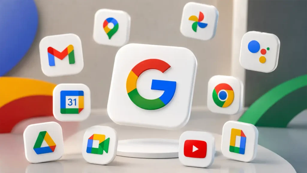
This article is an original analysis supported by the sources cited below
Gradient Google icon redesign rolling out on Android, iOS, and web
9to5Google report tracking the rollout of Google’s redesigned gradient icons across Workspace apps and launcher surfaces.
Google’s new gradient icons for Gmail, Calendar, Drive, and other apps are radical redesigns
Early 9to5Google report showing the broader Workspace icon redesign before the wider rollout.
Google is rolling out its redesigned Workspace app icons
The Verge report confirming the rollout of redesigned Workspace icons and describing the gradient treatment.
Google’s new gradient icons for Gmail, Calendar, Drive and more are finally rolling out
Android Central coverage describing which Workspace apps are affected and how the new icons differ from the previous set.
Google’s Workspace icons just got the AI gradient treatment
Fast Company design coverage analyzing the softer, gradient-heavy Workspace icon direction.
Google’s “G” gets a brighter look
Official Google announcement making the brighter gradient “G” the company-wide icon and linking the change to Google’s AI-era identity.
Google’s look, evolved
Official Google 2015 identity announcement explaining the earlier logo system and four-color “G.”
Evolving the Google Logo Identity
Google Design article explaining the design thinking behind the 2015 Google identity refresh.
Announcing Google Workspace, everything you need to get it done, in one location
Official Google Workspace announcement from 2020 introducing the Workspace brand and four-color app icons.
Introducing Google Workspace to help you get more done
Google blog post explaining the 2020 Workspace rebrand and the move to new four-color icons.
Material Design 3
Official Material Design 3 site describing Google’s current design system direction.
Icons – Material Design 3
Official Material Design guidance on icon styles, readability and modernized icon design.
Start building with Material 3 Expressive
Official Material Design post introducing Material 3 Expressive as an evolution of Material 3.
Expressive Design: Google’s UX Research
Google Design research article explaining the thinking behind Material 3 Expressive.
Android and Wear OS are getting a big refresh
Official Google post connecting Material 3 Expressive with Android and Wear OS design updates.
Android 16 is here
Official Android announcement describing Android 16 and its foundation for Material 3 Expressive.
Material Icons Guide
Google developer documentation explaining Material icon principles, clarity and display across platforms.
Google Play icon design specifications
Android developer guidance on adaptive launcher icons and product icon specifications.
Icon Usability
Nielsen Norman Group guidance explaining why icon labels and recognizability matter in user interfaces.
Icon Usability: When and How to Evaluate Digital Icons
Nielsen Norman Group article on testing icon recognizability and interpretation.
Understanding Success Criterion 1.4.11: Non-text Contrast
W3C accessibility guidance explaining non-text contrast requirements for visual cues and graphical objects.
Web Content Accessibility Guidelines 2.2
Official WCAG 2.2 technical standard relevant to accessibility, icons and interface perception.
New ways to create and get things done in Google Workspace
Official Google Workspace 2026 announcement covering AI-related Workspace updates including voice features, Google Pics, AI Inbox and Gemini Spark.
100 things we announced at I/O 2026
Official Google I/O 2026 roundup describing Google’s broader AI, Gemini and product strategy.
| Citing this article? Brief excerpts are welcome. Please credit Webiano.digital, name the author where stated, and include a link to https://webiano.digital and to this original article. Full or substantial republication requires prior written permission. Read our Copyright and Content Use Policy. |
This article was prepared with the assistance of artificial intelligence tools. The content underwent expert human review, and Webiano Digital & Marketing Agency assumes editorial responsibility for its final version and publication.