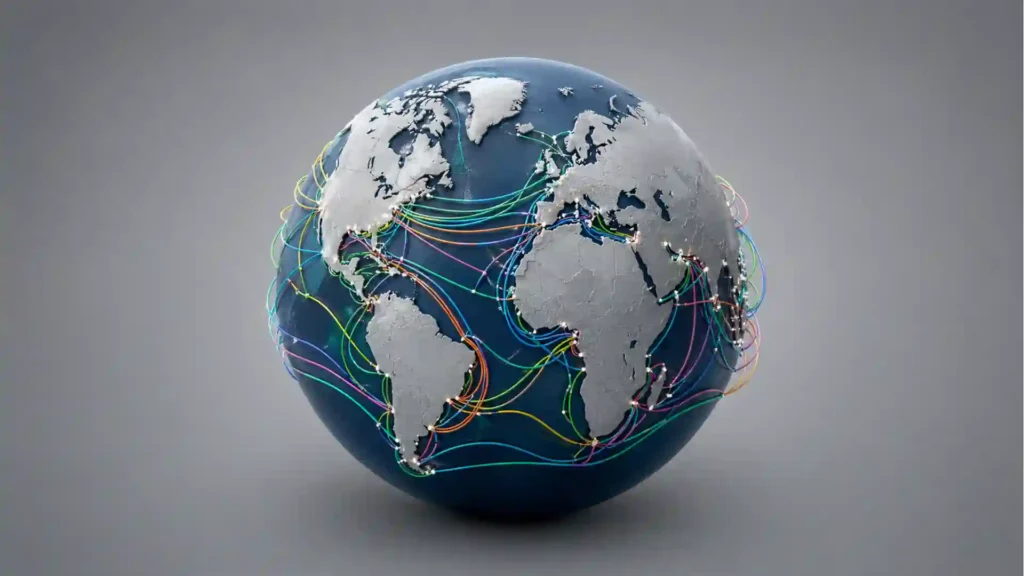
Open Submarine Cable Map and the internet suddenly stops feeling like weather. It becomes a thing with routes, landings, choke points, owners, dates, and long lines crossing dark water. The cloud gets dragged back down to Earth, then lowered beneath the surface, where fiber-optic cables lie across the seabed carrying the traffic most of us imagine as invisible.
Table of Contents
The map that makes the internet feel physical
The site is built by TeleGeography, a telecom market research and data company, and it does one job with unusual clarity: it maps the world’s major submarine cable systems and landing stations. You can zoom into a coast, click a cable, see where it lands, check its length, find its ready-for-service date, and learn who owns it. The experience is not dramatic in the usual internet sense. It does not shout. It does not turn infrastructure into a game. Its power comes from the opposite move. It quietly shows the hidden plumbing of global life.
The strange part is how quickly the map changes your mental picture of the internet. A website in another country no longer feels like a vague remote location. It sits behind a chain of physical decisions: a cable built by a consortium, a landing station on a coast, a route that avoids certain hazards, a repair ship somewhere on call, a market for capacity, a political border, a beach where something very important disappears underground.
For a curious reader, the map works as a rabbit hole. For a researcher, it is a compact reference point. For a technology person, it is a reminder that “online” is not weightless. The global network is not a mist of wireless signals bouncing through satellites. It is mostly glass fiber, steel armor, shore stations, permits, ships, money, and maintenance. The International Telecommunication Union says submarine cables carry about 99% of the world’s internet traffic, which is the kind of fact that sounds exaggerated until the map makes it visible.
That is why Submarine Cable Map belongs in Web Radar. It is not merely useful; it repairs a misconception. It turns the internet from an abstract service into a geography lesson with stakes. The world’s emails, cloud backups, financial trades, video calls, research data, streaming traffic, corporate systems, and ordinary messages do not magically “go global.” They cross oceans through named cables with owners and landing points. The site lets you see those names.
The best kind of internet map is slightly unsettling
Most maps make distance feel manageable. Submarine Cable Map does something more interesting: it makes dependency visible. A dense bundle of lines between North America and Europe tells one story. Sparse routes around island nations tell another. Landing clusters in Singapore, Marseille, Egypt, Mumbai, Fortaleza, Virginia Beach, Cornwall, and other coastal gateways suggest how much of the digital world still runs through old-fashioned geographic advantage.
The map is visually simple enough to explore without a manual. Lines represent cable systems, dots mark landing points, and the real fun begins when you start clicking. A route is not just a decorative arc. It opens into data: system name, length, status, landing points, ownership, supplier information, and links where available. A landing point opens into a list of cables touching that place. The International Cable Protection Committee describes the map in the same practical way: select a route to see the cable’s name, ready-for-service date, length, owners, website, and landing points; select a landing point to see the cables landing there.
The interface resists the trap of over-design. It lets the network be the spectacle. That restraint matters because the subject is already rich. You do not need animated whales, fake sonar pulses, or cyberpunk overlays when a single route from Europe to Asia can pull you into geopolitics, bandwidth demand, shipping lanes, cloud infrastructure, and the physical limits of the seabed. The map feels editorial because it chooses not to decorate what is already fascinating.
The first surprise is usually density. The oceans are not empty on this map. The Atlantic looks stitched. The Mediterranean looks crowded. East and Southeast Asia appear as a tightly woven exchange of routes, markets, islands, and coastal hubs. The second surprise is unevenness. Some countries sit at the edge of many systems. Others rely on a small number of connections. A few places appear almost lonely, which gives the map a quiet political charge.
That unevenness is not a design flaw. It is the point. The map shows that connectivity is not evenly sprinkled across the planet. It is built, financed, permitted, protected, and routed. A landing station is not just a dot; it is evidence of investment and access. A missing route is not just negative space; it might suggest geography, economics, regulation, security concerns, or simple lack of demand.
The site also makes old words feel current again. “Landing station” sounds like something from maritime trade, but it belongs fully to the internet. “Ready for service” sounds plain until you realize it marks the date a new artery entered the global network. “Lit capacity” and “potential capacity” sound technical, yet they carry the economics of how cable owners actually grow traffic over time. TeleGeography’s own FAQ explains that potential capacity is the total a cable could support with full terminal equipment, while lit capacity is the capacity actually running over it.
The emotional effect is hard to miss. The internet becomes less magical and more impressive. Magic is easy. Infrastructure is hard. Cables have to be planned, financed, manufactured, laid, protected, repaired, and eventually retired or replaced. Seeing them together creates a rare mix of wonder and unease. The web is global, but it is not floating. It has routes. Routes have weak points.
What the map actually lets you see
Submarine Cable Map is at its strongest when you stop treating it as a poster and start using it as a tool. The clicks are where the value lives. A route gives you the story of a system. A landing point gives you the importance of a coast. A regional view shows which corridors carry unusual weight. A planned cable reveals where demand is expected to grow.
The core interaction is simple: choose a cable line and read its profile. That profile turns an anonymous curve into a named piece of infrastructure. You may see its route, status, length, owners, landing points, supplier, and ready-for-service year. The data varies by system, but the pattern is consistent enough to make browsing rewarding. One click often leads to another. A cable points to a landing city. The landing city points to other cables. Those cables point to other continents.
TeleGeography says its free map is continually updated to show active and planned cables, and its FAQ says it tracks more than 600 active and planned submarine cables as of 2026. The number keeps shifting because new systems enter service and older ones get decommissioned. That living quality matters. A printed map can be beautiful, and TeleGeography still makes a yearly wall map, but the interactive version feels closer to the actual subject: a network always being extended, upgraded, rebalanced, and retired.
What stands out at a glance
| Feature | Why it matters |
|---|---|
| Cable routes | Shows how continents are physically linked |
| Landing stations | Reveals coastal gateways and dependence points |
| Ready-for-service dates | Shows old, new, and planned systems |
| Cable ownership | Connects infrastructure to companies and consortia |
| Length data | Makes distance and engineering scale tangible |
| Regional views | Exposes dense corridors and thinly connected places |
The table makes the map sound tidy, but the experience is better than tidy. Its real pull comes from following one practical detail until it becomes a larger story. A length number becomes a sense of scale. A landing station becomes a clue about national connectivity. An ownership field becomes a hint about the changing role of tech companies, telecom carriers, and private network operators.
The ownership detail is especially revealing. Submarine cables used to be a telecom-carrier story more than a platform-company story. TeleGeography’s FAQ notes that cables were traditionally owned by telecom carriers, often through consortia, while content providers such as Google, Meta, Microsoft, and Amazon are now major investors in new cable. That shift is not a side note. It shows how the companies behind cloud computing, search, social media, video, and online services have moved deeper into the physical internet.
The map also helps separate cable reality from cable myth. A submarine cable is not a huge tunnel under the sea. TeleGeography’s FAQ says that across most of its ocean journey, a cable is usually about as wide as a garden hose; the glass fibers inside are roughly the diameter of a human hair. Near shore, extra armoring protects the cable because that is where anchors, fishing, and human activity create more risk. In deep water, the cable usually lies directly on the ocean floor.
That small physical scale is part of the shock. Something close to a garden hose can carry national-scale dependency. A cable may be thin, but the system around it is enormous: survey vessels, manufacturing plants, cable-laying ships, repeaters, shore stations, permits, finance, maintenance agreements, and repair logistics. Submarine Cable Map does not show every part of that machine, yet it hints at all of it. The neat line on the screen is only the visible symbol of a far messier process.
The map is also good at showing why redundancy matters. A country with one cable is connected, but not comfortably connected. A country with many cables, landing in different places and joining different routes, has more room to absorb a fault. TeleGeography’s FAQ says countries need multiple cables to keep reliable connectivity when damage happens. That turns the map into a resilience tool, not just a visual index.
The hidden politics of where lines touch land
A submarine cable is technical, but its route is never only technical. Every landing point is a meeting of geography, economics, regulation, security, and trust. The map does not lecture you about any of this. It simply lets patterns sit there until you notice them. Why do so many systems gather around certain coastal hubs? Why do some island regions have only a few routes? Why do cables often cluster through narrow corridors?
The Mediterranean is a good place to see this. On the map, it looks less like a sea and more like a switching fabric between Europe, North Africa, the Middle East, and Asia. Egypt’s role becomes especially visible because many Europe-Asia routes have to cross or work around a narrow geography linking the Mediterranean and the Red Sea. The map turns what might sound like a policy briefing into a visual fact. Some places matter because geography refuses to stop mattering.
The same thing happens in the Atlantic. The route density between North America and Europe shows the weight of financial markets, cloud regions, enterprise traffic, media, and historical connectivity. The lines are not there because the ocean is easy. They are there because demand justifies the engineering and cost. The visual result is almost textile-like, but behind the weave is a competitive market for latency, capacity, resilience, and control.
Island nations carry a different kind of story. For them, a cable landing can mean the difference between fragile connectivity and a more stable digital future. The map makes that visible without sentimentality. You can see which islands have multiple routes and which do not. You can infer why a new system might matter far beyond speed tests. It may affect education, tourism, government services, disaster response, remote work, banking, and the local price of connectivity.
The politics also sit in ownership. When a large platform company invests in a cable, it is buying more than bandwidth. It is buying control over performance, cost, timing, and route strategy for its own services. Telecom carriers still matter, but the internet’s largest traffic generators have every reason to own or co-own the roads their traffic uses. The map makes that shift browsable. You do not have to read an industry report to notice familiar company names attached to ocean routes.
There is also a security dimension that the map makes hard to ignore. A cable route is a path of communication, but it is also a target, a risk, and a maintenance obligation. The ITU points to vulnerabilities from fishing and anchoring, natural hazards such as earthquakes and underwater landslides, aging infrastructure, and regulatory complexity. It also notes that more than 200 cable repairs were reported worldwide in 2023 by the International Cable Protection Committee.
This is where the site’s calmness becomes useful. It does not sensationalize vulnerability. Cable faults are common. Most do not become dramatic news because traffic can be routed around damage when networks have enough redundancy. TeleGeography’s FAQ says roughly 200 faults occur each year according to ICPC data, and that cable users often spread capacity across multiple cables so service keeps running while a damaged line is repaired.
The sober lesson is stronger than the dramatic one. The internet is resilient because people design it to be resilient, not because it is naturally safe. A cable can break. A repair can take time. A route can become politically sensitive. A coast can become a chokepoint. Submarine Cable Map helps you see the shape of that dependence without turning every line into a panic story.
Why this site is more addictive than it looks
Submarine Cable Map looks like a reference site, but it behaves like a slow-burn discovery engine. You open it for one fact and end up touring the internet’s underside. A reader might begin by checking the closest landing station to home, then jump to a transatlantic system, then inspect a Pacific route, then wonder why Marseille is so busy, then spend ten minutes comparing island connectivity in the Caribbean or the South Pacific.
The browsing rhythm is quiet and satisfying. Each click answers something small while raising something larger. A cable’s ready-for-service date makes you wonder what traffic looked like when it launched. A planned system makes you wonder who is expecting demand. A landing point with many routes makes you wonder how much local geography shapes global digital power. A very long cable makes you think about engineering in a more bodily way: how do you lay thousands of kilometers of fiber across terrain most people will never see?
The site also rewards people who like maps but distrust map gimmicks. There is no fake drama in the design. The map does not pretend to show packets moving in real time. It does not turn cables into glowing sci-fi highways. It stays closer to a working reference layer, which makes the discoveries feel earned. The pleasure comes from noticing, not being pushed.
For technology enthusiasts, the map is a grounding tool. It connects cloud services to coastlines. When people talk about regions, latency, redundancy, outages, and edge infrastructure, those terms can float away from physical reality. Submarine Cable Map pulls them back. The next time someone says their data is “in the cloud,” the map reminds you that the cloud still needs a wet, expensive, vulnerable path between continents.
For researchers, the map is useful because it gathers scattered infrastructure into one navigable view. It is especially good as a starting point, not a final authority for operational work. The ICPC explicitly warns that anyone planning work that could affect a submarine cable should contact charting authorities, telecom companies, and government agencies before operations. That warning matters. This is a discovery and research map, not a substitute for official marine charts or field coordination.
For ordinary curious users, the map offers the rare joy of finding out that a daily thing is stranger than expected. The internet you use every hour is tied to beaches you may never visit. Your message, call, document, purchase, or stream may cross a cable with a name, an owner, a landing date, and a maintenance history. The site gives that ordinary action a physical shadow.
The map also makes satellites look different. Popular imagination often gives satellites too much credit for global internet traffic. Satellites are useful, especially for remote coverage and broadcast-style distribution, but TeleGeography’s FAQ says fiber-optic cables beat satellites on cost and capacity for bit-by-bit transmission. It also cites FCC statistics showing satellites account for only 0.37% of U.S. international capacity.
That fact does not make satellites unimportant. It simply puts them in the right place. The main global internet is not mainly above us. It is below the waves. A wireless phone is only wireless for the short hop to a cell tower; after that, the data travels through terrestrial and subsea fiber. The map is persuasive because it does not argue this point loudly. It lets the cable density argue for it.
The design lesson hiding in plain sight
Submarine Cable Map is a good reminder that some of the best digital products do not need a heavy concept. A strong dataset, a clear interface, and a subject worth exploring are enough. The site has the confidence to stay focused. It is not trying to become a social network, an education platform, a dashboard suite, or a news portal. It maps submarine cables. That is the product.
This narrowness is part of its charm. The site knows the exact curiosity it serves. It serves the person who asks, “Where does the internet actually go?” It serves the person who wants to click a line and learn what it is. It serves the person who suspects that infrastructure is more interesting than the metaphors we use for it. By refusing to sprawl, the map becomes more memorable.
There is an editorial lesson here for anyone building a niche web tool. Do not bury the magic under explanation. Submarine Cable Map offers context, but it does not over-narrate. The user’s own curiosity drives the session. The map trusts you to notice the density of the Atlantic, the importance of landing stations, the long sweep of Pacific routes, the fragility of islands, and the strategic pull of narrow passages.
The site also benefits from being public. Specialized infrastructure data often lives behind reports, paywalls, procurement processes, or industry relationships. TeleGeography sells research and map products, including its annual printed submarine cable map, but the interactive map is free to browse. That openness gives the project cultural reach beyond the telecom industry. Teachers can use it. Journalists can check it. Students can explore it. Curious people can fall into it.
The 2026 printed edition also hints at the scale behind the free tool. TeleGeography says its 2026 Submarine Cable Map depicts 694 cable systems and 1,893 landing stations, with in-service and planned cables marked. The print map is a designed object; the website is the living interface. The two formats serve different pleasures. One belongs on a wall. The other belongs in the browser tab you keep reopening.
There is another design choice worth praising: the map uses ordinary telecom terms without trying to domesticate them too much. It lets the industry vocabulary stay visible. Ready-for-service dates, landing points, suppliers, owners, lit capacity, and potential capacity are not softened into lifestyle language. The result respects the reader. You may not know every term at first, but the map makes them learnable through use.
That respect gives the site a different tone from many public data tools. It does not assume curiosity requires simplification into childishness. The subject is technical, but the interface is approachable. The map gives enough information to make clicking worthwhile and enough structure to keep browsing from becoming messy. It proves that accessibility does not require flattening the topic.
The strongest design move is the simplest one: lines on water. The visual metaphor is almost literal, and that is why it works. You see a cable where a cable approximately goes. You see landings where cables meet land. You see the network not as a cloud diagram, but as geography. The map’s restraint lets the real-world strangeness come through.
Reader notes before opening it
Yes, the interactive map is free to browse. TeleGeography also produces paid and printed map products, but the web map itself is open for exploration. That combination explains why the project feels both public and professionally maintained.
It aims to show major active and planned submarine cable systems and landing stations. TeleGeography says it tracks more than 600 active and planned cables, while ICPC describes the map as showing the majority of active and planned international submarine cable systems. For operational marine work, use official charting and authority channels rather than treating the website as a navigation source.
Treat the visible lines as a research and discovery representation, not a field-precision marine chart. The useful truth of the map is network geography: what connects to what, where systems land, and which regions carry dense cable activity. Anyone planning seabed activity needs official coordination with cable owners, telecom companies, charting authorities, and relevant public agencies.
Wireless access is usually only the local part of the trip. Your phone connects wirelessly to a nearby tower, but the wider journey often moves through terrestrial and subsea fiber. This is why a submarine cable map is also a map of everyday mobile life, even if no cable is visible from the device in your hand.
Yes, faults are normal in this industry. TeleGeography cites roughly 200 cable faults per year, and the ITU notes more than 200 repairs reported worldwide in 2023. Most users never notice because major networks distribute traffic across multiple routes and repair systems are built into the operating model.
No, not for the main bulk of intercontinental traffic. Satellites have real uses, especially where fiber is unavailable or hard to deploy, but submarine fiber carries far more traffic at far lower cost per bit. The map is a good visual antidote to the idea that global connectivity mostly moves through space.
Open it if you like infrastructure, maps, internet history, geopolitics, networks, cloud computing, shipping routes, or strange public datasets. The best audience is anyone who uses the internet daily but has never seen the physical skeleton behind it. That includes almost everyone.
Why it belongs in your bookmarks
Submarine Cable Map earns a bookmark because it changes how you see something familiar. After using it, “the internet” feels less like a service and more like a global construction project that never ends. New systems are planned. Old systems age out. Landing stations gain importance. Capacity moves toward demand. Private network operators invest. Repair crews keep the whole thing from becoming fragile.
The map also has the rare quality of being useful at several depths. You can spend two minutes finding the cable nearest your country, or an hour reading the world through landing points. It works for a quick curiosity hit and for sustained research. That range is hard to fake. It comes from the subject itself, but also from the discipline of the interface.
The most memorable web projects often reveal an invisible system without trying to own the whole conversation. Submarine Cable Map does exactly that. It does not explain the entire internet, yet it makes the internet more understandable. It does not solve geopolitics, yet it shows why geography still matters. It does not dramatize outages, yet it shows why resilience matters. It does not sell wonder, yet wonder is the feeling it leaves behind.
There is also a quiet humility in the project. The map reminds us that the internet depends on work most users never see. People survey seabeds, lay fiber, negotiate permits, build shore stations, maintain cable ships, splice fibers, monitor faults, and plan redundancy so that ordinary messages arrive as if nothing physical happened. The site gives that hidden labor a visible shape.
That is the best reason to open it. Submarine Cable Map makes the web feel real again. Not smaller, not less impressive, not less advanced. More real. It shows the internet as a human-built system stretched across oceans, hidden under water, exposed to risk, repaired by specialists, and used by nearly everyone. Few websites can make a browser tab feel like a window into the seabed. This one does.
Author:
Jan Bielik
CEO & Founder of Webiano Digital & Marketing Agency
This article is an original analysis supported by the sources cited below
Submarine Cable Map
The official interactive TeleGeography map showing major submarine cable systems and landing stations around the world.
Submarine Cable Frequently Asked Questions
TeleGeography’s official FAQ explaining cable counts, cable construction, ownership, capacity, faults, satellite comparison, and how the map should be used.
TeleGeography’s 2026 Submarine Cable Map
TeleGeography’s 2026 map release page, used for the latest published figures on cable systems and landing stations in the printed edition.
Global submarine cable systems
The International Cable Protection Committee page describing TeleGeography’s map, its cable and landing-station data, and operational cautions for marine work near cables.
Submarine cable resilience
The International Telecommunication Union backgrounder on the role, scale, risks, and resilience challenges of global submarine cable infrastructure.