The Useless Web is almost offensively simple. You arrive on a mostly empty page, read a stacked invitation, and press a single button that promises to take you to a useless website. No feed. No account. No onboarding. No algorithmic explanation pretending to know you better than you know yourself. Just a button and a dare. The official homepage still phrases the whole thing as a tiny joke: “The Useless Web… because some websites, we just couldn’t do without — and some, we couldn’t keep.”
Table of Contents
The button that refuses to be productive
That smallness is the entire appeal. The site does not ask you to become a member of a community, improve your workflow, track your habits, learn a skill, build a brand, or install anything. It offers one of the rarest experiences left online: the option to click without a plan. The reward might be a strange animation, a pointless interaction, an absurd game, a one-note visual joke, or a page that feels as if someone built it at 2 a.m. because the idea made them laugh.
The project was created by Tim Holman, a developer whose online work has long treated the browser as a toy box. Holman’s GitHub profile describes him as a “tinkerer, tuner & tamperer,” which is a neat fit for a person whose best-known project turns unused creative energy into a public rabbit hole. The Useless Web is not polished in the startup sense. It is polished in the more interesting sense: it knows exactly what it is and refuses to become bigger than that.
The premise also has a great origin story. Holman wrote that he built the site in 2012 while stuck indoors during a hurricane, gathering odd little websites into a small portal. His later archive repeats the same point: The Useless Web began as a hub for “quirky and weird” corners of the internet and grew into a place where those strange creations could be remembered, not just clicked once and forgotten.
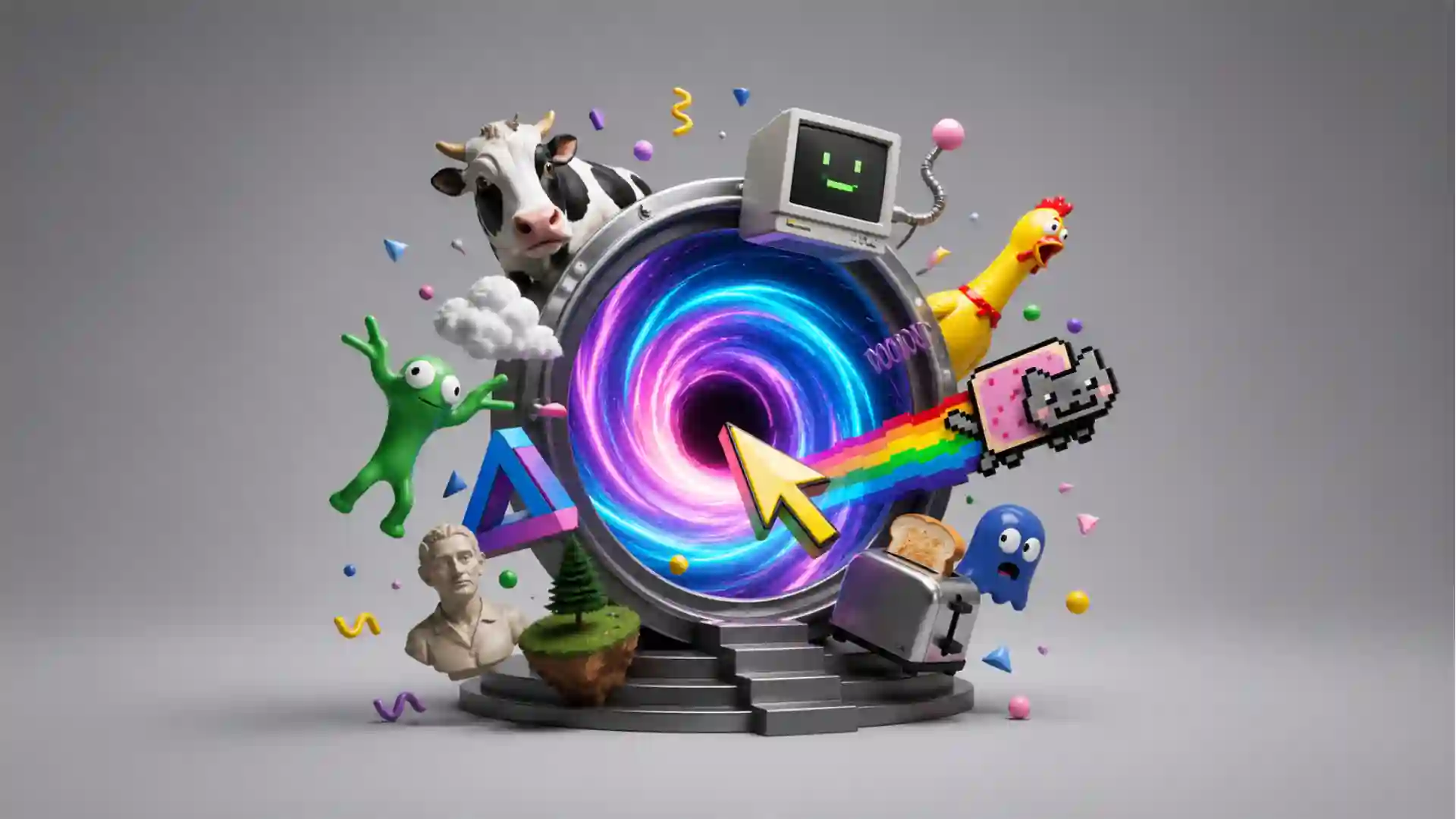
A lesser version of this idea would feel like a novelty link dump. The Useless Web survives because it is more selective than it first appears. It does not throw you into random noise from the entire internet. It sends you into a curated strain of web nonsense: pages with tiny rules, handmade jokes, weird animals, hypnotic loops, absurd mechanics, and the occasional digital object that sits somewhere between art, prank, and screen saver.
That is why the site is perfect for a bored five-minute visit and dangerous for a thirty-minute one. You tell yourself you are pressing the button once. Then the first page is funnier than expected, or dumber than expected, or just confusing enough to make you wonder what else is hiding behind the next click. The Useless Web understands the oldest habit of web browsing: curiosity does not need a serious reason.
The trick is not randomness, it is taste
Randomness alone is cheap. Any website can send you somewhere unpredictable. The Useless Web works because the unpredictability has a flavor. The destination is random, but the world behind the button is not. It has a house style made from weird little browser experiments, visual jokes, interactive doodles, and lovingly pointless pages that behave as if usefulness was never invited to the meeting.
Holman has described the original list as closely curated. In his 2013 post “The Virality of One Button,” he wrote that the early site ordered its list so the strongest destinations had a better chance of appearing first, with one of the top six selected at random on a click. He also wrote that the site stripped out Flash-based destinations when a user’s device did not support Flash, which tells you the joke had more engineering discipline behind it than the word “useless” suggests.
That hidden product thinking matters. The page looks like a throwaway, but its success came from the opposite instinct. It loaded quickly, made the desired action obvious, worked across devices, kept sharing visible without being obnoxious, and saved visited sites in local storage so returning users would not immediately see the same destinations again. The gag was frictionless because the boring parts were handled well.
The first click is the whole contract. You are not asked to choose a category or tune a preference slider. You do not filter by mood. You do not scan thumbnails, headlines, ratings, or popularity scores. The site removes taste from the user interface and hides it in the curation. It lets the editor do the choosing, then lets chance do the delivery.
That makes The Useless Web feel closer to a good mixtape than a search engine. Search is useful when you know what you want. A feed is useful when the platform wants to keep you scrolling. The Useless Web sits in a stranger lane. It gives you a nudge into pages you probably would never search for because the idea behind them is too silly, too specific, or too hard to describe.
The quick read
| Part of the experience | What it does | Why it stands out |
|---|---|---|
| One-button homepage | Sends you to a random odd site | No setup, no feed, no choice fatigue |
| Curated destinations | Filters the internet’s weird side | Randomness with taste behind it |
| Old and new web energy | Preserves tiny browser experiments | Feels handmade rather than platform-made |
| Archive and stories | Tracks the people behind the sites | Turns jokes into web culture |
The table makes the site look almost too neat, which is funny because the experience itself is proudly messy. The clean idea at the center is this: The Useless Web is not useful because it helps you complete a task. It is useful because it reminds you that the web once had room for pages that did not need a task at all.
The site directory makes that curatorial layer visible. The “Read About The Sites” section includes entries such as Checkbox Race, One Square Minesweeper, Doughnut Kitten, and Pug in a Rug, with creator notes and backstories attached to them. These are not generic “funny websites.” They are tiny authored experiences with names, origins, obsessions, and sometimes deeply specific personal stories.
Doughnut Kitten is a perfect example of the format’s odd warmth. Its archive entry explains how creator Tania Hennessy reached The Useless Web through her own strange path, then built a hypnotic pastel kitten experience around a photographed kitten and a doughnut prop. The page sounds ridiculous in summary, yet the story behind it has texture: pain, late-night browsing, art, collaboration, and the simple urge to make something delightful for no practical reason.
That is the secret behind the best “useless” websites. They are rarely empty. They are often full of decisions, jokes, constraints, craft, and personality. A page that makes a horse stretch forever, a checkbox race, or a single-square minesweeper joke might look dumb at first glance. After a few clicks, you start noticing the care inside the dumbness.
Why useless websites still feel alive
The modern web has become extremely good at explaining itself. Apps tell you their benefits before you have felt anything. Product pages list features, use cases, integrations, testimonials, plans, and security claims. Social platforms flatten weirdness into familiar containers: post, story, short, comment, reaction. Even entertainment often arrives wrapped in metrics, thumbnails, and recommendations.
The Useless Web feels alive because it does not explain too much. The destinations rarely greet you with a pitch. They just behave. Something bounces. Something sings. Something stares. Something grows. Something reacts to your cursor. Something refuses to be useful so completely that your brain stops asking for utility and starts asking a better question: who made this, and why?
That question is the web at its best. A personal or experimental website carries a trace of the person behind it. You feel the choice of font, the strange animation timing, the joke that probably made sense only to its maker, the domain name bought because it was available and funny. A useless site is often closer to a sketchbook page than a product. It does not have to justify its own existence in quarterly terms.
Early coverage understood this quickly. Wired described The Useless Web in 2012 as Holman’s curated list of useless pages, noting that some destinations were familiar to experienced time-wasters while others were new discoveries. The same piece pointed readers toward the site’s JavaScript file if they wanted to see the list behind the button, which captures the project’s old-web transparency rather nicely.
It’s Nice That also caught the creative angle early. Its 2012 write-up called The Useless Web a collection of seemingly pointless destinations and noted examples ranging from psychedelic web oddities to internet jokes that had already taken on a life of their own. The site was framed not as a productivity killer alone, but as a “timewasting wormhole” filled with irreverent humor and digital skill.
That phrase matters because the best useless web pages do require skill. They often involve animation, timing, performance tricks, cursor handling, sound, illustration, small game mechanics, or just the courage to stop before the idea becomes bloated. The discipline is not in making the page useful. The discipline is in making the uselessness legible within seconds.
The Useless Web also pushes against a dull assumption about the internet. We often talk as if the web is split between information, commerce, work, and social posting. This portal points to another category: little experiences that exist because someone wanted the browser to do a silly thing. That category has shaped internet culture more than people admit. Memes, microsites, interactive jokes, experimental art, and personal projects all live there.
A useless site can be more memorable than a useful tool because it has a clearer emotional payload. You might forget the fifth calendar app you tried, but you remember a page where a cat bounces, a pug accumulates status, or a horse scrolls endlessly downward. The idea is sticky because it has no practical wrapper around it. It enters the brain as an image, a motion, or a joke.
This is also why The Useless Web is a good recommendation for almost anyone with a soft spot for internet strangeness. It works for people who grew up with Flash games and personal homepages. It works for younger readers who have mostly known platforms and app stores. It works for designers studying constraint. It works for developers who want a reminder that a small idea is still worth shipping.
The site’s humor is not always sophisticated, and that is part of the charm. Some destinations are clever. Some are dumb. Some are beautiful. Some are mildly annoying. Some feel like they were made to test whether a domain name could carry an entire joke. The range is what makes the button feel honest. A portal to the useless web should not behave like a gallery wall with perfect lighting.
A tiny interface with strange product discipline
The Useless Web is a strong lesson in interface restraint. It proves how much can happen when a page has one job and refuses every extra feature that would make that job weaker. The homepage is basically an instruction, a button, and a promise. There is no list of benefits because the benefit is visible before you understand it. Press the thing. Disappear somewhere odd.
Holman’s own post about the site’s early spread shows how carefully the small details were handled. The project launched on November 5, 2012 with a tweet and a Reddit link, then reached 2.7 million unique pageviews within three weeks. He also wrote that the button had been pressed 30 million times in that early burst. Those numbers are old, but they still explain why the idea became part of web folklore so quickly.
The key product lesson is that a joke can have onboarding. The Useless Web does not show onboarding screens, but it still guides behavior perfectly. The typography stacks the sentence into a little staircase. The button text is the action. The whitespace makes the page feel like a stage. You understand the entire experience before your cursor reaches the target.
The second lesson is that speed changes humor. A joke website that loads slowly has already lost part of the joke. The Useless Web originally benefited from quick loading and static hosting, according to Holman’s write-up. That matters because the first click is an impulse. Delay that impulse and the spell breaks.
The third lesson is that surprise needs a little memory. Holman wrote that returning visitors could be served new sites because visited destinations were saved in local storage for supporting browsers. That is a small technical choice with a big emotional effect. A user who comes back and sees the same thing too soon starts thinking the box is smaller than it is. A user who comes back and finds something new keeps believing in the portal.
The fourth lesson is that share buttons should not shout over the experience. Holman’s post says sharing was visible but unobtrusive, and he argued that people share when they actually like something. That sounds obvious, but much of the social web has spent years ignoring it. The Useless Web did not need to beg for virality because the button created a clean story people could describe in one sentence.
That clean story is probably the reason the site keeps circulating. “Press this and it takes you to a useless website” is better than almost any marketing copy. It has risk, humor, and clarity. You can send it to a friend without explaining the backstory. You can open it in a room and make everyone guess where it will land. You can revisit it years later and still understand the rules.
There is a useful design paradox here. The Useless Web is memorable because it hides most of its intelligence. You do not see the ranking, filtering, compatibility choices, visited-site memory, archive work, or curation process during the main experience. You only feel that the button behaves better than a random link button should.
That hidden work separates it from novelty pages that collapse after one visit. Many funny sites are built around a single punchline. The Useless Web is built around the promise of many punchlines, collected under one gesture. The portal becomes the durable object. The destinations can change, disappear, break, return, or become archived. The button remains.
This is also why the site has aged better than many viral internet projects from the same era. It does not rely on a forgotten interface trend or a single meme format. It relies on a behavior that has not gone away: people still like being surprised by the web. The surrounding internet has become more controlled, which makes the button feel even stranger now.
The internet’s weird archive problem
The Useless Web is funny until you notice how fragile it is. Many of the pages it celebrates live on personal domains, old frameworks, abandoned hosting accounts, broken plugins, and the thin patience of individual creators. A strange little website might become beloved for a week, then vanish years later because a domain renewal email went to an inbox nobody checks.
Holman seems aware of that fragility. The Useless Web Archive was created to collect the stories behind the sites, with Holman writing that he was trying to track down the people who made them and show that the creators came from different backgrounds, ideas, and ambitions. That changes the project from a randomizer into something more like an oral history of pointless web magic.
The archive is important because useless websites rarely receive serious documentation. A startup gets press releases, funding announcements, product changelogs, founder interviews, and acquisition posts. A tiny browser joke might get one tweet, a Reddit thread, a burst of traffic, and then silence. The Useless Web’s archive asks the creators what happened, why they built the thing, and what odd detail made it work.
That turns the portal into a small preservation project. The web is full of screenshots of lost things, but screenshots rarely preserve the behavior that made a site charming. A useless website is often about timing, motion, repetition, interaction, and the slightly dumb feeling of doing something on purpose that has no purpose. Writing down the story does not fully preserve the experience, but it gives the page a better chance of being understood later.
The official sites page also reveals how many of these projects are stranger than their punchlines. Checkbox Race is not only a race through checkboxes; it is a small obsession with native browser elements. One Square Minesweeper is not only a one-square joke; it is a game reduced to the most absurd possible form. Pug in a Rug is not only a cute dog page; it is a tiny idle ritual about accumulating imaginary status by staring into a pug.
This is where The Useless Web becomes more than a boredom cure. It points to a culture of making that does not fit cleanly into design portfolios or product roadmaps. Some of these sites are jokes, some are experiments, some are small acts of stress relief, and some are probably all three. They are web-native in the deepest sense: cheap to ship, easy to share, hard to categorize.
The archive also gives credit where the old viral web often did not. People remember the sensation of a strange page but forget the person who made it. The Useless Web’s site stories put names and motives back into the frame. That matters because the web’s weirdness does not appear by accident. Someone buys the domain, writes the code, finds the image, adjusts the loop, and decides the joke is finished enough to release.
There is a quiet generosity in collecting these oddities instead of treating them as disposable. The Useless Web says a silly page is still a page worth saving, linking, and asking about. That attitude feels healthy. Not every creative object needs to be defensible as art, business, utility, or content. Some things deserve a small place online because they are specific and funny.
The fragility also makes the random button better. Every click feels like it might lead to something that should not still be alive. You are not just browsing a list. You are stepping into small preserved pockets of internet behavior. Some will feel dated. Some will feel fresh. Some will make no sense at all. That unevenness is proof that real people made them.
The best audience is anyone tired of the efficient web
The Useless Web is for people who miss the feeling of wandering. That includes office workers stealing a tiny break, students avoiding a tab full of obligations, designers looking for odd interaction ideas, developers who enjoy small browser jokes, and anyone who thinks the internet became less fun when every page started asking for consent banners, newsletter signups, and conversion goals.
It is especially good for people who enjoy surprise without commitment. You do not need to understand internet history to enjoy it. You do not need to know Holman’s work. You do not need to recognize the old references. Pressing the button is enough. The experience starts immediately, and the worst likely outcome is that you land somewhere boring and press again.
There is also a small educational value for makers, though the site would probably roll its eyes at that framing. The Useless Web teaches that a tiny interaction can be enough. It teaches that constraints sharpen a joke. It teaches that a domain name, a loop, a cursor behavior, or a single mechanic can become a whole site when the idea is clean. It teaches that shipping a weird small thing is better than leaving a clever small thing in a notes app forever.
For designers, the pleasure is in the range of interaction models. Some pages ask you to click. Some ask you to move. Some ask you to wait. Some ask you to do nothing while the screen does something ridiculous. They are not all good, but they are rarely neutral. Each one has a behavior you can feel, which is more than you can say for many polished pages that look expensive and say nothing.
For writers and editors, the site is a reminder that curation can be an experience by itself. Holman did not need to write long reviews of each destination on the homepage. The selection and the button did the editorial work. Later, the archive added story and context. That two-layer model is smart: instant discovery first, deeper reading only when curiosity survives the click.
For casual visitors, the pitch is even cleaner. Open it when you are bored. Open it when the internet feels too samey. Open it when you want to send someone a link that is not a news article, a shopping page, a video, or a social post. Open it when you want the web to surprise you without asking for anything back.
There are limits, of course. Random destinations can vary in quality, age, accessibility, and tone. Some old web jokes may not land. Some pages may feel broken or rough depending on the browser and device. Some destinations may be unsuitable for a work setting, a point Wired flagged with a “potentially NSFW” note in its early coverage. The site is best treated as a playful portal, not a carefully sanitized entertainment service.
That roughness is not a fatal flaw. A completely safe, predictable, moderated, polished version of The Useless Web would probably be worse. The charm comes from the possibility that the next page will be brilliant, stupid, broken, hypnotic, annoying, or weirdly touching. A discovery engine for useless sites needs a little wobble in it.
The best use is to give yourself a limit before opening it. Three clicks. Five clicks. One coffee break. One tab before returning to the thing you were supposed to do. The site is built for harmless derailment, but derailment is still derailment. Its power is that it makes losing time feel less like doomscrolling and more like wandering through a flea market of browser jokes.
A few notes before you click
Yes, because its core experience has not gone stale. A single button that sends you somewhere strange still feels good, especially when so much of the web tries to predict, rank, and personalize every movement before you make it.
Technically, yes, and emotionally, not quite. The site is useless in the narrow sense that it does not solve a practical problem. It is not useless in the cultural sense. It preserves a kind of web play that deserves more attention than it usually gets.
No, and that is fine. The pleasure comes from the uneven roll of the dice. Some pages are jokes, some are experiments, some are tiny games, some are visual loops, and some are just odd. The point is not guaranteed comedy. The point is surprise.
Treat it like a random web portal rather than a workplace-approved tool. Early coverage flagged that some destinations may be potentially unsuitable for work, and the nature of a random redirect means caution is sensible. Open it when you have a little privacy and a little tolerance for weirdness.
Social feeds are built around accumulation: more posts, more reactions, more signals, more ranking. The Useless Web is built around escape. Each click leaves the portal and enters a small authored object. That difference changes the mood completely.
Because it is a doorway to a forgotten habit: browsing for no reason and finding something a person made because the browser made it possible. The Useless Web is not just a funny button. It is a reminder that the internet is better when it leaves room for useless wonders.
Author:
Jan Bielik
CEO & Founder of Webiano Digital & Marketing Agency

This article is an original analysis supported by the sources cited below
The Useless Web
Official homepage of The Useless Web, including the central button experience, tagline, submission link, and credit to Tim Holman.
The Useless Sites of the Useless Web
Official directory and story archive for selected sites featured through The Useless Web, including creator notes and example projects.
The Useless Web Archive
Official GitHub repository for the archive project, with Holman’s description of the site’s origin and preservation goal.
The Useless Sites of The Useless Web
Tim Holman’s own post about tracking down the stories behind the strange sites gathered by The Useless Web.
The Virality of One Button
Tim Holman’s 2013 article explaining the launch, early traffic, interface decisions, curation logic, and sharing mechanics behind the project.
The Useless Web catalogs time-wasting greatness
Wired’s early coverage of The Useless Web, describing it as Holman’s curated collection of useless pages and noting the potentially NSFW nature of some destinations.
Uh-oh! Prepare to lose some time exploring The Useless Web
It’s Nice That’s 2012 article covering The Useless Web as a random generator for strange, funny, and skillfully made online destinations.
| Citing this article? Brief excerpts are welcome. Please credit Webiano.digital, name the author where stated, and include a link to https://webiano.digital and to this original article. Full or substantial republication requires prior written permission. Read our Copyright and Content Use Policy. |