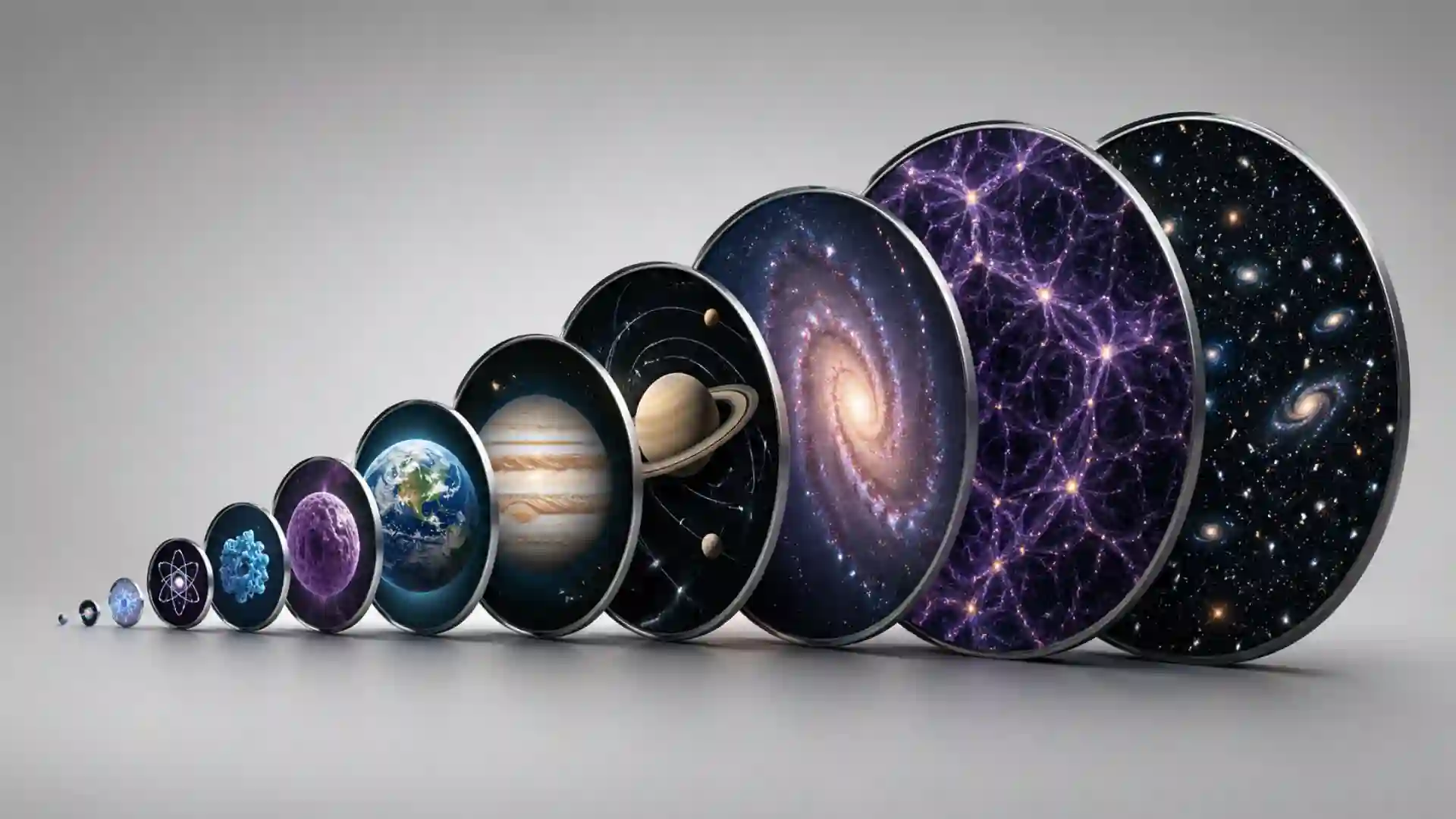
The Scale of the Universe does one thing almost absurdly well: it turns size into something you feel in your hand. You drag a bar. The screen moves. A human body slips past insects, cells, atoms, particles, planets, stars, galaxies, and the observable universe. Nothing about the premise sounds complicated, yet the effect is still weirdly powerful. It is the sort of website you open for thirty seconds and leave twenty minutes later, slightly offended by how small and large everything is.
Table of Contents
The current version presents itself as an interactive experience about “the visible and invisible world,” with objects you can click for more detail, a scroll bar for moving between scales, and a strong suggestion that audio improves the ride. That last detail matters. The site is not only a diagram. It behaves more like a calm digital planetarium, except the planetarium has been compressed into a browser window and given a single control. The whole interface says: do not read the universe from top to bottom; move through it.
Its charm comes from the speed of recognition. You know what a person is. You know what Earth is. You know a basketball, a grain of rice, a whale, a mountain, a bacterium, the Moon, Jupiter, and the Milky Way by name, if not by size. The Scale of the Universe puts those familiar things on one long visual ruler, then lets you discover that your mental ruler was laughably broken. A human is large next to a cell and microscopic next to a planet. A planet is huge until a star enters the frame. A star looks dominant until the galactic scale quietly eats it.
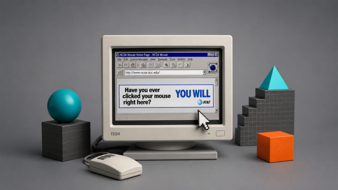
This is why the site belongs in Web Radar. It is not a new social platform, not a productivity hack, not another glossy AI toy. It is an old internet idea kept alive because the idea is still good. The original project came from Cary Huang, with the older HTwins version crediting him as creator and Matthew Martori for the Pixi.js port. The newer remastered site credits Cary Huang as the original creator and lists Chloe Caruso, Ben Plate, and others among the team behind the current version. The project has moved through web history, from Flash-era classroom wonder to a modern browser object that still knows exactly what it is.
Open it and the first surprise is how little explanation it needs. The control sits there. You move it. Objects resize and drift into view. Labels appear. A huge topic becomes playable without turning into a lesson plan. The site does not ask you to commit to astronomy, physics, biology, or cosmology. It asks only for curiosity and a few spare minutes. That is a lower barrier than most educational media, and also a smarter one.
A slider that turns scale into a feeling
Most scale comparisons fail because they stay polite. They give you numbers, charts, or careful prose, and the numbers are too large or too small to mean anything. Ten to the power of something is accurate, but it rarely lands in the body. The Scale of the Universe gets around that by letting the user perform the comparison. You move from one size range to another, and the motion itself becomes the explanation.
That small act of dragging matters. Instead of being told that a human sits between the microbial and the planetary, you watch the human become context. The body is no longer the default center of the universe. It becomes one object among others. The site does not need to scold or philosophize. It lets proportion do the work. A person is not made insignificant by text; a person is resized by the interface.
The project sits inside a longer tradition of powers-of-ten thinking. Charles and Ray Eames made Powers of Ten in 1977, a short film that moved outward from a picnic near Lake Michigan and inward toward the carbon atom. That film became one of the great visual explanations of scale because it made abstraction cinematic. The Scale of the Universe borrows the spirit of that move, but gives the wheel to the viewer. The shift from film to interaction is the whole point: you are not watching the zoom; you are steering it.
The site also understands that scale is emotional before it is educational. At the smallest end, the objects become almost mythical: quarks, neutrinos, strings, and the Planck length. At the largest end, familiar space language starts to buckle under its own mass: planets, stars, nebulae, galaxies, galaxy clusters, the observable universe. Somewhere between those extremes, you meet things that feel oddly intimate. A hummingbird egg. A coffee bean. A human hair. A red blood cell. These are not random decorations. They are anchors.
The best anchors are the ones that embarrass your intuition. A human cell feels tiny until you meet a virus. A virus feels tiny until molecular structures enter. Earth feels huge until Jupiter arrives. Jupiter feels huge until the Sun swallows the comparison. The Sun feels huge until the larger stars show up like cosmic jokes. The site is full of these quiet humiliations, and they are delightful because they are visual rather than moral. You are not being lectured. You are being resized.
The interface keeps that resizing clean. There are no dense menus, no wall of copy, no dashboard of controls begging for attention. The whole experience rests on zooming, reading labels, and clicking objects for more detail. The current site even says this plainly: click objects to learn more, use the scroll bar to zoom in and out. The product thinking is beautifully disciplined. It does not confuse “educational” with “loaded with features.”
That restraint gives the site a rare kind of confidence. It trusts the material. It knows the universe is already enough. A lesser version would add quizzes, badges, pop-ups, achievement streaks, classroom modes, premium overlays, and animated explainers competing for attention. The Scale of the Universe resists that clutter. It behaves like a map, not an app trying to prove its roadmap.
Why it still works after the Flash era
The Scale of the Universe feels like a survivor from a better corner of the web. The older HTwins page belongs to a period when small personal sites could travel everywhere because they were memorable, lightweight in spirit, and easy to share. The first wave of attention around the project came in 2012, when outlets such as ABC News, WIRED, and The Planetary Society wrote about the Huang brothers’ interactive scale visualization. Much of that early coverage carries the same tone: surprise that something this charming, ambitious, and usable came from young creators working for the joy of it.
The origin story is part of the appeal, but it is not the whole appeal. ABC News reported that Cary Huang created Scale of the Universe 2 as a 14-year-old ninth grader, with technical help from his twin brother Michael. Cary described being inspired by a size-comparison video shown by a science teacher and wanting to make a larger interactive version. That detail still feels important because the site has the energy of a person following a fascination rather than a committee filling an education brief.
You can feel that in the object choices. The experience is not arranged like a textbook chapter. It has scientific seriousness, but also odd humor and internet texture. The Planetary Society noticed small pleasures in the animation and comparisons, including the funny proximity of Dysnomia and West Virginia in size. That is exactly the kind of detail that makes the site stick. It teaches scale, yes, but it also lets scale produce jokes.
The old Flash problem could have killed it. Many early web gems vanished when browsers stopped supporting Flash, not because the ideas were weak but because the technical foundation expired. The Scale of the Universe had enough cultural memory to survive that shift. The HTwins page notes that The Scale of the Universe 2 was ported to Pixi.js by Matthew Martori. The newer site describes the project as having begun as an Adobe Flash app in 2010 and says it has since been updated with modern code and new discoveries.
That survival matters because interactive educational work is often fragile. A printed book can sit on a shelf for decades. A film can be archived. A website depends on code, browser standards, hosting, permissions, attention, and somebody’s willingness to care. When an old web object still opens cleanly, it carries more than its content. It carries maintenance. It carries taste passed forward.
The remastered version does not erase the old one. It stands beside it as a continuation. That is a good choice. The HTwins version still has the directness of a classic internet artifact, while the newer scaleofuniverse.com version feels more polished and more prepared for classrooms, mobile users, and modern expectations. Together, they show how a good web idea can age without needing to become unrecognizable.
There is also a lesson here about educational longevity. The strongest learning tools are not always the ones packed with current jargon. Sometimes they are the ones built around a durable human confusion. We have always struggled to imagine very large and very small things. The Scale of the Universe attacks that confusion with a single visual mechanic. That mechanic was good in 2010, good in 2012, and still good now.
The pleasure of getting lost between the sizes
A strange thing happens when you use the site for more than a minute: you stop thinking of it as a reference and start treating it like a place. The motion has geography. Certain objects become landmarks. You remember where the human body sits, where Earth begins to feel small, where the stars become ridiculous, where the microscopic world starts to look less like biology and more like a dream.
The best part is the middle. The extremes are dramatic, but the middle ranges are where your intuition gets tested most often. The size of a grain of sand, an ant, a human egg cell, a skin cell, a dust mite, a bacterium, a virus, a wavelength of light, a football field, a mountain, a city, a moon — these are the places where the brain thinks it knows what it is doing. Then the zoom reveals that the brain has been guessing.
This is not the same as memorizing facts. A student might forget the exact diameter of a planet or the size of a red blood cell, but the relationship lingers. A virus is not “small” in isolation; it is small compared with a cell and large compared with many molecules. Earth is not “large” in isolation; it is large compared with a person and small compared with the Sun. The site teaches relationship as the real fact.
That is why it works so well for curious adults too. Plenty of educational tools quietly assume the user is a child or a teacher. The Scale of the Universe does not condescend. It lets a nine-year-old and a physicist share the same object, even if they notice different things. The child may delight in planets and dinosaurs. The physicist may roll an eye at simplifications or theoretical edge cases. Both will keep dragging the slider.
Clicking objects adds a second rhythm. The zoom gives the big sweep; object cards give small pockets of information. This is smart because it avoids the usual trap of interactive infographics: either everything moves beautifully but says very little, or everything is annotated until the screen becomes work. The Scale of the Universe separates motion from detail. You can skim with your eyes, then stop when something catches you.
The visual density also makes the experience feel generous. At each scale, there are enough objects to compare without making the space unreadable. You are not just moving between a few famous scientific icons. You are passing through a crowded catalog of things: natural objects, human-made objects, biological forms, cosmic structures, theoretical scales. The project’s personality lives in that catalog.
The site is especially good at making the invisible feel less fake. Subatomic particles, quantum foam, and the Planck length can sound like ideas invented to torture students. By placing them along the same continuum as insects, buildings, moons, and stars, the site gives them a kind of address. You may not fully understand them after clicking around. You do understand that they belong somewhere on the ladder of scale.
At the other end, it makes cosmic bigness less ornamental. Space images often become wallpaper: beautiful, distant, and strangely flat. The Scale of the Universe restores measurement to the beauty. A galaxy is not just a spiral image; it is larger than the objects you just passed by, by amounts your brain cannot comfortably hold. The zoom does not solve that discomfort. It gives it shape.
Where the magic sits
| Part of the site | What it does well | Why it matters |
|---|---|---|
| Zoom slider | Turns magnitude into motion | The user feels scale instead of only reading numbers |
| Clickable objects | Adds detail when curiosity appears | Learning stays optional, not forced |
| Mixed object catalog | Places daily things beside cosmic things | Familiar objects become measuring tools |
| Minimal interface | Keeps attention on proportion | The universe stays louder than the UI |
| Modern remaster | Keeps an old web idea usable | A classic interactive survives browser change |
The table only works because the site itself is so focused. Each strength points back to the same editorial decision: make scale navigable, then get out of the way. That is harder than it looks. Many educational sites bury a strong idea under screens of supporting material. The Scale of the Universe lets the strong idea stay visible.
A web object with better taste than most explainers
The Scale of the Universe has taste because it knows when not to talk. This sounds small, but it is rare. Educational pages often confuse explanation with constant explanation. They fear silence. They fill every moment with instructions, context, captions, tooltips, calls to action, and moral significance. This site lets the visual comparison breathe. The silence is part of the intelligence.
The design also resists false drama. It does not need cinematic narration telling you that humanity is tiny, life is precious, or the cosmos is vast. Those thoughts may arrive anyway, but they arrive as yours. That makes the experience stronger. A website that lets the user reach the feeling independently will usually outlast one that tries to manufacture awe on command.
The site also avoids another common failure of science communication: treating wonder as decoration. Here, wonder comes from the data relationship itself. The oddness is not painted on. A human hair beside a dust mite is already strange. A bacterium beside a virus is already strange. Earth beside the Sun is already strange. The visual system only has to reveal the strangeness clearly.
That clarity makes it useful in classrooms without feeling trapped there. The current about page says schools around the world use Scale of the Universe as a learning tool, and that makes sense. A teacher can project it and move through size ranges during a lesson on astronomy, cells, measurement, or scientific notation. But the site does not feel like homework. It has the private, exploratory quality of the best educational toys.
The project also belongs to the internet because it rewards wandering. A textbook usually wants a path. A video wants a timeline. A website like this can let the user drift. You can start at human scale, jump outward, rush back inward, stop on a dinosaur, click a moon, overshoot into galaxies, then return to something mundane like a coffee bean. That wandering is not a flaw. It is the native behavior of the medium.
The older coverage understood this immediately. WIRED described children spending serious time scrolling, reading, and comparing, which captures the experience better than a technical summary would. The tool does not ask the user to sit still and absorb a lesson. It gives them a physical action that keeps creating fresh comparisons. Scroll, notice, click, repeat. That loop is simple, but it has grip.
There is a product lesson hiding here for anyone building educational media. Do not start by asking how to display all the information. Start by finding the action that makes the information matter. For this project, the action is zooming. Everything else supports it. When the action is right, the interface feels inevitable, almost invisible. Users do not praise the menu structure; they keep moving the slider.
That is why The Scale of the Universe still feels better than many newer web explainers with heavier production. It does not chase novelty. It has one strong interaction, a memorable subject, and enough visual surprise to carry the session. A lot of modern sites look expensive and feel forgettable. This one can look modest and still leave a mark.
Who should open it
Science enthusiasts should open it for the obvious reason: it gives scale a body. If you already like astronomy, physics, biology, or big comparative diagrams, this is comfort food with a cosmic range. It brings the pleasure of a museum wall, a planetarium zoom, and a childhood science book into one browser object. The familiar facts feel fresh because they are placed in motion.
Students should open it because measurement becomes less dead. Scientific notation can feel like a trick adults invented to hide meaning behind exponents. The Scale of the Universe gives those exponents visual consequences. Moving one step is not just adding a zero. It changes what kinds of things can exist in view. The site turns orders of magnitude from notation into territory.
Teachers should open it because it creates instant attention. You do not need a long setup. Put it on a screen and start from the human body. Move inward until students begin guessing what comes next. Move outward until planets stop feeling large. Ask them to choose two objects and explain the comparison. Ask them where life sits, where human technology sits, where the solar system sits. The site gives the room something concrete to react to.
Curious non-scientists should open it because it is not a test. You can enjoy it without pretending to understand every object. Part of the pleasure is admitting that your sense of size is incomplete. You do not need to know particle physics to feel the absurdity of the small end. You do not need to know cosmology to feel the pressure of the large end. The site makes room for awe without demanding expertise.
Designers and product people should open it for a different reason. It is a case study in interaction discipline. The core mechanic is obvious, satisfying, and closely tied to the subject. The content is broad, but the interface is narrow. That combination is difficult. Most products with huge content libraries become cluttered. The Scale of the Universe keeps the door small so the room can be enormous.
Parents should open it with children because it invites shared discovery instead of passive watching. A child can drive the slider while an adult reads labels. The adult can ask what seems bigger before the answer appears. The child can choose objects to click. Nobody needs to perform a lesson. The learning happens through argument, guessing, surprise, and the small thrill of being wrong.
The site is less useful if you need deep scientific precision on one object. It is a map of relationships, not a specialist database. Some entries simplify complex ideas, and the farthest edges of physics and cosmology involve theory, measurement limits, and definitions that deserve careful handling. Use it as a doorway, not as the final word. Its job is to make you care enough to keep looking.
The best way to use it is to move slowly at first. Start near human scale. Pick an object you understand. Then go outward only until your intuition breaks. Stop there. Click around. Come back. Then move inward and do the same. The temptation is to race from the smallest possible thing to the largest possible thing, but the site is richer when you let the comparisons accumulate.
What it reveals about the web
The Scale of the Universe is a reminder that the web is at its best when it lets us manipulate ideas directly. A printed chart can compare sizes. A video can dramatize a zoom. A website can put the zoom under your fingers. That difference is not cosmetic. Control changes attention. When you move the scale yourself, you become partly responsible for the discovery.
This is why the project still feels alive. It is not alive because every visual detail is new or because the subject has never been covered elsewhere. It is alive because the interaction remains natural. You do not need onboarding. You do not need an account. You do not need a feed. You do not need to be captured. The site gives you a clean little machine for thinking about size.
There is something almost old-fashioned in that generosity. The web once had more room for one-purpose wonders: pages that existed because someone had a strange idea and enough skill to make it work. Some were jokes. Some were tools. Some were experiments. Some were educational objects that spread because people could not stop sending them to friends. The Scale of the Universe belongs to that lineage.
The remastered version is encouraging because it treats preservation as creation. Updating an old interactive is not glamorous work. It means respecting what people loved while replacing the machinery underneath. The newer Scale of the Universe page keeps the essential invitation intact: click objects, move through scale, notice what happens to your sense of place. That continuity is the win.
The site also shows how much can happen without personalization. No algorithm needs to infer your interests. No onboarding form asks whether you prefer galaxies or microbes. The object itself is the recommendation engine. It says: here is everything from the tiny to the enormous; your curiosity will decide the route. That feels almost radical beside web products that treat attention as livestock.
It also proves that educational design does not need to flatten wonder into utility. The Scale of the Universe is useful, but usefulness is not the only reason to open it. You open it because it gives you the odd sensation of standing in several worlds at once. The kitchen-table world of eggs and coffee beans. The body world of cells and molecules. The planetary world. The galactic world. The speculative edge where language starts to flicker.
A good Web Radar find should produce a small private sentence in the reader’s head: I did not know this existed, and I am glad I opened it. The Scale of the Universe does that even if you vaguely remember seeing it years ago. The return visit still works. The slider still has pull. The universe still refuses to fit into the human imagination, and the site makes that failure enjoyable.
The final reason to recommend it is simple: it gives the internet back some scale. So much daily browsing shrinks the world into feeds, tabs, reactions, and tiny arguments. This site moves the frame until those things feel properly sized. For a few minutes, your screen stops being a place for updates and becomes a measuring instrument for existence. That is a good use of a browser.
Common questions before opening it
Yes. The interactive tool is available in the browser and does not require an account to start exploring.
Yes. It works especially well for students because scale becomes visual and physical, not just a set of numbers or scientific notation.
Yes. The experience moves from subatomic and microscopic scales all the way to planets, stars, galaxies, and the observable universe.
It is both, but the strongest part is the visual experience. The science lands because the user moves through the comparison directly.
The newer version is the better default for modern browsing, while the HTwins version is still useful as the classic original-style reference.
Author:
Jan Bielik
CEO & Founder of Webiano Digital & Marketing Agency

This article is an original analysis supported by the sources cited below
Scale of the Universe
Official current version of the interactive Scale of the Universe experience, used to verify the remastered site, its interface cues, and creator credits.
About the Scale of the Universe
Official about page for the current project, used for background on the tool’s history, educational use, creators, and modern updates.
The Scale of the Universe 2
HTwins version of the project, used to verify the original creator credit, Pixi.js port credit, language support, and link to the earlier interactive lineage.
The Scale of the Universe, by Cary and Michael Huang
The Planetary Society article from 2012, used for early editorial reception and observations about why the interactive worked so well.
The Scale of the Universe, by Two Teenage Brothers
ABC News article from 2012, used for background on Cary and Michael Huang, the school inspiration, and the early viral spread of the project.
The Scale of the Universe: An Interactive Infographic
WIRED article from 2012, used for early coverage of the interactive as a scrolling comparison from quantum scale to the estimated size of the universe.
Powers of Ten and the Relative Size of Things in the Universe
Eames Office page for the 1977 film, used as historical context for the powers-of-ten visual tradition behind interactive scale comparisons.