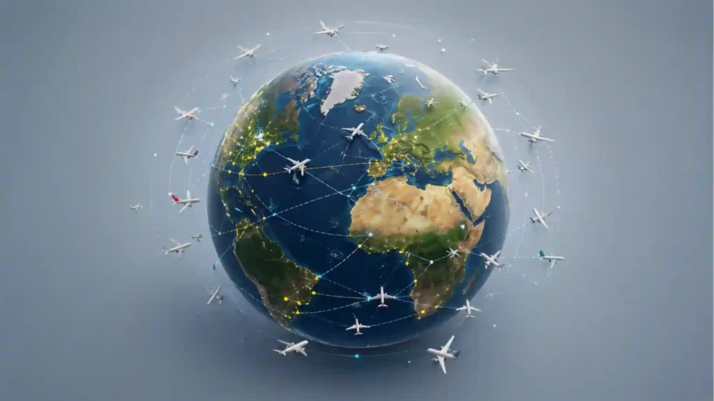
The first hit of Flightradar24 is not information, but scale. Open the map and the sky stops being an empty blue idea. It becomes a restless layer of tiny yellow aircraft, each one moving with its own speed, altitude, route, delay, destination, and reason for being there. A flight from Lisbon to Warsaw, a cargo jet crossing the Pacific, a regional hop descending into Oslo, a helicopter crawling over a city: they all sit on the same living surface.
Table of Contents
The map turns air traffic into something you can feel
That is why the site works even before you search for anything. Most tools ask for intent. Flightradar24 rewards aimless looking. You can arrive with a specific flight number, but you can also arrive because you heard something overhead, because an airport near you seems quiet, because a storm is bending arrivals into strange shapes, or because you want to see what the world looks like when measured in aircraft.
The interface has the rare quality of being instantly legible and slightly overwhelming. You know what the plane icons mean without being taught. You know that crowded paths mean busy corridors. You know that gaps over oceans, deserts, conflict zones, and remote regions mean something too, even when you do not yet know what. The map gives you a first impression before it gives you a manual.
Flightradar24 describes itself as a global flight tracking service with real-time information about thousands of aircraft, available on the web and through mobile apps. Its own About page also says it tracks more than 250,000 flights per day, has more than 5 million daily users, and has passed 100 million app downloads; its press page now states that the service sees 6+ million users per day and runs the world’s largest ADS-B network with more than 60,000 connected receivers.
Those numbers matter because Flightradar24 is not just a pretty aviation map. It is one of the web’s great real-time public interfaces. Weather maps show atmosphere. Traffic maps show roads. Market charts show money moving. Flightradar24 shows the invisible choreography above us, a system most people depend on but rarely see. It makes the sky readable without making it feel smaller.
The site also has a quiet emotional pull. A parent tracking a child’s long-haul flight is not using it the same way as a spotter watching a rare aircraft. A traveler checking whether an inbound plane has left yet is not using it the same way as a journalist watching airspace close during a crisis. The same map holds all of those uses without announcing a different mode for each one.
The best internet discoveries often change the texture of a familiar thing. Flightradar24 does exactly that with flight. A plane in the sky is usually a passing sound and a white line. On this site, it becomes a named object with a route, a history, a direction, and a little public biography. That shift is simple, but it is sticky. Once you have used the map, the sky feels less anonymous.
The trick is that it does not look like a specialist tool
Aviation has plenty of specialist language, yet Flightradar24 keeps the front door unusually open. You can click a moving aircraft and get the basics quickly: flight number, aircraft type, origin, destination, altitude, speed, heading, scheduled times, and often a photo of the exact aircraft. The result feels technical enough to be satisfying, but not so technical that a casual user bounces away in two seconds.
That balance is harder than it looks. A pure hobbyist tool would lead with squawk codes, receiver data, registration obsessiveness, and raw feeds. A watered-down travel app would hide the good stuff behind clean cards and airport clichés. Flightradar24 sits in the middle. It lets beginners understand what is happening, while leaving enough depth for people who care about airframes, routes, airport operations, and strange patterns.
The map also understands the pleasure of following a single moving thing. Watching a flight land is a tiny drama. The plane joins an arrival stream, slows, turns, lines up, drops altitude, and finally vanishes into the airport. There is no soundtrack, no commentator, no false suspense. Just a moving icon, a trail, and the knowledge that hundreds of people are inside that icon.
Travelers get a practical use case immediately. Airline apps tell you whether a flight is scheduled, delayed, boarding, or landed. Flightradar24 lets you inspect the physical reality behind those words. Is the inbound aircraft still halfway across Europe? Has it turned toward the airport? Is it circling? Did it divert? For anyone waiting at arrivals or trying to guess a connection, that extra visibility feels wonderfully direct.
Aviation enthusiasts get a different kind of reward. They can search by aircraft, airline, airport, route, or registration; watch unusual aircraft; inspect traffic flows around major hubs; follow special liveries; and compare how a plane behaves across flights. A normal user sees movement. A spotter sees patterns, habits, fleets, and tiny operational choices.
The site’s public widgets make the whole thing more social than it first appears. A 2025 Flightradar24 feature note describes “most tracked flights,” airport disruption summaries, bookmarks, and live tracking statistics in the mobile pull-down menu, with similar widgets available on the web map. Those features turn private curiosity into a shared signal: not only what is flying, but what other people are suddenly watching.
That “most tracked” idea is a brilliant piece of internet product thinking. It does not need a trending hashtag or a news editor. It lets attention reveal itself. If an ordinary-looking aircraft suddenly has thousands of viewers, the user feels a question forming before the answer appears. Why that plane? Why now? What does everyone else know? The map becomes a live index of curiosity.
This is where Flightradar24 starts to feel less like a database and more like a web-native observatory. It does not force a story on the user. It lets motion, attention, geography, and timing produce the story. Some days that story is mundane: congestion at Heathrow, storms over Florida, a late holiday flight. Some days it is geopolitical. Some days it is deeply human.
The first things worth opening
| Part of Flightradar24 | What it shows | Why it sticks |
|---|---|---|
| Live map | Aircraft moving across the world in near real time | Turns invisible traffic into a visible system |
| Aircraft card | Route, type, altitude, speed, times, and often a photo | Makes each icon feel like a real machine |
| Most tracked flights | Flights drawing the most viewer attention | Shows what the internet is watching together |
| Airport disruption tools | Delays, cancellations, weather, and stressed airports | Connects aviation data to passenger reality |
| Statistics and data pages | Daily flight counts, aircraft tracking, airports, and airlines | Reveals the size of the network behind the map |
The table is small because the appeal is not complicated. Flightradar24 is strongest when it turns a technical aviation feed into a scene you can read at a glance. You open one plane, then another, then an airport, then the busiest route you can find, and suddenly ten minutes have disappeared.
What actually makes the map work
The simple version is that aircraft broadcast signals and Flightradar24 gathers them. The fuller version is more interesting. The service combines ADS-B, MLAT, satellite, radar, schedule data, flight status data, and other sources into one map. Its How it works page says ADS-B is the primary technology it uses, with aircraft transmitting position information that receivers pick up and send to Flightradar24, where it appears on the site and apps.
ADS-B is the little acronym behind the magic. It stands for automatic dependent surveillance-broadcast. “Automatic” because the flight crew does not have to manually send the signal. “Dependent” because the position depends on satellite navigation systems used by the transponder. “Broadcast” because the aircraft is sending that information out to receivers rather than whispering it to one private listener.
The crowdsourced part is the best bit of the story. Flightradar24 says it began in 2006 as a hobby project by two Swedish aviation geeks, then opened its network in 2009 so anyone with a suitable ADS-B receiver could upload data. The service still relies on volunteers around the world for much of its coverage, which gives the map a faintly handmade quality beneath the polished interface.
This is not the usual platform myth where “community” means comments under a post. Here the community is physical infrastructure. People put receivers in houses, on roofs, near airports, in regions where coverage is thin, and in places most users will never visit. A tiny yellow plane on your screen may have reached you because someone, somewhere, decided to plug in a box and feed the network.
The limits are part of the truth. Flightradar24 explains that its ground-based ADS-B receivers usually cover about 250 to 450 kilometers in each direction, depending on receiver location and aircraft altitude. That range makes oceans difficult for terrestrial coverage, which is why satellite-based ADS-B matters for remote and oceanic tracking.
The site also uses MLAT, which is less elegant to explain but lovely as a concept. In areas with enough receivers, Flightradar24 can calculate positions for some non-ADS-B aircraft by measuring the difference in arrival time of signals from older Mode S transponders. It needs four or more receivers hearing the same aircraft, so coverage depends on altitude and receiver density.
Then there are the layers that fill in the map. Flightradar24 lists satellite-based tracking for aircraft outside terrestrial receiver coverage, North American radar data, Australian radar data, and Open Glider Network data for gliders and light aircraft. The experience feels singular on screen, but it is stitched together from different kinds of visibility, each with its own strengths and blind spots.
That matters because the map is persuasive. A clean moving interface can look more complete than it is. Flightradar24 is careful to explain that visibility depends on aircraft type, transponder type, aircraft altitude, terrain, coverage, estimations, and blocking. It also says some aircraft may be limited, blocked, or anonymized, and that aircraft outside coverage may be estimated for a time rather than directly tracked.
The right way to read Flightradar24 is not as a perfect mirror of the sky. Read it as the best public composite view most people will ever touch. It is incredibly revealing, but it is still a model built from signals, receivers, feeds, permissions, coverage, and product choices. That caveat does not weaken the site. It makes it more fascinating.
The data pages widen that feeling. Flightradar24’s aviation data section lets users search airports, aircraft, flights, and airlines; it also links to flight tracking statistics, airport disruption maps, a GPS jamming map, and pinned historical flights. The same page says its database contains more than 1,200,000 aircraft, 300,000 flights, 8,000 airports, and 2,000 airlines, with data updated in real time.
The surprise is how quickly a casual visit becomes a systems lesson. You start by checking one flight and end up noticing the North Atlantic tracks, airport holding patterns, aircraft spacing, regional gaps, glider clusters, cargo flows, and the daily pulse of hubs waking up and falling quiet. The map teaches without becoming a classroom.
Why people open it when the world gets strange
Flightradar24 has become one of the internet’s crisis windows. During weather disruptions, volcanic ash events, major accidents, airspace closures, political visits, military tension, and celebrity or royal flights, people open the map because it shows behavior before the official language catches up. Planes reroute. Airports empty. Corridors tighten. Icons stop crossing a region. The map gives the public a visible first draft.
That habit has history. The Guardian reported in March 2026 that Flightradar24 grew out of a Swedish flight price comparison portal, became more popular than the original price tool, and drew huge attention during the 2010 Eyjafjallajökull volcanic eruption when flights were grounded across Europe. The same report describes later spikes around aviation crises, Covid-era travel collapse, conflict-related airspace closures, and high-profile flights.
A flight map does something news articles cannot always do quickly. It shows absence. Empty airspace is a visual fact. A crowded detour corridor is a visual fact. A group of diversions fanning away from an airport is a visual fact. You still need reporting to understand the cause, but the map lets you see the physical consequences before the article is finished.
That is why Flightradar24 often appears in screenshots during breaking news. It gives editors, analysts, travelers, hobbyists, and ordinary observers a shared visual reference. A closed region is not an abstraction when the sky around it visibly bends. A disruption is not just a line in an airline alert when inbound flights are turning away in clusters.
The site also sits in an odd moral space. Public flight tracking can be useful, educational, and even comforting. It can also create privacy and security tension, especially around private aircraft, political figures, law enforcement, and sensitive operations. Flightradar24’s own documentation notes that some flights may be limited, blocked, or anonymized through requests and third-party services.
That tension is part of what makes the platform so revealing. The web has always been good at turning obscure data into public experience. Flightradar24 does that with air traffic, but aircraft are not neutral dots. They carry people, status, cargo, diplomacy, emergency response, business decisions, family plans, and sometimes state power. A map that makes movement visible also makes questions visible.
The most watched flights prove that the internet is drawn to moving symbols. The Guardian reported that no event had drawn more attention to Flightradar24 than the 2022 flight carrying Queen Elizabeth II’s coffin, with 4.8 million people following part of the journey. That kind of mass attention turns a short aircraft movement into a shared ritual of watching.
For a Web Radar discovery, that cultural layer is the real hook. Flightradar24 is useful, yes. It is also strange. It gives ordinary people the same screen to watch a delayed vacation flight, an emergency diversion, a diplomatic aircraft, a rare cargo plane, and a quiet regional turboprop landing in the rain. The internet rarely flattens distance this literally.
There is also a calmer everyday version of the same behavior. People track relatives because it eases waiting. People watch storms because the route changes are visible. People follow their own future aircraft because airlines often reuse planes across legs. People look at the sky over their city and connect a noise to an actual machine. The drama is optional; the curiosity is constant.
The useful part is deeper than plane spotting
The easy stereotype is that Flightradar24 is for aviation nerds. It is, happily. But stopping there undersells it. The site is also for travelers, journalists, designers, logistics people, students, airport neighbors, weather watchers, and anyone who likes public systems made visible. It turns aviation from a service you consume into a network you can observe.
For travelers, the best use is checking the aircraft behind the itinerary. Airline status pages often behave like polite announcements. Flightradar24 behaves more like a window. If your flight is delayed because the incoming aircraft is late, the map may show where that aircraft actually is. If your destination airport is under stress, the disruption tools and arrival patterns may tell you more than a vague delay message.
For aviation enthusiasts, the depth is obvious. Aircraft photos, registrations, histories, routes, callsigns, special aircraft, airport movements, filter tools, playback, and fleet patterns create a hobby loop that never really ends. A person who starts by identifying one overhead flight can end up learning aircraft families, airline networks, approach paths, and seasonal route shifts almost by accident.
For journalists and researchers, the site is a public clue machine. It is not a replacement for reporting, official records, or aviation authorities, but it often points to the thing worth asking about. A diversion, disappearance from coverage, unusual holding pattern, mass reroute, or sudden viewer spike can be the beginning of a question. Good reporting still has to answer it.
For product people, Flightradar24 is a lesson in restraint. The site could have hidden the world behind dashboards, menus, and polished travel language. Instead, it makes the live map the star. Everything else sits around that core: search, filters, aircraft cards, weather layers, airport pages, playback, statistics, photos, subscriptions, API access. The product knows what the user came to see.
The business layer is also visible without being obnoxious. Free users get the main magic. Paid tiers add deeper history, more advanced filters, alerts, weather layers, and other features depending on plan. Flightradar24 also offers commercial data services and an API; its API pages describe access to real-time aircraft positions, airline and airport information, and historical flight data.
That split makes sense because the audience is layered. A casual user wants to know what just flew overhead. A traveler wants reassurance or timing. A hobbyist wants detail. A company may want data integration. An airline, airport, or aviation business may want operational awareness. Flightradar24 manages to serve these layers without hiding the public toy that made it famous.
The JetPhotos connection adds a human texture. Aircraft are machines, but aircraft photography turns them into characters. Seeing an image attached to a registration makes the map less abstract. The icon is no longer merely “an Airbus A350.” It may be a specific aircraft with a livery, age, airline history, and photographed appearances at airports around the world.
The strongest design choice is that Flightradar24 does not overexplain the pleasure. It lets the user click, follow, zoom, pan, filter, and wander. You learn by touching the map. You notice that arrivals form lines. You notice that cargo keeps moving while passenger hubs sleep. You notice that geography, weather, regulation, and economics leave marks in the air.
A good discovery site has re-open value. Flightradar24 absolutely does. It is different at breakfast, different at midnight, different during a storm, different during a holiday rush, different when a major airport shuts down, different when a rare aircraft appears, different when a war closes airspace, different when you are waiting for someone you love to land.
The web at its best still feels a little like this
Flightradar24 belongs to a class of sites that make the internet feel physical. Radio Garden turns radio stations into geography. MarineTraffic turns ships into a moving sea map. Windy turns weather into animated pressure, wind, and rain. Flightradar24 turns aircraft into a live public layer. These sites remind you that the web is not only posts, feeds, shops, and chat boxes. It can be a window.
The joy comes from watching a hidden system become visible. You do not need a long onboarding flow. You do not need an account to understand the premise. You do not need to be an expert to feel the scale. The map says: this is happening above you, right now, almost everywhere. That immediacy is the product.
There is also a strange comfort in seeing the routine. Thousands of aircraft move safely, repeatedly, precisely, every hour. The site can make global aviation look impossibly busy, but it also makes it look organized. The flows into Amsterdam, Atlanta, Singapore, Dubai, Frankfurt, Istanbul, Tokyo, and São Paulo have a rhythm. The world is messy; the arrivals still line up.
Then the site breaks that comfort when reality changes. A storm pushes arrivals into holds. A runway closure scatters plans. A conflict empties airspace. A volcano erases routes. A medical diversion turns one line into a different story. Flightradar24 is gripping because the normal pattern is always visible enough for the abnormal pattern to stand out.
This is the web experience that many polished apps have forgotten. It does not feel sanitized. It contains clutter, edge cases, specialist labels, paid features, missing aircraft, estimated positions, blocked flights, obscure vehicles, and occasional confusion. Good. The real sky is not a lifestyle product. The slight mess is part of the credibility.
The site’s name is sometimes mistyped as FlightRadar24, but the official styling is Flightradar24. The lowercase “r” is a small editorial detail, yet it fits the product’s story: a niche tool that became a public reference point without losing all of its hobbyist DNA. Even the name still feels slightly internet-native, like something that escaped a side project and became infrastructure.
The reason to open Flightradar24 is not only to track a flight. Open it because it changes your mental model of the sky. Open it because the map is alive. Open it because it turns travel, logistics, engineering, weather, attention, and geography into one readable surface. Open it because a great website should make you say, almost involuntarily, “I had no idea I could see that.”
Airport pages are where the map becomes a travel instrument rather than a toy. Click into a major airport and the moving dots turn into arrivals, departures, delays, weather signals, runway behavior, and operational mood. You can see whether an airport is merely busy or actually stressed. A departures board gives rows of text; Flightradar24 gives the geometry behind those rows.
That geometry is especially good during bad weather. When storms sit near an airport, the arrival streams bend, holds form, and aircraft sometimes peel away to alternates. You do not need meteorological expertise to notice that the sky has become less tidy. The map translates weather into consequences: extra loops, widened routes, missed approaches, long taxi queues, and flights that suddenly stop behaving like straight lines.
Cargo is another quiet reward. Passenger aviation has daily peaks, public brands, and emotional stakes, but cargo aircraft make the map feel like a hidden economy. Late at night, when passenger airports thin out, freighters keep crossing oceans and continents. Watching those movements is a reminder that the web, retail, manufacturing, medicine, and food supply chains all have an airborne shadow.
The aircraft photos create a small but memorable jump from data to object. A registration number is abstract until the site pairs it with an image. Then the aircraft becomes specific. You see the paint, the age in the livery, the airline’s visual identity, sometimes even the exact machine you just heard over your house. That tiny bit of photography gives the interface warmth.
The map also teaches route logic without announcing that it is teaching. Long-haul flights do not always look intuitive on a flat map. North Atlantic crossings curve. Polar routes surprise people. Aircraft avoid closed airspace, storms, terrain, and restricted regions. Flightradar24 lets those decisions draw themselves. The user learns that aviation geography is not the same as a classroom map.
The replay and history features add a second pleasure: time travel. Live tracking is the hook, but looking back at a flight path changes the mode. You can reconstruct a diversion, compare a normal approach with a disrupted one, or revisit a route after hearing about it later. The site becomes less like a window and more like a memory of movement.
There is a lovely humility in the receiver network too. The global map depends partly on small local acts: someone with roof access, someone near a coast, someone close to an airport, someone in a region where coverage is thin. The polished interface hides a scattered physical network, but once you know it exists, the map feels more human than corporate.
Flightradar24 also makes airspace feel political without needing a lecture. Borders are not only lines on the ground. They shape flight paths, permissions, risk calculations, fuel burn, airline economics, and passenger delays. When a region closes or becomes risky, the map shows air traffic flowing around it like water around a rock. The viewer sees policy as motion.
The site’s strongest design move may be the absence of a forced narrative. It does not tell you what to care about. It gives you enough context to choose your own thread. A rare aircraft, a delayed family flight, a crowded airport, a suspiciously empty corridor, a glider field, a cargo stream, a famous journey: the map lets your attention become the story.
That is why Flightradar24 ages well as a bookmark. A single-purpose tool often fades after one use. This one stays alive because the underlying subject never stops. There is always another departure, another route, another storm, another late arrival, another aircraft someone is watching for reasons you do not yet know.
Small practical notes
It is presented as a real-time flight tracking service, but the exact freshness depends on data source, coverage, aircraft equipment, location, and filtering. The useful mental model is near-live public visibility, not omniscience. For normal flight tracking, it feels immediate enough to be addictive; for safety-critical decisions, official aviation sources still come first.
No. Aircraft visibility depends on transponder type, altitude, terrain, receiver coverage, data source, and restrictions. Flightradar24 says aircraft that are not visible may lack a compatible transponder or may be outside coverage, and some flights may be blocked, limited, or anonymized.
Aviation enthusiasts will get the deepest long-term pleasure, but travelers may get the most immediate payoff. Airport neighbors, parents, logistics watchers, journalists, designers, map lovers, and curious internet people all have a reason to open it. The site is generous because it works as both a utility and a rabbit hole.
The “most tracked flights” view deserves attention. It turns collective curiosity into a live discovery tool. When a flight draws unusual attention, the viewer is pulled toward the story. Sometimes the answer is aviation news. Sometimes it is a famous person. Sometimes it is a weird route. Sometimes it is only the internet being the internet.
Start with your own city or nearest airport, then click one aircraft that is about to land. Watch its altitude, speed, and path. After that, search a major global hub and compare the density. Then check the most tracked list. The site makes the most sense when you move from familiar airspace to the wider world.
Do not treat every missing aircraft as a mystery or every strange path as drama. Flight tracking has gaps, estimations, restrictions, data quirks, and ordinary operational explanations. Flightradar24 is most rewarding when curiosity is paired with caution.
Because it is a famous site that still feels like a discovery when you open it with fresh eyes. It reveals a live layer of the world that most people know exists but rarely see. It is practical, mesmerizing, slightly odd, culturally loaded, and still one of the clearest examples of the internet making hidden infrastructure visible.
This article is an original analysis supported by the sources cited below
Flightradar24 about page
Official company page used for the service description, public usage figures, receiver network context, app download figures, industry-use notes, and origin story.
Flightradar24 how it works
Official technical explanation of ADS-B, MLAT, satellite tracking, radar data, Open Glider Network data, estimations, blocking, coverage limits, and aircraft visibility.
Flightradar24 aviation data
Official aviation data entry point used for database scale, search categories, flight tracking statistics, airport disruption tools, GPS jamming map, and pinned historical flights.
Flightradar24 press and media center
Official press page used for the latest public positioning, receiver network size, daily user figure, trusted data-source claims, and media-facing context.
Flight tracking at a glance
Official feature note used for most tracked flights, airport disruption widgets, bookmarks, statistics, and the way these features appear in the mobile app and web interface.
Flightradar24 API overview
Official API page used for the commercial and developer layer, including real-time aircraft positions, airline and airport information, and historic data access.
Introducing the Flightradar24 API
Official product article used for API context, real-time movement data, aircraft information, origin and destination fields, callsigns, registrations, equipment type, and airport or airline data.
How Flightradar24 became the go-to platform for the world to watch global aviation crises unfold
Guardian feature used for cultural context around crisis-watching, the site’s origin from a Swedish price comparison portal, major audience spikes, the 2010 volcanic ash moment, and the 2022 royal flight attention record.