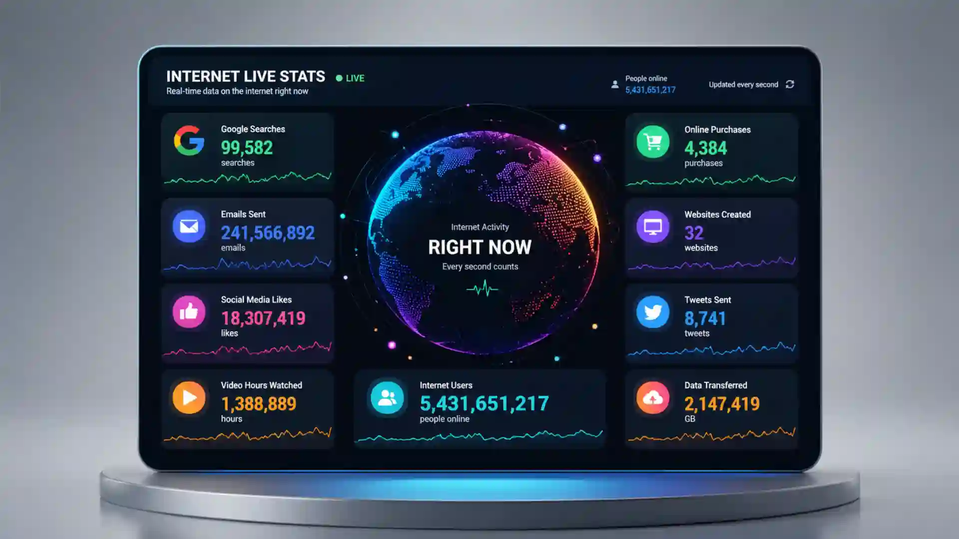
Internet Live Stats does one trick that still feels strangely good: it takes the internet, a thing most of us experience as tabs, feeds, messages, and search boxes, and turns it into a wall of moving numbers. Open the site and the web stops being an abstraction. It becomes a machine with counters attached to it. Internet users tick upward. Websites appear. Emails fly by. Google searches keep climbing. Videos, posts, traffic, electricity, and CO₂ emissions turn into visible motion. The page does not ask you to read a report. It asks you to stare for ten seconds and admit that the internet is much larger than your personal version of it.
Table of Contents
The dashboard turns the internet into a pulse
The first impression is not sleekness, and that works in its favor. Internet Live Stats looks closer to an old-school data observatory than a polished SaaS dashboard. The charm sits in the frictionless spectacle: big labels, live counters, links to “watch all,” and the hypnotic feeling that the numbers are outrunning your ability to understand them. The site belongs to the Real Time Statistics Project, alongside Worldometers and 7 Billion World, and its own About page describes the team as developers, researchers, and analysts trying to make statistics available in a time-sensitive format.
The page is built around a simple editorial decision: the internet is easier to feel when you watch it move. Most statistics pages freeze the world into annual totals, PDF charts, and institutional language. Internet Live Stats does the opposite. It shows estimates as if they were happening under glass. Emails sent today. Google searches today. Blog posts written today. Tweets sent today. Videos viewed on YouTube. Photos uploaded to Instagram. Internet traffic today. Electricity used by the internet. CO₂ emissions from the internet. Even when you know these counters are modeled, not magically plugged into every server on Earth, the experience lands because motion gives scale a body.
That is why the site is useful for more than trivia. A student can open it before writing about digital growth and immediately see the difference between a billion as a word and a billion as a rate. A researcher can use it as a starting point for questions about measurement, sources, and estimation. A marketer can use it to remind a client that “online activity” is not a vague mood but a measurable flood. A curious reader can simply enjoy the strange pleasure of watching a global system count itself in public.
The dashboard also does something that many charts fail to do: it makes time visible. A static figure tells you what the world looked like when the figure was made. A moving counter makes you feel the loss of the last second. While you read a label, the count has already changed. While you compare emails with searches, the distance between them has shifted. That tiny instability keeps the page alive.
The best Web Radar finds are often not obscure because nobody needs them; they are obscure because they sit outside the normal product categories. Internet Live Stats is not exactly an analytics tool, not exactly a reference library, not exactly a science exhibit, and not exactly a news graphic. It is closer to a public instrument panel for the networked world. That makes it easy to underestimate. You can spend two minutes there, close the tab, and still keep thinking about the numbers later when you send an email, search for a recipe, or refresh a feed.
What makes it worth opening
The site’s strongest feature is the way it collapses huge behavior into a single glance. You do not need a login, a tutorial, or a dashboard setup. You land on the page and the counters are already moving. That directness matters. A lot of internet measurement lives behind corporate dashboards, academic datasets, or media charts. Internet Live Stats turns the same general idea into a public-facing object: open page, watch web.
The “one second” pages are the cleverest part of the experience. Instead of only showing totals, the site lets visitors watch certain categories unfold as individual units, one after another. “Watch all Internet users in the world” sounds almost absurd, because of course you are not literally seeing everyone. Yet the page’s purpose is not literal surveillance. It is a visualization trick: one unit, another unit, another unit, until the scale becomes impossible to domesticate. The site calls this visual approach “Single Unit Isotype” and “Live Isotype,” building on the idea that repeated symbols can make quantities legible without turning them into oversized shapes.
That choice gives the project a museum-like quality. Internet Live Stats does not only say “many searches happen.” It stages the searches. It does not only say “many websites exist.” It lets the count run until you begin to sense the difference between a stock number and a flow. The method is almost childish in the best sense: count one thing, then another, then another. The result is not childish at all. It teaches through accumulation.
The Google Search page is one of the better examples of how the site mixes spectacle with background. It reports an estimate of more than 40,000 Google search queries per second on average, translating that rate into daily and yearly figures, then places the current counter beside a history of search growth and references. Some of the supporting figures are older, and that matters, but the page still gives readers a fast path from “search is big” to “search became a planetary habit at astonishing speed.”
The websites page is also good because it complicates the easy story. Internet Live Stats says there are over 1.5 billion websites on the web, while fewer than 200 million are active. It also notes that the one-billion-website milestone was first reached in September 2014 and that counts can dip because inactive sites fluctuate. That is a better lesson than the raw total alone. The web is not only growing; it is also full of parked domains, abandoned projects, shells, experiments, and dead storefronts that still count in some technical sense.
The dashboard works because it mixes the intimate with the planetary. Google searches feel ordinary because you make them. Emails feel ordinary because you send them. Photos and videos feel ordinary because they pass through your day without ceremony. Then the counter shows the same behaviors as a global torrent. The site’s trick is not to make the internet alien. It makes the familiar too large to casually dismiss.
It is also a rare website that becomes better when you leave it open. Many pages punish lingering with pop-ups, autoplay, or clutter. Internet Live Stats rewards idleness. Leave it on a second monitor, a classroom projector, or a browser tab during a break, and the page turns into ambient evidence. It keeps saying the same thing without using words: the network does not pause because you paused.
The numbers are estimates, not magic
The most honest way to read Internet Live Stats is as a live model, not a live wiretap. The official FAQ says its counters display current estimates based on statistical analysis of data from reliable sources. It also says the project uses an algorithm to derive estimates and gathers data from more than 250 official sources, with main sources listed under the relevant statistics pages. That matters because “real time” can sound like direct measurement, when the reality is closer to modeled motion based on known data, rates, and assumptions.
That does not make the site fake. It makes it a particular kind of informational object: an estimate presented as a live experience. Weather apps do something related when they show future rain hour by hour. Population clocks do it when they turn demographic estimates into second-by-second growth. Internet Live Stats applies the same logic to network activity. The page is less about precision at the individual-unit level and more about making the speed of digital behavior visible.
The timezone note in the FAQ is small but revealing. The site says “today” refers to the period from the start of the current day as set on your computer clock, while “this year” begins on January 1 in your timezone. That means two visitors in different places may experience the same daily counter with different local framing. The numbers feel universal, but the time window is personal. That tiny detail is a useful reminder: even global dashboards are seen from somewhere.
A stronger version of the site would make uncertainty more visible. Right now, the counters create a feeling of confidence because they move with such authority. They do not naturally show ranges, confidence intervals, refresh rules, or source freshness at the point of reading. You can click into source pages, and the FAQ gives a methodology sketch, but the live surface itself favors drama over caveat. For a public curiosity site, that tradeoff is understandable. For serious research, the live page should be treated as an entry point, not the final citation.
The supporting ecosystem makes that distinction clearer. ITU estimated that roughly 6 billion people, or 74 percent of the world’s population, were using the internet in 2025, while about 2.2 billion people remained offline. Internet Live Stats is exciting because it shows the connected world in motion; ITU’s figures remind us that the motion still excludes a huge part of humanity. The dashboard shows velocity. The institutional data shows uneven access. A good reader needs both.
Internet Society’s Pulse work points toward another layer the dashboard does not fully cover. Availability, resilience, shutdowns, critical technologies, internet exchange points, and market concentration shape whether the internet works well in the first place. Internet Live Stats shows the roar of activity. Internet Society’s measurement work asks whether the pipes, policies, and infrastructure behind that activity are stable and open enough to trust. Those are different views of the same creature.
The point is not to distrust the counters; the point is to read them at the right distance. If you need a live-feeling illustration of scale, the site is excellent. If you need to prove the exact number of Google searches performed during a narrow time window, it is not enough by itself. The page works best when it sparks the question, then sends you toward the source trail.
That reading distance is part of internet literacy. People often treat numbers on a screen as cleaner than words, as if a counter has escaped interpretation. Internet Live Stats is a good place to practice the opposite habit. Ask what is being counted, where the base data came from, how often the estimate is refreshed, and whether the label matches normal human language. A website count, a user count, a search count, and an emissions count are not the same kind of fact, even when they sit in the same visual grid.
The site quietly teaches the difference between precision and truthfulness. A fast-moving number with commas and decimals can feel precise while still being an estimate. A rounded institutional figure can feel less exciting while being better suited for policy or research. Internet Live Stats is most truthful as a depiction of speed and magnitude. It becomes weaker when a reader pretends the live counter is a perfect measurement device.
The best part is the friction
Internet Live Stats feels almost unfashionable, and that is part of its appeal. It does not bury you in personalization. It does not ask you to create an account. It does not turn the page into a newsletter funnel before the counters load. The design is plain, the labels are direct, and the premise is obvious within seconds. That lack of ceremony gives the site a kind of confidence most modern dashboards lose by trying too hard to impress.
The site also resists the private-dashboard habit that has swallowed much of the web. Most analytics experiences are about your account, your campaign, your audience, your performance. Internet Live Stats points outward. It has no interest in your metrics. It shows a shared system and lets you feel tiny inside it. That is a rare posture online, where even public information often gets wrapped around individual identity or commercial intent.
There is a beautiful absurdity in watching a counter for emails sent today. Email is one of the least glamorous parts of the internet, but the number moves with comic speed. It includes work notes, password resets, newsletters, receipts, spam, support tickets, school reminders, shipping alerts, and unread promotions. The counter turns a boring medium into a visible storm. You start thinking not about one message, but about the planet’s administrative noise.
The environmental counters add a sharper edge. Seeing internet traffic beside electricity use and CO₂ emissions changes the emotional temperature of the page. The internet is often described in weightless language: cloud, stream, feed, post, search. Internet Live Stats puts energy and emissions in the same visual frame as social activity. It does not solve the measurement problem, and it should not be read as an environmental audit, but it nudges the reader away from the fantasy that digital life floats above material reality.
The “watch all” links turn raw count into a tiny web performance. A dashboard number is useful; a page where units appear one by one is memorable. That difference matters for teaching, presentations, and curiosity. If you have ever tried to explain the scale of online activity to someone who does not enjoy charts, a live unit stream does more work than a paragraph of statistics. It gives the brain something to track.
There is also a pleasing lack of over-explanation. The site gives you labels, counters, and paths to more detail, then leaves room for the reaction. You are not told exactly what to feel. You are not pushed through an argument with animated scroll effects. The numbers do the theatrical work. The editorial voice of the site is mostly restraint, and that restraint makes the counters louder.
That ambient quality is harder to design than it looks. A normal dashboard wants action: filter this, export that, segment the audience, compare the cohort. Internet Live Stats asks for attention before action. Its best mode is passive watching, which makes it closer to a clock, a seismograph, or a city traffic camera than to a work tool. You are not there to manage the internet. You are there to notice it.
This is why the site is so easy to show to someone else. You do not have to explain a feature set. You point at the screen and the argument is already moving. A child understands that the numbers are racing. A manager understands that the market is larger than a campaign report. A researcher understands that the model needs scrutiny. The same page works at different depths without changing modes. That rare clarity is the reason a dated-looking counter page can still beat a glossy explainer in an ordinary browser tab, without extra ceremony.
The counters also create a tiny moral discomfort. Every tick represents behavior, infrastructure, or both. Some of it is communication. Some of it is entertainment. Some of it is spam, waste, fraud, abandoned automation, and duplicate noise. The site does not sort the noble from the pointless. It simply shows the flow. That bluntness is useful because the internet is not only a library or a marketplace or a social square. It is also an engine that keeps burning energy while producing mountains of forgettable activity.
What stands out at a glance
| Part of the site | Why it works | Where to be careful |
|---|---|---|
| Live dashboard | Shows internet activity as motion | Counters are modeled estimates |
| One-second views | Makes scale feel physical | Not literal event-by-event tracking |
| Trends pages | Adds history and source notes | Some references are dated |
| Website counter | Separates total sites from active sites | Technical definitions matter |
| Energy and CO₂ counters | Connects digital use to infrastructure | Not a full climate accounting tool |
The compact lesson is this: Internet Live Stats is strongest when read as a scale machine. It is not the right place to settle a technical dispute about exact current totals, but it is a very good place to make digital scale visible. For a Web Radar pick, that distinction is enough. The site is worth opening because it gives an everyday user a feeling that most datasets hide.
Where the site feels frozen in time
The most interesting weakness is that Internet Live Stats also feels like an artifact from an earlier internet. The dashboard still lists Google+ active users, even though Google’s consumer social network has long since disappeared from ordinary web life. That does not ruin the site, but it changes how you read it. A live dashboard that includes dead-platform residue becomes a strange hybrid: part real-time instrument, part archive of the social web’s old assumptions.
That dated feeling is not purely negative. It gives the site texture. Plenty of modern dashboards are technically current but emotionally forgettable. Internet Live Stats has a slightly dusty confidence, like a public science exhibit that still works even after the posters have faded. You notice the old platform names, then you keep watching the numbers anyway. The site’s core idea survives the aging of some categories.
Still, the project would benefit from clearer maintenance signals. A small “last reviewed” note on each major counter would make a big difference. So would clearer labels for retired, legacy, or historically estimated categories. The audience for a site like this includes students and casual researchers, and they need to know which counters reflect active present-day platforms and which ones have become historical fixtures. A dashboard does not need to be flashy to stay trustworthy. It needs to show its upkeep.
The Google Search page shows the same tension. Its headline estimate remains memorable, but some source references date back to older public disclosures and search-market snapshots. That is partly because platform companies reveal less than curious people want, and partly because web measurement often has to stitch together public claims, historical data, and estimation. The page remains useful, but it rewards readers who check dates rather than copying numbers blindly.
The web itself creates this problem for anyone trying to count it. What counts as a website? Internet Live Stats uses unique hostnames that resolve through name servers, but it also notes that many counted sites are inactive, parked, or similar. That single definition explains why website totals can sound inflated to ordinary readers. Your sense of “a website” probably means an active destination with content. A technical count includes many more ghosts.
That is exactly why the site is more interesting than a clean modern infographic. It lets the mess show through. The internet is not a tidy object with one perfect dashboard. It is a stack of human behavior, corporate platforms, protocols, inactive domains, bots, spam, infrastructure, habits, and measurement gaps. Internet Live Stats does not explain all of that on the surface, but its rough edges point toward it. The site is fascinating because counting the internet is itself a strange act.
There is a broader design lesson in that imperfection. A totally refreshed version of Internet Live Stats might look cleaner, quote newer sources, and remove the old platform fossils. It might also lose some of the weird public-web energy that makes the project stick. The task is not to preserve every dated corner. The task is to keep the feeling of a live public instrument while making the maintenance trail easier to trust.
Who should use it and why it sticks
Internet Live Stats is ideal for people who need a fast sense of digital scale. Teachers can open it at the start of a media literacy class. Students can use it to frame a presentation. Journalists can use it as a lead generator, then verify exact claims through primary sources. Designers can study it as a lesson in public data dramatization. Marketers can use it to escape platform tunnel vision and remember that the web is larger than any campaign dashboard.
Data enthusiasts will enjoy the source trail as much as the counters. The site’s public FAQ says the team gathers data from more than 250 official sources, and the Trends pages point readers toward source notes for specific statistics. That source posture is the difference between a novelty counter and a project with research ambitions. The execution is not perfect, but the site invites curiosity beyond the live number.
Researchers should treat it carefully. Internet Live Stats is good for orientation, illustration, and public communication. It is weaker as a final authority for exact current counts unless the relevant source page is checked and the methodology fits the question. For internet penetration, ITU and related datasets are better primary anchors. For internet resilience and infrastructure questions, Internet Society Pulse goes deeper. For social platform statistics, official company disclosures or audited reporting may be needed. The live counter is the doorway, not the whole building.
The site is especially useful for anyone who has become numb to internet scale. Words like “billions” and “trillions” have been worn smooth by tech coverage. Live counters restore some of the shock. They make the web feel busy again. Not new, not glamorous, not cleanly futuristic. Busy. Restless. Wasteful in places. Brilliant in places. Too large for any one person’s feed to represent.
There is also a quiet design lesson here for product people. Internet Live Stats proves that a strong interaction does not need a complex interface. The moving counter is the interaction. The waiting is the interaction. The small urge to refresh, click “in 1 second,” or compare one category with another is enough. The site’s design understands that curiosity can be a stronger hook than decoration.
For parents, teachers, and media-literacy educators, the site offers a simple way to start harder conversations. How much of online activity is useful? How much is automated? How much is spam? How much energy does digital behavior require? Who is missing from the counters because they are offline? Who is counted but not well represented? A page of racing numbers becomes a prompt for questions the dashboard cannot answer by itself.
Internet Live Stats belongs here because it makes the internet strange again. That is harder than it sounds. Most of us have lived inside digital systems long enough that their scale feels ordinary. We know billions of people are online, yet we mostly experience the network through tiny personal windows: one inbox, one phone, one search bar, one group chat. Internet Live Stats pulls the camera back without turning the subject into an academic chart.
The site’s real achievement is emotional, not technical. It makes a familiar system feel countable and uncountable at the same time. You see the numbers, so the internet feels measurable. You watch them accelerate, so it feels beyond you. That tension is the whole experience. A perfect dashboard would probably smooth it away. Internet Live Stats leaves enough roughness for the mind to stay alert.
That emotional effect is why the site works for people who do not normally care about statistics. A static chart can be skipped. A report can be postponed. A live counter is harder to ignore because it creates a small conflict with the reader’s attention. You want to look away, but the number keeps changing. You want the count to settle, but it never does. The page turns restlessness into a teaching device.
It also captures a disappearing style of web project. Before every useful idea became an app, a subscription, a thread, or a branded report, the web had more odd public pages built around one strong concept. Internet Live Stats feels descended from that tradition. It is a site you open because someone says, “You should see this,” not because an algorithm pushes it into your feed.
The recommendation is simple: open it when you want to remember that your internet is not the internet. Your tabs are only the tiniest surface of a system that keeps moving without you. The counters will not tell the whole truth, but they will shake loose one lazy assumption: that digital life is weightless, private, and somehow smaller than the physical world. It is not. It is enormous, uneven, measurable, wasteful, useful, fragile, and alive in the dullest and most astonishing sense of that word.
The tab is also a useful antidote to platform narcissism. A feed makes the web feel like whatever has been selected for you. A search engine makes it feel like a question-answering machine. An inbox makes it feel like a chore. Internet Live Stats cuts across those private frames and shows the background hum. It does not care what you clicked. It cares that billions of clicks, searches, posts, and transmissions are happening beyond your screen.
Questions readers will ask before opening it
It is live in presentation and estimated in method. The counters move in real time on your screen, but the official FAQ describes them as current estimates based on statistical analysis rather than direct measurement of every email, search, website, or upload. That is the right expectation to bring to the site.
Start with the main live dashboard, then click one of the “in 1 second” or “watch all” views. The dashboard gives you the full spread of activity, while the one-second views make the scale easier to feel. Google searches and internet users are especially good starting points because the behavior is familiar and the speed is easy to grasp.
Yes, but with care. Use Internet Live Stats as a visual starting point or an illustration of scale, then check the related source page and compare the claim with primary sources when precision matters. The site itself says its data is processed from many official sources, which is helpful, but serious work should still cite the most direct source available.
Some categories and references reflect older web platforms and older public disclosures. The presence of Google+ on the dashboard is the clearest example. Rather than ignoring that, read it as part of the site’s character and as a reason to check source dates before treating every category as equally current.
It reveals that the internet is less like a place and more like a constant event. Every second brings searches, emails, uploads, posts, traffic, energy use, and emissions. The site does not show all the politics, infrastructure, labor, or inequality behind those numbers, but it gives the scale a visible rhythm.
Author:
Jan Bielik
CEO & Founder of Webiano Digital & Marketing Agency
This article is an original analysis supported by the sources cited below
Internet Live Stats
The official live dashboard showing internet users, websites, emails, Google searches, social activity, internet traffic, electricity use, and CO₂ estimates.
About Internet Live Stats
The project’s official background page, including its connection to the Real Time Statistics Project and its stated approach to visualizing live statistics.
Internet Live Stats FAQ
The official methodology note explaining that the counters are current estimates based on statistical analysis and data from many official sources.
Total number of websites
Internet Live Stats’ detailed page on website counts, including the distinction between total websites and active websites.
Google Search Statistics
Internet Live Stats’ page on Google search volume, historical growth, and source references for search estimates.
Internet use
ITU’s 2025 internet use update, used for current global connectivity context and the share of the world still offline.
Measuring the Internet
Internet Society’s overview of its Pulse measurement work, used to frame broader internet availability, resilience, and infrastructure questions.