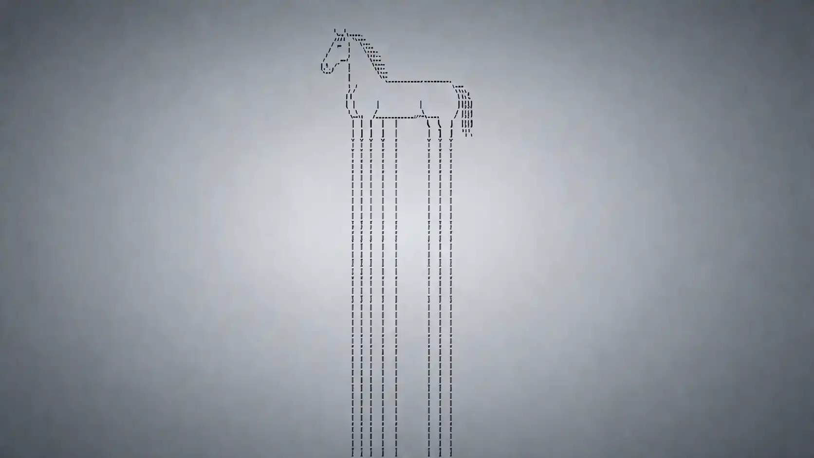
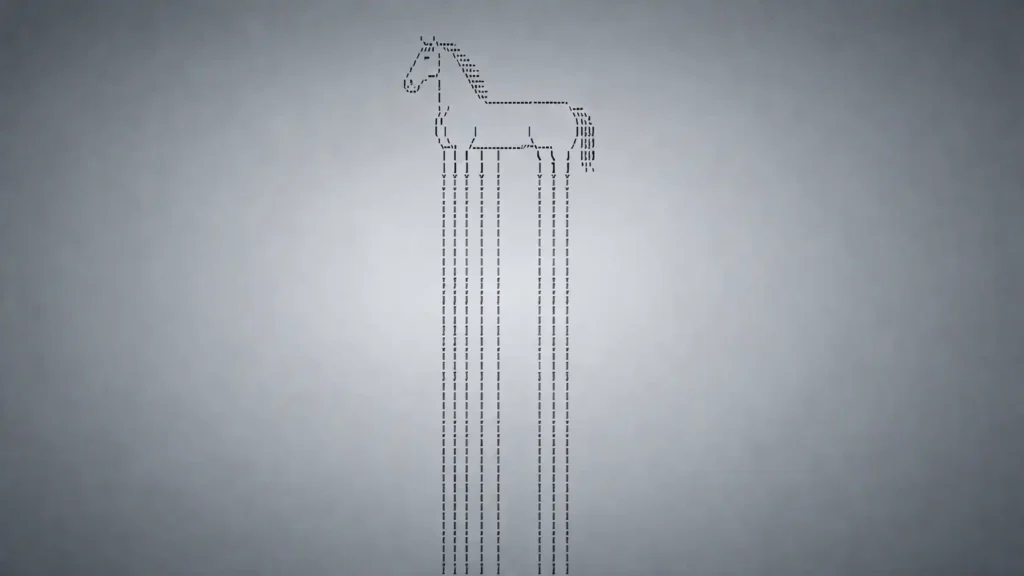
Endless Horse looks like a joke that should die after three seconds, but the whole point is that it refuses to give you that clean exit. You open a plain page, see an ASCII horse, scroll down, and discover that its legs keep extending. There is no menu, no button, no animation, no score, no payoff, no “you made it” screen. The site does almost nothing, then keeps doing that nothing for as long as your patience, curiosity, or stubbornness lasts.
Table of Contents
The trick is so small that describing it feels like damaging it. Endless Horse is a website where the punchline is the browser scrollbar itself. A normal page uses scrolling to move you through content; this one uses scrolling to make you complicit in a visual gag. Every downward flick says the same thing: maybe now, maybe the bottom is coming, maybe the horse ends after this next batch of legs. It does not. That refusal is the whole machine.
Open the source trail and the joke becomes funnier rather than less funny. The project was made in 2015 by Colleen Josephson with Kyle Miller for the Stupid Shit No One Needs & Terrible Ideas Hackathon, and Josephson later described it as “a website of a horse with unusually long legs.” Her own write-up says the explosion of new top-level domains made her feel that “many stupid websites” were waiting to be made, and she “found” hers in endless.horse.
That origin matters because Endless Horse is not a polished novelty product pretending to be useful. It came from a setting that rewarded bad ideas executed with conviction. The Stupid Hackathon described itself as an event where participants make projects with “no value whatsoever,” which sounds dismissive until you notice how much of the web’s personality came from exactly that impulse: a person has a dumb idea, makes it real, gives it a domain, and lets the rest of us decide whether the dumbness has charm.
The site also belongs to a disappearing kind of internet object. It is a single-purpose page with no conversion funnel and no attempt to explain itself into respectability. You are not asked to subscribe. You are not asked to sign in. You are not trained through a tutorial. You are not moved through a stack of engagement prompts. You are shown a horse, then asked by implication whether you are silly enough to keep scrolling. Plenty of people are.
That is the strange social intelligence of Endless Horse. It knows the web user better than it pretends to. It understands that a person will often keep going when a page quietly suggests there might be a bottom. It understands that “nothing happens” can be a stronger invitation than a loud interface. It understands that the most powerful button on a website may be no button at all, just a blank page extending downward with the promise of a joke that cannot complete itself.
The first time you see it, the reaction usually lands in stages. Recognition comes first: yes, that is a horse, built from text characters, with a wonderfully awkward little body. Suspicion comes second: the legs look too long already. Experiment comes third: a scroll, then another, then a faster one. Then comes the small private embarrassment of realizing that the page has persuaded you to test the word “endless” with your own hand.
There are better-looking web toys, deeper web toys, stranger web toys, and more technically ambitious web toys. Endless Horse wins because it is almost offensively pure. Its design idea fits in one sentence. Its interface fits in a blink. Its emotional arc fits in the gap between “surely there is a bottom” and “I am still scrolling through horse legs.” That gap is larger than it should be, and the site lives there.
The web page that wins by doing almost nothing
The first thing Endless Horse gets right is restraint. A weaker version would explain the joke before the joke had time to work. It would add a title, a caption, a progress indicator, a “share this horse” panel, a fake hoof counter, a reset button, maybe a footer with credits and a joke about the bottom. Endless Horse chooses the funnier option: it leaves you alone with the page.
The page title itself stretches the joke into the browser chrome. The raw index file is titled “hooooooooooooooooooooooooooooooooooooooooooooooooooooooooorse,” which already tells you the creators understood that the domain was not the only place the gag could live. The horse is not merely endless on the page; it leaks into the name of the document. Even the title bar gets pulled into the long-body logic.
The ASCII drawing does a lot of work. Because the horse is made of characters, the page feels old without feeling fake-retro. It does not cosplay as an 8-bit game or a terminal app. It simply uses text as image, which gives the whole thing a dry, underbuilt quality. The horse appears as if someone found it in a drawer of internet scraps and then decided the legs were the only part worth scaling.
ASCII art also makes the endlessness funnier. If the horse were a glossy vector illustration, the joke would feel like a designer’s exercise. If it were a photorealistic horse, it would become uncanny in the wrong way. Text keeps it lightweight. Text lets the page be absurd without needing production value. Text makes the horse feel like a creature that belongs to the internet’s spare parts bin: slashes, apostrophes, parentheses, pipes, backticks, underscores, and one quietly doomed scrollbar.
The body of the horse is detailed enough to be legible, then the legs become absurdly plain. That contrast is the whole visual rhythm. The top has shape, mane, head, belly, tail, a recognizable animal made from tiny typographic decisions. Below it, the legs simplify into repeated vertical bars. The further you scroll, the less horse you get. You are no longer looking at a horse; you are looking at the continuation of a premise.
That continuation has a satisfying plainness. The raw legs.html fragment is just repeated leg lines, and the page points back to the same file so more legs can be appended. The “endless” part is not a hidden universe of content. It is the same little strip of horse-leg text loaded again and again, which is somehow more elegant than a complex trick would be.
The public GitHub repository reinforces the smallness of the object. It contains a short file list including index.html, legs.html, a favicon, a sitemap, and a jScroll script, with the repository description reduced to one word: “neigh.” The repo is not trying to present Endless Horse as a major project. It is exactly as unserious as it needs to be, which is part of why it still feels intact.
The absence of interface is not laziness. It is the interface. A site like this can only work if it trusts the visitor to understand the bit without being guided. That trust is rarer than it looks. Much of the modern web treats the visitor as a target to be measured, retained, converted, or corrected. Endless Horse treats the visitor as a co-conspirator in a stupid act. That makes it feel strangely generous.
The page does not chase you. It does not punish you for leaving and does not reward you for staying. There is no streak to preserve, no badge to earn, no “people also viewed” drawer. The only reward is the private laugh of recognizing that you have donated time to a horse with no feet. That is enough. In fact, adding more would probably make it worse.
The joke also benefits from being slow. You do not instantly receive the concept as a finished meme. You discover it through action. The first scroll extends the legs just enough to suggest a trick. A few more scrolls convert the trick into a dare. After that, the page starts to feel less like content and more like a tiny behavioral experiment. It asks how long you will personally keep testing a claim that the domain already told you was true.
This is why Endless Horse gets passed around so easily. It is not a story you need to summarize with care. “There is a horse and its legs never end” is enough. The site survives translation, age, platform shifts, and short attention spans because the premise is nearly impossible to mangle. A screenshot explains half of it. A link explains the rest. The visitor supplies the motion.
The site’s blankness also leaves space for tone. Some people read it as stupid, some as soothing, some as a prank, some as a pure internet artifact. It can handle all of those reactions because it makes no claim bigger than its own ridiculous construction. It does not ask to be admired. It only asks, silently, whether you will scroll again.
That small silence is powerful. Endless Horse does not say “look how clever this is.” It waits for you to catch up. The moment you realize there may never be a bottom, the site has already won. You can close the tab immediately and still feel the joke continuing somewhere in the background, as if the horse’s legs are quietly lengthening in another part of the web.
The trick is smaller than the effect
The mechanism behind Endless Horse is not mysterious in the heroic engineering sense. It is funny because the machinery is so modest. The top of the horse sits in the main page. The lower leg segment lives in a separate HTML file. A scrolling script keeps loading the next bit when you approach the bottom. The next bit points to more of itself. The result feels endless because your browser keeps receiving another identical excuse to continue.
The included JavaScript is jScroll, a jQuery plugin for infinite scrolling and auto-paging. Its own header identifies it as an infinite scrolling plugin by Philip Klauzinski, and the Endless Horse repository includes a minified or compacted copy of it. Infinite scroll is usually a productivity and retention pattern: feeds, galleries, shopping pages, archives. Endless Horse uses it in the most literal possible way. It turns infinite scroll into a horse-body extender.
That literalness is the joke’s technical soul. Most infinite-scroll interfaces pretend to be natural. They behave as if the page is simply continuing, as if there is always more news, more posts, more products, more recipes, more arguments, more fragments of other people’s lives. Endless Horse removes the pretense. It says: yes, this is infinite scroll; here are more legs.
Because the content is repeated, the page exposes the mechanism without draining the charm. The visitor does not need to understand the code to understand the pattern. The repeated leg lines become a visible loading unit. The page is not hiding the seam. It turns the seam into the design. Each newly appended stretch of legs says, with perfect deadpan timing, “you asked for more page, so here is more horse.”
There is a pleasing mismatch between tool and purpose. Infinite scroll was built to keep people moving through content, but Endless Horse keeps people moving through almost no content at all. That mismatch makes the site feel like a joke about interface design rather than just a joke about a horse. It uses a serious pattern in a unserious way, and by doing so it makes the pattern visible again.
The modern web trained us to treat scrolling as a low-friction act. Endless Horse turns that habit back on us. You are used to moving downward without thinking. Here, the page gives you nothing but your own motion reflected back as more vertical horse. The longer you continue, the less you can claim you are looking for information. You are maintaining the joke manually.
That manual quality separates it from a looping animation. A GIF of an endless horse would be weaker because it would perform the absurdity for you. Endless Horse asks for participation, but just barely. It does not demand skill. It does not require timing. It only requires the same action you perform on hundreds of ordinary pages. The difference is that the result is useless enough to make the action feel newly visible.
The site also has a neat relationship with browser trust. When a page has a scrollbar, users believe the scrollbar describes a finite space. It may be long, but it should end. Endless Horse breaks that expectation politely. It does not glitch or trap you. It simply keeps extending the document at the moment the document should be running out. The browser tells you there is more below because the page keeps making more below.
That creates a small philosophical comedy. You are chasing an ending that is produced by your attempt to reach it. The closer you get, the more the page grows. The bottom is not hidden; it is deferred. Your scroll does not reveal the end of the horse. Your scroll helps manufacture the next length of horse. This is why the site feels relaxing to some people and maddening to others. It has the structure of a task, but no task can be completed.
The Useless Web interview gives the technical backstory a lovely bluntness. Josephson said the domain came first, while Kyle Miller handled the scrolling code as a quick hack, and she singled out legs.html as “the best part.” That feels right. The best part is not a complex backend or a clever visual engine. The best part is a little page of leg characters that links to itself, like a tiny creature eating its own tail, except the tail is legs.
The same interview also explains the name. The original thought was “infinite.horse,” but endless.horse won after the creators looked for alternatives and polled people at the hackathon. That naming accident feels lucky. “Infinite Horse” sounds more like a math joke. “Endless Horse” sounds more physical, more helpless, more likely to keep descending through the page until the internet gives out.
The domain itself is half the artifact. A .horse address looks like a joke before the page loads. Endless Horse belongs to that brief, wonderful period when new top-level domains made the address bar feel absurd again. A domain could be a sentence fragment, a punchline, a tiny poem, or a dare. Here, the domain and the interface are so tightly joined that neither would land as well alone. The address promises the experience, then the page fulfills it with almost insulting literalness.
The site’s code also gives it durability. There is not much to break. A page, a leg fragment, an old but simple scrolling script, and a public repository make the object easier to understand and easier to preserve. It is not dependent on a fragile account system or a complicated third-party platform. It feels closer to a street sign than to an app. The joke exists because a few small files agree to keep repeating a visual lie.
The secure version adds another small chapter to the joke’s life. Josephson wrote that someone asked in early 2017 for HTTPS support, and that it took two years before secure.endless.horse went live. This is funny in exactly the right way. A student in Germany wanted encrypted transport for a horse with never-ending legs. The request sounds absurd and completely reasonable at once, because even useless web pages live inside real browser warnings and modern network expectations.
That HTTPS detail gives the project a faintly noble afterlife. The horse did not need to become secure to remain funny, but the fact that it did become secure shows how web maintenance creeps into even the dumbest monuments. The page is unserious; the infrastructure is not. Someone still owns the domain. Someone still responds, eventually, to the weird needs of a changing web. Even a horse that never ends has to deal with browser security culture.
There is an old internet lesson in this. A tiny project becomes more memorable when its construction is readable. Endless Horse is not a black box. You can inspect it and find the joke sitting there plainly. The source does not reveal a disappointing secret. It reveals an even better one: the endless horse is endless because the same small piece of horse keeps inviting itself back onto the page.
Why it works better than it should
Endless Horse should be a one-note gag. The surprising part is how long the note rings. The site has no story, no characters beyond the horse, no challenge, no collectible, no twist. Its appeal comes from the precision of its limits. It does not overbuild. It does not apologize. It does not explain. The page picks one absurd promise and delivers it with a blank face.
The humor depends on timing. The first few seconds are not the punchline; they are the setup. You need enough time to recognize the horse, enough time to notice the legs are strange, enough time to scroll, and enough time to realize the page is still extending. The joke is not “long horse.” The joke is the creeping realization that the browser is participating in a denial of closure.
There is also a soft challenge built into it. People stay because they want to disprove the title. “Endless” is not just a description; it is a claim. The user’s instinct is to test the claim, and the only test available is scrolling. Each scroll produces evidence for the site and against the user. The horse wins without changing expression.
That dynamic is older than the web. Humans are bad at leaving unfinished things alone. A locked door, a covered box, a road disappearing over a hill, a progress bar paused at 99 percent: all of them create a tension between boredom and curiosity. Endless Horse gives that tension a ridiculous body. The unfinished thing is not a mystery novel or a loading screen. It is legs.
The legs matter because they are dumb. A more dramatic endless object would become symbolic too quickly. An endless road would suggest travel. An endless staircase would suggest anxiety. An endless tunnel would suggest dread. Endless horse legs suggest the wrong kind of majesty: a creature that cannot possibly function, drawn in text, extending below the screen with the stubbornness of a spreadsheet column.
The site is also strangely calm. Nothing jumps out, nothing speeds up, nothing begs for a reaction. The page’s humor is quiet enough that it becomes almost meditative. You scroll, the pattern repeats, your mind accepts the repetition, and the absurdity becomes a low hum. This is why the site can be pointless and relaxing at the same time. It gives you a task with no stakes and no endpoint.
That low-stakes quality is rare. Most web experiences create urgency, even when the content does not deserve it. Read now. Buy now. Watch before it disappears. Continue the thread. Accept the alert. Endless Horse has no urgency because urgency would ruin it. It lets you arrive, misunderstand, understand, keep going, stop, return, or send it to someone else. The page is indifferent in a way that feels almost luxurious.
The indifference makes it memorable. A site that does not care whether you stay can be more magnetic than one engineered to retain you. The visitor is free to project intention onto the horse. Is it a prank? A toy? A protest against infinite scroll? A tiny art piece? A hackathon artifact? A dumb domain joke? The answer can be yes without the page having to announce any of it.
Endless Horse also benefits from scale mismatch. The project is tiny, but the behavior it points at is enormous. Infinite scroll became one of the defining gestures of web consumption. Feeds and recommendation systems turned downward motion into a daily reflex. Endless Horse takes that massive interface habit and reduces it to a single absurd diagram. It is not moralizing. It is not scolding. It just makes the habit look funny.
The page’s refusal to end feels more honest than many pages that pretend to have content. Endless Horse gives you endlessness and admits it is endlessness. A social feed often gives you the same emotional structure with more camouflage. There is more below, and more below that, and more below that, and the bottom keeps moving because the system does not want you to leave. Endless Horse says the quiet part with legs.
This is why the site still feels sharp, not just cute. It accidentally became a perfect joke about web design’s appetite for continuation. The horse is not trying to sell you more articles, more outrage, more products, or more minutes. It has no commercial hunger. Yet it uses the same endless pattern that commercial interfaces use. By stripping away the motive, it makes the pattern visible as a shape.
The absurdity also makes it easy to share without context. A good internet discovery often needs no preamble. You send the link with a line like “scroll down” or “do not ask,” and the recipient performs the rest. Endless Horse is particularly strong because the instruction is built into ordinary behavior. The page does not need to tell you to scroll; the visible length of the horse suggests it.
There is a social pleasure in watching someone else encounter it. Endless Horse is best when introduced with a straight face. The less you say, the better. Someone opens it, stares, scrolls, scrolls again, laughs, scrolls faster, then looks up with the face of a person who knows they have been trapped by the world’s lowest-stakes prank. The site creates a tiny shared embarrassment, and that embarrassment is part of the fun.
The best useless websites often have this quality. They give people a small ritual, not just a small joke. Pointer Pointer asks you to move your cursor and waits with uncanny certainty. Cat Bounce lets you fling cats around a page. Zombo.com promises everything and delivers an endless voice. Endless Horse asks for one downward gesture and turns it into a ritual of disproving the impossible.
The ritual is important because it gives the visitor a role. You are not merely consuming the joke; you are extending it. The horse lengthens only because you continue. That makes you responsible for your own wasted time, which is much funnier than passive nonsense. The page does not trap you. It simply reveals how little trapping is needed when curiosity has already done the work.
There is no “correct” amount of time to spend on Endless Horse. Ten seconds is enough to understand it; two minutes is enough to feel implicated. Past that, the experience becomes private. Some people scroll until the humor fades. Some scroll until the repetition becomes soothing. Some try to force the site to fail. Some open developer tools. Some leave immediately and remember it for years. A good web oddity allows all of those exits.
The project also has a rare purity of expectation. The domain name makes a promise, and the website keeps it. Modern sites often overpromise and underdeliver; Endless Horse underpromises and then overcommits with absurd discipline. It says “endless horse” and gives you a horse that behaves, at browser level, as though the promise is literal. That alignment between name and behavior is the difference between a throwaway joke and a tiny classic.
A joke from the stupid web that aged well
Endless Horse came out of a culture that understood the creative value of deliberate uselessness. The Stupid Hackathon was not a failure of seriousness; it was a refusal to let usefulness become the only acceptable reason to build something. Its own description of projects with “no value whatsoever” sounds comic, but the freedom hidden inside that phrase is real. When a project does not need to solve a problem, it can reveal a habit, twist a format, or make a domain name feel inevitable.
The 2015 timing matters. The web was already heavily platformed, but small independent jokes could still travel by link. A weird domain could get noticed, shared on blogs, passed through chat, and land on Hacker News without needing a growth team. Josephson’s write-up says Endless Horse was featured on the front page of Hacker News and Boing Boing after launch, which fits the way a small web object could suddenly become a minor shared reference.
Boing Boing’s short 2015 post captured the appeal with the right level of overstatement. It called the page an “ASCII horse without end” and credited Colleen Josephson and the Stupid Hackathon. That kind of blog-era endorsement mattered because it treated a tiny joke as worthy of attention without inflating it into discourse. The post was short because the site did not need a long explanation.
A later Useless Web interview gave the project the afterstory it deserved. Josephson and Miller were PhD students, the idea came from hearing about the .horse top-level domain, and the page’s popularity was unexpected. That background improves the site because it keeps the origin human-sized. Endless Horse was not a brand stunt. It was a ridiculous idea attached to a new domain and built in the spirit of a hackathon.
The .horse part is easy to understate. A domain like endless.horse feels like the joke’s title, stage, and punchline at once. Plenty of novelty sites have funny content on ordinary domains. Endless Horse has a domain that feels discovered rather than chosen, even though the Useless Web interview explains that the creators worked through alternatives before landing on it. The name has the inevitability of a good bad idea.
That is why the site aged better than many web jokes from the same period. It does not rely on a celebrity reference, a platform-specific quirk, a vanished browser feature, or a topical meme. It relies on the basic fact that a page can scroll and that a horse has legs. Both remain legible. Even if someone has never heard of the Stupid Hackathon or the new-domain rush, the site still works.
The project’s smallness also protects it from becoming dated. There is almost no interface fashion to age. No flat-design buttons, no skeuomorphic controls, no social widgets frozen in the style of a lost decade. ASCII is already outside the fashion cycle. It reads as old, but not old in a way that expires. The horse could have appeared twenty years earlier or yesterday and still feel like a prank left on the sidewalk.
The public repository adds to that preservation quality. The source is visible, the file list is tiny, and the joke’s internal logic is plain. That openness lets the site act as both artifact and specimen. You can enjoy it as a visitor, then inspect it as a builder and see how little code is needed to make a memorable web experience. The GitHub page shows the project is small enough to hold in your head.
The later secure subdomain is a charming proof of survival. A page created as a useless hack still had to adapt to a web where HTTPS became expected. Josephson’s 2019 note about secure.endless.horse is funny because the request sounds out of proportion to the object: encrypted access for endless ASCII horse legs. Yet it also shows the small maintenance burden that even jokes inherit once people care about them.
The Hacker News afterlife shows another layer. When Endless Horse resurfaced there in 2022, people were still inspecting the source, making puns, discussing the self-loading leg file, and treating the page like a tiny shared puzzle. A comment quoting the source credit led Kyle Miller to respond that Endless Horse was Colleen’s idea, and another thread noted the legs.html repetition. The site still invited both laughter and technical curiosity years after launch.
That combination is hard to manufacture. Many projects are funny until inspected; Endless Horse becomes funnier when inspected. The code is not hiding an elaborate trick. It is hiding almost nothing. The reveal is that the endlessness comes from repetition as blunt as the concept itself. A page of legs points to another page of legs. The horse continues because the web is happy to fetch the same joke again.
The Useless Web listing also places Endless Horse inside a lineage of purposeless sites. Tim Holman’s project has long collected quirky, weird, single-purpose web pages, and the Endless Horse entry frames it as exactly that kind of object: ridiculous, memorable, and better because it commits to a narrow idea. The interview format helps too, because it confirms that behind these tiny pages are people with lives, studies, jokes, deadlines, and domain coupons.
That human trace is part of the site’s appeal. Endless Horse feels made, not generated. It carries the taste of someone choosing the exact wrong thing with the exact right confidence. A horse, not a dog. Legs, not neck. Downward scroll, not sideways scroll. Endless, not infinite. Text, not image. No explanation, not even a “welcome.” Those choices add up to a sensibility.
The site also aged well because it does not beg to be relevant. It is not trying to be a commentary piece, which makes it easier to read as one now. You can see it as a joke about infinite scroll, or about top-level domains, or about the social life of useless websites. You can also see it as a horse whose legs never end. The page holds all of that because it remains quiet.
A lot of internet artifacts collapse under nostalgia. Endless Horse does not need nostalgia to work. The first-time experience still has the same physical comedy: scroll, legs, scroll, legs, no feet. The page may carry blog-era charm for people who remember that web, but it does not depend on memory. It gives new visitors the same ridiculous task it gave old visitors.
That is a stronger test than traffic or fame. A web oddity lasts when the original gesture remains alive. Endless Horse’s gesture is still alive because the basic browser behavior is still alive. As long as pages scroll, the horse can be funny. As long as people believe a page might have a bottom, the horse can trick them. As long as a domain can act like a dare, endless.horse will remain a perfect address.
What it says about internet discovery
Endless Horse is a reminder that discovery does not always need depth. Sometimes the pleasure is finding a site that is exactly as strange as its premise. A person does not open Endless Horse to learn a skill, save money, compare products, or become better informed. They open it because someone somewhere made a ridiculous page and left it available. That is a different kind of value, even if the Stupid Hackathon would enjoy denying the word.
The best internet discoveries often feel like artifacts from a parallel web. They make you realize the internet is not only platforms, feeds, stores, search results, and work dashboards. It is also a place where someone can register a domain for a joke about a horse’s legs and keep it alive for years. That possibility is easy to forget when so much online space feels standardized. Endless Horse reintroduces the handmade absurd object.
There is also a design lesson in its lack of explanation. A discovery site becomes stickier when the visitor gets to perform the realization. Endless Horse does not tell you “this horse has endless legs.” It shows you enough to suspect it, then lets your own scroll prove it. That self-confirming structure is stronger than a label. The visitor becomes the person who discovered the joke, even though the joke was sitting in the open.
This makes the site unusually teachable. You can use it to explain infinite scroll, interaction design, internet humor, domain naming, minimalism, and the psychology of completion. Yet the site never becomes didactic on its own. It remains a silly horse. That balance is why it works as both a classroom example and a casual link dropped into a group chat. The explanation is optional; the experience comes first.
The page also exposes a tension in digital product thinking. Useful products often try to remove friction, while memorable toys sometimes need just enough friction to make you notice yourself acting. Endless Horse has almost no friction in the technical sense, but it creates mental friction. You know continuing is pointless. You do it anyway. That tiny contradiction makes the interaction memorable.
Many modern interfaces try to make the user forget the interface. Endless Horse makes the interface impossible to ignore. The scroll is the joke. The document length is the joke. The loading of more content is the joke. The page does not hide its structure behind polish. It turns structure into content, then content into a dare. That is a neat reversal, especially from such a small project.
The site’s uselessness is also protective. Because Endless Horse does not need to be useful, it cannot easily fail at usefulness. A weather app can be wrong. A task app can be annoying. A search tool can disappoint. Endless Horse only needs to extend the horse. Its bar for success is absurd and perfectly matched to its premise. It promises one thing, then does that one thing forever enough.
This is why the word “pointless” does not quite dismiss it. Pointlessness is the material of the page, not a defect in it. A pointless calculator is bad because calculation has a purpose. A pointless horse-leg scroll is good because the lack of purpose is the joke. The site does not fail to provide information. It refuses the category. It belongs with digital doodles, jokes, and micro-experiences that exist because someone wanted the web to be less tidy for a moment.
The compactness also makes it a good antidote to bloated web experiences. Endless Horse is not fast because it is optimized for performance theatre; it is fast because there is almost nothing there. The horse, the leg fragment, the script: that is the object. A visitor can understand the surface instantly and, with a little inspection, understand the mechanism too. That kind of legibility has become rare enough to feel refreshing.
The site reminds us that a web page can still be a gag with an address. Not a post inside a platform, not a video clipped from a feed, not a meme trapped in an app, but an actual place. You can point to it. You can revisit it. You can send someone directly to the horse, not to an account that uploaded a horse. The URL is part of the cultural object.
That matters for memory. People remember places differently than they remember content units. “Endless Horse” is not merely a thing someone posted once; it is a location you can return to. The address is simple enough to say out loud. The premise is simple enough to store in your head. The page is stable enough that the link still feels like a small door into a joke rather than a dead relic.
The social contract is also cleaner. Endless Horse asks for attention but does not take more than you give it. It does not autoplay sound. It does not open pop-ups. It does not request notification access. It does not track your emotions through a ranking system. It simply keeps extending a horse when you scroll. That clarity feels almost polite, despite the prank.
The site’s relationship to boredom is worth noticing. It does not eliminate boredom; it gives boredom a shape. Many apps treat boredom as a hole to fill with infinite novelty. Endless Horse fills boredom with sameness. The sameness is the bit. You are allowed to become bored, amused by boredom, irritated by boredom, then amused by your irritation. The page is simple enough to let those reactions happen without steering them.
There is a quiet critique here, though the site is better because it does not announce one. Endless Horse turns the endless feed into a visible absurdity. Instead of posts, legs. Instead of personalized recommendations, legs. Instead of a system learning your preferences, legs. Instead of social proof, legs. It is a parody of endlessness stripped down to the mechanical fact of continuation.
The more one thinks about it, the more the horse becomes a perfect mascot for low-stakes digital persistence. It keeps going without ambition. It has no roadmap, no community strategy, no monetization, no seasonal update, no pivot. Its only product decision is to continue downward. The absurdity is pure, but the persistence is real. The page is still there, still ready to make someone scroll into a horse’s impossible anatomy.
What stands out at a glance
| Detail | Why it matters |
|---|---|
| One joke | The site never dilutes the premise. |
| ASCII art | Text keeps the horse dry, old-web, and lightweight. |
| Infinite scroll | A common web pattern becomes literal comedy. |
| Self-repeating legs | The source is as funny as the surface. |
| No interface chrome | Nothing interrupts the visitor’s realization. |
| Perfect domain | The address and experience are the same joke. |
The table makes the site look almost too rational, but that is part of the fun. Endless Horse is not impressive because it has many features. It is impressive because each tiny decision supports the same absurd promise: a horse whose legs keep going down the page until you decide to stop believing in bottoms.
The small craft behind the ridiculousness
Endless Horse has taste. That may sound like too serious a word for a page of endless horse legs, but the restraint is too exact to ignore. Good taste in web weirdness is not about beauty in the conventional sense. It is about knowing when to stop adding. The creators stopped at the point where the premise was fully alive and not one step more.
The page does not decorate the joke. It lets the joke occupy the whole page. There is no visual hierarchy beyond horse and legs. There is no competing message. Even the whiteness around the ASCII drawing matters because it gives the horse an absurd stage. The blank space says the site is not hiding anything else. What you see is what you are going to get, except longer.
The horse’s body is placed high enough that the first scroll becomes natural. The opening view gives you just enough animal to read the drawing and just enough leg to wonder what is happening below. That is a subtle interaction choice, whether accidental or deliberate. If the entire horse fit neatly on screen, the scroll might feel optional. If only legs appeared, the joke might arrive too late. The page begins at the right level of obviousness.
The name also avoids overexplaining. “Endless Horse” is funny because it is grammatically plain. It does not wink too hard. It does not add a joke subtitle. It does not call itself “The never-ending horse experience” or “Can you reach the hooves?” The flatness gives the absurdity room to breathe. Two common words, one impossible object.
That flatness continues in the repository description. “Neigh” is exactly the right amount of documentation for a joke repository. More would feel needy. Less would miss the chance for a small equine shrug. The project’s public face stays consistent: the page is silly, the code is simple, the creators know it, and nobody is trying to inflate the object into something grand.
The source comments and surrounding references give the project enough provenance without crowding the user experience. The main page itself remains clean, while the backstory sits elsewhere for people who care. That split is smart. The visitor gets the pure encounter first. The curious person can later read Josephson’s note, inspect the repository, or find the Useless Web interview. The lore exists, but it does not stand in front of the horse.
A lot of small websites ruin themselves by becoming too proud of their own cleverness. Endless Horse resists that temptation. It never says “you’ve been pranked.” It never congratulates itself for wasting your time. It never inserts a final joke after ten scrolls. The lack of a second punchline is crucial because the second punchline would limit the first. The horse must keep its promise, not convert it into a sketch.
The self-repeating legs.html file is craft disguised as dumbness. The same file provides the next visible strip and the link to the next strip, which turns a minimal HTML fragment into a continuation engine. You could explain it to a beginner in minutes. That does not make it less clever. It makes the cleverness more shareable. The implementation fits the joke so well that a more complex version would feel wrong.
There is a kind of elegance in using a conventional infinite-scroll plugin for an absurdly literal infinite object. The page does not invent new technology; it misuses an existing pattern with perfect comedic aim. That is often how good internet jokes work. They do not require new tools. They require someone to notice that a familiar tool becomes funny when pointed at the wrong target.
The site also avoids the common trap of randomness. Nothing about Endless Horse depends on surprise variations. The legs do not change color. The horse does not occasionally speak. A hidden cow does not appear after 400 scrolls. The repetition stays pure. That choice gives the site its deadpan force. The joke is not “anything might happen.” The joke is “this exact thing will keep happening.”
That predictability creates trust, then turns trust into comedy. After a few scrolls, the visitor knows what will happen and still tests it. The page becomes a small ritual of confirmed expectation. This is different from boredom because the premise remains absurd enough to keep the repetition lightly charged. You are not waiting for a twist. You are watching a refusal to twist.
The pacing is controlled by the user, which keeps the page from overstaying in the usual way. You choose the speed of the joke. Slow scroll and the legs feel like a long reveal. Fast scroll and the horse becomes a vertical texture. Use a trackpad and it glides. Use a mouse wheel and it ticks downward in little comic units. The site’s only interaction is flexible enough to create different rhythms.
The lack of sound is another smart absence. A neigh, hoofbeat, or looping song would make the page more memorable for the wrong reason. Silence lets the visual gag stay dry. It also keeps the site socially safe to open anywhere, which matters for shareability. The horse does not embarrass you with audio. It embarrasses you more quietly, by making you scroll a joke longer than necessary.
The site’s minimalism is not the polished minimalism of a design portfolio. It is practical, almost careless minimalism, which is why it feels alive. Nothing looks tuned for awards. Nothing announces an aesthetic. The page seems to exist because the joke needed the shortest path to reality. That kind of roughness can carry more personality than a carefully branded micro-site.
The broader lesson for makers is simple but not easy. A small idea can survive if every part of the object protects the idea. Endless Horse’s domain, ASCII body, scrolling behavior, repeated legs file, lack of controls, and absence of payoff all point in the same direction. A single wrong addition could weaken it. The craft is the discipline of not adding that wrong thing.
It is tempting to call Endless Horse a “less is more” project, but that phrase is too tidy for something this dumb. The better description is that the site has exactly enough and no spare furniture. The horse needs a body, legs, a way for more legs to arrive, and a name that tells the truth. The rest can stay out of the room.
Small notes for first-time scrollers
No meaningful ending is presented in the experience. The visible trick keeps appending repeated leg segments as you approach the bottom, and the raw leg fragment points onward rather than resolving into hooves. In practical terms, the site behaves as if the horse refuses to finish.
Colleen Josephson made it with Kyle Miller in 2015, and Josephson’s own page connects it to the Stupid Shit No One Needs & Terrible Ideas Hackathon. The Useless Web interview adds that the idea came from Josephson’s reaction to the .horse top-level domain, with Miller handling the scrolling code.
The calm comes from its refusal to perform too much. There is no sound, no jump scare, no countdown, no fake urgency, and no hard sell. The site gives the visitor one action and one result. That narrowness makes the experience feel less like a prank attack and more like a small absurd place you can enter and leave.
They keep scrolling because understanding does not end the tiny challenge. The word “endless” invites verification, and the browser’s normal behavior makes that verification feel possible for longer than it should. Once the visitor has invested a few scrolls, continuing for a few more becomes part of the comedy.
Yes, especially for anyone who likes small web artifacts. The source is almost funnier because it is so plain: a horse, a leg fragment, and a scrolling plugin that keeps the page extending. The technical idea is readable, which means inspection does not kill the joke. It confirms the joke’s stubborn literalness.
Endless Horse is worth opening because it offers a rare kind of internet pleasure: a complete idea in a tiny package. It takes a familiar web habit, scrolling, and turns it into absurd physical comedy. It also preserves a style of web discovery that feels increasingly precious: one domain, one joke, no account, no feed, no explanation.
People who like internet oddities, interface jokes, ASCII art, weird domains, old web toys, hackathon culture, and tiny projects with perfect names will probably get the most from it. Designers and product people may enjoy it for the same reason casual visitors do, because it shows how a single interaction can carry an entire experience when the idea is sharp enough.
Do the least sophisticated thing possible. Look at the horse, scroll down, keep scrolling slightly longer than dignity recommends, then send it to someone with minimal explanation. The site works best when it is allowed to ambush the visitor gently. Too much setup turns a perfect dumb object into a described dumb object.
That is the real recommendation. Open Endless Horse not because it is important in the conventional sense, but because it is a tiny proof that the web can still host a joke with no ambition beyond being perfectly itself. A horse with impossible legs is not a service. It is not content strategy. It is not a productivity tool. It is a reminder that sometimes the best link you can send someone is the one that makes them ask why they are still scrolling.
Author:
Jan Bielik
CEO & Founder of Webiano Digital & Marketing Agency
This article is an original analysis supported by the sources cited below
Endless Horse
The official Endless Horse website, used as the primary object of analysis for the experience, visual premise, and scrolling behavior.
2015: endless.horse
Colleen Josephson’s own note on Endless Horse, used for the project origin, creators, hackathon context, and early attention.
cjosephson/endless.horse
The public GitHub repository for Endless Horse, used to verify the project structure, file list, repository description, and source availability.
Endless Horse raw index file
The raw index HTML, used to verify the ASCII horse body and page title.
Endless Horse raw legs file
The raw leg fragment, used to verify the repeated leg lines and the self-continuing page fragment.
Endless Horse on The Useless Web
The Useless Web interview and listing, used for creator background, domain choice, launch context, and the explanation of the scrolling code.
secure.endless.horse
Colleen Josephson’s follow-up note about HTTPS support for Endless Horse, used for the later maintenance story.
Endless.horse on Boing Boing
Boing Boing’s 2015 post, used for early coverage context and the site’s public reception.