
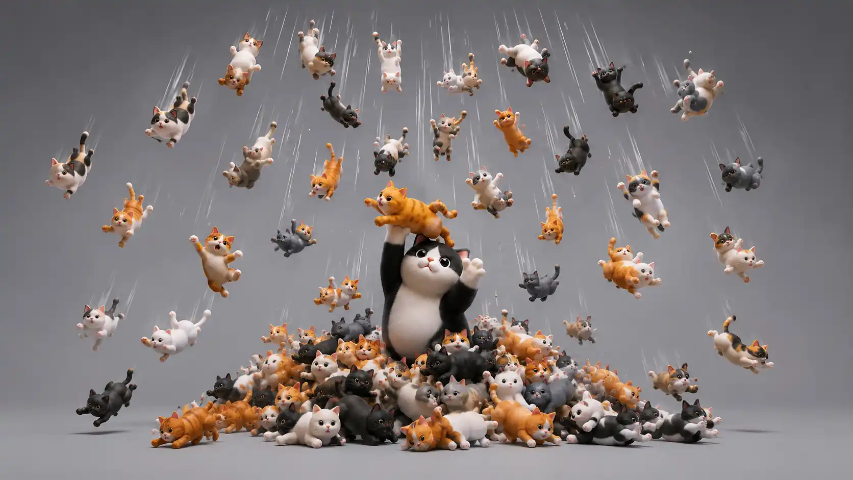
Cat Bounce does one thing with absurd confidence: it fills your browser with cats, lets them bounce around, and gives you permission to grab them like soft little physics objects. There is a button that makes it rain cats. There is no progress bar, no unlockable level, no account, no lore, no daily streak, no second mode waiting behind the curtain. You open it, the cats fall, the cats rebound, and the whole thing immediately explains itself by refusing to explain much at all. The official page greets visitors with the logic of the site in miniature: some cats are bouncier than others, more force means more bounce, and if the background color bothers you, reloading or resizing changes it.
Table of Contents
That thinness is the point. Cat Bounce is not underbuilt; it is edited down to the exact amount of nonsense it needs. Most playful websites are tempted to keep adding. Add a menu. Add settings. Add skins. Add achievements. Add a share mechanic that sits on the page like gum stuck under a desk. Cat Bounce does not behave that way. It acts like someone had a stupid idea, made it properly, and then had the discipline to stop before the joke leaked out. The result is a rare internet object: a website that feels disposable at first click, then strangely durable because nothing in it is trying to become bigger than the moment.
The joke lands before the page finishes loading
Cat Bounce is funny because the premise arrives faster than language. You do not have to read a paragraph, learn a control scheme, or watch a branded intro animation. Cats appear. They bounce. You move the cursor. You poke the system. It reacts. In a few seconds, your hand has already learned the website. That instant legibility is part of its charm. The page feels like a toy you found at the bottom of a drawer: dumb, bright, tactile, and weirdly hard to throw away.
The strongest digital jokes usually have a tiny distance between seeing and doing. Cat Bounce understands that distance perfectly. The site does not build up to the gag. It is the gag. The cats are not decorations for a larger feature; the cats are the interface, the content, the feedback, the physics test, and the punchline. A user does not ask, “What am I supposed to do here?” for very long. The answer is in the motion. Grab one. Fling it. Watch the others ricochet. Press the button. The page will take care of the rest.
There is a particular pleasure in websites that do not demand self-improvement from you. Cat Bounce is not asking you to track your habits, compare prices, build a dashboard, polish your personal brand, or express productivity through color-coded widgets. It gives you a useless action and makes that useless action feel crisp. The small rebellion is not loud, but it is there. In a web crowded with interfaces that want your email address before they let you breathe, a page that only wants you to fling cats around feels almost rude in the best way.
The first laugh is obvious, but the second one is better: the physics is just good enough to make the stupidity tactile. The cats do not merely slide across the screen like stickers. They fall with gravity, collide with the browser edge, respond to force, and carry a little comic weight. The official about page says Cat Bounce uses JavaScript to simulate two-dimensional physics, including friction, gravity, and velocity according to the visitor’s interaction. That makes a difference. Bad toy physics gets boring in six seconds. Cat Bounce buys itself more time because the cats feel responsive enough to invite experimentation.
The site also uses the browser window as a physical room. This is easy to miss because it feels natural once you are playing. The edges are walls. The background is a stage. Reloading is not a reset in the polished game sense; it is more like shaking the box and letting the cats scatter again. Resize the window and the space changes. The browser is not just a delivery container. It becomes part of the toy. That old web trick still works because it makes the screen feel less like a feed and more like a place.
The “Make It Rain” button is the only extra feature the site needs, and it is not really an extra feature so much as a pressure valve. A few cats are funny. Too many cats are funnier. Cat Bounce understands escalation at the level of a playground dare. It does not add complexity; it adds quantity. The same system becomes ridiculous by being overfed. The button is also worded perfectly. It does not say “add more cats” or “increase cat count.” It says what the moment feels like. Rain. Cats. Of course.
A site this small lives or dies by whether the user senses a human joke behind it. Cat Bounce does. Its copy is warm, strange, and lightly theatrical. The page signs its welcome note from “The Management.” It warns you not to bounce too hard because it makes the cats cry. It tells you the rule twice: more force equals more bounce. This is not corporate microcopy pretending to be cute. It reads like a person making a page at human scale, then leaving a note on the fridge.
That note matters because the weirdness never turns cruel. The cats are images, not animals, and the whole page exists in the slapstick register of rubbery internet physics. The copy’s little plea not to bounce too hard softens the absurdity without ruining it. Cat Bounce has the tone of a site that knows the joke is dumb and still wants to keep the room friendly. That is harder than it sounds. A page built around flinging cats could easily tip into mean-spirited chaos. This one stays goofy.
A website with no ambition is rare now
Cat Bounce was created in 2012 by artist Tara Sinn and updated for modern browsers in 2017 by Nick Hulea, according to the site’s own about page. That timeline matters because the page carries the spirit of an older web without becoming a museum piece. It belongs to the tradition of single-serving websites: a clean URL, one joke, one interaction, and no meaningful reason to stay except the pleasure of being there. Those sites were not always technically impressive, but the best ones had a kind of editorial purity. They knew exactly what they were.
The phrase “single-serving website” now feels almost nostalgic, but Cat Bounce shows why the format still works. A single-serving site does not need depth in the usual product sense. It needs an instantly graspable premise, a memorable behavior, and enough craft to make the first click worth passing along. Cat Bounce has all three. The premise is visible. The behavior is physical. The craft is hidden inside the smoothness of the bounce. You do not admire it by reading a feature list. You admire it by accidentally spending longer there than you meant to.
Modern web design often treats simplicity as a sales posture rather than a real limit. A homepage says it is simple, then gives you three pricing tiers, seven badges, six product videos, an exit-intent popup, and a chatbot smiling in the corner. Cat Bounce is simple in the brutal sense: it has almost nothing. That almost-nothingness is not a lack of care. It is the structure. Strip away one piece and the site gets worse. Add the wrong piece and it gets worse faster.
The lack of ambition is refreshing because the site does not try to convert attention into obligation. There is no sign-up wall after three bounces. There is no message saying “create an account to save your cats.” There is no fake community layer around the act of throwing images across a browser window. Cat Bounce trusts the joke enough to let it remain a joke. That trust gives the user room to enjoy it without feeling targeted. The page wants a laugh, not a customer relationship.
This is why the site feels oddly premium despite looking proudly silly. Restraint is a form of taste, and Cat Bounce has more restraint than many serious digital products. It does not confuse delight with decoration. It does not confuse engagement with retention mechanics. It does not confuse interactivity with a menu full of knobs. It gives you a tiny physics sandbox and lets the cats do the work. The confidence of that choice is what makes the page feel finished.
The best part is that Cat Bounce does not beg to be understood. It has an about page, and the about page is charming, but the main site does not need an explanatory frame. It does not show tutorial arrows. It does not announce “click and drag.” It lets affordance do the teaching. A bouncing cat near your cursor is invitation enough. The web used to have more of this: interfaces that trusted curiosity, friction, and accident. You poked things to see what they did. Sometimes you broke them. Sometimes cats rained from the top of the screen.
There is also a quiet design lesson in the absence of options. Options often create the illusion of care while diluting the thing that made a project distinct. Cat Bounce could offer breed selection, speed sliders, background palettes, sound packs, leaderboards, or collectible cat packs. Any of those additions would make sense in a meeting. Most would make the site less memorable. The current version leaves the imagination slightly hungry, which is often better than feeding it with mediocre choices.
When a project is this small, every additional feature becomes a vote against the original idea. That is why “there is no second feature and none is needed” is not just a funny summary; it is a sharp reading of the site. Cat Bounce has enough. The raining cats button is not a second idea, exactly. It is the same idea shouted from a balcony. Everything else would be garnish. The page wins by knowing where the edge is.
Why the cats feel better than they should
The cats in Cat Bounce are not photorealistic avatars, and that helps the site more than it hurts. They feel like cutouts in a browser-sized collage, which keeps the whole scene loose. A slicker version might look like a mobile game ad. A more realistic version might feel uncanny. This version sits in the sweet spot between pet photo, sticker, and physics object. The cats are recognizable enough to be funny, flat enough to be flung, and varied enough to keep the screen from turning into wallpaper.
The motion gives them personality. A bouncing cat becomes a character because the user supplies intention to an accident. One cat tumbles awkwardly and appears indignant. Another ricochets across the screen like it has somewhere to be. A cluster gets trapped in a corner, then one escapes. None of this is scripted as narrative, but the human brain is greedy for narrative. Cat Bounce exploits that greed with almost no machinery. It lets physics produce little incidents, and we do the emotional overdubbing.
The site’s about page describes cats as sovereign, mysterious, charming, graceful, wild, willful, shy, party animals, and smart even when they look dumb. That paragraph is funny because it gives philosophical cover to a browser full of bouncing JPEG cats. It treats the choice of cats as both obvious and cosmic. Why cats? Why not cats? The question answers itself in the culture of the internet. Cats have always belonged online because they are expressive without being obedient. They look like they know something and refuse to explain.
Cat Bounce works because cats are already little physics comedians. A dog falling off a sofa often reads as slapstick. A cat falling off a sofa reads as betrayal by gravity, followed by immediate reputation management. Cats are elastic in the public imagination: they stretch, launch, land, glare, reset. The site takes that shared understanding and exaggerates it. The cats are not trained performers. They are aloof bodies temporarily subject to browser physics. That tiny mismatch is the joke.
The interaction has a pleasing moral ambiguity too. You are clearly responsible for the chaos, but the chaos remains harmless. Dragging and flinging creates the sense of mischief without consequence. The warning not to bounce too hard becomes part of the comedy because users immediately test what too hard means. The site lets you be a nuisance in a sealed digital room. No one gets hurt. No feed gets polluted. No metrics dashboard needs to make sense of your behavior. The cats absorb the impulse.
The page also benefits from a texture of unpredictability. You know what will happen in broad terms. The cats will bounce. You do not know exactly where a dragged cat will land, how the pile will scatter, or what the screen will look like after rain. That tiny unpredictability gives the site replay value without the furniture of a game. It is not deep. It is not trying to be deep. It is just unstable enough to make one more fling feel justified.
The audio support line on the official page appears in the text crawl as a browser compatibility fallback, but the main experience is visual and physical. Cat Bounce would still work muted, in a shared office, at 1 a.m., or on a laptop with the sound off. That matters because small web toys survive by fitting into stolen moments. The site is something to send in a chat, open between tasks, or rediscover when someone asks for a weird website. It does not need the conditions a larger experience requires.
There is an old-fashioned joy in making the cursor feel like a hand again. Many modern interfaces reduce the cursor to a selector for buttons, cards, and fields. Cat Bounce makes it grabby. You can seize a cat, throw it, and immediately see the result. That is a simple trick, but it restores a little physicality to the browser. The page is not asking you to scroll; it is asking you to handle something. Even if that something is ridiculous, the handling feels good.
What the page actually gives you
| Element | What it does | Why it matters |
|---|---|---|
| Bouncing cats | Cats fall, collide, and rebound | The entire joke stays visible |
| Click and drag | Visitors fling cats with force | The user becomes the chaos engine |
| Make It Rain | More cats drop into the scene | Escalation without complexity |
| Changing background | Reloading or resizing changes the backdrop | The room feels lightly alive |
| Minimal copy | A strange note from “The Management” sets the tone | The page gets a voice without overexplaining |
This compact setup explains why the site sticks. Every element either feeds the bounce, increases the absurdity, or protects the tone. Nothing asks the visitor to manage preferences, study rules, or perform identity. Cat Bounce is almost brutally clear about what belongs on the page. Cats belong. Gravity belongs. A rain button belongs. Almost everything else does not.
The hidden craft of making something this pointless
Pointless websites are easy to dismiss until you try to make a good one. The weaker ones are random; the better ones are exact. Cat Bounce falls into the second group. Its uselessness is not a lack of design. It is the design problem. The site must communicate the joke instantly, reward touch, avoid confusing the user, keep the cats readable, survive different screen sizes, and maintain the feeling that none of this has been overworked. That is a narrow target.
The about page says the site uses JavaScript to simulate two-dimensional physics, with friction, gravity, and velocity shaped by user interaction. Those words sound plain, but they describe the difference between a static gag and an interactive object. If the cats bounced too mechanically, the page would feel dead. If they bounced too wildly, the user would lose them. If the friction felt wrong, the screen would become noise. The site needs the physics to be funny, not realistic. That distinction is crucial.
A polished product team might ask for a clearer user journey, and that is exactly what would ruin it. Cat Bounce’s user journey is: arrive, laugh, touch, overdo it, leave, send it to someone. The cycle is small and complete. The site’s job is not to guide you toward mastery. There is nothing to master. The pleasure comes from impulse and reaction. A good weird website knows the difference between a toy and a task. Cat Bounce is a toy all the way down.
The copy deserves more credit than it usually gets. The voice makes the page feel hosted rather than merely deployed. “The Management” is a perfect signature because it creates a fake institution around total nonsense. It suggests that somewhere, somehow, a serious committee has reviewed the cat-bouncing protocols and reached a position. Please bounce responsibly. More force equals more bounce. We love you. The joke is not only visual; it lives in the strange etiquette around the bouncing.
Cat Bounce also resists the dead hand of explanation. Its about page offers context, credits, links to cat causes, and code-learning resources, but the main page stays clean. That split is smart. Visitors who want the bit get the bit. Visitors who want to know who made it or why it exists have somewhere to go. The experience does not collapse under its own footnotes. It is a small example of information architecture serving tone.
The site’s longevity hints at a type of web craft that is easy to underrate because it is not heavy. Cat Bounce is not a technical showcase in the way a generative 3D demo or data visualization might be. Its trick is smaller. It makes a basic browser interaction feel memorable. That is the craft of selection, timing, restraint, and comic feel. A joke page without feel is landfill. A joke page with feel becomes a link people remember years later.
The page won a Webby in the Weird category in 2019, according to the Webby Awards listing. That recognition feels less like a trophy for novelty and more like a trophy for survival. Cat Bounce had already been online for years by then. Many viral web jokes burn bright, get scraped into listicles, and rot. This one kept being sent around because the original interaction remained intact. The web changes around it, but the cats still bounce.
Laughing Squid wrote about Cat Bounce in October 2012, describing it as an interactive site by New York City artist Tara Sinn where images of cats bounce around the screen, with a recommendation to click “make it rain.” That early description is still basically the whole pitch. The fact that a 2012 summary still explains the site cleanly in 2026 is not a weakness. It is proof that the idea did not depend on a passing interface trend. The page is a small machine with one job, and the job has not expired.
The update for modern browsers in 2017 matters for another reason. Many weird old websites die not because people stop liking them, but because browsers move on. Plugins vanish. APIs change. Mobile habits shift. Hosting lapses. Old code breaks quietly. Cat Bounce avoided becoming a fossil by receiving enough care to keep functioning. Preservation on the web often looks like glamorous archiving from the outside. Here, it looks like keeping the cats bouncing.
There is something admirable about maintaining a joke past its first burst of attention. The internet rewards novelty, but affection often builds through return. A user might forget Cat Bounce for years, then suddenly remember it when someone asks for useless websites. The URL still works. The cats still fall. The button still rains. That continuity is a small kindness. It preserves not only a page, but a mode of browsing that feels less algorithmic and more accidental.
The web needs tiny rooms like this
Cat Bounce belongs to the room-sized web, not the platform-sized web. A platform wants scale, governance, retention, policy, monetization, identity, and endless surface area. A room-sized website wants one visitor to step inside and notice something. It has walls. It has a mood. It has a trick. You can leave without losing your place because there was never a place to lose. That kind of web still matters because not every online experience should become infrastructure.
The site is also a useful antidote to the feed as default environment. Feeds flatten everything into comparable units: videos, posts, ads, arguments, screenshots, performances. Cat Bounce is not a unit in a feed when you open it. It becomes a place with behavior. The user is not consuming a stream; the user is touching an environment. Even a tiny environment changes the mood of browsing. It interrupts passive scrolling with small physical agency.
There is no content calendar inside Cat Bounce. The page does not need to post. It does not chase relevance by commenting on the day’s discourse. It does not generate new entries for the sake of activity. It remains itself. That is almost exotic now. Many digital projects feel anxious when they are quiet. Cat Bounce is quiet except for the cats. Its silence is part of the confidence. It does not try to prove it is alive by moving the goalposts.
This is the internet as a cabinet of curiosities rather than a shopping mall. You open a small door, see something improbable, and maybe show someone else. The value is not efficiency. The value is flavor. Cat Bounce has flavor because it is specific. Bouncing cats are not a metaphor for a productivity framework. They are bouncing cats. The project’s refusal to translate itself into use cases is why it feels like a discovery rather than a product demo.
The site’s about page points visitors toward cat rescue organizations and code-learning resources, which adds a gentle layer without forcing virtue onto the main joke. That choice feels human because it lets the absurd page have a conscience without making the absurdity wear a sash. If the bouncing cats make you fond of cats, there are real cats that need care. If the page makes you want to build a weird webpage, there are paths into code. The links sit off to the side, where they belong.
Cat Bounce also shows how low-stakes creativity lowers the barrier to making things. Not every web project needs a pitch deck or a market. Some projects begin because a person thought, “What if cats bounced around the browser?” That kind of impulse built much of the playful web. It still matters because small, unserious projects give new makers permission to experiment. A useless page can be a better invitation to code than a polished course landing page.
The creator credit matters here. Knowing that Cat Bounce was made by an artist who dabbles in code gives the project the right scale. It does not feel like a laboratory demo or a startup experiment. It feels like an artist’s joke that found its medium. The web is good at this kind of object when it is allowed to be. A webpage can be a sketch, a toy, a postcard, a prank, a little stage. Cat Bounce is all of those without needing to choose one.
The project also avoids the common trap of explaining weirdness until it becomes normal. Its about page has a “Why cats?” section, but the answer is playful and slippery rather than definitive. It talks about cats as sovereign creatures and then drifts into the idea that the site may not be about cats at all. That is the right answer because a fully rational answer would be worse. Weird websites need enough explanation to welcome people, not enough to pin the butterfly.
This is why Cat Bounce remains recommendable. It gives the reader the exact feeling Web Radar exists to chase: I did not know this existed, I am glad I found it, and I want to open it immediately. It is not a grand discovery. It is better than that. It is a tiny, complete thing. The internet is full of enormous systems with unclear human purpose. Cat Bounce is a small system with a very clear silly purpose. Open browser. Bounce cats. Make it rain.
The pleasure of a website that refuses to become content
A strange thing happens when you try to describe Cat Bounce: the description is accurate and still inadequate. “A website of bouncing cats” tells the truth. “You can grab and fling them” tells more of it. “There is a button that makes it rain cats” finishes the practical explanation. Yet the page still needs to be opened because the charm lives in timing, weight, and the first ridiculous collision. Some web experiences cannot be paraphrased without losing the reason they work.
That quality protects Cat Bounce from being fully absorbed into screenshots. A screenshot of Cat Bounce is almost useless. It shows cats, but not bounce. It shows layout, but not force. It shows absurdity, but not the user’s hand entering the system. The page is native to interaction. It needs the browser, not because the browser is advanced, but because the joke is kinetic. The internet has become very good at turning everything into image previews. Cat Bounce resists by being better in motion.
The site also resists content inflation. A lesser version would surround the interaction with cat facts, cat memes, cat quotes, social widgets, and probably a merch link. Cat Bounce does not need thematic filler. The cats themselves are not a brand universe. They are props in a tiny physical comedy. The restraint keeps the visitor focused on the one action that matters. Grab. Release. Bounce. Rain. Repeat until the joke has given you enough.
There is a lesson here for serious design too. A strong interaction can carry more emotional weight than a long feature list. Cat Bounce’s interface is primitive by corporate standards, yet the page is memorable because the interaction has feel. The user’s movement changes the system instantly. The feedback is visible. The result is funny. Many expensive products fail at this basic loop. They have features, but no feeling. Cat Bounce has almost no features and plenty of feeling.
The humor also gains from being nonverbal enough to cross contexts. You do not need much English to understand falling cats and a rain button, though the copy adds personality for those who read it. The core gag belongs to slapstick, toy physics, and internet animal affection. That makes it easy to pass around. A person can send Cat Bounce without a long setup. “Open this” is enough. Good discovery links often travel because they do not require the sender to become a salesman.
The site’s long shelf life is also tied to how little it asks from the visitor’s mood. Some funny websites depend on being in the right cultural moment. Some depend on knowing a reference. Some depend on a specific kind of irony that goes stale. Cat Bounce depends on a much sturdier combination: cats, motion, mischief, and surprise. Those ingredients age better than most internet jokes. The presentation may feel of a certain era, but the impulse underneath is older than the web: throw soft thing, watch soft thing bounce.
Its uselessness is clean rather than cynical. Cat Bounce does not mock the visitor for enjoying it. Some weird web projects carry a sneer, as if the joke is that you are wasting your time by being there. Cat Bounce wastes your time kindly. It gives the waste a shape, a soundless rhythm, a little burst of chaos. That generosity is part of why it is easy to recommend. The site is dumb, but not contemptuous. It laughs with the visitor, not at them.
The “Make It Rain” control is a perfect example of escalation as delight rather than feature creep. It does not ask you to switch modes or learn a system. It simply pours more of the same joke into the same space until the screen becomes absurd. The moment works because abundance is funny when the base object is already funny. One cat is a gag. Many cats are weather. The button understands comedy at the level of mass.
Cat Bounce also has a subtle anti-product lesson: sometimes delight comes from not knowing what the user will do next. A product analytics mindset wants to define funnels and outcomes. Cat Bounce has outcomes, but they are messy: a laugh, a screenshot, a link sent to a friend, a brief spell of procrastination, a rediscovery years later. These are not useless outcomes just because they are hard to measure. The web loses something when only measurable outcomes are treated as real.
The page is memorable because it gives permission for unserious attention. Attention online is often framed as either productive or wasted. Cat Bounce slips between those categories. It is not productive, but the word “wasted” feels too harsh for a minute spent with a good joke. There is a difference between being drained by a feed and being briefly amused by a handmade oddity. One leaves a residue. The other clears the palate.
Cat Bounce as internet taste test
Recommending Cat Bounce is also a small test of taste. Some people will open it, bounce one cat, press the rain button, and immediately get it. Others will ask what the point is. Both reactions are fair, but they reveal different expectations for the web. If every page must justify itself as information, service, status, or commerce, Cat Bounce looks empty. If a page is allowed to be a tiny experience, Cat Bounce looks complete.
The site belongs on the same mental shelf as other links people keep around for mood rather than function. It is not useful, but it is useful to know that such uselessness still exists. That sounds paradoxical only if utility is defined too narrowly. The web is not only a tool belt. It is also a social space, an art medium, a toy chest, and an archive of odd decisions made by specific people. Cat Bounce earns its place by being one of those decisions in pure form.
There is a mild sadness in the fact that a page like this now feels almost radical. It should not be radical to make a site that does one funny thing and leaves the visitor alone. Yet compared with the current web’s appetite for accounts, notifications, and extraction, Cat Bounce feels unusually polite. It gives without asking much back. It can be opened, enjoyed, and closed cleanly. That cleanliness is rare enough to notice.
Cat Bounce’s weirdness also feels different from randomness. Random is cheap; specific is durable. A random site might throw any animals, any objects, any noise, any joke into the browser. Cat Bounce is specific in its noun, verb, and texture: cats bounce. The entire identity sits in those two words. The rain button extends that identity without wandering away from it. Specificity is why the URL sticks in memory. Once heard, Cat Bounce is almost impossible to misunderstand.
The page’s fame across blogs and lists makes sense, but it remains better as a direct link than as an entry in a roundup. Roundups flatten weird sites into specimens. Cat Bounce is not a specimen when it is open. It is a little physical scene. That is why the source section can tell you where it came from, but the real recommendation is still to click the site itself. The page makes its case better than any paragraph can.
A more ambitious product might have turned Cat Bounce into an app. That would probably make it worse. Apps bring installation, permissions, icons, updates, store screenshots, and the heavy smell of permanence. Cat Bounce belongs in a tab precisely because it is light. The browser gives it the right level of commitment. A URL is enough. A tab is enough. A minute is enough. The site’s scale matches its promise.
The Webby recognition in 2019 gives it a neat badge, but the true award is that the joke still works without the badge. You do not need to know it won anything to enjoy it. Awards can explain why a site deserves attention, but they cannot create the first bounce. Cat Bounce had to earn that itself. It earned it by being immediate, tactile, funny, and small. The award is context. The cats are the experience.
There is also a useful distinction between minimal and thin. Thin work runs out because there was never much intention behind it. Minimal work keeps delivering because the intention has been compressed. Cat Bounce is minimal. The interface is small, but the decisions are sharp: cats as subject, physics as engine, browser window as room, fake management voice as tone, rain as escalation. These choices make the page feel authored.
Authorship is the quality that keeps returning in small weird websites. You can feel that someone chose this. Not a committee. Not a content strategy document. Someone chose the cats, the bounce, the line about force, the warning, the rain. The page has a human fingerprint even though the interaction is code. That fingerprint gives the whole thing warmth. It is why Cat Bounce feels like a found object rather than a generated distraction.
This is also where the site says something about internet culture without trying to. Cats became online icons because they combine cuteness with refusal. They are expressive, but not obedient. They are domestic, but not fully domesticated in vibe. They are perfect material for a medium built on sharing, remixing, and projecting feelings onto images. Cat Bounce taps that cultural current without making a lecture out of it. The cats bounce because cats on the internet already bounce around meaning.
The button is the philosophy
The “Make It Rain” button is the moment when Cat Bounce becomes unavoidable. It takes the site’s one idea and proves that more of it is somehow funnier than enough of it. Before pressing it, you understand the page. After pressing it, you understand the page’s sense of humor. The button is not subtle. It is not clever in a puzzle-box way. It is generous, dumb, and correct. Sometimes the right design decision is just to drop more cats from the sky.
That button also reveals the site’s refusal to create hierarchy. No cat is special. There is no main character, no rare cat, no reward cat, no boss cat. They are all bodies in the same comic field. The visitor’s attention moves wherever the collisions send it. This creates a democratic silliness. The page does not tell you where to look. It lets chaos compose the scene. That looseness keeps the experience from feeling scripted.
The rain mechanic carries an echo of old desktop toys and screensavers. It turns the browser into something closer to a kinetic poster. You can interact, but you can also sit back and watch. The cats continue to move. The page does not require constant input. In that sense, Cat Bounce has a screensaver soul: animated, unnecessary, atmospheric, a little hypnotic. It is less a game than a moving desktop mood with better timing.
What makes the page stand out is not only that it is silly, but that the silliness has no hidden agenda. A branded site might use the same mechanic to sell cat food. A growth project might turn it into a viral referral loop. A mobile game might add coins. Cat Bounce stays clean. Its agenda is the bounce. The purity is funny because it feels almost irresponsible. Someone spent real care on a thing that refuses to become sensible.
There is also pleasure in the site’s modest grammar. Cat. Bounce. Make it rain. More force equals more bounce. The words are short. The actions are short. The feedback is immediate. The whole project speaks in verbs and nouns, which suits the joke. It does not need adjectives piled on top. The cats supply the adjectives through motion: frantic, limp, springy, doomed, triumphant, offended.
This is why Cat Bounce makes a good Web Radar subject. It is not obscure because it is inaccessible; it is obscure in the way a strange alley shop is obscure. It is sitting there, open to anyone, but outside the main lanes of online attention. It does not need a login. It does not need a tutorial. It does not need your demographic data. It waits at a simple address with a simple promise. Open it and the cats bounce.
The page’s lasting charm comes from a perfect match between idea and medium. Bouncing cats would be less funny as a static poster. It would be overdeveloped as a full game. It would be trapped as a video because you could not touch it. The browser is exactly right: light enough for a joke, interactive enough for physics, shareable enough for discovery, disposable enough for the premise. Cat Bounce is not just a funny idea online. It is a funny idea shaped correctly for the web.
That shaping is what separates memorable web oddities from novelty debris. The best useless websites are not random acts of weirdness; they are tiny systems with taste. Cat Bounce has taste because it stops. It does not keep pleading for attention after the first laugh. It lets the user decide when the moment is over. That confidence makes the page easier to return to. There is no burden attached to it. You can open it again years later and still know exactly what to do.
The site is also a reminder that small web experiences age differently from large platforms. Platforms age through policies, redesigns, scandals, user migrations, and business pressure. A tiny page ages through whether its core trick still runs and still feels good. Cat Bounce’s survival is refreshingly concrete. Do the cats still bounce? Does the rain button still rain? Does the page still make someone smile before they overthink it? Yes. That is the maintenance contract.
The joke may be simple, but the absence of a second feature is the rarest feature of all. Cat Bounce understands the discipline of enough. It gives you cats. It gives you bounce. It gives you rain. It gives you a little note from management and a strange doorway into cat causes and code resources for anyone curious enough to look deeper. Then it steps aside. It knows that the minute it tries to become bigger, it becomes smaller.
Cat Bounce is worth opening because it restores a lost feeling of the web as a place where someone might have made something for no reason except the reason itself. Not every page needs to teach, sell, persuade, automate, or collect. Some pages only need to make a visitor grin and send the link to another person with no explanation. Cat Bounce does that with bouncing cats and a rainstorm button. There is no second feature. None is needed.
Questions people ask after opening Cat Bounce
Cat Bounce is a tiny interactive website where cats fall, bounce around the browser window, and can be grabbed and flung with the cursor. Its whole appeal comes from how quickly the joke works.
Barely, and that is the point. The one extra escalation is the “Make It Rain” button, which drops more cats onto the page. It does not need a second real feature.
Cat Bounce was created by artist Tara Sinn and later updated for modern browsers by Nick Hulea, according to the site’s official about page.
Because it is a rare example of a web toy that knows exactly when to stop. It gives you one absurd interaction, makes it feel good, and leaves before it becomes bloated.
Author:
Jan Bielik
CEO & Founder of Webiano Digital & Marketing Agency
This article is an original analysis supported by the sources cited below
CAT BOUNCE!
The official Cat Bounce website, used to verify the current main experience, the bouncing-cat interaction, the “Make It Rain” button, the welcome copy, and the site’s own explanation of force, bounce, background changes, and tone.
About Cat Bounce
The official about page for Cat Bounce, used for creator and update credits, the JavaScript physics description, the site’s explanation of why it uses cats, and the supporting links around cat advocacy and code learning.
CAT BOUNCE! at The Webby Awards
The official Webby Awards winner listing, used to verify Cat Bounce’s 2019 recognition in the Weird category.
Cat Bounce, a website of bouncing cats
Laughing Squid’s 2012 write-up, used as an early external reference for how the site was described when it first circulated widely.
| Citing this article? Brief excerpts are welcome. Please credit Webiano.digital, name the author where stated, and include a link to https://webiano.digital and to this original article. Full or substantial republication requires prior written permission. Read our Copyright and Content Use Policy. |
This article was prepared with the assistance of artificial intelligence tools. The content underwent expert human review, and Webiano Digital & Marketing Agency assumes editorial responsibility for its final version and publication.