
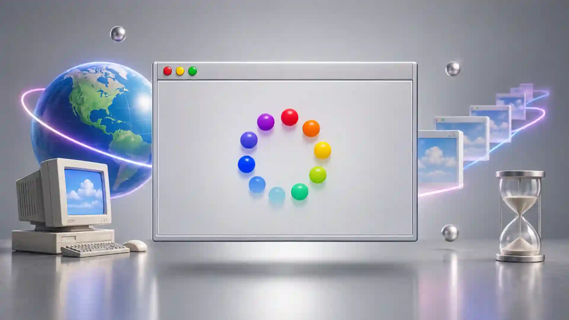
There is a peculiar kind of confidence in a website that greets you with grand promises, shows you a spinning animation, plays a booming voice, and then refuses to get to the point. Zombo.com built its entire reputation on that refusal. For decades, the site promised that anything was possible there while offering almost nothing to do. The joke was not hidden behind a menu, buried in an About page, or reserved for people who understood web development. The joke was the website.
Table of Contents
Open the original experience and you are confronted with what looks like an introduction to something enormous. The page behaves as though a vast digital destination is about to reveal itself. A theatrical voice welcomes you. Colored circles pulse or spin. You are told that possibility itself has arrived. The presentation keeps building, but the destination never appears. The waiting is the destination.
That absurdly small idea turned Zombo.com into one of the web’s most durable inside jokes. The Web Design Museum dates the original to 1999 and describes it as a parody of the flashy introductory screens that had become fashionable at the end of the 1990s. Those intros were supposed to create anticipation while a website loaded. Zombo.com removed the website and kept the anticipation.
The result is almost aggressively simple. A normal site tries to justify your click by delivering information, entertainment, tools, products, conversation, or some other payoff. Zombo.com delivers the feeling that payoff is about to happen. That one move turned a loading screen into satire.
The joke also survived long enough to become something else. It outlived the design fashion it mocked. It survived the disappearance of Flash. It was rebuilt in HTML5. It became a reference point for programmers, cartoonists, designers, and people who simply liked weird websites. Then, in February 2026, the domain itself changed hands and the live site was redesigned, introducing a new logo, different audio, a progress bar, and a message from “New Management.” The current page says the domain was purchased through GoDaddy and that its operators would like to buy the rights to the former site’s content.
That creates an unexpectedly good reason to visit Zombo.com now. You are no longer looking at one old internet joke. You are looking at an old internet joke that has become a small argument about preservation, ownership, nostalgia, and what happens when a domain survives longer than the culture that made it famous.
The original version remains available through recreations and archives, so the joke itself has not vanished. The current Zombo.com, though, is a different object. It sits in the strange position of being both the official address and not quite the thing people remember. The URL survived. The experience did not survive intact. That distinction makes Zombo.com more interesting in 2026 than a simple retro-site recommendation would suggest.
The perfect website for doing absolutely nothing
The original Zombo.com has one of the cleanest comedic structures ever put on a web page. It creates expectation, stretches it, and never resolves it. That is the whole machine.
The visual setup was sparse. A logo. A circular group of colored elements. Lots of blank space. The page looked less like a destination than the prelude to one. Every visual cue told you that you had arrived too early. The site appeared to be preparing itself for your presence.
Then came the voice. Deep, dramatic, strangely reassuring. It told visitors that they had reached Zombo.com and that extraordinary things were possible there. The delivery was slow enough to feel ceremonial. The voice spoke with the authority of a corporate launch presentation and the substance of a screensaver.
That mismatch gave the page its character. The design was not trying to be chaotic. It was not packed with random GIFs or deliberately ugly elements. Zombo.com looked controlled. Its absurdity came from how seriously it treated its own emptiness.
The best parody often works by removing one part of a familiar structure and leaving everything else intact. Zombo.com did exactly that. Commercial websites of its era frequently treated an animated intro as proof of sophistication. Visitors might sit through a logo reveal, music, spinning objects, swooping typography, or a mysterious percentage counter before being allowed into the real site. Zombo.com asked what would happen if the introduction never stopped being an introduction.
The answer was surprisingly funny.
The site eventually offered a “newZletter” sign-up link, but even that was part of the routine. Contemporary descriptions of the original note that the link led to another non-event, thanking users for their patience instead of delivering a functioning newsletter. Even the closest thing to a feature refused to become useful.
Nothing about the joke requires specialist knowledge. You do not need to remember Netscape Navigator, dial-up modems, or browser plug-ins to understand the basic trick. A website keeps promising that something is coming, and nothing comes. The longer you stay, the more ridiculous the promise becomes.
Knowing the historical target does sharpen the joke. Late-1990s and early-2000s web design had a particular affection for theatrical entrances. Designers suddenly had access to animation, sound, vector graphics, and interactive presentation through Flash. Many treated that freedom like filmmakers discovering the crane shot. If movement was possible, movement appeared.
Zombo.com turned that exuberance into a deadpan loop.
Its restraint matters. Imagine the same joke filled with dozens of buttons, hidden gags, fake products, fake testimonials, pop-ups, and elaborate easter eggs. It might still be amusing, but it would become a comedy site. Zombo.com is funnier because it refuses to become anything at all.
That refusal is why it fits the category often called a single-serving website. Such sites are built around one narrow idea rather than an expanding body of content. Zombo.com pushes the format toward its logical edge. The single serving is anticipation.
There is also something oddly generous about the page. It does not trap you with registration, ask for personal data, load a dashboard, explain a pricing plan, or demand that you learn its interface. You understand Zombo.com within seconds. Remaining there is entirely voluntary.
That made it unusually shareable. Someone could send a link with no explanation. The recipient would open it, wait, listen, and eventually realize that the waiting itself was the joke. The confusion was part of the delivery mechanism.
This type of sharing mattered before social feeds turned every link into a preview card accompanied by comments, engagement counts, thumbnails, and explanations. A bare URL could still arrive in an email, chat window, forum thread, or message with no clue attached. Zombo.com benefited from being discovered before it was explained.
The modern web has made that kind of surprise harder. Search engines summarize pages. Browsers show previews. Social platforms wrap links in context. Recommendation systems try to tell you why something deserves attention before you open it. Zombo.com belongs to an internet where clicking an unexplained address still felt like opening a strange door.
That is one reason the site continues to work as a discovery object. Its value is not proportional to the amount of content it contains. It works because the page turns your own expectation into the content.
You arrive with a simple assumption: a website should lead somewhere. Zombo.com keeps that assumption alive for just long enough to expose it.
What actually happens at Zombo.com
| Version | What you encounter | Why it matters |
|---|---|---|
| 1999 original | Flash animation, looping welcome, endless anticipation | The loading screen becomes the entire joke |
| 2021 HTML5 version | The core visual and audio idea recreated without Flash | The joke survives its dead technology |
| 2026 current site | New branding, new audio, progress bar, management notice | The famous URL now tells a new story about ownership and preservation |
The table looks almost absurdly small because Zombo.com itself is absurdly small. Its history is easier to understand as three changes in context than as three giant redesigns. The central idea stayed recognizable for years, even while the technology underneath it changed. In 2026, the break became much more obvious.
The strange thing is that this tiny site has generated more commentary than websites thousands of times larger. People have called it brilliant, pointless, beloved, useless, and strangely representative of the internet. In a 2003 Guardian interview, web animator Joel Veitch named Zombo.com his least useful website because, as he put it, it “doesn’t do anything except tell you how wonderful it is.” That criticism is practically a description of the punchline.
A useless site normally disappears because nobody has a reason to return. Zombo.com reversed that logic. Its uselessness became the reason to remember it.
Why the joke worked in 1999
To understand why Zombo.com landed so neatly, you have to remember what Flash represented before it became shorthand for obsolete technology. Flash made the web feel theatrical.
Basic HTML pages could already be lively, messy, colorful, and personal. Flash added a different kind of control. Designers could create tightly choreographed motion, synchronized sound, custom interfaces, transitions, games, strange menus, animated typography, and entire experiences that behaved less like documents and more like little pieces of software.
The technology had genuine creative power. Entire genres of browser games, animation, experimental storytelling, portfolio design, and interactive art grew around it. The mistake was not using Flash. The mistake was assuming that animation automatically made a website more impressive.
Intro screens became one of the era’s most recognizable habits. Instead of seeing the site immediately, visitors sometimes encountered a presentation before the presentation. A logo might assemble itself. Music might fade in. A loading percentage might crawl across the screen. Then a “skip intro” button appeared, quietly admitting that many visitors wanted to avoid the thing someone had spent hours building.
Zombo.com made the skip-intro problem impossible to ignore. If the intro is so spectacular, why rush past it? If the intro is the proof of creativity, why bother with the ordinary pages after it? What if the site simply stays in introduction mode forever?
That is not a complicated critique, but it is precise. The page targets the exact moment when visual ambition becomes self-parody.
The joke also caught the inflated language of the commercial web. Technology companies have always liked large promises, but the late 1990s gave those promises a special flavor. Websites were not merely pages. They were portals, communities, destinations, virtual worlds, gateways, revolutions, new economies. Zombo.com offered the biggest possible promise in the smallest possible package.
Anything was possible.
Nothing happened.
The contradiction is almost mathematical.
The site’s voice plays a huge role here. Text alone would make the concept feel like a slogan. The spoken welcome gives it drama. You are not reading a joke; you are being inducted into it. The voice stretches simple phrases into declarations, as though an unseen host is introducing the future.
The visual loop works with the voice because both imply movement without progress. The circles spin. The speech continues. Time passes. Activity is everywhere, but change never arrives.
Anyone who has watched a progress indicator remain stuck at 99 percent already understands the psychological mechanism. Motion tells us to keep waiting. A status animation suggests that the system is working on our behalf. Zombo.com turns that tiny interface convention into a promise that can never be completed.
The site also arrived at exactly the right point in web culture. In 1999, the medium was old enough for recognizable design clichés to exist but young enough for those clichés to still carry excitement. You could parody the web because the web had developed habits.
That matters. A joke about Flash intros in 1994 would have been premature. A joke about them in 2010 would have felt nostalgic. In 1999, the target was alive.
The Web Design Museum places Zombo.com directly inside this moment, describing it as a parody of the creative but often pointless Flash intros then in fashion. Its archive credits 15footstick as the author and preserves Zombo.com alongside other examples of late-1990s design. Seen in that museum context, Zombo.com looks less like random internet nonsense and more like a tiny piece of design criticism.
The criticism works because it never explains itself. There is no essay about usability. No manifesto about unnecessary animation. No lecture about loading time. The site demonstrates the problem by becoming the problem.
That is a much sharper form of satire than merely saying “Flash intros are annoying.” Zombo.com lets you feel the gap between spectacle and purpose.
It also mocks the idea that a website needs a grand identity. The name “Zombo.com” sounds specific enough to imply a brand but vague enough to mean nothing. You expect some explanation of what Zombo is. No explanation arrives, which makes the name sound increasingly important and increasingly empty at the same time.
This is one of the reasons the audio became memorable. Repetition changes the word. After hearing “Zombo.com” enough times, it stops sounding like a domain and starts sounding like a place, a philosophy, a product, a cult, a theme park, or a company whose business model has yet to be invented.
The domain ending matters too. In 1999, “dot com” carried cultural electricity. The address was not merely a location; it was part of the identity. Companies added “.com” to names because the suffix itself suggested futurity and commercial possibility. Zombo.com made the suffix part of the chant.
The page therefore parodied more than loading screens. It parodied a whole mood around the web: the belief that being online, animated, branded, and mysterious was itself enough to justify attention.
What makes the joke unusually durable is that the target never entirely disappeared. The technologies changed, but the behavior did not. Modern sites rarely force users through a full-screen Flash intro, yet plenty still wrap modest functions in enormous claims, animated launch sequences, cinematic scrolling, artificial wait states, and language that promises far more than the product actually does.
Zombo.com no longer looks like a parody of one obsolete design habit. It looks like a parody of presentation without substance.
That keeps it fresh.
A new visitor who has never seen Flash may miss the original reference and still understand the joke through current experience. They have seen apps promise to change their lives. They have watched landing pages spend hundreds of words explaining a product that could be described in one sentence. They have waited for animated loading indicators, onboarding screens, and launch videos. The vocabulary changed. The gap between promise and delivery did not.
This is also why old descriptions of Zombo.com remain so good. Dave Rowntree of Blur reportedly praised the site because it summarized the internet as a place that promises the earth and delivers a bit of animation with scratchy sound. Joel Veitch disliked it for almost the same reason. People could disagree about whether the site was funny while agreeing on exactly what it was doing.
That is a sign of a strong joke. The mechanics are unmistakable.
A tiny page that understood web attention
Most websites want to reduce uncertainty. Zombo.com depends on it.
A useful site tells you where you are, what you can do, and what will happen if you click. Zombo.com tells you that you are somewhere extraordinary and then withholds every practical detail that might prove the claim.
This produces a funny tension. Visitors know they are probably being fooled, yet the interface keeps asking for another few seconds. The site turns patience into participation.
You do not merely observe Zombo.com. You decide how long to believe it.
That may sound like too much philosophical weight for a looping joke, but the mechanism is concrete. Every extra second is a tiny wager that something else might happen. Perhaps the animation will finish. Perhaps a menu will appear. Perhaps the voice will reveal the point. Perhaps the absurdity itself will escalate.
The longer nothing happens, the more invested you become in the possibility that something eventually will.
That relationship between time and expectation is common across the web. Infinite-scroll feeds exploit curiosity about the next item. Video platforms tease the next recommendation. Games use progress bars and reward loops. E-commerce sites use countdowns and stock notices. Zombo.com does something much cleaner: it creates anticipation and then refuses to monetize it.
There is no catalogue waiting behind the spinner. No premium tier. No conversion funnel. No treasure.
The user’s attention becomes the only resource being spent.
This is why Zombo.com feels almost restful compared with the modern commercial web, despite being built around delay. The site wastes your time openly. Most modern sites pretend not to.
A news site may make you close a newsletter box before reading. A recipe page may bury the recipe under ads and storytelling. A software site may require you to watch an onboarding sequence before using a simple function. A social app may keep you scrolling long after you intended to stop. Zombo.com announces its emptiness through exaggeration.
It is honest nonsense.
There is no dark pattern hidden inside the original joke. The page does not manipulate you into buying something. It manipulates you into staying for another sentence because the voice sounds so certain that a payoff exists.
That distinction explains why people remember it fondly. The site wastes time without trying to own your future time. When you leave, Zombo.com does not send a push notification asking you to return.
Even the newsletter joke satirized the idea of an ongoing relationship rather than building one. A visitor waited for the site, reached a newsletter invitation, and discovered another joke instead of a marketing database. The page performed the shape of a commercial website without doing the commercial work.
There is something almost luxurious about that now.
The modern web rewards measurement. Teams test calls to action, track conversion, study retention, compare funnels, and ask where users drop off. A page with one looping gag and no practical objective looks irrational under that model.
Zombo.com succeeds precisely because it has no sensible success metric.
How would you judge it? Session duration would be misleading because confused visitors might stay longer. Conversion would be meaningless. Page depth would be zero. Feature adoption would not exist. Revenue per user would be comical.
The only useful question is whether someone remembers it.
People did.
That makes Zombo.com a good example of something the web sometimes forgets: memorability and utility are not the same thing. A page can be useless and culturally sticky. A technically modest object can outlast ambitious services because it creates a sharper mental image.
This is common in art, jokes, logos, songs, and physical objects. It is less common in software, where products are often evaluated by what they enable. Zombo.com occupies the border between website and performance piece. Its behavior is the content.
The internet has always had room for pages like this. Personal homepages, net art, joke domains, one-off experiments, fake interfaces, browser toys, and deliberately pointless sites formed a parallel web next to search engines, shops, portals, and services.
Zombo.com belongs to the web as playground rather than infrastructure.
That distinction matters because the modern web often feels increasingly instrumental. A page exists to sell, inform, capture, rank, convert, transact, authenticate, stream, or retain. Even playful sites frequently connect back to a creator’s portfolio, store, newsletter, sponsorship, or social profile.
Zombo.com arrived from a culture where publishing something strange could be reason enough.
The domain itself became part of the artwork. You did not visit a Zombo page hosted inside a larger platform. You went to Zombo.com. The address and the joke were fused.
That makes the 2026 ownership change more than a technical footnote. If the work depends on its domain, what happens when the domain changes hands?
The code can be copied. The animation can be recreated. The sound can survive. An archive can preserve the historical files. But a web work tied closely to one famous address has another layer: the continuity of the URL.
The current owners possess that continuity. The classic reproductions possess more of the old experience. Neither alone is exactly the same as the original cultural object.
That split is fascinating because it exposes something unusual about digital preservation. A painting does not normally have a DNS record. A film does not become a different film because its official homepage expires. A website can be inseparable from a domain that remains a tradable asset.
Preserving a web experience can require preserving both the files and the address people remember.
That is harder than it sounds.
A domain registration must be maintained. Hosting must continue. Software dependencies change. Browsers remove old features. Security standards shift. Certificates expire. Servers disappear. Companies close. Personal projects lose maintainers. Rights can be unclear. The URL can be sold even when copies of the old content still exist.
Zombo.com lived through several of those pressures.
Its original Flash foundation became a problem when Flash itself reached end of life. Adobe ended support on December 31, 2020 and blocked Flash content from running beginning January 12, 2021. A website built as a joke about a technology had to survive the death of that technology.
That could have been a perfect ending. The eternal loading screen finally becoming genuinely unloadable would have been almost too neat.
Instead, Zombo.com continued.
What changed when Flash disappeared
Flash’s death created a preservation crisis far larger than Zombo.com. Browser games, interactive art, animations, educational tools, old portfolios, experimental interfaces, and countless obscure pages depended on a plug-in that modern browsers stopped supporting. A huge slice of web culture suddenly required translation, emulation, or archival work.
Adobe had announced the end years in advance. By January 2021, Flash content was being blocked from ordinary playback. Open web standards such as HTML5, WebGL, and WebAssembly had taken over many roles Flash once handled.
For Zombo.com, the technical challenge was smaller than for a complex game or interactive film. The site’s design was simple enough to reproduce with modern browser technologies. The harder question was whether a recreation would still feel like Zombo.com.
That may sound trivial until you compare old web experiences with modern reproductions. Tiny differences matter. Animation timing matters. Audio compression matters. Browser behavior matters. Fonts render differently. A spinner that was once slightly jerky may become perfectly smooth. A delay that once felt like network latency may become obviously theatrical on a fast connection.
Web Design Museum notes that Zombo.com received an HTML5 conversion in January 2021, after the end of Flash. The joke moved to a new technical foundation while trying to keep its old shape.
This is where nostalgia becomes tricky. People often say they want an old website preserved, but what exactly do they want preserved?
Do they want the pixels? The timing? The sound? The URL? The original source files? The slowness? The browser chrome around it? The monitor resolution? The memory of discovering it unexpectedly at work or school?
A perfect copy of the page cannot reproduce the conditions that made the first encounter happen.
The original audience arrived in a web full of Flash intros. A visitor today may arrive through an article explaining that Zombo.com is a famous parody of Flash intros. The code might be preserved exactly while the context changes completely.
This does not make preservation pointless. It makes the preserved object more interesting.
The modern HTML5 versions allow visitors to experience the rhythm of the original without installing obsolete software. They preserve enough of the mechanism for the joke to remain legible. A person can still hear the grand welcome, watch the circles, and understand that the site is never going to become the thing it keeps promising.
That is a success.
It also reveals how little Zombo.com technically needed. Many web experiences age badly because their complexity depends on old APIs, server-side systems, databases, proprietary media formats, or social networks that no longer exist. Zombo.com survived partly because there was almost nothing to preserve.
Its minimalism became a preservation advantage.
This is one of the quiet pleasures of old single-page web experiments. They can sometimes be carried forward with relatively little machinery. A clever interaction built from a few files may survive longer than a giant service backed by dozens of companies, APIs, authentication layers, and licensing contracts.
The current ecosystem around Zombo.com shows this nicely. The original official domain changed, but recreations and preserved versions still circulate. Search results point toward HTML5 reproductions and emulator-based versions. The experience escaped the address.
That is not unique to Zombo.com. Fans preserve old games, abandoned software, defunct sites, and disappearing online communities through mirrors, emulators, screenshots, source repositories, and archives. The more beloved the object, the more likely somebody is to keep a copy alive.
Zombo.com earned that affection with almost no content.
There is an amusing contradiction here. The site mocked bloated introductions, yet its own loading sequence became worthy of preservation. The useless intro became the useful historical artifact.
This is why opening it today is more interesting than watching a video capture. A recording shows what happened. A working page lets the timing happen to you.
You still have to wait.
You still wonder when the voice will stop.
You still participate in the joke.
That distinction separates web preservation from screenshot preservation. A screenshot can document a design, but it cannot preserve behavior. A video can document behavior, but it cannot preserve the user’s freedom to leave, wait, refresh, inspect, or interact. A functioning reconstruction keeps some of the original relationship between page and visitor.
For Zombo.com, that relationship is almost the whole artwork.
The HTML5 transition also exposes a larger irony. Flash intros were once treated as signs that a site was modern. Two decades later, Flash itself became the obsolete layer that threatened access to Zombo.com. The technology that made the joke possible eventually became another part of the joke’s history.
Web fashion moves quickly, but technical dependency moves with it. What looks permanent inside a browser is often resting on standards, companies, plug-ins, file formats, and maintenance decisions that users never see.
Zombo.com makes that fragility unusually visible because the page is so simple. If even this tiny site required a migration to remain playable, consider what happens to far more complicated web works.
This is why the 2021 conversion matters more than its modest appearance suggests. Someone decided the joke deserved to keep running.
That decision kept the original rhythm accessible through the collapse of its native platform.
It also set up the stranger problem that arrived five years later. Technology was no longer the threat. Ownership was.
The strange 2026 reboot
Visit Zombo.com now and you are not seeing the untouched 1999 classic. The famous address has entered a new chapter.
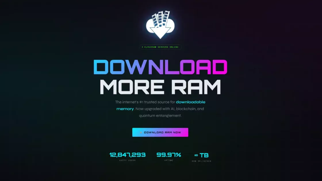
The Web Design Museum records a full redesign on February 7, 2026. Its description notes new content, new audio, a redesigned logo, and a progress bar. The museum says the new version uses AI-generated music and a new announcer in place of the original audio.
The live site carries a more direct explanation. It welcomes visitors to “New Management,” says the domain was purchased openly via GoDaddy, and says the new operators would like to purchase the rights to the former site’s content. Until then, the page says its material is new and unique. The note is striking because it openly separates ownership of the domain from ownership of the old creative material.
That distinction is the core of the current Zombo.com story.
Public domain-registration data shows Zombo.com was originally registered on October 10, 1999. Current WHOIS information lists GoDaddy as registrar, an update date of February 9, 2026, and an expiration date in October 2028, with the registrant hidden behind privacy protection. Those records confirm a major registration update around the time of the redesign, but they do not by themselves explain exactly how control changed hands.
Online discussion has included claims that the domain was stolen, expired, transferred, or purchased after becoming available. Some summaries repeat an allegation that it was taken by a hacker. The current site disputes the darker framing by stating that the domain was purchased openly through GoDaddy. The public evidence visible from the outside does not cleanly settle every detail of that story.
For a Web Radar reader, the unresolved ownership drama is interesting, but the design change is more revealing.
The original Zombo.com depended on ambiguity. You could not tell whether the site was loading, performing, malfunctioning, or teasing you. The uncertainty was the joke.
The 2026 version adds a progress bar.
That sounds like a tiny decision. It is not.
A progress bar gives waiting a destination. It tells users that movement can be measured. Even when progress is fake, the visual language implies completion. The original joke thrived on endlessness; a progress bar introduces the grammar of arrival.
The new version also explains itself through the management notice. Again, that is understandable from a practical standpoint. A new domain owner dealing with a famous site and unclear rights has good reason to tell visitors what happened. Yet explanation changes the mood.
The old Zombo.com never apologized for being incomprehensible. The new page has an administrative reality pressing through the joke.
This is one of those cases where a website becomes interesting partly because of what it cannot reproduce. You can rebuild the logo. You can write new audio. You can create another spinner. You can imitate the cadence. But cultural continuity is harder to copy.
The classic Zombo.com accumulated meaning through repetition. People visited it for years. They sent it to friends. Writers referenced it. Developers remembered it. Its audio became recognizable. The absurdity gathered social memory.
A redesign inherits the address but not automatically the accumulated feeling.
The current operators seem aware of that. Their note explicitly asks the old content rights holders to contact them and says they want to help “revive the infinite.” That wording is playful, but it also acknowledges the gap between possession of the domain and possession of the original work.
The result is a website about itself.
The old Zombo.com pretended to be the future.
The new Zombo.com is partly a negotiation with the past.
That is a fascinating reversal.
It also raises a question faced by many old web properties: when does preservation become reinterpretation?
If a new owner recreates the look of an old site with new assets, are they preserving it, rebooting it, or borrowing its fame? If the classic site survives at another address, which version should people consider “real”? Does authenticity belong to the domain, the files, the creators, the voice recording, the design, or the community memory around it?
There is no simple answer because websites mix all of those things.
A book has editions, but copies preserve the text. A website can change completely while keeping the same address. The URL gives continuity even when the content breaks it.
That makes domain ownership culturally powerful in a way we rarely discuss. People treat a familiar domain as an identity. If nytimes.com, wikipedia.org, or a beloved personal site suddenly changed operators and content, the address itself would transfer a reservoir of trust and memory.
Zombo.com is smaller, but the principle is the same.
Its current state is almost an accidental experiment in internet identity. How much of a website lives in the domain name?
The answer seems to be: enough that people noticed immediately.
Fans began pointing one another toward preserved HTML5 versions and discussing the change on Hacker News, Reddit, Lemmy, Tumblr, and other corners of the web. Some reactions were amused. Others were angry. Some simply wanted to know where the old version had gone. The reaction proved that people were attached not just to the joke, but to the continuity of finding that joke at the same old address.
This is why the current site deserves attention even from people who dislike the redesign. It turns Zombo.com into a live case study rather than a museum piece.
You can open the current domain.
You can compare it with preserved versions.
You can see exactly how a tiny web artifact changes when the files, rights, operators, and domain stop lining up neatly.
Few websites make digital preservation this tangible with so little material.
There is also a wonderfully Zombo-like irony in the current situation. The original page promised limitless possibility while doing almost nothing. The new page says it wants to revive that infinity but cannot yet use the old content.
The promise remains larger than the delivery.
Zombo.com has somehow managed to become a new version of its own joke.
Why Zombo.com is still worth opening
Plenty of old websites deserve preservation because they were technically advanced, historically influential, beautifully designed, or commercially important. Zombo.com deserves preservation because it understood the comic potential of the web itself.
It saw that a browser does more than show information. A browser creates expectation.
A link promises a destination.
A loading animation promises progress.
A welcome message promises a place worth entering.
A newsletter link promises future contact.
A domain name promises identity.
Zombo.com turns each promise into a stage prop.
That is why it still feels surprisingly modern. Many digital products remain obsessed with anticipation. Waitlists, countdowns, teaser pages, launch events, invitation systems, “coming soon” screens, beta sign-ups, progress meters, AI demos, preorders, and product reveals all ask users to become excited before they receive much substance.
The original Zombo.com treated anticipation as an endlessly renewable resource.
Modern marketing sometimes does the same thing accidentally.
The site is also a reminder that a strong web idea does not need much interface. It needs a clear relationship with the visitor.
Zombo.com’s relationship is teasing. It tells you that your possibilities are limitless, then makes you stare at a loop. The visitor supplies the irritation, curiosity, amusement, and eventual recognition.
That is an economical design.
People building websites today could learn something from that economy even if they never imitate the style. A memorable web experience does not always come from adding more sections, interactions, gradients, animations, modules, or features. Sometimes the sharpest idea is the one that knows exactly what to leave out.
Zombo.com leaves out the website.
Everything else follows.
There is also pleasure in encountering something that does not behave like a modern product. The page does not introduce a founder story, customer logos, pricing cards, user testimonials, a content hub, three tiers, a Discord link, and an email sequence.
It does not ask to become part of your life.
That modesty gives it unusual charm.
Even the grandiose voice becomes less annoying because there is nothing behind it trying to sell you something. The bombast is self-contained. The joke starts, loops, and waits for you to leave.
The current 2026 page complicates that purity, but it also makes the site newly worth checking. This is no longer a static relic you can summarize with “funny old Flash page.” Zombo.com now has a before and after.
Open the current site first and you see the reboot.
Then open a preserved classic version and the difference becomes immediate.
The contrast teaches more than either page alone. You can feel how much of the joke depended on pacing, visual restraint, voice, ambiguity, and the absence of explanation.
You can also see how web history fragments. The famous domain points one way. The preserved experience lives somewhere else. The historical descriptions live in museums and articles. Public registration data records administrative changes without capturing cultural meaning.
The “real” Zombo.com is now distributed across several places.
That makes it a perfect Web Radar discovery because clicking around is part of understanding it. You do not need a giant research project. A few tabs are enough.
Start with the current Zombo.com and listen.
Then find the preserved HTML5 or emulated original.
Then look at the Web Design Museum’s 1999 and 2026 captures.
The difference between them is the story.
The oldest version tells you something about late-1990s design excess.
The 2021 conversion tells you something about technical preservation.
The 2026 version tells you something about domains, rights, continuity, and nostalgia.
One tiny joke accidentally became a timeline of the web.
That is a lot of cultural weight for a page with spinning circles.
It also explains why calling Zombo.com “useless” never quite captures it. Functionally, yes, the original did almost nothing. Joel Veitch’s old description is accurate on that level. But usefulness is a poor measure for comedy.
A joke does not need to complete a task.
A strange page does not need to increase productivity.
An internet artifact does not need to justify itself with utility.
Sometimes being memorable for twenty-seven years is enough.
Zombo.com earned that memory by doing less than almost every competing site.
The page has been around long enough that different generations can read it differently. Someone who encountered it around 2000 may remember the target immediately: bloated Flash intros and overconfident dot-com branding. Someone discovering it later may treat it as absurdist humor. Someone arriving after Flash disappeared may see it as retro web design. Someone visiting in 2026 encounters a preservation and ownership puzzle.
The same domain has accumulated layers without ever accumulating much content.
That is rare.
It is also why I would not recommend Zombo.com as pure nostalgia. Nostalgia alone tends to flatten old websites into decoration: pixel fonts, GIFs, CRT filters, neon colors, tiled backgrounds. Zombo.com is more interesting when you focus on the behavior.
Its design is not memorable because it looks old.
It is memorable because it knows what a website is expected to do and refuses to do it.
That refusal still reads.
There is another reason to keep Zombo.com in circulation. The modern internet is increasingly mediated through giant platforms. People encounter posts inside feeds, videos inside apps, products inside marketplaces, articles through recommendation systems, and identities through standardized profile pages.
A standalone domain doing one strange thing feels almost rebellious by comparison.
Zombo.com is a reminder that a website can still be a self-contained object.
No account is required.
No platform identity frames the experience.
No social graph explains why you are there.
You type an address and meet the thing directly.
That simplicity was once ordinary. It now feels distinctive.
The independent web still exists, of course, and there are countless personal sites, art projects, small tools, archives, experiments, and weird domains worth visiting. Zombo.com matters because it demonstrates how durable that form can be when the idea is clear enough.
The page is tiny.
The memory is large.
Its history is messy.
The joke is intact in preserved versions.
That combination makes Zombo.com worth more than a thirty-second nostalgia visit.
It is a compact lesson in interface expectation, satire, technical decay, digital preservation, domain identity, and the social life of a URL.
It is also still funny.
That last part should not get buried under the history.
Open the classic version with sound on and do not explain it to anyone nearby.
Wait.
Listen to the voice.
Watch the circles.
Let the promise continue longer than seems reasonable.
The only correct way to understand Zombo.com is to spend a little time expecting something that will never arrive.
What the site reveals about the web
Zombo.com has survived because its joke is attached to a permanent tension inside digital design: interfaces must ask users to believe in what comes next.
Every button is a promise.
Every link is a promise.
Every loading state is a promise.
Every onboarding screen is a promise.
Every product page is a promise.
The web depends on small acts of trust. You click because you expect a result. You wait because you expect completion. You register because you expect access. You read because you expect information.
Zombo.com isolates that trust and plays with it.
This is why the site is more than a parody of one dead plug-in. It is a parody of interface confidence.
The voice never hesitates.
The branding never apologizes.
The animation never admits defeat.
Only the visitor slowly realizes that nothing is coming.
A lot of comedy works through social confidence. Someone states something ridiculous with total seriousness and the gap creates the laugh. Zombo.com turns that structure into web design.
Its confidence also exposes how much authority visual polish can create. An animated logo, professional voice, and controlled layout suggest intention. We assume that effort implies purpose.
Zombo.com breaks that assumption.
The site clearly took effort to make, yet the effort produces almost no conventional function.
That was especially pointed during the Flash era, when elaborate presentation could signal budget, technical skill, or creative ambition. The more elaborate the intro, the more serious the company might appear.
Zombo.com asked whether spectacle could become detached from purpose.
It could.
It still can.
The current AI era gives the joke another layer, even without changing a line. Websites can now generate pages, images, videos, voices, copy, demonstrations, and endless variations at enormous speed. Producing presentation is cheaper than proving substance.
A site that promises everything while delivering a loop fits that environment disturbingly well.
This does not mean Zombo.com secretly predicted AI marketing or modern product culture. There is no need to turn a small joke into prophecy. The more grounded observation is better: the same human appetite for impressive presentation keeps reappearing under new technologies.
Flash was one vehicle.
Parallax scrolling was another.
Cinematic homepages, autoplay backgrounds, animated 3D objects, waitlist pages, launch countdowns, and AI-generated brand media all belong to different moments, but they can produce the same mismatch.
The technology changes.
The temptation stays.
Zombo.com keeps asking whether the presentation is doing any work besides announcing itself.
That question is useful for designers, writers, founders, marketers, and anyone building a site.
Remove the pitch.
Remove the animation.
Remove the fashionable visual treatment.
Remove the claims.
What is left for the visitor?
Zombo.com’s answer is deliberately “almost nothing.”
A good website usually needs a better answer.
The joke also reveals something about patience. Early web users tolerated delays that would feel outrageous now. Connections were slower. Media took time. Loading was visible. Waiting belonged to the medium.
Modern sites are technically faster in many situations, yet they have invented new forms of delay: cookie banners, consent layers, splash screens, app-install prompts, account walls, video ads, queue systems, animated transitions, and staged onboarding.
We eliminated some waiting and designed new waiting.
Zombo.com makes waiting theatrical enough to notice.
That theatricality is useful because many modern delays hide behind necessity. A spinner tells us a server is working. A queue tells us demand is high. A countdown tells us access will begin later. Sometimes those explanations are real. Sometimes they are partly designed to shape behavior.
Zombo.com gives us a loading ritual with nothing behind it.
It is delay in its purest form.
The site also demonstrates the power of repetition. The voice repeats the name until it becomes absurd, then familiar, then strangely comforting. Repetition turns branding into comedy and comedy back into branding.
After enough exposure, Zombo.com becomes hard to forget.
This is another feature modern advertising understands well, though Zombo.com uses it without selling anything. The name is repeated until the visitor carries it away.
There is no logo system document.
No campaign.
No slogan deck.
Just a voice insisting that you are at Zombo.com.
It works.
That brings us back to the current ownership situation. Because the name and domain became so recognizable, control of the address carries cultural weight. The asset is valuable because the joke made it memorable.
The present site’s desire to acquire rights to the old content makes that relationship explicit. A domain can be owned separately from the creative material historically associated with it. The two can drift apart.
That is common in commerce and licensing, but seeing it happen to an absurdist one-page joke makes the structure unusually easy to grasp.
The address is one asset.
The audio is another.
The design may have its own authorship.
The code can be recreated.
The historical reputation belongs to no single file.
A website is not one thing.
It is a bundle of code, media, names, servers, rights, memories, references, and habits.
Zombo.com spent decades pretending to be nothing.
Its current history proves it was always made of many things.
Questions people still ask about Zombo.com
The original Zombo.com is supposed to keep promising that you can do anything while giving you almost nothing to do. It was created as a parody of Flash intro screens, the animated sequences many websites once placed before their actual content. Instead of using an intro to lead somewhere, Zombo.com effectively made the intro the site. The humor comes from waiting for a destination that never properly arrives. The animation, booming welcome, repeated promises, and eventual non-payoff all support that structure. If you are wondering whether you missed the “real” website, you have understood the joke.
No. The live Zombo.com domain was redesigned in February 2026. The current page identifies itself as being under new management and says the domain was bought through GoDaddy. It also says the present operators want to acquire rights to the former site’s material. Classic versions still survive through recreations, archives, and HTML5 or emulator-based reproductions. The famous domain and the classic experience are now separate places, which is part of what makes the site’s current story so unusual.
No. Zombo.com was converted away from Flash and continued running in modern browsers. Adobe ended Flash Player support on December 31, 2020 and began blocking Flash content in January 2021. Web Design Museum records an HTML5 redesign of Zombo.com on January 5, 2021.That migration kept the joke accessible after its original technology became unusable in ordinary browsers. Zombo.com survived the platform it was created to parody.
Historical references generally connect the original site to 15footstick and creator Joshua Levine, with accounts placing its origins around George Washington University and the late-1990s experimental web scene. The Web Design Museum credits 15footstick on its 1999 archive page. The site’s authorship has accumulated some folklore because Zombo.com circulated for so long as a mysterious standalone page. Its anonymity was part of the experience for many visitors, even though historical documentation points back to identifiable creators.
Because Zombo.com compresses an entire era of web design into one joke. It mocks decorative loading screens, inflated dot-com confidence, branding without substance, and the assumption that technical spectacle automatically creates a better site. It also survived long enough to become a memory shared across generations of web users. The Guardian recorded Joel Veitch calling it his least useful website in 2003, while other designers and creators have praised it for essentially the same qualities. Its uselessness became culturally productive.
Yes, but for a different reason. The preserved classic is the stronger version of the original joke. The current domain is interesting because it shows what happens when an internet artifact, its famous URL, and its original creative rights stop lining up neatly. Visit both. The old version gives you the comedy. The current version gives you the afterlife. Together they tell a better story than either one alone.
Author:
Jan Bielik
CEO & Founder of Webiano Digital & Marketing Agency
This article is an original analysis supported by the sources cited below
Zombo.com
The current official domain and primary source for the 2026 “New Management” notice, including the statement that the domain was purchased through GoDaddy and that the present operators would like to purchase the rights to the former site’s content.
Zombo.com in 1999 — Web Design Museum
A historical record of the original 1999 version, including its role as a parody of late-1990s Flash intros and its attribution to 15footstick.
Zombo.com in 2026 — Web Design Museum
A record of the February 2026 redesign, documenting the new content, redesigned logo, progress bar, new announcer, and AI-generated music.
Adobe Flash Player End of Life
Adobe’s official explanation of Flash Player’s end of support on December 31, 2020 and the blocking of Flash content beginning January 12, 2021.
My new media — The Guardian
A 2003 interview with web animator Joel Veitch in which he names Zombo.com his least useful website, capturing how the site’s deliberate uselessness was understood during its original era.
ICANN Registration Data Lookup Tool
ICANN’s official registration-data lookup service, used to check current public registration information associated with the Zombo.com domain.
| Citing this article? Brief excerpts are welcome. Please credit Webiano.digital, name the author where stated, and include a link to https://webiano.digital and to this original article. Full or substantial republication requires prior written permission. Read our Copyright and Content Use Policy. |
This article was prepared with the assistance of artificial intelligence tools. The content underwent expert human review, and Webiano Digital & Marketing Agency assumes editorial responsibility for its final version and publication.