
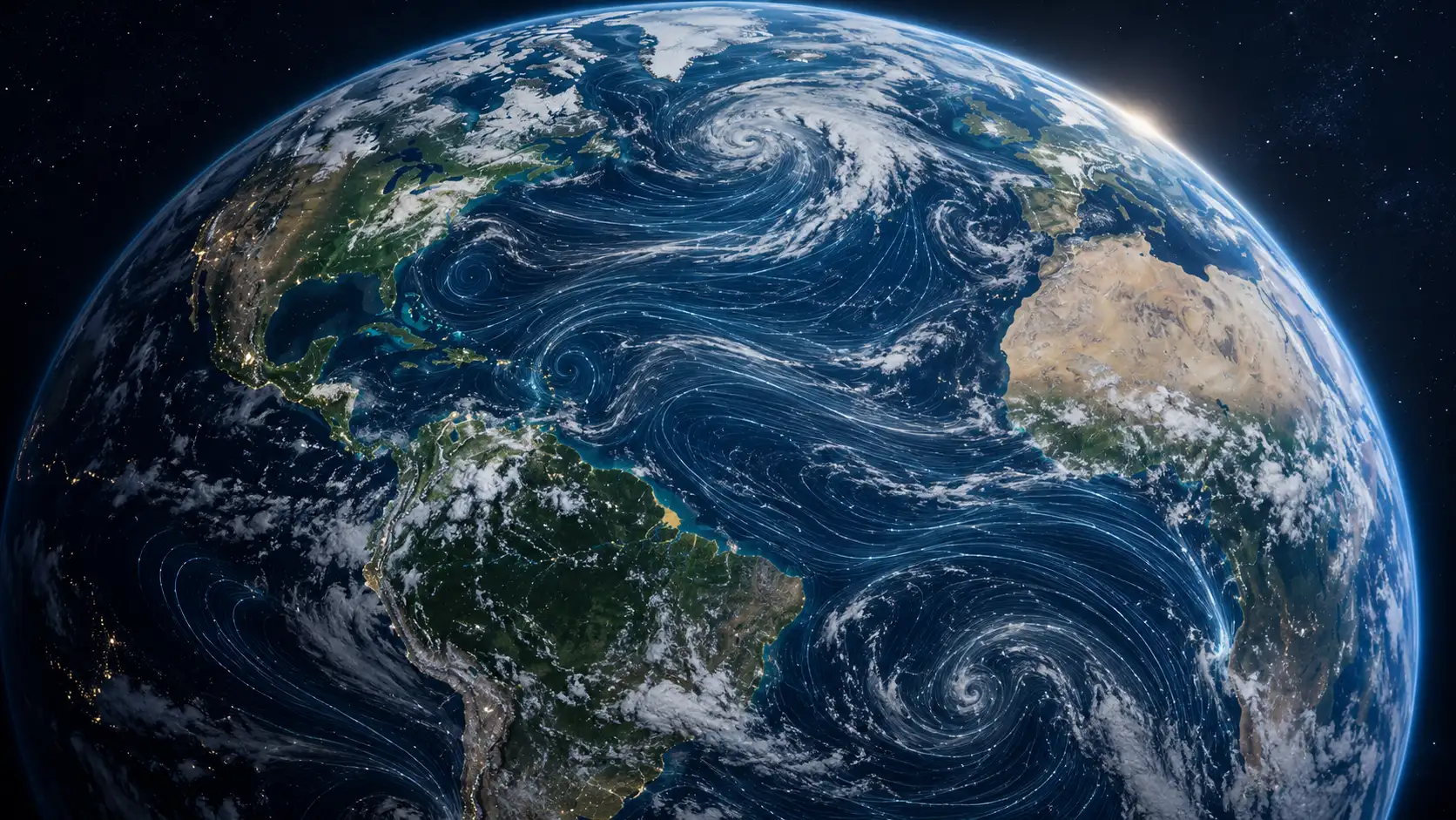
Open Earth Nullschool and the first thing you notice is not a forecast. It is motion.
Table of Contents
Fine streams race over the Pacific, bend around continents, bunch together around pressure systems and stretch into long atmospheric rivers. The planet looks less like a map and more like an organism under glass. Zoom out and the atmosphere appears to inhale and exhale. Rotate the globe and enormous circulations suddenly make physical sense. A weather system that looked like a coloured blob on a television forecast becomes a structure with direction, shape and momentum.
That visual trick is the reason Earth Nullschool remains one of the web’s great rabbit holes more than a decade after Cameron Beccario first released the project. It turns data usually trapped inside specialist models, numerical grids and institutional charts into something you understand almost before you know what you are looking at.
Calling it a weather map barely describes it anymore. The current site lets you move between air, ocean, atmospheric chemistry, particulates, space weather and biological data modes. Wind is only the doorway. Behind it sit ocean currents, wave behaviour, surface temperature, temperature anomalies, atmospheric instability, particulate matter, smoke, dust, carbon monoxide, active fires, ultraviolet exposure, coral bleaching stress and auroral activity, among other layers.
The strange thing is how little ceremony surrounds all of this. There is no feed, no account wall, no onboarding theatre and no attempt to turn every click into engagement. You get a dark globe, moving particles and a compact set of controls. The project assumes curiosity will do the rest.
That confidence makes Earth Nullschool feel almost anomalous on the contemporary web. Plenty of sites contain more weather information. Plenty offer prettier satellite imagery. Plenty give a cleaner local forecast. Nullschool does something narrower and stranger: it makes planetary systems feel spatial, continuous and alive.
You can visit for thirty seconds. You can also lose an hour.
A weather map that behaves like a living system
Most weather products answer a practical question. Will it rain? How hot will it be? Is the wind strong enough to cancel a ferry? Earth Nullschool begins somewhere else. Its natural scale is planetary rather than personal.
When you first arrive, thousands of tiny particles move across the globe. Their paths are derived from a wind field, and their movement turns abstract vectors into visible flow. The crucial detail is that you are not watching individual parcels of air travel from one side of the planet to the other. The animation is a visual representation of a changing field. It gives direction and speed a form the eye can follow.
That distinction matters because Nullschool is persuasive precisely where technical weather displays often become unreadable. A meteorologist may be perfectly comfortable looking at pressure contours, vectors and numerical model output. Most people are not. Human vision, however, is remarkably good at reading movement. We see streams converge, separate, rotate and accelerate without needing to decode rows of numbers first.
Watch the North Atlantic for a moment and you start recognising the shape of atmospheric circulation. Follow high-altitude winds and the jet stream appears as a fast, wandering river. Look near a tropical cyclone and the famous spiral stops being merely an icon used by news graphics. The circulation has texture. You can see how the surrounding atmosphere feeds into it and how the system belongs to something much larger than the storm itself.
This is the first reason Nullschool is worth opening even if you already use a weather app: it restores context.
Local weather interfaces have become extremely good at collapsing complexity into an answer. They tell you 12°C, 70 percent chance of rain, wind from the west, jacket probably required. That is useful. It also removes the physical system behind those numbers. Earth Nullschool travels in the opposite direction. It makes you look at the entire machine.
The effect becomes stronger once you change altitude. At the surface, wind responds to terrain, friction and local conditions. Move upward through pressure levels and the pattern changes. At roughly the level commonly associated with the jet stream, the atmosphere suddenly looks like a network of immense high-speed bands circling the planet. Go higher again and the geometry shifts once more. The site’s documentation provides pressure levels ranging from near-surface conditions into the stratosphere.
Changing altitude is one of the site’s quiet revelations. Weather stops looking like something painted onto the surface of Earth. You begin seeing the atmosphere as a deep three-dimensional body with layers behaving differently above the same geographic point.
That sounds obvious when written down. Of course the atmosphere has depth. Yet conventional maps train us to flatten it. Temperature, wind, rainfall and pressure all become coloured surfaces. Nullschool gives you a crude but memorable way of moving vertically through that invisible volume.
Time works much the same way. The site provides controls for stepping backward and forward through available model times, along with shortcuts for returning to the newest data. Movement through time makes the map feel less like an illustration and more like an instrument. A circulation pattern is no longer a single picture. It becomes one state in a sequence.
The underlying weather feed comes from the Global Forecast System, the numerical weather prediction system run by the U.S. National Weather Service’s National Centers for Environmental Prediction. NOAA describes GFS as a global model producing data for atmospheric and land variables including wind, temperature and precipitation. The operational system runs multiple cycles each day.
Earth Nullschool’s own about page describes its global weather visualization as being updated every three hours. Ocean currents, sea-surface temperature, waves and aurora use different update schedules because they originate from different systems.
The site therefore occupies an interesting position between scientific infrastructure and public experience. Nullschool is not producing the weather forecast itself. It is interpreting streams of institutional Earth-science data and giving them a visual body.
That sounds like a secondary role until you see how much interpretation matters.
A dataset can technically be public and still remain practically invisible. Files may be open, documented and downloadable, yet comprehensible mainly to people who already know the formats, variables and conventions. Nullschool sits one level above that machinery. It takes information produced by supercomputers, satellites and research institutions and turns it into something a curious person can touch.
There is also a peculiar emotional effect. Global maps usually make the planet feel static. Nullschool makes stillness seem impossible. Even when the weather where you live is quiet, something is moving somewhere. Westerlies sweep around the Southern Ocean. Trade winds cross the tropics. Currents curl along coastlines. Waves propagate far from the storms that generated them. Dust leaves one continent and travels toward another. Smoke spreads beyond a fire’s visible perimeter.
You are looking at a planet that never stops transporting things.
That may be Earth Nullschool’s deepest appeal. It makes connection visible.
What Earth Nullschool is actually showing
The moving particles are so seductive that it is easy to mistake Nullschool for an animated artwork with scientific data underneath. In practice, the project behaves more like a visual switchboard for several Earth-observation and forecast systems.
Its weather layer relies on GFS. Ocean-current options draw on sources including OSCAR and Copernicus Marine data. Sea-surface-temperature choices include NOAA and Met Office products. Wave information comes from WAVEWATCH III. Atmospheric chemistry and aerosol layers use NASA GEOS and Copernicus CAMS material. Aurora data comes from NOAA’s space-weather infrastructure. Active-fire information is connected to NASA FIRMS.
The important word here is sources, plural.
There is no single sensor orbiting Earth that sends Nullschool a perfect live image of “the weather.” Much of what appears on the globe has been produced by numerical models that blend observations, physical equations and computation. Other layers come from remote sensing or specialised analysis products. Each carries its own resolution, timing, assumptions and uncertainty.
That is why the menu is more interesting than it initially appears. Each switch changes the meaning of the globe. A moving line may represent wind in one mode, an ocean current in another or wave direction elsewhere. Colour might indicate temperature, wind speed, aerosol concentration or another quantity entirely. The geometry remains familiar while the physical story changes.
What the main modes reveal
| Mode | What you are looking at | What makes it interesting |
|---|---|---|
| Air | Wind and atmospheric variables at different pressure levels | Planetary circulation becomes visible as motion |
| Ocean | Surface currents, temperature and wave conditions | The sea stops looking like empty blue space |
| Chem | Atmospheric gases and composition products | Pollution and chemistry acquire geography |
| Particulates | Dust, smoke and fine airborne particles | Invisible material transport becomes traceable |
| Space | Aurora-related space-weather information | Earth’s atmosphere connects visually to solar activity |
| Bio | Biological or ecosystem-related layers exposed by the current interface | Physical conditions can be read beside living systems |
The modes are best treated as different lenses rather than different versions of the same map. Each data family has its own source, refresh rhythm and caveats, so switching modes means switching the phenomenon you are asking the globe to explain.
Air is the obvious place to begin because wind makes the animation legible at once. Yet the Ocean mode may be the more surprising experience. On ordinary maps, oceans are often negative space: large blue areas placed between the things we name. Add current animation and the emptiness disappears.
Currents curve, split and form rotating structures. Warm and cold regions become visible through temperature overlays. Waves reveal energy crossing enormous distances. Suddenly the ocean resembles a moving fluid system rather than a background colour behind continents.
That shift in perception is not cosmetic. The ocean occupies most of Earth’s surface, yet everyday mapping treats it badly. Roads, boundaries, cities and terrain dominate common map interfaces because those are the features people use for navigation. Nullschool gives the sea equal visual authority.
Wave mode is particularly good at changing intuition. A storm may be thousands of kilometres away, while the swell it produced keeps travelling. Nullschool’s documentation explains that the displayed peak wave period follows the wave group carrying the most energy at a location rather than attempting to depict every wave system simultaneously. That choice keeps the display readable, though it can create visual boundaries where the leading wave group changes.
That is a good example of what visualization always requires: choosing what not to show.
A perfect display of every relevant variable would be useless. Earth systems are too complicated, and the screen is too small. Nullschool works because it makes strong editorial decisions. One field animates. Another becomes colour. Controls hide until you ask for them. Geographic outlines are reduced. Labels are sparse.
The project is full of these reductions.
Temperature becomes colour. Wind becomes moving particles. Altitude becomes a selectable pressure level. Time becomes a sequence you can step through. Model output becomes a globe. Complexity is not removed; it is translated.
Chemistry mode pushes that translation into territory most casual weather sites ignore. Gases such as carbon monoxide or nitrogen dioxide normally appear in specialist air-quality products, research dashboards or regulatory reports. On a planetary globe, they read differently. You stop seeing pollution only as a number attached to a monitoring station. You see plumes, gradients and transport.
Copernicus describes its CAMS system as a global atmospheric-composition service that combines observations with modelling and produces forecasts for pollutants and aerosols including particulate matter, ozone, nitrogen dioxide and carbon monoxide. Earth Nullschool lists CAMS alongside NASA’s GEOS system among its atmospheric chemistry sources.
This is where the phrase “watch the planet breathe” becomes more literal than poetic. Wind is not transporting an abstract pattern. It moves moisture, dust, smoke, sea salt, pollution and heat. Once you switch from pure wind speed to chemistry or particulates, the atmosphere starts looking like a transport network.
Dust provides one of the clearest examples. Huge plumes can move across seas and national borders with complete indifference to political geography. Smoke behaves the same way. A fire has a location; its atmosphere does not.
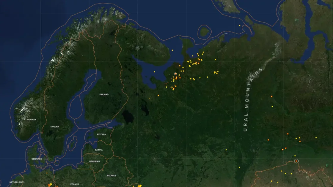
Earth Nullschool includes active-fire information sourced from NASA’s Fire Information for Resource Management System. NASA describes FIRMS as a system delivering satellite-derived active-fire locations, including data from VIIRS instruments with a nominal 375-metre active-fire product.
Put fire detections beside wind or smoke information and a familiar news story becomes physical. You can examine where burning is occurring, then inspect atmospheric movement around the region. It does not turn Nullschool into an emergency-management platform, nor should it be used as one. It does make the relationship between a point event and a moving atmosphere much easier to grasp.
Sea-surface-temperature anomaly does something equally revealing in the ocean. Raw temperature tells you whether water is warm or cold. Anomaly asks a different question: warm or cold compared with the expected value for that place and time.
That distinction is powerful because absolute conditions and unusual conditions are not the same thing. Tropical water may be naturally much warmer than water in the North Atlantic, but the more interesting signal on a given day could be a northern patch running far above its expected temperature.
Nullschool’s documentation explicitly lists sea-surface-temperature and anomaly products, with different baselines attached to different source datasets. That detail is easy to miss, yet it points toward good data-reading habits. A coloured anomaly layer always has a reference period behind it.
Atmospheric instability is another layer worth trying even if the acronym means nothing to you. CAPE, or Convective Available Potential Energy, is used by meteorologists when examining the potential for buoyant rising air and severe convection. Nullschool describes the layer as an indicator of atmospheric instability.
CAPE is not a thunderstorm detector. Seeing a dramatic value on the map does not mean a storm must occur. It tells you something about the environment in which convection could develop. The distinction is a useful reminder that Earth Nullschool is better at provoking investigation than delivering binary answers.
The same applies to pressure. Mean sea-level pressure gives large atmospheric systems another visible structure. Wind curls around areas of high and low pressure. You can watch a field you may have seen represented by curved isobars emerge through motion. The old weather-map symbols stop feeling arbitrary because the airflow gives them context.
Then there is wet-bulb temperature, ultraviolet exposure, wind-power density, precipitable water, cloud water and precipitation accumulation. The site rewards people who click terms they do not yet understand. You may arrive to admire a cyclone and leave knowing why meteorologists care about the 250-hPa level.
That is unusual educational design because nobody has built a lesson plan around you. The site rarely interrupts to explain itself. You learn because the object is compelling enough to make explanation feel necessary.
A conventional educational interface often begins with instruction and eventually reaches exploration. Nullschool reverses that order. It presents something beautiful, lets confusion develop naturally, then offers documentation when curiosity catches up.
There is risk in that approach. A user can misread a layer or overestimate the precision of what they see. Yet the alternative — flattening the product until nobody can misunderstand it — would destroy what makes the project worth visiting.
Earth Nullschool trusts the reader more than most mass-market data products do.
The interface disappears so the planet can take over
A large part of Nullschool’s success has nothing to do with meteorology. It comes from restraint.
Load the site and the map dominates the screen. There are no giant promotional banners explaining why the project matters. No row of cards tells you what to click next. No floating assistant asks what you are trying to accomplish. The globe gets nearly all the attention.
That choice now feels radical.
Modern web products tend to explain themselves continuously. Every unused patch of space becomes an opportunity for a button, recommendation, badge, alert, upsell or personalised suggestion. Nullschool behaves as though attention is something to protect. It offers controls, then gets out of the way.
The design lineage helps explain this. Beccario’s open-source repository describes Earth as a personal project used to learn JavaScript and browser programming, based on an earlier Tokyo Wind Map and inspired by the celebrated wind visualization from Hint.fm.
The Hint.fm wind map, created by Fernanda Viégas and Martin Wattenberg, established a visual language that proved remarkably durable: animated lines turning wind vectors into something between scientific display and kinetic drawing. A 2014 review from the International Cartographic Association’s Commission on Map Design praised Beccario’s global version for combining an aesthetic experience with simple controls and multiple projections.
The ancestry matters because Earth Nullschool never treats beauty as decoration added after the data. The beauty is produced by the representation itself.
The lines are beautiful because wind has structure. The vortices are beautiful because rotating fluids create organised forms. The colour gradients are attractive because continuous variables produce spatial patterns. A designer did not place an illustration over the science. The science generates the composition.
That difference keeps the site from ageing as quickly as many visual experiments from the same era.
The typography, menus and technical foundations have changed across the project’s lifetime, but the central gesture remains legible: put a moving Earth in front of someone and allow direct manipulation.
Rotation is especially important. A flat global map always privileges one cut through the planet. A globe lets you turn any region into the centre. Continents stop occupying fixed positions inside a familiar rectangle. The poles become places you can inspect rather than distorted margins.
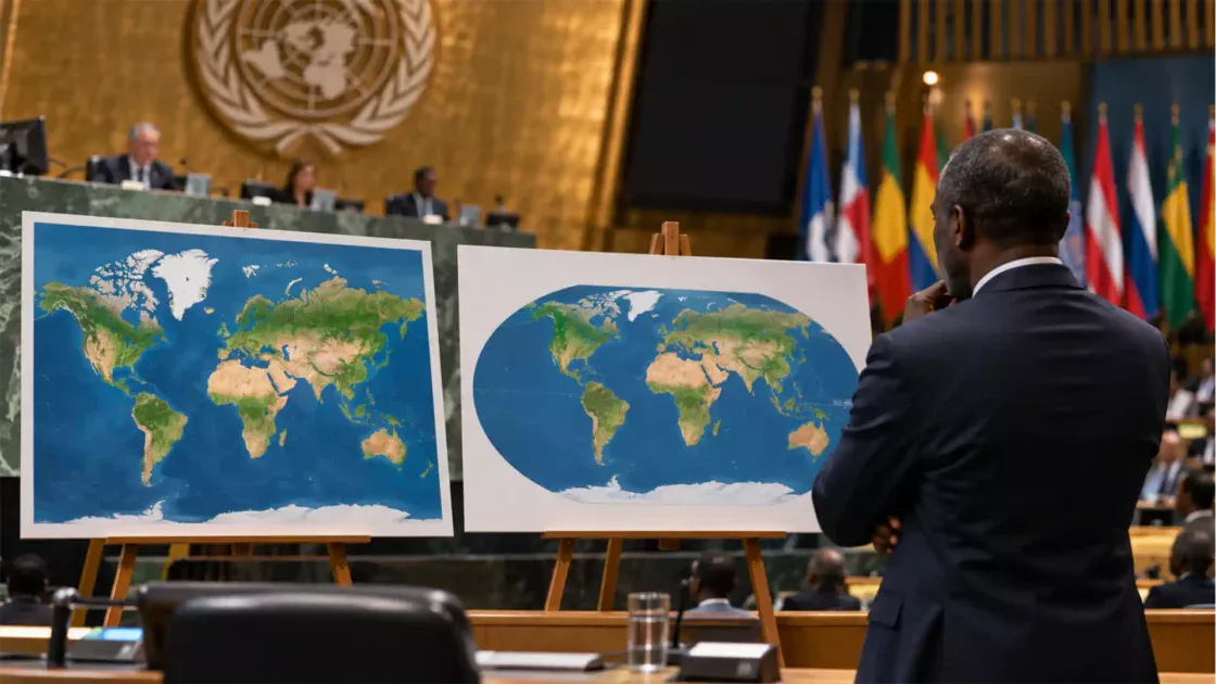
Nullschool has also long experimented with multiple map projections. Earlier cartographic commentary singled this out as one of the project’s pleasures: changing projection alters the shape of the world and the patterns your eye notices.
Projection becomes part of the act of thinking.
That sounds overly grand until you switch one. Geographic information is never shown without a geometry. Every world map makes compromises. Areas stretch. Distances deform. Directions shift. Nullschool makes those decisions unusually visible because the same flowing field can be viewed through different mappings.
The animation also solves an old cartographic problem. Directional flow is awkward to display densely. Fill a conventional map with arrows and the screen becomes a thicket. Make the arrows too sparse and local detail disappears. Animated particles distribute attention over time. The map does not need to show every vector simultaneously because motion carries part of the information.
It is a clever use of the browser as a medium rather than a digital imitation of paper.
That point is easy to underestimate. Many early web maps were basically printed maps with pan and zoom attached. Earth Nullschool belongs to a different tradition: the browser is used as a computational surface. Data can move continuously. The projection can change. Layers can be recalculated. Time can be stepped through. The visual state responds immediately to interaction.
Beccario’s original repository is strikingly modest about this. He describes the project as a way to learn browser programming. The result became a reference point for weather visualization and spawned forks, adaptations and imitations.
There is a useful design lesson hiding there. Memorable tools do not always begin with a plan to build a platform. Sometimes a tightly observed personal experiment develops a stronger identity than a product created by committee.
Nullschool has an opinion about what matters. The data deserves the screen. Motion deserves priority. Controls should stay compact. Users should be allowed to wander. Documentation can live nearby without smothering the experience.
It also accepts a little friction.
Some labels are cryptic. Pressure levels require knowledge. Chemistry abbreviations can look hostile. The controls do not behave like a polished consumer weather app. Yet the friction feels connected to the subject rather than to poor product strategy. You are manipulating meteorological and oceanographic variables. Some terminology is irreducibly technical.
Good interfaces do not always remove difficulty. Sometimes they place difficulty where it belongs.
The project’s keyboard shortcuts reinforce that sense of instrumentality. You can move through time, switch altitude, toggle animation, adjust the view and return to current conditions without repeatedly digging through menus. The documentation lists a compact keyboard vocabulary for these actions.
Once learned, those controls change the experience. Nullschool starts to feel less like a webpage and more like a piece of scientific apparatus that happens to run in a browser.
There is no reward system for mastering it. No progress meter. No badge appears when you inspect the stratosphere. The reward is that the globe becomes more intelligible.
This is perhaps why people remember the site years after first encountering it. The interaction creates a private sense of discovery. You move the planet yourself. You find the cyclone. You climb into the jet stream. You switch to ocean currents and realise the sea has its own weather. You find smoke crossing an ocean.
The site does not announce those moments.
You discover them, which makes them yours.
From jet streams to smoke, waves, fires and aurora
The best way to understand Earth Nullschool is not to work through every menu item. Pick a phenomenon and chase it.
A strong first experiment is the jet stream. Start in Air mode, move above the surface and inspect the 250-hPa level. Nullschool’s documentation associates that pressure level with roughly 10.5 kilometres altitude and the jet stream.
The result is startling if your mental image of high-altitude wind comes from diagrams. Fast bands snake across entire ocean basins. They bend north and south, split, rejoin and wrap around large weather systems. A concept from school geography becomes a moving object.
Then return to the surface.
The visual pattern changes sharply. Terrain matters more. Wind slows. Local structures become easier to see. You have just compared two slices through the same atmosphere without opening a textbook diagram.
Move next to a tropical storm when one is active somewhere on Earth. A cyclone is almost too perfect for Nullschool because rotation is its dominant visual fact. Television maps often mark tropical systems with symbols and predicted tracks. Nullschool lets you ignore the future for a moment and inspect the flow surrounding the present circulation.
Do not use that view to make safety decisions. Official warning agencies exist for that purpose. Use it to understand shape.
A cyclone seen this way is not a pin moving along a forecast cone. It is a circulation embedded in neighbouring winds, moisture and pressure patterns. The storm belongs to the atmosphere around it.
Another good experiment is to inspect the Southern Ocean. Remove your attention from land entirely. A broad ring of westerly flow circles Antarctica with far fewer continental interruptions than in the Northern Hemisphere. The movement makes the geography of the planet itself feel causally relevant.
This is where Nullschool becomes more than a weather curiosity. You start developing intuition about why global patterns look the way they do.
Now switch to the ocean.
Surface currents trace a completely different set of flows. They hug coastlines, curve into gyres and form eddies. The familiar geography remains, but your sense of what the map is “about” changes. Continents become barriers directing fluid motion rather than the principal subjects.
Try sea-surface temperature next. Warm water spreads through the tropics while colder regions dominate toward the poles, yet local structures complicate that broad pattern. Then switch to an anomaly view if available from the selected source.
An anomaly map is one of the most useful cures for lazy weather interpretation. Red does not automatically mean a place is hot in absolute terms. It can mean warmer than its expected baseline. Blue can mean cooler than expected even when the water itself would not feel cold.
You begin asking better questions.
What is the comparison period? Which product produced the field? Is the newest value preliminary? Nullschool’s about page notes, for example, that recent NOAA OI SST values may be preliminary and subject to change.
That single warning reveals something healthy about the project: the visualization is confident without pretending the data is flawless.
Wave mode offers another shift. Ocean waves are usually experienced locally. You stand on a coast and watch them arrive. Nullschool restores the missing journey.
Follow a large swell pattern away from its generating region and the ocean turns into an energy-transfer surface. Waves do not care whether the storm that produced them is still nearby. The cause and the effect can be separated by days and enormous distances.
The site’s treatment of peak wave period is especially instructive because the documentation openly describes the simplification involved. Multiple wave groups may coexist, but the display prioritises the group carrying the most energy. Where the dominant group changes, visible boundaries can appear.
That is not a defect to hide. It is evidence that visualizations have grammar. A map is always telling you not only about the world but about the method used to represent it.
Particulate layers take the experience from fluid dynamics into atmospheric transport.
Open a dust-related layer during an active plume and you may see material leaving desert regions and extending far over water. The atmosphere becomes less like empty air and more like a conveyor carrying physical matter.
Smoke is even more immediately legible because fires give the plume an obvious origin.
NASA’s FIRMS infrastructure supplies near-real-time satellite fire detections used by scientists, fire managers and the public. Nullschool combines active-fire information with its global visualization environment, making it possible to see hotspots in geographic relation to atmospheric conditions.
The combination is more interesting than either layer alone.
A fire-detection map tells you where thermal anomalies have been observed. A wind map tells you how the atmosphere is moving. A particulate view tells you where material may be concentrated. Put those ideas together and a regional disaster acquires planetary context.
The same principle applies to air pollution.
Pollution is commonly communicated through local indexes, coloured circles and health advisories. Those are the right formats for deciding whether to exercise outdoors. They are poor formats for understanding transport. Nullschool makes air pollution behave like weather because, physically, it travels inside weather.
Carbon monoxide, nitrogen dioxide, particulate matter and aerosol measures do not remain obediently inside administrative boundaries. Wind moves them. Chemistry changes them. Rain can remove some material. Sources turn on and off. Mixing occurs vertically as well as horizontally.
A moving global map does not explain all of that. It does something prior to explanation: it makes the spatial problem impossible to ignore.
The CAMS material behind some atmospheric products is built precisely to describe atmospheric composition at large scales through a mix of modelling and observations. Copernicus says the system produces global forecasts for pollutants, aerosols, greenhouse gases and wildfire emissions.
Earth Nullschool compresses access to such material into a few clicks.
That compression is one of the site’s greatest achievements and one of its risks. A person can jump from wind to particulate matter in seconds without learning the methodological distance between those products.
The solution is not to avoid the site. The solution is to read the source notes.
Nullschool’s about page is unusually candid for such a visually polished project. It names the institutions behind individual datasets, describes what numerous overlays mean and includes caveats where the creator encountered problems or where providers restrict interpretation.
The historical note about carbon-dioxide display is a striking example. The documentation records that earlier GEOS-5 output differed from contemporary observed global concentration figures and explains a temporary visualization adjustment used before a later model change made it unnecessary.
That kind of note is messy, specific and trustworthy. It tells you a human being encountered a data problem, made a choice and documented it rather than pretending the pipeline was automatic and unquestionable.
Space mode produces a different kind of wonder.
Auroral activity normally appears in specialised forecasts, photographs from high latitudes or social posts celebrating a geomagnetic storm. On a globe, the phenomenon becomes geometrically obvious. Aurora is not a random collection of green photographs taken in northern countries. It forms around Earth’s magnetic polar regions.
Nullschool lists NOAA’s OVATION product among its aurora sources and says aurora information is refreshed more frequently than several of its ocean datasets.
The space-weather view also creates a satisfying conceptual endpoint for the site. You begin by looking at wind over the ground and eventually arrive at a phenomenon produced by interactions far above the weather layer.
The globe has expanded vertically again.
Then there are the less glamorous overlays that become unexpectedly useful once you know what they mean.
Total precipitable water shows how much water vapour exists through a column of atmosphere. Mean sea-level pressure gives structure to large weather systems. Relative humidity adds another dimension to temperature. Wet-bulb temperature points toward the combined effect of heat and moisture on evaporative cooling. Wind-power density makes high-wind regions read in energetic rather than purely meteorological terms.
None of those layers needs to become your new hobby.
Their presence matters because Nullschool keeps reminding you that “the weather” is not one variable.
The forecast shown by a phone app is an edited answer assembled from many physical quantities. Earth Nullschool lets you peel some of those quantities apart and look at them individually.
That makes it superb for comparison.
Why is one region receiving heavy precipitation while another equally humid region is not? What does the pressure pattern look like around a wind event? How does the high-altitude flow compare with conditions near the ground? Where does a warm ocean anomaly sit relative to surface currents? What happens to smoke after it leaves the immediate fire zone?
The map encourages paired questions.
That is a much richer way to use it than staring passively at animated wind.
The limits are part of the value
Earth Nullschool is visually convincing enough that it can look more certain than the data deserves.
That is not unique to this site. Every clean scientific visualization faces the same problem. A colourful continuous field appears authoritative. Smooth animation feels precise. A globe covered from edge to edge seems complete.
Reality is rougher.
Weather and ocean products are generated on grids. Numerical models approximate physical processes. Observations have gaps and errors. Forecast skill changes with region, phenomenon and lead time. Satellite detections have resolution and timing limits. Derived quantities depend on formulas and assumptions.
Nullschool says this directly. Its documentation notes that weather and ocean data are produced from numerical models and that the company provides no guarantee of accuracy. It also carries provider-specific warnings for some products.
The site is therefore best used for seeing patterns, not granting final authority.
If you need a hurricane warning, use the responsible national meteorological or emergency agency. If you need marine navigation information, use the official operational sources intended for navigation. If wildfire threatens your area, follow fire authorities and emergency services. If local air quality affects a medical decision, use a recognised local monitoring service.
Nullschool excels when your question begins with what does this system look like?
It is weaker when the question is what must I do right now?
That distinction should not reduce enthusiasm for the project. It clarifies what kind of object it is. Earth Nullschool is an exploratory visualization. It is unusually good at revealing relationships and stimulating investigation. It is not a replacement for every specialised service feeding it data.
The difference between observation and model output deserves particular attention.
When people hear “current weather map,” they may imagine direct measurements covering every point. No observation network works like that. Atmospheric models combine measurements with mathematical representations of the atmosphere to estimate a coherent state across the globe.
NOAA describes GFS as a numerical forecast system producing global atmospheric and land fields. Nullschool then visualizes selected fields from that model.
What you see is therefore not a live camera pointed at the wind.
Even the movement itself deserves caution. Animated particles are an interpretation of a vector field. They are there to reveal direction and relative behaviour. A viewer should not follow one particle and imagine a specific identifiable parcel of air has been tracked across the screen.
Once you understand that, the animation becomes better rather than less magical. You begin appreciating it as visual mathematics.
Resolution creates another trap.
Zooming deeply into a map creates the psychological impression that more geographic detail must mean more data precision. Sometimes the underlying grid does not justify that impression. A smooth coloured surface can be interpolated between much more widely spaced model points.
The website can make a field appear continuous because continuity is useful for reading it. Continuity on screen does not mean the atmosphere was measured at every pixel.
Timing has similar complications.
Different Nullschool layers refresh at different intervals. Weather, ocean currents, temperatures, waves, fires and aurora do not share one universal clock. A composite mental picture assembled from several modes may therefore contain products with different valid times and production pipelines.
That matters when comparing rapidly changing events.
If you are examining a fast-moving smoke plume beside a fire layer, for instance, check what each layer represents before treating them as perfectly simultaneous.
The documentation exists for exactly this reason.
Nullschool also depends on large public scientific institutions whose work most people encounter only indirectly. NOAA, NASA, Copernicus services, research laboratories and marine programmes sit behind many of the coloured fields and moving lines.
The current Earth Nullschool homepage has even displayed a message drawing attention to threats against NOAA staffing and data availability, stating that much of the site’s data comes directly from NOAA servers and warning that disruption could affect features for which substitutes are limited.
Whatever one thinks about the politics surrounding public agencies, the technical dependency is impossible to miss.
A project like Nullschool is only possible because governments and scientific organisations operate satellites, forecast systems, computing centres, ocean programmes and distribution networks whose output can be reused downstream.
The elegant globe is the visible tip of an enormous institutional structure.
That makes Nullschool unexpectedly good at exposing the architecture of public data. Click through the source notes and the apparently self-contained website begins unfolding into NOAA centres, NASA programmes, Copernicus services, ocean research groups and open-source libraries.
The internet gem is really a window into scientific infrastructure.
Privacy is a separate practical concern. Earth Nullschool can be explored without building a profile or signing into a personal dashboard, which sharply reduces the sense that you are feeding a recommendation machine every time you rotate the planet. Nullschool Technologies does publish a privacy policy covering information handled through its services, so anyone with specific privacy concerns should read the current policy rather than assume the site collects nothing.
The larger point is experiential. You can use the core globe without turning yourself into the product’s main subject.
That changes the mood.
The website feels quiet because nothing is constantly asking you to return, subscribe, react, post or build a streak. You look outward rather than inward. Your personal feed disappears. Your follower graph disappears. The planet becomes the object of attention.
That quality is rarer than it should be.
There is also no need to romanticise every rough edge. Some terminology remains obscure. New users may struggle to understand pressure levels. Layer abbreviations can feel like codes from a research paper. The menu contains more scientific depth than its compact design initially suggests.
A small amount of explanatory guidance would make certain features easier to discover without damaging the minimalist character.
Yet I would rather have Nullschool remain slightly mysterious than watch it become another brightly labelled consumer dashboard.
Its difficulty is productive when it leads to the about page, then to NOAA documentation, then to questions about how weather models work. The best web tools do not merely answer a query. They create better queries.
Earth Nullschool does that constantly.
Why this old web project still feels fresh
Earth Nullschool dates back to the early 2010s, a period when experimental browser visualization felt particularly fertile. JavaScript performance was improving, D3 had changed expectations around data graphics, and creators were testing what could happen when maps became animated and computational.
A project from that era should, by normal web standards, feel ancient.
Nullschool somehow does not.
Part of the reason is that its visual premise was never tied to a temporary interface fashion. There are no skeuomorphic knobs, social-feed conventions or startup-era dashboards screaming the year of their creation. The central image is Earth in motion.
Weather has not gone out of style.
Neither has curiosity.
The project also benefited from choosing a subject whose visual complexity renews itself every few hours. The interface can stay familiar because the content never repeats. Open it today and the atmosphere is arranged differently from yesterday. A storm has moved. A jet has shifted. Another plume has formed. The ocean has changed slightly. Auroral conditions may be different.
Many data projects become museums because their dataset freezes.
Nullschool’s source material keeps arriving.
That makes return visits feel less like checking an app and more like opening a window.
There is also a deeper reason the project has aged well: it does one unforgettable thing before it does anything else.
You watch Earth move.
Only later do you learn that the same system contains chemistry, waves, ocean temperatures, fires and numerous atmospheric variables. The project’s identity does not depend on a feature checklist. It depends on a single visual idea strong enough to carry years of added depth.
That is good product design, whether or not Nullschool was conceived as a conventional product.
A weaker site might have responded to every new dataset by adding another panel. Nullschool tends to keep the planet itself as the central stage. New information becomes another state of the same object.
This creates continuity across subjects that are usually separated online.
Weather lives on one site. Ocean data lives on another. Atmospheric chemistry appears elsewhere. Fire detections sit inside specialist maps. Aurora forecasts occupy their own niche. Nullschool places several of those phenomena onto one geographic body.
You start noticing relationships partly because the coordinate system remains constant.
Earth itself becomes the interface.
That is perhaps the simplest explanation for the site’s staying power.
A globe is understandable before any menu is opened. Rotation is understandable. Motion is understandable. Colour gradients are understandable. The technical variables become optional depth rather than the entrance fee.
The site also demonstrates something the contemporary web frequently forgets: a useful page can exist without pretending to become your entire environment.
Earth Nullschool does not need a messaging layer, creator economy, marketplace, productivity suite or AI concierge. It does not try to absorb adjacent habits. It has a subject.
The subject is big enough.
There is satisfaction in opening a website whose ambition is conceptual rather than commercial. Nullschool wants to make Earth systems visible. Everything else sits beneath that purpose.
That does not mean the project exists outside money, hosting costs, licensing, institutional dependencies or organisational needs. Nullschool Technologies is a company, and the site publishes licensing contact information.
The experience still feels unusually direct.
Open page. Move globe. Notice something. Follow it.
That sequence is close to the original spirit of browsing the web for its own sake.
Before recommendation feeds became the default route to information, websites often felt like places. They had particular moods, peculiar interaction models and specific obsessions. You remembered the address because nothing else behaved quite the same way.
Earth Nullschool belongs to that tradition.
It is a destination rather than a content unit.
The open-source history contributes to that feeling. Beccario published the Earth project on GitHub and described it as a personal learning project. The repository accumulated thousands of stars and more than a thousand forks, while later developers created specialised branches and adaptations.
The code became part of the project’s cultural footprint.
That openness matters because visual ideas spread through implementation. Someone sees the moving field, studies how it works, modifies it, builds a regional variation, adds another layer or carries the approach into a different context.
The project is therefore both a website and a lineage.
Its influence is easy to recognise in later weather products that use flowing particles to express wind. The visual language now feels familiar enough that newcomers may not realise how striking it once was.
This is the fate of successful interface ideas: eventually they stop looking inventive because everyone learns the grammar.
The original still has character.
Perhaps that is because it remains less polished than the commercial descendants. There is no attempt to hide every scientific seam. Dataset names remain visible. Acronyms survive. Source attribution takes up real space on the about page. The project tells you which institutional system sits behind a layer.
The result feels closer to a workshop instrument than a consumer appliance.
You are allowed to see the machinery.
That makes Nullschool particularly good for students, designers, developers, journalists and anyone whose interest sits between visual communication and Earth science.
A student can use it to develop intuition about circulation.
A journalist can use it to orient themselves around a weather event before consulting authoritative forecasts.
A designer can study how animation carries vector information.
A developer can inspect the project’s open-source ancestry.
A teacher can use the globe to trigger questions before introducing formal terminology.
A curious person can simply watch.
None of those uses requires the site to become a lesson platform, professional forecast terminal or development framework.
Its looseness is part of its reach.
The greatest compliment I can give Earth Nullschool is that it changes the way ordinary maps look afterward.
Once you have watched atmospheric circulation cross an entire hemisphere, a static weather icon feels tiny.
Once you have watched currents animate across the ocean, blank blue space feels suspicious.
Once you have followed smoke away from fire detections, national borders feel less physically persuasive.
Once you have moved between the surface and upper atmosphere, “the weather” no longer seems flat.
The site leaves residue in your mental model.
That is far more memorable than another set of forecasts.
What people usually want to know
Is Earth Nullschool really showing live weather?
It is better described as near-current and forecast/model-based rather than a literal live view. The weather visualization uses numerical model data, principally GFS, and Earth Nullschool says its global weather conditions are refreshed every three hours. Other products use different update intervals. Aurora, ocean currents, sea-surface temperature and wave information do not all update on the same schedule.
The moving particles are also a visualization of a wind field, not tracked physical particles. Think of them as a way of making direction and speed perceptible. The distinction matters whenever an animation becomes so convincing that it feels like direct observation.
Is Earth Nullschool accurate enough to use as a weather forecast?
Use it for pattern recognition and exploration, not as your sole operational forecast. The project itself states that weather and ocean data are generated from numerical models and provides no guarantee of accuracy.
For decisions involving safety, aviation, shipping, severe weather, wildfire evacuation or similar consequences, go to the responsible official service. Nullschool is excellent for seeing the shape of a system around those warnings. It is not the warning authority.
Does Earth Nullschool cost anything to use?
The public globe can be opened directly in a browser without a subscription flow. You do not need to create an account merely to explore its principal visualization.
Nullschool Technologies also publishes contact information for licensing and other inquiries, so public browsing and commercial licensing should not be treated as the same question. Anyone planning to reuse the visualization commercially should check the site’s current terms and contact information rather than infer rights from casual access.
What should I click first?
Start with wind, then change altitude. Surface wind gives you familiar geography and local movement. Moving toward the 250-hPa level reveals the much faster upper-atmosphere flow associated with the jet stream. That single comparison explains the site faster than reading a long tutorial.
After that, switch to Ocean mode. Seeing surface currents immediately after atmospheric wind is the best second act. The same planet suddenly obeys a different moving system.
Then pick one subject that interests you — smoke, waves, sea temperature, pressure, aurora, fires — and follow it rather than sampling every button.
Can Earth Nullschool show past or future conditions?
The interface includes time controls for moving through available data steps, and the documentation lists keyboard shortcuts for stepping backward, forward and returning to the newest state. The exact usable range depends on the selected data product.
Treat the date shown by the interface as part of the data, not decoration. A map without its valid time is an incomplete statement. This becomes especially relevant when comparing layers with different refresh schedules.
Why do some layers have strange abbreviations?
Because the site exposes real scientific variables rather than translating every concept into consumer wording. CAPE refers to convective available potential energy. MSLP is mean sea-level pressure. TPW is total precipitable water. PM2.5 refers to particulate matter below a particular particle size. The about page explains many of these terms.
The abbreviations are intimidating for about five minutes. After that, they become doors into subjects you might never have searched for deliberately. Nullschool is unusually good at creating that kind of accidental education.
Is the site useful for teaching?
Yes, especially when the aim is to build intuition before formal explanation. A teacher can rotate the globe to show global circulation, compare surface and upper-level winds, examine ocean currents or connect fires with atmospheric transport. The project has also been recognised in educational-resource contexts, and third-party education services continue to list it as a resource for Earth and space science.
Its strongest classroom use is not “look at this pretty map.” It is asking students to predict before switching layers. What will happen to wind speed higher in the atmosphere? Where might ocean currents bend? What direction might smoke travel? Which parts of the world are behaving differently from their usual temperature?
Prediction turns spectacle into observation.
Does Earth Nullschool collect personal information?
The main globe does not force you through account creation before you can explore it, which makes the experience less identity-centred than many web services. Nullschool Technologies does maintain a formal privacy policy describing its handling of personal information across its services.
Anyone assessing the site for organisational, school or privacy-sensitive use should read the current policy directly rather than assume a minimalist interface means zero data processing.
Is the source code available?
A free version of the Earth project is publicly available through Cameron Beccario’s GitHub repository. The repository describes Earth as a project for visualizing global weather conditions and identifies the original work as a personal JavaScript and browser-programming project inspired by earlier wind maps.
The production service and the historic open-source repository should not be assumed to be identical in every current detail. Still, the repository is a fascinating artifact in its own right because it reveals how a personal browser experiment became one of the web’s most recognisable scientific visualizations.
Why is Earth Nullschool worth keeping bookmarked?
Because few websites change your sense of scale so quickly.
A normal forecast tells you what may happen where you are standing. Earth Nullschool reminds you that your weather is a fragment of a moving planetary system. It shows air crossing oceans, waves carrying distant energy, currents bending around continents and airborne material travelling far beyond its source.
The experience lasts longer than the visit.
You begin noticing flow where maps once looked static.
That is the hidden gem here. Earth Nullschool does not merely show the planet. It teaches your eye to see movement in it.
Author:
Jan Bielik
CEO & Founder of Webiano Digital & Marketing Agency
This article is an original analysis supported by the sources cited below
Earth Nullschool
Earth Nullschool
The live project itself, used to verify its current modes, controls and core visual experience.
About Earth Nullschool
About Earth Nullschool
Official documentation covering data sources, update intervals, overlays, pressure levels, keyboard controls, caveats and technical acknowledgements.
Cameron Beccario’s Earth repository
Earth on GitHub
The open-source repository documenting the project’s origins, technical ancestry and relationship to earlier wind-map experiments.
NOAA Global Forecast System
Global Forecast System
NOAA documentation describing the GFS numerical weather model that supplies core atmospheric data used by Earth Nullschool.
The CAMS system
Copernicus Atmosphere Monitoring Service
Official Copernicus material explaining the global atmospheric-composition system behind pollution, aerosol and chemistry products referenced by Nullschool.
NASA Fire Information for Resource Management System
NASA FIRMS
NASA’s near-real-time satellite fire-information service, a source behind active-fire data used in the project.
Earth Wind Map by Cameron Beccario
International Cartographic Association MapCarte review
An early cartographic assessment documenting the project’s visual impact, global scope, controls and projection choices.
Nullschool Technologies privacy policy
Nullschool Technologies privacy policy
The company’s current policy describing how personal information is handled across its services.
| Citing this article? Brief excerpts are welcome. Please credit Webiano.digital, name the author where stated, and include a link to https://webiano.digital and to this original article. Full or substantial republication requires prior written permission. Read our Copyright and Content Use Policy. |
This article was prepared with the assistance of artificial intelligence tools. The content underwent expert human review, and Webiano Digital & Marketing Agency assumes editorial responsibility for its final version and publication.