Google Earth has a flight simulator, and the oddest part is not that it exists. The oddest part is that it still feels like something you were not meant to find. Open the right version of Google Earth, trigger the simulator through the Tools menu or a keyboard shortcut, and the globe stops being a thing you drag with a mouse. It becomes a cockpit window. Cities, coastlines, deserts, mountains, runways, and accidental crash sites all become part of a small, stubbornly charming aviation toy that sits inside one of the most famous map products ever made.
Table of Contents
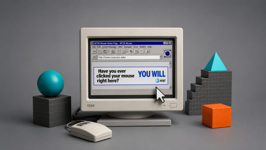
This is not Microsoft Flight Simulator, and it should not be judged as one. Google’s own help page frames the desktop feature plainly: use a joystick or keyboard shortcuts to explore the world in a flight simulator, with Google Earth installed on a Mac, Windows, or Linux computer, and with either a joystick or mouse and keyboard as controls. The official instructions still list the old secret-feeling shortcuts: Ctrl + Alt + A on Windows, Command + Option + A on Mac, or Tools, then Enter Flight Simulator.
The charm lives in that mismatch between giant platform and tiny cockpit. Google Earth is a planetary interface. It lets you search addresses, tilt terrain, inspect cities, look at satellite imagery, jump into Street View, and zoom from continents to rooftops. Then, tucked inside that same machine, it lets you pick a Cirrus SR22 or an F-16 and try to keep yourself airborne long enough to cross a bay, skim a valley, or discover how quickly poor keyboard discipline turns into a crater.
The feature matters because it belongs to an older, weirder web. Not the web of growth funnels, login prompts, subscription walls, and interfaces that all seem to have read the same product-management thread. This is the web where a serious tool might contain a toy because some product team, engineer, designer, or manager decided the toy belonged there. In 2007, Wired covered the flight simulator as a Google Earth Easter egg, noting that version 4.2 included a hidden simulator reached through a keyboard command before it became visible from the Tools menu.
There is also a newer wrinkle. Google’s developer documentation now describes an experimental web flight simulator for Google Earth on web, with simplified flight physics, dynamic loading of 3D buildings and imagery, and a note that it is meant for casual exploration rather than high-fidelity aerodynamic training. That page was last updated on June 12, 2026, which makes the old story less dusty than it first appears.
So the correct Web Radar recommendation is not just “try this old Easter egg.” It is stranger and better: Google’s map of the planet still has a cockpit mode, and the idea still works. It works because flying changes what Google Earth is. It turns an index of places into a continuous physical journey. Search is replaced by approach. Dragging is replaced by banking. The web page or desktop app stops being a map and becomes a low-pressure invitation to wander.
The article that follows is written under the supplied human-style standard, which asks for concrete, direct, natural writing rather than padded machine-sounding prose. That rule fits the subject. Google Earth Flight Simulator does not need inflated language. It needs a fair look, a good route, and enough respect for the fact that one of the world’s biggest software companies once hid a tiny flying machine inside a globe.
A cockpit hidden inside a globe
The best way to understand Google Earth Flight Simulator is to remember what Google Earth feels like before you fly. You search a place. You zoom down. You tilt the camera. The world rotates under your cursor like a model on a glass table. You are powerful, but also oddly detached. You can jump from Lisbon to Tokyo to the Atacama in seconds, yet none of those jumps has weight. The map obeys, and the journey disappears.
Flight gives the globe friction. Once you enter the simulator, the view stops teleporting cleanly from one location to another. Distance starts to matter. Altitude matters. The horizon matters. A turn has to be managed. A mountain is not just a photorealistic surface; it becomes something you must clear. A city is not a label or a search result; it becomes a field of texture sliding under the nose.
That is why the feature still catches people. It is not technically luxurious. It is not a deep aviation sim. The graphics depend on streamed imagery and 3D coverage, so some places look crisp, some look flat, and some load with the faint awkwardness of the web trying to become a world in real time. Yet the moment your aircraft leaves the runway, Google Earth gains a kind of narrative it usually lacks. You are no longer looking at the planet. You are moving through it.
The official desktop flow is refreshingly plain. In Google Earth Pro, you open the simulator through Tools and Enter Flight Simulator, or use the keyboard shortcut. Then you choose an aircraft, a start point, and a controller. Google suggests the SR22 for beginners and the F-16 for people who want a faster, more punishing climb. You can start from the current view or from an airport in the list.
That start-from-current-view option is the secret sauce. A normal flight simulator begins with the sim’s world and asks you to accept it. Google Earth begins with a place you have chosen. You can search the Grand Canyon, the Alps, Madeira, Manhattan, the Faroe Islands, the mouth of the Nile, or your own town, then enter flight mode from there. The flight is not a preset mission. It is your curiosity given a throttle.
The SR22 and F-16 choice is almost comically blunt, but it works. The SR22 is the small-plane answer: slower, friendlier, better for learning what the controls are doing. The F-16 is the “fine, crash faster” answer. Wired’s early write-up from 2007 described the aircraft pairing as part of the feature’s desk-chair appeal: a prop-driven Cirrus SR22 or a supersonic F-16, with flight data laid over the screen.
The simulator’s restraint is part of its appeal. There is no career mode. No aircraft marketplace. No livery economy. No campaign tree. No desperate attempt to turn a lovely side feature into a platform within a platform. You enter, you fly, you probably overcorrect, and you start again. That smallness feels almost luxurious because so much software now acts as if every button must become a business model.
Google Earth itself gives the simulator a larger stage than it deserves. Google’s current Earth versions page still presents the web, mobile, and desktop Pro editions as ways to examine the world, view satellite imagery, explore 3D terrain and buildings in many cities, and move into Street View’s 360-degree views. The flight simulator borrows that giant surface without needing to build its own planet.
A tiny cockpit inside a globe is a better product idea than it sounds. Most map products treat movement as utility: calculate the route, estimate the time, avoid traffic, get there. Google Earth Flight Simulator treats movement as attention. It asks you to stay with the terrain. It makes you notice the line of a coast, the shape of a river valley, the spread of a suburb, the absurdity of trying to thread an aircraft through a place you usually see from above.
The feature also shifts the emotional texture of satellite imagery. Satellite view can feel cold because it is so capable. It gives you everything at once and nothing to hold. Flight narrows the view. The same imagery becomes more intimate because you cannot see everything. You choose a direction and accept the loss of omniscience. That is a rare feeling inside a Google product: less power, better attention.
There is a reason people still call it an Easter egg even though the desktop feature is now documented. It has the personality of a secret. It does not advertise itself from the home screen. It does not beg to be shared. It has no onboarding celebration. It sits there, waiting for the kind of person who opens menus, tests shortcuts, or remembers when software had hidden rooms.
That hidden-room quality makes it ideal Web Radar material. It is not a startup. It is not a newly launched app. It is not a tool asking for your email before showing you anything useful. It is a side door inside a product almost everyone knows, and side doors are one of the web’s great pleasures. They remind us that familiar sites are not always finished being discovered.
The old Easter egg still has a pulse
The original discovery story matters because it explains the simulator’s tone. Wired covered it in September 2007 as a hidden feature in Google Earth 4.2, a version that also carried Google Sky. The instructions then felt like folklore: open Google Earth, click the map window, press Ctrl + Alt + A on PC or Apple + Option + A on Mac, and the simulator dialog appears.
That origin places the feature inside a specific software mood. Google in that period liked playful seams. Search could do tricks. Maps and Earth felt experimental in public. Products were not always stripped down to the safest possible interface. Some features looked as if they escaped from an internal demo day and were allowed to live because they made the product feel more alive.
The flight simulator fits that mood perfectly. It takes the obvious fantasy of Google Earth and refuses to overexplain it. If you have a 3D-ish globe made from satellite imagery and terrain, of course someone will want to fly through it. The surprise is that Google let the fantasy become a working feature, not just a marketing video or a one-off launch gag.
The 2007 reaction also tells us what the simulator was never trying to be. Wired’s desk-chair pilot piece explicitly said it was not likely to replace X-Plane or Microsoft Flight Simulator X for true flight-sim enthusiasts. That was a fair judgment then and remains fair now. The point is not aeronautical depth. The point is access, scale, and the giddy realization that the whole Earth has become your practice area.
That matters because software commentary often punishes small features for not being large systems. Google Earth Flight Simulator is easy to dismiss if you ask the wrong question. Is it a serious simulator? No. Is it a structured geography lesson? Not exactly. Is it a game with goals? Barely. Is it a precise aviation trainer? Absolutely not. But as a way to re-enter a familiar map with fresh attention, it is unusually good.
Its age also works in its favor. A new product that launched today with this level of simplicity might get smothered in account prompts, badges, sharing loops, tutorial cards, premium aircraft, and AI route suggestions. The old Google Earth simulator has the opposite texture. It gives you controls and lets you make a mess. That trust feels refreshing because it does not try to convert your curiosity into a funnel.
The feature’s survival says something about Google Earth as a container. Earth is big enough to absorb features that are not strictly necessary. A normal app must justify every panel. A globe can hold weather layers, historical imagery, measurement tools, Street View, placemarks, tours, and, apparently, a flight simulator. Its excess is part of its identity.
The newer web documentation complicates the “old Easter egg” story in a useful way. Google’s current developer page for the experimental web version says the web simulator is available in Google Earth on web, uses simplified flight physics, and streams 3D buildings and high-resolution imagery as you fly. It even warns that extreme speeds or low bandwidth may cause temporary loading delays.
That warning is quietly perfect. Google Earth Flight Simulator is not just simulating flight; it is also staging a negotiation between aircraft fantasy and web infrastructure. You are not flying through a neatly packaged local world. You are asking the internet to keep loading the planet under you quickly enough that the illusion holds. When it works, it feels absurdly smooth. When it stutters, you remember that the ground is data.
The desktop and web versions have different personalities. The older desktop feature, especially in Google Earth Pro, feels like a preserved power-user artifact. It belongs near menu bars, keyboard shortcuts, and joystick checkboxes. The newer web documentation points toward a more browser-native version, casual and experimental, with controls that match web expectations. One feels like software from the downloadable era. The other feels like the web trying to inherit its tricks.
Both versions share the same central idea: the map is better when you can fail inside it. Normal maps remove failure. If you drag too far, you drag back. If you search the wrong thing, you search again. Flight mode lets you botch the approach, lose altitude, overshoot a coastline, or smack into the terrain. Failure gives the map edges. Edges make the place more memorable.
The historical continuity is the surprising part. Plenty of web-famous Easter eggs vanish. Interfaces get redesigned. Menus change. Teams move. Experiments die quietly. Google Earth Flight Simulator, in one form or another, keeps reappearing in official documentation and public memory. That persistence turns it from a novelty into a small piece of internet culture.
It also proves that usefulness is not the only reason a feature should live. A feature can survive because it changes how people feel about a product. It can make a tool warmer, stranger, more generous. The flight simulator does that for Google Earth. It reminds users that the globe is not only an index of places. It is a toy, a stage, and a very large invitation.
The joy is in the controls being slightly wrong
The first minutes are often ugly. You increase thrust, nose down or up the wrong way, bank too hard, panic, and discover that a planet-sized map is still very good at giving you somewhere to crash. That awkwardness is not a flaw to polish away. It is part of the feature’s flavor. Google Earth Flight Simulator is most charming when it resists the frictionless confidence of ordinary software.
The official desktop help page tells you to make small corrections. It says to press Page Up to increase thrust, use the mouse slightly once moving, center the mouse once the wings level, and use arrow keys for course corrections or banking. It also explains that the HUD tracks heading, speed, bank angle, vertical speed, throttle, rudder, aileron, elevator, pitch, altitude, flaps, and gear.
That HUD gives the toy just enough seriousness. Speed in knots, altitude above sea level, vertical speed, pitch angle, throttle, and control surfaces make the experience feel like a cockpit rather than a camera mode. You do not need to understand every number to enjoy it, but the numbers matter because they frame the view as flight, not sightseeing.
The funny thing is that Google Earth’s usual camera already flies. When you zoom across a city or tilt over mountains, you are doing a kind of frictionless drone movement. The simulator makes that movement less perfect. It adds inertia. It adds consequence. It asks your hands to learn a rhythm. The result is less convenient and more memorable.
A joystick changes the feel, but the keyboard has its own appeal. Google’s help page supports a joystick, mouse, and keyboard, and the older coverage from Wired also noted that a joystick helps, while keyboard control can be hard. That difficulty is part of why people remember the feature. A perfectly smooth flight would be less funny. A slightly panicked flight over San Francisco Bay is the story that sticks.
The controls also create a useful divide between sightseeing and piloting. If your goal is to inspect a building, normal Google Earth is better. If your goal is to feel the shape of a place, flight mode is better. The simulator is not a better map. It is a worse map with a better sense of motion, and that trade is exactly why it has a place.
The SR22 is the route into that feeling. Start there. The F-16 is tempting because speed always looks like the fun option, but speed in Google Earth mostly turns loading, steering, and terrain into a slapstick routine. The SR22 lets you notice things. It gives the satellite texture enough time to become scenery. It lets coastlines bend gradually instead of flashing past as punishment for your impatience.
The F-16 is still worth trying because it reveals the ridiculous ambition of the feature. You are not just panning a map. You are trying to fly a fighter jet through a commercial mapping product. Even if the physics are simple and the aircraft choice is limited, the mental image remains delightful. One tab, one globe, one aircraft, too much confidence, and then the ground.
Google’s newer web documentation makes the casual nature explicit. It says the experimental web simulator uses simplified flight physics and is aimed at casual exploration rather than high-fidelity aerodynamic training. That phrase matters because it gives permission to stop judging it like a specialist sim. The point is not to pass a flight exam. The point is to use flight as a way of looking.
That casual framing is a strength. Serious sims often demand gear, patience, settings, and a willingness to read. Google Earth Flight Simulator asks for curiosity. It rewards the person who wants to skim the coast near Cape Town, lift over Hong Kong, trace the edge of Iceland, or try to approach Innsbruck without pretending they are training for a checkride.
The controls being slightly wrong also make the feature social. It is easy to hand to another person. Watch them oversteer. Watch them ask why the plane keeps leaning. Watch them discover that “up” and “down” are not always what their hands expect. The simulator creates small moments of shared comedy, which is rare for a map. Most maps are used alone, under mild pressure. This one is better when someone is laughing beside you.
A polished interface would damage that. If Google covered the screen in tutorials, route suggestions, achievements, or friendly prompts, the simulator would become less mysterious. The thinness of the feature leaves room for the user’s own experiments. Fly badly. Restart. Pick another place. Try a runway. Ignore the runway. Chase a river. Pretend the Alps are a final boss. The product does not need to know.
The old keyboard shortcut is part of the pleasure too. Ctrl + Alt + A feels like a code, even now that the feature is documented. Good hidden features often survive by keeping a ritual around them. The shortcut is a ritual. It makes the user feel as if they have entered a small pact with the software: I know the door, and the door still opens.
What makes it worth opening
Google Earth Flight Simulator is worth opening because it changes your relationship with places you already know. Search your own city, enter the simulator, and the familiar grid becomes strange. Roads you use daily turn into marks on terrain. Hills you ignore become aviation problems. A river becomes a guide. The ordinary place gains a new scale because you have to move through it instead of jumping over it.
It is also worth opening because it makes famous places less poster-like. The Grand Canyon is not a wallpaper in flight mode. It becomes a navigational decision. Manhattan is not just a skyline; it is a dense, textured island you approach at speed. The Alps are not a scenic backdrop; they are a set of ridges you must respect. The flight mode pushes famous imagery back into physical space.
The web is full of maps that explain, but fewer that let you drift. Google Earth Flight Simulator is a drifting machine. It does not tell you where to go. It does not tell you what matters. You pick a start and let the surface suggest the route. That makes it useful for a certain kind of geographic curiosity: not the need to know an address, but the urge to feel how places connect.
Designers should open it because it is a lesson in product generosity. The simulator is not central to Google Earth’s business case. It is not the cleanest path to a utility outcome. It is not necessary. Yet it gives the product memory and character. Many modern interfaces are so trimmed for measurable tasks that they forget to include any rooms for delight. This is one of those rooms.
Teachers should open it carefully, not as a substitute for real instruction, but as a spark. A flight over river deltas, mountain ranges, volcanic islands, or urban sprawl gives students a way to see terrain as continuous. Google Earth already supports geographic exploration. Flight mode adds motion and consequence. A student who crashes into a ridge may remember that ridge better than one who only sees it from above.
Travel people should open it before a trip. Not for planning logistics, but for appetite. Fly over the coast you will drive. Approach the city from the water. Follow the mountain road from above. A standard map gives orientation. Flight mode gives anticipation. It turns a place from a cluster of pins into a body you can circle.
Aviation fans should open it with fair expectations. The simulator is not a replacement for a dedicated sim. It will not satisfy someone who wants deep aircraft systems, weather modeling, real procedures, or cockpit fidelity. But it offers a planetary playground with almost no barrier. For casual aviation curiosity, that is enough. For serious sim pilots, it is a snack, not dinner.
Web culture people should open it because it preserves a fading product attitude. The internet used to be full of official things that behaved unofficially. Hidden modes, playful shortcuts, strange demos, public experiments, interfaces with personality. Google Earth Flight Simulator belongs to that lineage. It has survived into a more cautious software age, which makes it feel more precious.
Where the simulator shines and where it does not
| Angle | Best part | Real limit |
|---|---|---|
| Casual exploration | Flying makes terrain feel continuous | Not a deep aviation sim |
| Interface charm | The hidden-door feeling still works | Easy to miss without knowing it exists |
| Geography | Places become routes, not pins | Imagery quality varies by location |
| Controls | Small mistakes make it memorable | Keyboard flying can feel twitchy |
| Web culture | A serious tool contains a playful room | The feature has little onboarding |
The table matters because Google Earth Flight Simulator is easiest to misread when judged from one angle. As a simulator, it is thin. As a map mode, it is oddly rich. As an internet artifact, it is excellent. The best experience comes from accepting all three truths at once.
The strongest routes are the ones with clear terrain drama. Try coastlines where land and water form readable edges. Try mountain valleys where elevation changes shape the flight. Try islands where scale is contained. Try cities with strong 3D coverage. Try rivers. Try volcanoes. Flat farmland can be calming, but the simulator earns its keep when the ground below gives you visual decisions.
The weakest routes are the ones where you ask too much of it. If you expect full flight modeling, you will leave annoyed. If you fly too fast over areas that need time to load, the illusion thins. If you treat it as a replacement for a modern sim, it loses. If you treat it as a way to make Google Earth less obedient and more alive, it wins.
The best opening session is short. Do not overplan it. Pick the SR22, start from a place with visible terrain, increase thrust, lift carefully, and spend ten minutes trying not to embarrass yourself. Then pick somewhere completely different. The feature rewards jumping between moods: a quiet island, a dense city, a desert escarpment, a mountain pass, a runway you have no business attempting.
It also rewards personal geography. Fly over where you grew up. Fly over a place you miss. Fly over a road trip you took years ago. The simulator’s emotional pull often appears there, not at the postcard locations. A familiar place seen from a slightly fragile cockpit can feel newly arranged. That is a hard trick for a map to pull off.
The most impressive moment is not always takeoff. Sometimes it is the first long turn, when the horizon swings and the satellite image stops feeling like a flat layer. Sometimes it is clearing a ridge by less than you expected. Sometimes it is spotting a city from the side rather than from above. Sometimes it is crashing so suddenly that the map’s authority collapses into a joke.
The internet used to hide more rooms like this
Google Earth Flight Simulator belongs to a genre that has become rarer: the official hidden toy. Not a third-party hack, not a fan mod, not an unofficial extension. A real feature, made by the product owner, placed inside a serious tool with just enough secrecy to make discovery feel personal. That category tells us something about how software used to carry personality.
Search engines and map products once had a strong culture of surprise. Some of those surprises were jokes. Some were demos. Some were tests that became beloved. They made products feel inhabited by people rather than committees. The flight simulator is bigger than a joke because it uses the core asset of Google Earth, the planet itself, as the toy’s material.
The feature is also a quiet argument against the idea that every product interaction must be measurable. What is the conversion metric for flying badly over the Andes? What is the retention logic of a hidden cockpit? What is the quarterly goal of letting someone crash into Alcatraz, as Wired joked in its early test? The simulator’s existence suggests that software can contain features whose value is experiential rather than extractive.
That may sound sentimental, but the product point is practical. Delight creates memory. Memory creates attachment. People remember the weird thing an app let them do. They tell someone. They come back years later. They search for the shortcut. They write articles about it long after the original launch window should have closed. A hidden simulator gives Google Earth more cultural life than another settings panel ever could.
The simulator also sits at a crossroads between utility and play. Google Earth is useful for research, planning, geography, storytelling, and professional work. The flight simulator uses the same underlying world for play without making a separate game out of it. That reuse is elegant. It says the difference between a tool and a toy is sometimes just a camera angle and a control scheme.
Modern software often separates these modes too sharply. Work products must look serious. Games must look entertaining. Educational products must look educational. Google Earth Flight Simulator ignores that sorting. It lets a professional-grade mapping application become briefly foolish. That foolishness makes it more human.
There is also a preservation question. Features like this can disappear quietly when platforms change. A keyboard shortcut stops working. A web app replaces a desktop app. A documentation page moves. A product is simplified. The loss may not seem large until you notice how many playful side rooms have vanished from software you once used daily.
The current official documentation gives the feature a safer footing than pure nostalgia. Google still documents the desktop simulator in its Earth Help pages, including aircraft choice, start locations, controller options, HUD elements, and exit controls. Google also has current developer documentation for an experimental web flight mode, with its own browser-based flow. Those pages make the feature discoverable again, even for users who missed the original Easter egg.
The desktop Pro angle also matters. Google’s Earth versions page still lists Google Earth Pro on desktop for advanced needs, including GIS import and export, historical imagery, and availability on PC, Mac, or Linux. The flight simulator sits inside that older desktop context, close to tools that feel more like software than a website.
That desktop context gives the simulator a certain texture. Menu bars, keyboard shortcuts, joystick support, and HUD panels feel like a leftover from a more tactile computing era. Web apps are convenient, but desktop software often leaves more space for strange affordances. The Google Earth simulator carries that old affordance culture with it.
The web version points in a different direction. If the experimental web simulator becomes the more common entry point, the hidden-room feeling may change. Browser users expect less setup and more immediate interaction. Google’s page already mentions on-screen indicators and crash recovery. That could make the experience easier to enter, but perhaps less secretive. Both moods have value.
For Web Radar, the interesting question is not which version is purer. The interesting question is why flight remains such a compelling way to use a map. We already have fast zoom, search, Street View, and 3D tilt. Yet flight persists because it creates an embodied relation to place. Even a simplified cockpit gives the brain a role to play. You are not consuming the map. You are negotiating with it.
That negotiation is what many digital experiences lack. Too many interfaces remove every snag. They predict, complete, recommend, and auto-arrange. Google Earth Flight Simulator leaves enough snag to make attention necessary. You must correct. You must choose. You must accept that speed has consequences. A small amount of difficulty makes the world less disposable.
The feature also reminds us that the web is best when it lets us misuse serious infrastructure for wonder. Satellite imagery, terrain data, 3D buildings, and global mapping are expensive, technical, politically complex systems. Here they become the ground for a playful flight. That contrast is almost absurd, and the absurdity is the pleasure. A planetary information system should occasionally let people goof around.
There is a deeper design lesson here: a product’s soul often lives in the feature nobody would approve first. The flight simulator is not the clean pitch. It is not the obvious roadmap item. It is not the thing that belongs in a quarterly business review. Yet it gives Google Earth a story. When people remember products, they often remember the unnecessary feature that made the product feel generous.
The web needs more of that generosity. Not fake delight pasted over a thin product. Not confetti after a billing action. Real generosity means giving users an experience that is not trying to squeeze them. Google Earth Flight Simulator gives you a planet, a plane, and no demand that you turn your flight into content. That is rarer than it should be.
The best way to fly it without turning it into work
Start with the desktop version if you want the classic feeling. Download Google Earth Pro from Google’s Earth versions page, open it on your computer, and use Tools, then Enter Flight Simulator. The official help page also gives the shortcut route: Ctrl + Alt + A on Windows, Command + Option + A on Mac.
Pick the SR22 for the first flight. The F-16 is funny, but the SR22 gives you enough time to understand the controls. Choose an airport if you want a cleaner start, or use Current View if you want the more magical version: search a place, set the view, then turn that view into a takeoff. That current-view path is where the feature feels least like a menu item and most like a secret power.
Use terrain as your route planner. Do not start with a list of landmarks. Start with a physical shape. A coastline, a valley, a mountain wall, a river bend, an island chain. The simulator is strongest when the ground tells you what to do next. Pins and labels are useful in normal map mode. In flight mode, edges are better.
Keep the first route slow and readable. Try the Bay Area, the Amalfi Coast, the fjords of Norway, the volcanic slopes of Hawaii, the Alps around Innsbruck, the Scottish Highlands, the Cape Peninsula, Rio de Janeiro’s mountains, or the edge of the Grand Canyon. These are not the only good routes, but they share a trait: the terrain gives you feedback even when your flying is poor.
Do not chase realism. The moment you start asking the simulator to behave like a dedicated aviation product, you drain it of its best quality. Let it be an odd map toy. Let it be slightly clumsy. Let the imagery pop in. Let the controls feel touchy. Let the whole thing sit halfway between geography, game, and browser-era magic.
Use the HUD as atmosphere, not homework. Heading and altitude are useful. Speed matters. Vertical speed explains why the ground is suddenly becoming intimate. You do not need to master every control-surface indicator to enjoy the flight. The HUD’s main job is to make the view feel like a cockpit. Read enough to stay alive, then look out the window.
Pause often. Google’s help page says the spacebar pauses and resumes the desktop flight. Pausing is not cheating; it is a way to notice the place. The best flights include moments where you stop, rotate the mental map, and decide what you want to chase next.
Switch places before you get bored. The feature is not built for a six-hour session. It is built for short acts of curiosity. Ten minutes over a coastline. Five minutes trying to leave a runway without disgrace. A quick pass over a city you know. A failed mountain crossing. A low flight along a river. The rhythm should feel exploratory, not dutiful.
Try the web experiment if it is available in your Google Earth interface. Google’s current developer page describes opening Google Earth on web, going to Explore Earth, opening the Tools menu, and selecting Flight Simulator from the menu. It also notes that the default basemap may be abstract and that switching to Satellite gives photorealistic imagery.
That satellite switch is important. A flight simulator over an abstract map is a different experience. It may be cleaner, but the magic comes from the planet-like texture: water, roads, cliffs, neighborhoods, fields, shadows, and buildings where coverage exists. The closer the view feels to a real place, the more the cockpit fantasy lands.
Bandwidth matters more than romance wants to admit. Google’s web documentation warns that 3D buildings and high-resolution imagery load dynamically, and extreme speed or low bandwidth may cause delays. This is the technical underside of the magic. If the ground struggles to keep up, slow down or pick a better-connected moment.
The crash recovery in the web documentation is almost charmingly blunt. If the aircraft hits terrain, the simulation pauses and offers a restart at a safe altitude and coordinates. A product that says, in effect, “you crashed, try again” has a refreshingly honest tone.
A good route for first-timers is San Francisco Bay. The water creates orientation, the bridges provide landmarks, the terrain gives enough variation, and the cultural memory of early Google Earth flight tests hovers nearby. Wired’s 2007 desk-chair pilot piece even joked about crashing near Alcatraz. It remains a fitting place to discover how fast confidence leaves the cockpit.
A better route for wonder is any place you know emotionally. The simulator’s strongest trick is not spectacle. It is re-scaling memory. Fly above a childhood town, a campus, a holiday coast, an old commute, or a mountain you once saw from the ground. The imperfect 3D and satellite texture become part of the feeling. You are not looking for visual perfection. You are looking for recognition from a new angle.
A better route for pure landscape is somewhere with hard edges. Iceland, the Dolomites, the Andes, the Canary Islands, the Namibian coast, the Norwegian fjords, the Himalayas near accessible valleys, the Utah canyon country, New Zealand’s South Island. These places give the simulator enough drama that even poor flying feels cinematic.
A better route for product thinking is a route that loads imperfectly. Watch what happens when the dream of flying meets the reality of streamed map data. The brief visual gaps, texture shifts, and building loads are not just defects. They reveal the architecture of the experience. You are seeing the web assemble a world while you demand motion from it.
Use the simulator as a reminder that discovery does not always mean finding a new website. Sometimes discovery means finding a new door in an old one. Google Earth is familiar enough to become invisible. The flight simulator makes it visible again. It asks you to treat a known product as if it still has secrets.
Things people ask before takeoff
Yes, the desktop simulator is still documented by Google for Google Earth installed on Mac, Windows, or Linux, with menu access and keyboard shortcuts. Google also documents an experimental web flight simulator for Google Earth on web, last updated on June 12, 2026.
No. Google Flights is for searching real airline tickets; Google Earth Flight Simulator is a flying mode inside Google Earth. The naming confusion is understandable because people often search “Google flight simulator,” but the interesting discovery here is the Earth feature, not the travel-search product.
For the classic desktop version, yes, you need Google Earth installed on a computer, and Google’s Earth versions page presents Google Earth Pro on desktop as the downloadable desktop edition for PC, Mac, and Linux.
Google’s current developer documentation describes an experimental flight simulator for Google Earth on web. That means the story is no longer only about the old desktop Easter egg. The web version is framed as casual, simplified, and tied to dynamic loading of imagery and 3D buildings.
No, and Google does not pretend otherwise for the web version. The point is casual exploration, not flight-school fidelity. Serious sim pilots should use serious sims. Curious map people should absolutely try this.
Choose the SR22. It gives you enough time to make mistakes and understand them. Try the F-16 later, when you want speed, chaos, and a better chance of turning a beautiful landscape into a brief incident report.
Flight mode adds motion, inertia, a cockpit view, a HUD, and the possibility of failing. A tilted map is still obedient; the simulator pushes back. That pushback is why the same places feel new.
It is for map obsessives, casual aviation fans, teachers, designers, travel planners, nostalgia-prone internet people, and anyone who likes finding a weird room inside a familiar product. It is especially good for people who enjoy tools that do not explain themselves to death.
The most honest recommendation is simple: open it because it makes a famous tool feel unfamiliar again. Google Earth Flight Simulator is not the biggest simulator, the prettiest simulator, or the deepest simulator. It is a strange little bridge between a planetary map and a cockpit fantasy. It still works because the fantasy is basic and durable: pick a place, lift off, and see what the ground becomes when you are no longer in full control.
That is why it belongs on Web Radar. It is not obscure because nobody knows Google Earth. It is obscure because many people know Google Earth without knowing this side door exists, or they once heard about it and forgot the door still opens. Hidden internet gems are not always hidden in unknown places. Sometimes they are hidden inside famous ones, waiting for the right shortcut.
The final pleasure is that Google Earth Flight Simulator does not ask much from you. No grand setup. No long account ritual. No promise that your life will be improved. It offers a modest exchange: bring curiosity, accept imperfect controls, and the planet becomes flyable for a while. That is enough. A web full of louder products could learn from that restraint.
Author:
Jan Bielik
CEO & Founder of Webiano Digital & Marketing Agency

This article is an original analysis supported by the sources cited below
Fly around the world
Google’s official help page for the classic Google Earth desktop flight simulator, including requirements, launch shortcuts, aircraft choices, start locations, controller options, HUD details, and exit controls.
Earth Versions
Google’s official page for Google Earth on web, mobile, and Google Earth Pro on desktop, used here to verify the current desktop Pro context and platform availability.
Fly around the world Experimental
Google’s current developer documentation for the experimental Google Earth web flight simulator, including web-only access, simplified flight physics, dynamic loading notes, crash recovery, and the June 12, 2026 update date.
A Desk-Chair Pilot Discovers Google Earth’s Hidden Flight Sim
Wired’s 2007 coverage of the Google Earth 4.2 hidden flight simulator, used for historical context around the feature’s early public discovery and its comparison with dedicated flight simulators.
Easter Egg The Google Earth Flight Simulator
Wired’s 2007 Easter egg report, used for the original activation story, early shortcut instructions, and the detail that the simulator later became reachable from the Tools menu.