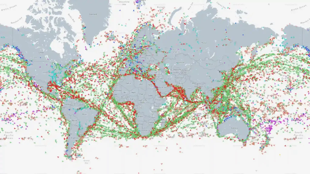
Open MarineTraffic at the wrong moment—late at night, with nowhere specific to be—and the first feeling is not technical. It is mild disbelief. The ocean, which most of us picture as a vast blue blank with a few postcard sailboats in it, turns into a packed working surface. Dots move through the Strait of Malacca. Ferries shuttle between islands. Tankers wait outside ports with the patient geometry of a queue. Bulk carriers creep across open water with names that sound faintly invented: names built from family initials, old Greek words, port cities, luck, steel, and corporate taste.
Table of Contents
The point of MarineTraffic is easy to describe and harder to shake off. It is a live map of ships: cargo vessels, ferries, tankers, tugboats, fishing vessels, cruise ships, yachts, offshore support vessels, and plenty of maritime oddities that are hard to classify at first glance. Click a moving mark and the abstract turns into a particular machine with a name, flag, size, course, speed, destination, recent port calls, and often a photo. The act of looking changes. You stop seeing a line in the water and start seeing a freight system with a pulse.
The comparison with Flightradar is useful because it gets people through the door. Flightradar makes air travel visible; MarineTraffic does that for the water. Yet the sea version has a different mood. Air traffic is quick, regular, and recognisably passenger-facing. Flights depart, climb, arc across a map, and land before you have grown too attached to the route. Ships move slower. They wait. They anchor. They change course by degrees. Their voyages have room for weather, congestion, paperwork, canal schedules, bunkering, labour disputes, commercial decisions, and the simple fact that a big vessel cannot turn its day around in fifteen minutes.
That slowness is the source of the site’s strange power. A ship crossing an ocean is not an abstract data point that refreshes and disappears. It is a small story unfolding in public. You can return hours later and see it farther along the same line. Return days later and it may have crossed a sea, rounded a headland, entered a narrow channel, or sat almost exactly where it was, proving that movement is only part of shipping. Waiting is part of shipping too.
MarineTraffic is built around AIS, the Automatic Identification System. Ships fitted with AIS broadcast information including identity, position, speed, course, navigational status, and other operational details for reception by ships and shore stations. The International Maritime Organization’s rules make AIS carriage mandatory for specified classes of vessels, including passenger ships regardless of size and many larger cargo vessels. That technical rule becomes a civilian viewing window once the signals are collected, processed, and shown on a public map.
The map is not magical, and it is not truly a view of every boat on every patch of water at every second. Calling it “every cargo ship, ferry, and tanker on Earth in real time” is a good headline and a bad promise. MarineTraffic is closer to a near-real-time, highly detailed picture of much of the commercial sea. Its terrestrial receiving network is strongest near coasts and ports; satellite AIS fills in parts of the open ocean, subject to product access and the messy limits of radio signals and reception.
That caveat does not make the experience less impressive. It makes it more legible. A quiet patch of ocean is not necessarily empty. A vessel marked out of range is not necessarily gone. A blank area is not proof that nothing is happening there. The absences belong to the map as much as the dots do. They remind you that this is a view assembled from broadcasts, receivers, satellites, database work, and business choices—not an omniscient maritime control room.
The public-facing miracle is that you do not need to work in shipping to enter. There is no gatekeeping test before the map appears. You do not need to know what a Panamax bulk carrier is, why a tanker’s draught matters, or which route a feeder container ship will probably take after a port call. You can arrive with nothing more serious than a curiosity about the vessel you saw from a beach, the ferry a friend is taking, or the cargo ship sitting on the horizon. The site rewards beginner curiosity rather than punishing it.
Start with a nearby port and the map feels almost domestic. You recognise the coastline. You recognise a ferry route. You may recognise the passenger terminal, the breakwater, the marina, the industrial cranes, or the stretch of water where people stand with coffee and watch ships pass. The same interface then lets you zoom out until your local harbour becomes one node among thousands. That scale shift is MarineTraffic’s best move. A boat you watched for two minutes may be tied to routes that reach three continents.
A useful first exercise is to choose a vessel you can see with your own eyes. Watch it travel outside the map for a moment. Notice how little it gives away from shore: colour, bulk, direction, perhaps a hint of its name through binoculars. Then find it online. The ship acquires a type, a flag, a reported destination, a speed, a length, a history of calls, and a place in a much larger route. The satisfying part is not knowing everything. It is seeing how much was already there.
A more revealing exercise is to do the opposite: begin with a ship name on the map and make it real. Select a tanker passing through a familiar strait. Open its page. Look at its length against the size of the channel. Look at the destination field. Look at how long it has been moving in one broad direction. Look at the nearby traffic. The ship becomes an object with habits. It is not a generic vessel crossing generic water; it is a particular unit in a moving commercial system.
MarineTraffic has a habit of making mundane geography feel dramatic. A narrow channel on an atlas becomes a place where hundreds of large vessels have no interest in getting creative. A port that sounded like a distant proper noun becomes a crowded entrance with waiting ships, terminal traffic, pilots, tugs, and vessels approaching on different schedules. A stretch of coast you know from holidays becomes a corridor for the world economy. The sea is still beautiful, but it stops pretending to be empty.
The real surprise is how quickly the map turns you into someone who notices maritime language. “Underway using engine” begins to sound different from “at anchor.” A destination field that reads “FOR ORDERS” feels like a clue from a thriller, even though it can be perfectly ordinary. A vessel moving at a slow, steady speed tells a different story from one making a tight turn outside a harbour. The words are functional, but they carry atmosphere. Shipping speaks in short operational phrases that somehow still sound cinematic.
This is not a site built around digital spectacle in the usual sense. It does not need an endless feed of reactions, an algorithmic For You page, or loud visual tricks. Its engine is simple: the world’s working vessels are already moving in patterns strange enough to watch. The internet’s contribution is to arrange that movement into an interface a curious person can read.
There is a particular pleasure in seeing a map that makes the physical world feel busier rather than smaller. Many digital maps flatten places into roads, pins, reviews, and directions. MarineTraffic restores friction. Water has depth, ports have queues, ships have turning circles, weather imposes itself, and a route that looks clean on screen may demand days of work at sea. The map does not erase distance. It puts distance back into the picture.
That is why MarineTraffic deserves attention beyond the narrow category of “useful tracker.” It is a public interface for invisible infrastructure. It lets anyone watch the systems that keep supermarkets stocked, factories supplied, holiday islands connected, fuel moving, and ports alive. It never turns those systems into a lecture. It lets the dots do the teaching.
Every ship becomes a small database
The first click on a vessel is where MarineTraffic stops being a map and starts becoming a catalogue of moving things. A typical vessel details view can include a current voyage, departure and arrival information, speed, course, draught, load condition, location, AIS source, port calls, vessel type, flag, IMO number, MMSI number, dimensions, builder, owner, manager, tonnage, and engine information. That is an absurd amount of biography for an object most people would otherwise call “a ship.”
The effect is more human than it sounds. A huge cargo vessel does not become a person, but it does become specific. It has a name rather than a silhouette. It has a body rather than an icon. It has a current state rather than a vague direction. It may be laden, partly laden, or in ballast. It may have left one port several days ago and be aimed at another. The data gives it a working life.
Draught is a good example. To a non-specialist, it may look like one more technical field in a dense panel. Spend a little time around the site and it begins to feel revealing. A ship sitting deeper in the water likely has a different operational story from one riding higher. You do not need to pretend that the field gives a complete picture; it does not. Yet small details make the map feel less decorative and more physical. Ships are not symbols moving over blue pixels. They are heavy objects carrying weight, consuming fuel, dealing with water, time, depth, and access.
The same is true of the vessel type. “Cargo ship” is a broad label that tells you almost nothing about the job. A container vessel looks and behaves differently from a bulk carrier. A crude oil tanker has a different rhythm from a car carrier. A ferry may trace the same route with the regularity of public transport. A tug may move in short, purposeful bursts near a port. MarineTraffic makes the variety visible without requiring you to study a maritime textbook first.
Names are part of the fun. They range from stately to baffling, from generic to extremely specific. Some ships sound like luxury hotels. Some sound like private jokes. Some carry the names of cities, people, flowers, birds, mythological figures, stars, companies, or words that appear to have been assembled in a hurry. A vessel name is a tiny invitation to project a story onto steel. The site wisely does not overplay that romance; it just places the name beside the movement and lets your brain do the rest.
The numbers have their own quiet charm. An IMO number is not a poetic detail, but it offers a stable way to identify a ship beyond repainting, renaming, or changing flags. An MMSI number belongs to the AIS world. A call sign points toward radio practice. Length and beam give a more physical sense of scale than a map icon ever can. Technical identifiers are what keep maritime fascination from drifting into pure fantasy. They anchor the vessel to a record.
Photos play an underrated role here. Not every ship page gives you a perfect portrait, and the image quality varies. That variation is part of the point. A crisp image taken in bright weather lets you inspect the deck layout, accommodation block, funnel, cranes, and hull markings. A grainy shot from the wrong angle makes the vessel feel more elusive. The photograph is evidence that the abstraction has a body. You are not following a line; you are following a thing that exists in weather.
The vessel page also changes the way you read a port. A port call is an ordinary unit of shipping data, but it has narrative force. A ship has been somewhere. It left at a certain time. It is expected elsewhere. Repeat that enough times and a route begins to emerge. You start to see that ports are not just destinations. They are switching stations in a giant physical network, places where cargo changes hands, schedules slip, crews rotate, fuel is taken on, paperwork lands, and commercial plans become logistics.
The site is especially good at making routine look complicated. A port call field appears tidy because databases like tidy fields. Behind it, someone booked a berth, someone arranged a pilot, someone tracked an arrival, someone dealt with cargo, someone took care of the paperwork, and someone somewhere made a spreadsheet more urgent than it was yesterday. MarineTraffic shows the clean outer face of a messy operational world. That contrast is compelling.
A ship’s reported destination is another field that deserves a little suspicion and a lot of attention. Sometimes it is direct and useful. Sometimes it is abbreviated. Sometimes it reads oddly. Sometimes it reflects how the crew or operator entered data. The field is a clue, not a narrator. MarineTraffic is strongest when you treat it as a place to begin asking better questions rather than a final answer stamped by an oracle.
That discipline matters because the internet loves turning public tracking data into overconfident stories. A vessel slows down and someone announces a crisis. A ship changes course and a thread appears with ten theories. A destination field is vague and people decide it conceals drama. The map is rich in signals, but signals are not always explanations. MarineTraffic gives you material to observe; it does not remove the need for restraint.
The platform itself describes its data stream in three useful categories: dynamic information such as position, speed, course, status, and rate of turn; static information such as name, IMO number, MMSI number, and dimensions; and voyage-specific information including destination, ETA, and draught. Those categories explain why the site feels so complete at first glance. It joins a ship’s present motion to its longer identity and its stated intention.
The present motion is usually the thing that catches the eye. The longer identity is what keeps you reading. A ship icon heading north becomes more interesting once you know whether it is a ferry with a repeating timetable, a bulk carrier on a long voyage, a tanker waiting offshore, or a workboat moving between nearby tasks. Context is what turns motion into a pattern.
You do not have to become a ship spotter to enjoy that pattern recognition. The site is perfectly happy with casual use. You can look up a cruise ship before it enters your city, check whether a ferry is running late, or identify the large vessel on the horizon. But the page design quietly leaves doors open. The dimensions invite comparison. The port calls invite history. The vessel type invites a search. The nearby traffic invites a look around. MarineTraffic does not force a rabbit hole; it places one under every click.
There is an argument that too much metadata ruins mystery. MarineTraffic proves the opposite. The ship is not less mysterious after you learn its flag, dimensions, speed, and destination. It becomes mysterious in a more grounded way. Why that route? Why that port sequence? Why that delay? Why that waiting pattern? Why does a vessel of that size stop where it does? Good data does not end curiosity. It gives curiosity better furniture.
A map like this also trains your eye to recognise working shapes. Cruise ships announce themselves. Car carriers have a strange boxy height. Tankers often read as long, flat, and blunt. Container ships reveal their cargo like a skyline of coloured blocks. Bulk carriers look stripped back, broad, and practical. Ferries have a public-transport confidence to them: direct routes, repeated appearances, familiar timings. The interface gives you a visual vocabulary without making a performance out of education.
The more time you spend with vessel pages, the more the word “ship” starts to feel too broad. That is a useful correction. We tend to group maritime traffic into one distant category because we see it from shore. MarineTraffic breaks the category apart. Each kind of vessel has a different relationship to time, place, cargo, passengers, and risk. The map becomes richer as those distinctions stop looking like trivia.
There is also something quietly satisfying about a platform that treats detailed information as a reason to look longer rather than a reason to sell you an immediate answer. The best pages do not tell you what to think. They let a vessel’s details accumulate until an impression forms. The ship’s identity emerges from fragments. That is a good web experience: one that trusts the reader to assemble meaning.
The rabbit holes start with one vessel
The easiest way to lose an hour on MarineTraffic is to begin with a ship you already care about for some small, accidental reason. Maybe it passed your apartment window. Maybe your family is on a ferry. Maybe a cruise ship is arriving tomorrow. Maybe you saw a tanker on a weather app and wondered what it was doing. A personal hook is enough. The site has no shortage of routes out from there.
Look up the ferry first. Ferries are the friendliest entry point because their movement is legible. They connect places people recognise. They often return. They have a rhythm. Watch one for a few days and the map becomes less like a global abstraction and more like a transit board stretched across water. A ferry route teaches you that the sea has commuting patterns. On some coasts, the map is every bit as local as a train tracker.
Then look just beyond the ferry lane. A cargo ship may be approaching the same port from a completely different life. A tanker may be holding outside the entrance. A tug may be working close to the breakwater. A fishing vessel may be moving in loops that make no sense until you remember that straight lines are not every kind of work. The harbour becomes a neighbourhood with overlapping jobs.
A port is one of the best places to zoom in because the dots become dense enough to read as choreography. Incoming traffic slows. Outgoing traffic lines up. Ships turn. Small vessels cluster near large ones. Anchored ships sit in arranged waiting areas that can look, from far enough out, like a collection of punctuation marks. MarineTraffic makes harbour movement look designed even when it is simply managed.
Watch a major strait and the site changes genre. You are no longer following a vessel; you are watching a global bottleneck. The density of movement tells its own story before you identify a single ship. Lines converge. Traffic separates. Vessels move through narrow paths where geography has already made the decision. Chokepoints are where the map becomes almost architectural. Water is open in theory and constrained in practice.
The route itself can be more interesting than the destination. A vessel that makes a clean diagonal across a large sea is satisfying in a geometric way. A vessel that tracks coastlines, rounds islands, pauses near a port, and alters course in small increments feels more human, even though the choices come from operations rather than personality. MarineTraffic turns geography into behaviour. Coastlines stop being outlines and become forces.
A good rabbit hole begins when a vessel’s route does not match your expectation. You might assume a ship will take the shortest visual path, then notice it keeps farther offshore. You might assume a port is an ending, then see that the vessel continues after a short call. You may expect speed, then find long periods of waiting. The map gives you a recurring lesson: physical movement is governed by constraints you cannot see from a flat screen.
It is tempting to turn every unusual track into an amateur investigation. Resist that impulse. There is pleasure in observation without a dramatic conclusion. A ship may slow because of traffic, weather, fuel use, arrival timing, pilotage, berth availability, safety, maintenance, a commercial decision, or something much less interesting than the stories people prefer. MarineTraffic is better when used with curiosity and patience than with a detective’s hunger for scandal.
Still, a little amateur pattern reading is part of the appeal. You begin to notice which ships are regulars and which feel like visitors. A ferry route becomes familiar. A large vessel comes through once, then never appears again. A tug stays in one port area all week. A tanker waits farther from shore than you expected. The map rewards repeat visits because memory becomes part of the interface.
That is a rare quality on the web. Most sites reset you into a new feed each time. MarineTraffic gives you a place you can revisit and slowly learn. You remember the geography. You remember that a certain anchorage gets crowded. You remember which port entrance produces tight turning patterns. You remember a vessel name because it appeared when you first began looking. Your own attention becomes a layer on top of the data.
The global view opens a different kind of rabbit hole: industrial geography. Follow container vessels around coasts and through canals. Look at the connection between ports and manufacturing regions. Notice how many ships sit near places that never appear in casual conversation but carry huge weight in trade. The map gives obscure ports their proper scale. A name that looked minor in an atlas may turn out to sit at the centre of nonstop traffic.
For anyone who likes maps, MarineTraffic has a special gift: it makes the world feel uneven in a productive way. Some seas teem with dots. Some coastlines become almost continuous strings of movement. Some islands appear to sit beside maritime highways. Some ports seem to pull traffic toward them with visible force. The distribution of movement becomes a form of geography you can watch rather than memorise.
For anyone who likes systems, the appeal is even stronger. Supply chains often arrive as diagrams with arrows between boxes. MarineTraffic replaces those arrows with moving vessels. It does not reveal every contract, cargo manifest, or commercial decision, but it gives the supply chain a physical surface. The box-and-arrow diagram suddenly has weather, anchorages, queues, and wake.
For anyone who likes design, the site is an example of a mature information product that does not need to be cute. It has a lot to organise: map layers, vessel categories, search, route information, port information, details panels, photos, historical information, notifications, and paid features. Yet the central action remains obvious: find a ship, click it, and keep looking. The product knows what its raw material is.
The visual language matters. Small symbols and coloured tracks are not glamorous on their own. Their value comes from density and context. A screen full of vessel icons creates a sense of movement that a table of rows never could. A selected ship stands out against nearby traffic. A course line turns a point into a direction. The design converts messy radio-derived data into spatial intuition.
The same raw data in a spreadsheet would be useful to a shipping professional and almost inert to everyone else. On a map, it becomes legible to a teenager, a tourist, a logistics manager, a ship enthusiast, or someone who simply cannot sleep. MarineTraffic’s quiet achievement is translating specialist infrastructure into a public visual language.
The site gets especially sticky when you learn enough to make a few informed guesses. A vessel approaching a congested port may slow before it reaches the entrance. A ferry will likely follow a known corridor. A ship in ballast may be headed toward a loading region. A group of anchored vessels may signal a delay somewhere in the system. Guessing is fun because the map gives you feedback. You can check again later and see whether the world agreed with you.
You do not need to become accurate at every guess. The point is to see what a living map feels like when time is part of the interface. A static map says, “This is where things are.” MarineTraffic says, “This is where things were recently, where they appear to be going, and how the route is taking shape.” That third part—how it is taking shape—is what separates it from a directory.
The platform also works as a cure for lazy phrases about “global shipping.” The phrase is easy to say and hard to picture. MarineTraffic gives it edges. You see it in waiting ships outside a port. You see it in dense lanes off industrial coastlines. You see it in a ferry arriving on time, which is mundane until you notice the larger traffic sharing the water. The global becomes visible through particular movements.
A good Web Radar subject leaves you with a changed habit. MarineTraffic does that. After a few sessions, you may find yourself looking at the horizon differently. A distant ship no longer reads as scenery. It reads as a question with a page waiting behind it. The website does not merely identify vessels; it changes the way the coast looks.
What the map is actually good at
MarineTraffic is easy to praise as a general curiosity machine, but it becomes more useful when you stop treating it as a single product. It serves several kinds of attention at once. A traveller checking a ferry does not need the same thing as a ship enthusiast. A logistics team does not need the same thing as someone standing on a beach. The cleverness lies in how a shared map supports wildly different reasons for looking.
For the casual user, the immediate value is identification. There is a large object on the water. What is it? Where did it come from? Where is it going? What kind of ship is it? MarineTraffic turns that moment from a guess into a look-up. It gives a name to something that would otherwise remain a distant silhouette.
For travellers, the appeal is emotional and practical. Checking a ferry route gives you a feeling of where a journey is before you board. Checking a cruise ship arrival makes a port visit more concrete. Watching a vessel carrying friends or family is a modest form of reassurance, provided you remember that public tracking has limitations and delays. The map is a bridge between travel plans and the physical journey already underway.
For photographers, spotters, and coastal walkers, the site becomes a field guide with a clock. A ship can be identified before it reaches the best viewpoint. A vessel’s expected course may suggest where it will appear next. A photo on the vessel page may help you recognise its profile. It turns ship spotting from a lucky encounter into a practice of informed waiting.
For people who live near ports, MarineTraffic is a civic map. Ports often occupy huge physical and economic space while remaining mentally separate from the rest of a city. They are fenced, industrial, noisy at certain hours, and visually distant even when they sit close to homes. The map reveals the traffic pattern behind the cranes. It gives residents a way to see the working life that shapes their coastline.
For students, journalists, researchers, and policy-minded readers, the site offers a starting surface rather than a complete investigation. It lets you see routes, port activity, vessel types, and operational patterns. It does not tell you everything, and it should not be mistaken for a perfect evidentiary record. But it gives abstract topics a visible, inspectable form. You begin with a ship, then ask what is known, what is missing, and which claims need proper sourcing elsewhere.
For people in logistics and maritime work, the platform has an obvious professional side. Its commercial services expose event feeds, ship databases, and other data products aimed at shipping operations, traders, insurers, port authorities, and analysts. The public map is only the most visible layer of a much larger data business. That dual nature explains why the product feels both approachable and deeply operational.
The consumer-facing experience benefits from that professional seriousness. The map does not feel like a novelty project dressed up in nautical colours. It feels like a real system because it has to work for people who care about details. Vessel characteristics, port calls, data source labels, timestamps, and event categories are not decorative extras. They are the residue of a product built around actual maritime work.
Where MarineTraffic earns the extra click
| Use case | What to open first | Why it works |
|---|---|---|
| Identify a ship offshore | Live map and vessel search | It turns a distant hull into a named object with a route and profile |
| Follow a ferry or cruise ship | Vessel details and recent positions | It makes an itinerary feel physical rather than theoretical |
| Explore a port | Zoomed live map and nearby vessels | It reveals queues, approaches, turns, and working density |
| Learn shipping geography | Major straits, canals, and anchorages | It shows how routes are shaped by real choke points |
| Watch a global system move | Vessel type filters and wider map views | It makes supply chains visible as traffic rather than diagrams |
| Start a serious investigation | Vessel page, timestamps, then outside reporting | It provides leads without pretending to settle every question |
The table matters because MarineTraffic has no single “correct” way to use it. The same map can be a two-minute identification tool, a daily ritual, a travel companion, a geography lesson, or the first screen in a much more serious research process.
The most reliable casual habit is to search for something concrete. Do not open the map and expect it to explain the world before you give it a handle. Search a port you know. Search a ferry route you have taken. Search a ship you saw. Specific curiosity beats aimless browsing at the start. Once you have a point of contact, the broader map becomes much easier to read.
The second useful habit is to leave the vessel page earlier than you think. People often click a ship, read its name and destination, then stop. The richer experience comes from clicking back out to the surrounding water. What else is moving nearby? Is the ship in a lane? Is it approaching a port? Is it alone in open water? Are there ships anchored nearby? The ship is a door into a scene.
The third habit is to watch a place twice. A harbour at noon and the same harbour at midnight can look different. A strait on a weekday may feel different from a holiday period. A port’s anchorage may be sparse one week and crowded another. Time is the feature most people underuse. MarineTraffic is not a map you finish; it is a map you revisit.
The fourth habit is to read the timestamp. This sounds dull, but it is the difference between enjoying the map and misreading it. A position has a source and a time. That matters especially when a vessel is offshore, when coverage is thin, or when you are looking at something that appears dramatic. Freshness is part of the data, not a footnote.
The fifth habit is to use vessel types as a way to change the map’s personality. A view crowded with passenger vessels feels different from one focused on tankers. A map of fishing vessels tells a different spatial story from a map of container ships. Filters turn one product into several distinct maps. They let you ask what a coast looks like through a specific kind of work.
The sixth habit is to keep a sense of proportion. A vessel icon is not a ship-shaped truth capsule. It is a representation based on received data. The interface can feel so immediate that you forget its layers: shipboard equipment, radio transmission, terrestrial reception, satellite collection, processing, database matching, and display. Remembering the chain makes the map more interesting, not less.
That chain begins with AIS broadcasting. The US Coast Guard’s Navigation Center describes AIS as a shipboard broadcast system operating in the VHF maritime band, able to handle thousands of reports per minute and update as often as every two seconds. Speed at the transmitter does not mean every public map position is equally fresh everywhere, but it explains why the interface can feel strikingly alive near strong coverage.
MarineTraffic’s own support material explains that its network collects AIS transmissions through receiving stations and processes them into dynamic, static, and voyage-related information, while showing current positions and tracks on the live map. That is the machinery behind the small thrill of watching a ship icon move. A radio message has been turned into a public visual event.
The product is also a useful reminder that maps are arguments about what deserves to be seen. Road maps privilege roads. Flight trackers privilege aviation. MarineTraffic privileges maritime movement. Once you spend time with it, you notice how little of the sea is usually represented in ordinary digital mapping. Coastlines are there. Ports are pins. Shipping lanes are often absent. MarineTraffic fills that missing layer with work.
The result is a more honest picture of the coast. Coastal life is often sold through leisure: beaches, marinas, seafood, sunsets, boardwalks, sailboats, cliff paths. MarineTraffic brings in the other coast: tugboats, roll-on/roll-off ferries, bunkering, anchorages, cargo calls, dredgers, pilots, and ships waiting for a berth. It adds industry without draining the romance. In fact, it makes the romance more real.
A ship on the horizon is romantic partly because you do not know where it has been. MarineTraffic gives you some of that answer, but never enough to destroy the feeling. You may learn the previous port, the stated destination, the vessel type, and the route. You still do not know the weather on deck, the state of the cargo, the mood of the crew, the commercial pressure behind the voyage, or the thousands of small decisions that made this particular line appear on the map. Data narrows the mystery without closing it.
There is a broader product lesson here. The best public data tools do not bury people under information or flatten information into a single score. They offer a surface that works for a glance and a deeper layer for those who stay. MarineTraffic gets the ladder right. The map is immediate; the vessel pages reward patience.
The platform’s mobile details view makes that ladder clear. MarineTraffic lists current voyage information, current position, nearby vessels, AIS source, timestamps, port calls, and technical vessel information in one place. That is a lot of operational detail to make available from a phone screen, yet the sequence remains intuitive because it follows the question a person naturally asks: where is it, what is it, and what has it been doing?
A lesser product would treat every field as equally important. MarineTraffic gets much of its readability from hierarchy. You notice location and movement first. Then voyage context. Then the supporting material. The site understands that people arrive through curiosity before they arrive through data literacy.
The gaps are part of the story
A mature appreciation of MarineTraffic begins with a refusal to treat the map as a perfect witness. The platform’s strongest feature—the feeling that the sea has become observable—also creates its biggest temptation. It is easy to see a dot and assume visibility. It is easy to see no dot and assume absence. Both leaps can be wrong.
MarineTraffic states plainly that its terrestrial AIS-based system does not cover every part of the world’s seas. Land-based reception depends on stations being close enough to receive the signal, and satellite AIS broadens coverage without removing every limitation. The map is a coverage map as much as it is a vessel map. You are always looking at ships and the conditions under which they were seen.
Near coasts, geography and antenna placement matter. MarineTraffic says a typical receiving station with an external antenna positioned 15 metres above sea level may receive AIS information within roughly 15 to 20 nautical miles, while higher stations may reach much farther under favourable conditions. A coast is not just a line on the map; it is part of the reception system. Hills, elevation, obstacles, equipment, and weather all matter.
Out at sea, satellite AIS makes the picture broader, but not uniform. MarineTraffic notes that satellite tracking supplements terrestrial data for remote areas and that access depends on plan settings in parts of the service. The phrase “live global tracking” hides a lot of texture. A position may come from land, a satellite, or another recognised source, and the provenance matters.
The platform’s recent mobile documentation even surfaces data-source labels such as terrestrial, satellite, and roaming alongside timestamps. That is a useful bit of product honesty. It gives attentive users a way to ask not just “where is this ship?” but “how was this position received?” A tracker that reveals its own epistemology is more trustworthy than one that pretends every dot arrived the same way.
There are other reasons a ship might not appear. It may not have an AIS transponder. The equipment may be off, malfunctioning, poorly configured, or operating outside useful range. A low-power Class B signal may be harder to receive. In high-traffic areas, satellite reception can be affected by signal collisions or interference. Absence has many causes, and most are less dramatic than the internet likes to imagine.
That does not mean the data is meaningless. It means you need to treat it as a trace. The trace may be rich. It may show a route, timing, location, and vessel identity. It may also be incomplete, delayed, or missing details you wish were there. A trace is still useful when you know it is a trace.
The rule applies with special force when public events pull people toward ship tracking. During major disruptions, conflicts, accidents, port blockages, storms, or supply-chain stories, vessel maps suddenly acquire a wider audience. Screenshots circulate. People identify shapes, routes, and anchorages. The visual authority of the map can outrun the certainty of the data. A clean interface makes partial information look more complete than it is.
MarineTraffic should be treated as an observation layer in those moments, not as the sole basis for a claim. Check timestamps. Check the source. Check official notices, reputable reporting, port authorities, shipping statements, maritime safety information, and direct evidence. A moving icon is a useful clue; it is rarely a complete account.
That caution is not an accusation against MarineTraffic. It is a way of respecting the tool. The platform does not promise that every public user is entitled to every operational fact about every ship. The maritime world has safety, privacy, commercial, legal, and security concerns that do not disappear because a map looks inviting. The IMO itself has warned that public web publication of AIS-generated ship data can create safety and security concerns in some contexts. Visibility is not automatically harmless.
The tension is real. Public vessel tracking satisfies legitimate curiosity, supports research, enriches geography, and can improve awareness. It can also attract speculation, sensationalism, and unwanted attention. MarineTraffic lives at the edge of that tension. Its existence invites a broader question about public infrastructure data: what should be visible, to whom, at what level of precision, and with what safeguards?
The best personal rule is simple: watch ships, do not stalk people. A ferry route is fair game for ordinary travel interest. A cargo vessel’s progress is part of public maritime life. Turning location data into a campaign of harassment or a claim of certainty about sensitive activity is different. Curiosity has a line, and the map does not draw it for you.
There is another gap worth noticing: cargo. A ship type and route can suggest possibilities, but they do not give you a full manifest. A tanker is not a detailed ledger of what it is carrying. A container ship is not a transparent database of every box on deck. A bulk carrier’s path is not a complete explanation of its commercial purpose. The route tells you where a ship is moving, not the whole business behind the movement.
That missing context is part of what makes maritime tracking seductive. You are close enough to see the machine, far enough away to want the rest of the story. The responsible response is not to fill the gaps with confidence. It is to distinguish between what is visible, what is likely, and what remains unknown. Good observation leaves room for the unknown.
A similar discipline applies to ETA fields. Estimated arrival times are useful. They are also estimates. Weather, port congestion, pilot availability, berth schedules, routing decisions, and many other operational realities can alter a voyage. The timestamp is a snapshot of intent, not a contract with the future.
The map also refuses a common fantasy about global logistics: that the system moves in clean, frictionless lines. MarineTraffic makes waiting obvious. Vessels anchor. They slow. They queue. They loop. They drift in holding patterns. The pauses are often more revealing than the crossings. They show that shipping is not only about transport; it is also about coordination.
A crowded anchorage is especially telling. From afar it may look like a handful of dots doing nothing. Look longer and you understand that “doing nothing” is rarely the right description. A ship at anchor can be waiting for a berth, instructions, cargo, clearance, weather, crew changes, service, or a commercial decision. Stillness can be operational. The map trains you not to confuse absence of movement with absence of work.
The same applies to slow speed. A vessel moving slowly may be conserving fuel, timing an arrival, facing weather, managing traffic, or approaching a pilot station. MarineTraffic encourages you to notice slow movement, but it cannot always tell you the operational reason. The map gives you behaviour, not motive.
This is one of the reasons the experience stays interesting after the novelty wears off. Perfect visibility would be dull in its own way. A map that answered every question would become a database query with a coastline. MarineTraffic remains alive because it shows enough to prompt interpretation while holding enough back to demand humility.
The product’s limitations also reveal the practical materiality of the internet. It is easy to think of digital services as floating above geography. MarineTraffic does not. Its usefulness depends on hardware placed somewhere, radio signals travelling through actual air, ships carrying actual equipment, satellites passing overhead, and data infrastructure processing messages at scale. The website is made of antennas as much as code.
That is a lovely thing to remember while using it. The interface on your screen may feel frictionless, but behind it are receiver stations, antennas, cables, feeds, servers, data-cleaning systems, maritime standards, vessel crews, and a global infrastructure of maintenance. Every dot is the visible tip of an engineering chain.
A public map of private commerce
MarineTraffic is entertaining because ships move. It matters because ships move things that shape ordinary life. Food, fuel, cars, machinery, building materials, electronics, chemicals, textiles, spare parts, household goods, raw materials, and much else travel by sea before they become invisible again on shelves, in warehouses, at factories, or inside other products. The map gives the hidden logistics of daily life a visible route.
That route is never the whole story, but it is enough to change your mental picture. When people talk about “supply chains,” the phrase often lands as corporate weather: a bland explanation for delays, prices, and shortages. MarineTraffic makes it tangible. You can see ships waiting outside ports. You can see dense traffic in passages that connect regions. You can see how much movement gathers near industrial coastlines. The term “supply chain” starts to look like what it is: a physical choreography spread across water.
The public map also turns port cities into more than destinations. A port is a threshold between land logistics and maritime logistics, but it often disappears from the popular picture of a city unless there is a strike, a disaster, a giant cruise ship, or an awkward traffic jam. MarineTraffic puts the port back in the frame. It lets you see the city’s working edge.
That working edge can be beautiful in a hard, non-postcard way. Rows of vessels at anchor. Ferries drawing repeated lines. Container ships sliding past shore at night. Tugs appearing as small purposeful marks beside much larger hulls. The beauty comes from function made visible. The map does not prettify industrial movement; it lets the structure of it show through.
There is a reason maps of trade routes have always fascinated people. They combine geography, wealth, risk, ambition, weather, empire, labour, technology, and distance in a single image. MarineTraffic takes that old fascination and gives it a refresh button. The route is no longer a historical line in a book. It is a present tense event.
Yet the site avoids the trap of pretending that all movement is equally glamorous. Much of shipping is repetitive. That is exactly why it is compelling. The repetition reveals reliability, routine, pressure, and scale. A ferry keeps arriving. A feeder vessel keeps connecting ports. A tanker waits, departs, and becomes one more large fact on a route. The ordinary work is the story.
This is where MarineTraffic feels different from apps built around spectacle. It does not need a singular viral moment because the underlying subject has durable interest. The sea is busy every day. Ports continue operating. Vessels keep moving. The platform is powered by continuity. You do not need breaking news to have a reason to open it.
The map also has a quiet democratic quality. It gives non-specialists a glimpse of a world that is often represented by experts, companies, regulators, and trade publications. You will not become a shipping professional by watching dots move. But you will gain a sense of scale that no press release quite provides. You are allowed to look at the infrastructure that surrounds your life.
That matters because public understanding of infrastructure is usually reactive. People care when a bridge closes, a train fails, a port backs up, or a supply shortage reaches the news. MarineTraffic offers a less panicked route into awareness. It lets people observe the ordinary baseline first. A normal day on the map is useful context for an abnormal one.
There is no need to romanticise maritime commerce. Shipping is tied to environmental pressures, labour conditions, regulation, market volatility, geopolitical tension, and difficult questions around transparency. A moving map does not settle any of those issues. But it gives them a physical setting. Arguments about trade become arguments about ships in particular places, moving through particular waters, under particular constraints.
The site is also a reminder that globalisation is not weightless. The internet can make every purchase feel immediate, but the physical economy still moves at the speed of ships, ports, trucks, rail terminals, and paperwork. An online order may arrive with a few taps and a notification. Somewhere behind that clean user experience, a container may have crossed water slowly, waited outside a harbour, been unloaded, sorted, moved, and delayed for reasons no shopping interface will explain. MarineTraffic restores the lag that digital commerce tries to hide.
There is a small philosophical pleasure in that. The platform makes modern life feel less magical and more impressive. Things do not appear because the world has become frictionless. They appear because countless people and machines keep a slow, coordinated system working through friction. The map is a tribute to organised difficulty.
It also makes you respect the sea differently. On a conventional map, water often acts as empty background between meaningful land areas. MarineTraffic reverses that hierarchy. Water becomes a work surface thick with routes, crossings, waiting zones, port approaches, and maritime borders. The sea stops being blank space. It becomes a place where the world is actively being assembled and redistributed.
That shift is intellectually useful. It changes the way you read coastlines, islands, canals, and narrow passages. A small gap between land masses may be a major economic artery. A port city far from your usual mental map may matter because of where it sits in the network. A distant island may matter because it lies near a route, a strait, or an anchorage. MarineTraffic teaches strategic geography by making it visible.
For people who enjoy old port photography, industrial documentaries, rail maps, shipping timetables, or satellite imagery, the platform fits naturally into a larger family of obsessions. It belongs to the internet’s best tradition of public technical windows: sites that show a system in action without reducing it to a novelty. You open them for a fact and stay for the world they reveal.
The map’s strongest cultural lesson may be that infrastructure has personality. Not human personality, exactly, but recurring character. Certain ports feel intense. Certain ferry routes feel dependable. Certain anchorages feel tense or sleepy depending on the day. Certain vessels become familiar. Patterns make systems feel alive.
That is a subtle distinction. You are not projecting too much onto the ship when you recognise a pattern. You are noticing that systems have regularities and that regularities are legible. A ferry has a rhythm. A port has a pulse. A channel has a traffic logic. MarineTraffic gives those patterns a visual stage.
The web has spent years trying to turn every interest into a feed. MarineTraffic feels healthier because it gives you a place rather than a feed. You decide where to look. You choose the ship. You zoom, pan, filter, and return. Your attention remains active. The map asks more of you than a scroll, and gives more back.
That may be why the platform works for people who normally have no interest in shipping. It offers a concentrated version of the pleasure that maps have always provided: orientation, scale, discovery, and the sensation that the world contains more systems than you had imagined. MarineTraffic makes the invisible busy.
First-time watcher notes
The live public experience is accessible for casual browsing, while some capabilities—especially wider satellite coverage, fleet management, historical information, alerts, and professional data access—sit behind plans or commercial products. MarineTraffic’s support pages describe terrestrial positions as broadly available while presenting satellite tracking as an additional service for selected vessels or plans. You do not need a paid account to discover the map’s appeal.
Think “near real time” rather than “a perfect continuous feed.” AIS transmissions may be frequent, but public visibility depends on reception, source, processing, coverage, and product access. Check the position timestamp and source before treating a dot as current to the second. Freshness is a field to read, not an assumption to make.
No. A vessel may be absent because of equipment, range, coverage, signal power, satellite limitations, or data freshness. MarineTraffic notes that a ship without fresh position information can drop from the live map until new data is received. A quiet area may be under-observed rather than empty.
Search the ship you can see, the ferry you might take, the nearest working port, or a strait you have heard about but never pictured as a traffic system. A real-world anchor makes the map click much faster than a random global zoom.
Look past the name. Check its vessel type, current voyage, speed, course, draught, last position timestamp, data source, port calls, and nearby traffic. MarineTraffic lists many of those elements in its vessel details views. The details give the icon a context and a past.
Use it as a lead and then verify elsewhere. A vessel’s apparent location or route may be relevant, but public tracking data can be incomplete, delayed, misread, or missing operational context. A map screenshot is not a complete investigation.
MarineTraffic is worth opening because it gives you a rare sensation: the world becomes larger, busier, and more concrete at the same time. The site does not make the sea less mysterious. It makes the mystery operational. You learn that a horizon contains timetables, radio signals, ports, crews, cargo, fuel, weather, waiting, and a set of routes that keep ordinary life supplied.
Its best trick is not the ability to track ships. Plenty of services can show a position. MarineTraffic’s real trick is making you care about the position. It turns a dot into a vessel, the vessel into a route, the route into a piece of geography, and the geography into a working picture of the world.
Spend ten minutes with it and you may come away with one ship name lodged in your head, one port you did not know mattered, one canal or strait that suddenly feels crowded, and one useful correction to the idea that oceans are empty. They are not empty. They are busy in ways most maps never bother to show.
Author:
Jan Bielik
CEO & Founder of Webiano Digital & Marketing Agency
This article is an original analysis supported by the sources cited below
MarineTraffic live map
MarineTraffic’s main public map, which frames the service around near-real-time vessel locations, ship details, and photos.
How MarineTraffic collects and uses AIS data
MarineTraffic’s explanation of the AIS inputs it collects and the dynamic, static, and voyage data shown across its map and vessel pages.
Typical AIS reception range
MarineTraffic’s guidance on terrestrial AIS reception, coastal coverage, station height, and the role of satellite AIS beyond shore coverage.
Vessel satellite tracking
MarineTraffic’s explanation of how satellite AIS complements the land-based receiver network for vessels operating far from shore.
Why a vessel may not appear on the live map
The platform’s account of coverage gaps, equipment issues, Class B constraints, signal interference, and other reasons a vessel may not be visible.
AIS transponders
The International Maritime Organization’s overview of AIS purpose, carriage requirements, transmitted information, and concerns around public publication of AIS-derived data.
Automatic Identification System overview
The US Coast Guard Navigation Center’s technical overview of AIS broadcasting, VHF operation, reporting rates, and navigational use.