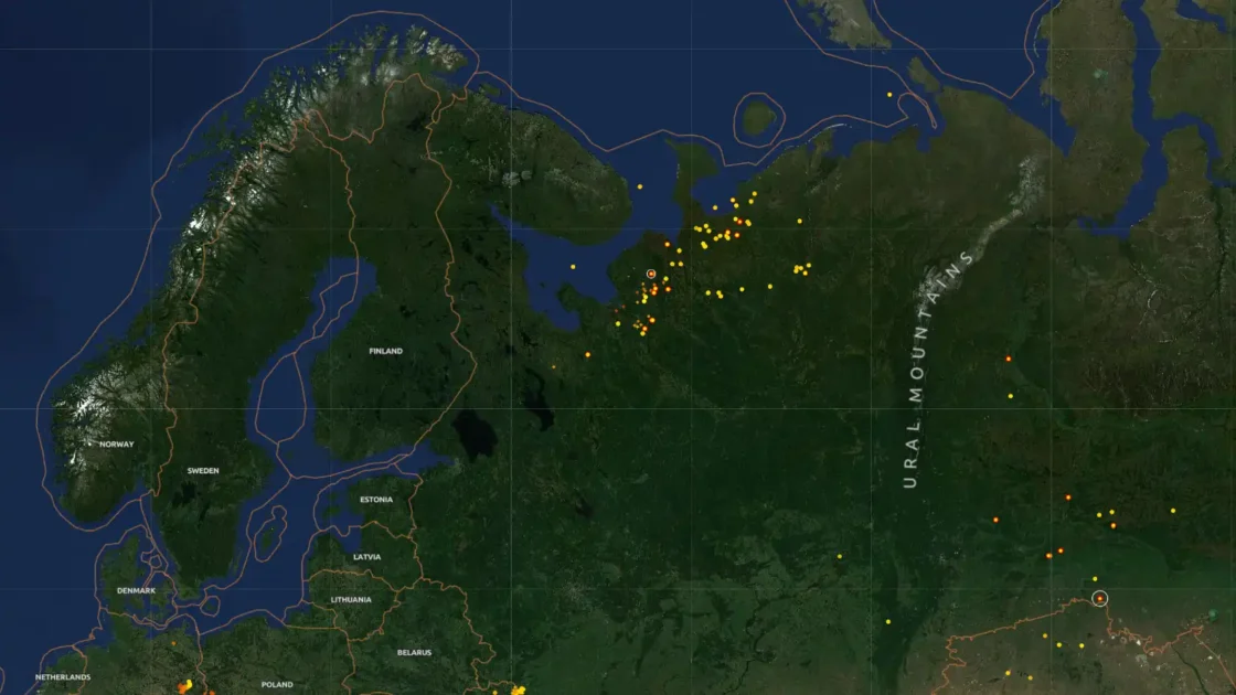

Osiris looks like the kind of screen Hollywood gives to a cyber unit five minutes before a crisis, except the surprising part is not the glow, the maps, or the military-flavored interface. The surprising part is the claim behind it: the project is open source, runs in a browser, and builds its drama from public data feeds rather than sealed intelligence systems. The official repository describes it as the “Open Source Intelligence & Reconnaissance Integrated System,” a real-time global intelligence dashboard that pulls flight tracking, CCTV networks, earthquake monitoring, conflict-zone mapping, and news feeds into a single GPU-accelerated interface.
Table of Contents
The reason it spread so quickly is easy to understand after one glance. Osiris does not ask the reader to care about API endpoints, feeds, state vectors, or satellite metadata. It turns those dry words into a living globe. Aircraft become moving marks. Earthquakes become fresh signals. Fire hotspots, weather events, news streams, CCTV points, satellites, naval routes, and cyber lookup tools sit beside each other in the same visual field. The live site presents itself as an “open source global intelligence command,” with aviation, maritime and space, surveillance, natural hazard, threat, infrastructure, and display layers visible in the browser interface.
That is why the Palantir comparison travels well, even when it needs a heavy dose of caution. A viral X post from Coin Bureau described Osiris as an open-source “clone” of Palantir and framed it as a way to watch commercial flights, satellites, CCTV feeds, weather systems, earthquakes, and wildfires from one interface. The comparison is useful as internet shorthand, not as a product equivalence. Palantir is a giant private software company selling deeply integrated analytical systems to governments and enterprises. Osiris is a public GitHub project with a theatrical UI, a browser demo, open-source code, and many data layers stitched together through web technologies.
The better way to understand Osiris is as a visibility machine. It does not magically reveal a hidden world. It arranges the visible world so forcefully that the visible starts to feel secret. That is the trick. The aircraft were already broadcasting. Earthquake feeds were already public. NASA fire data was already published. News streams were already online. Public CCTV endpoints existed in their own scattered places. Network lookup tools had their own tabs, dashboards, terminals, and websites. Osiris makes the separate pieces feel like one operating surface.
That shift matters because most people underestimate the power of aggregation. A single public data source rarely feels dramatic. A live earthquake feed is useful but narrow. A flight tracker is familiar. A satellite layer is interesting for a minute. A DNS lookup tool belongs to technicians. A CCTV map feels like a curiosity until it is placed beside news, weather, aviation, fires, ports, cyber indicators, and conflict markers. Osiris understands that the interface is the story. The repository says the platform is built with Next.js 16 and MapLibre GL, with data rendered through WebGL for performance with thousands of entities on-screen.
The project lands in a strange cultural moment. People are more aware of surveillance, but less aware of how much surveillance-adjacent data is not secret. They know flights are tracked, but not always how broadly aircraft position data moves through public and research systems. They know satellites exist, but not how normal it is to query orbit data. They know wildfires and earthquakes appear in the news, but not how quickly hazard systems publish structured feeds. They know cyber tools exist, but they rarely see DNS, WHOIS, certificates, vulnerabilities, sanctions checks, and IP lookups presented beside physical world events.
Osiris makes that mismatch visible. It is not the first OSINT tool, not the first 3D globe, not the first flight map, not the first hazard dashboard, and not the first recon toolkit. Its memorable quality is the editorial assembly. It says: here is the planet, here are the signals, here is the feeling of watching them at once. That feeling is powerful, and a little uncomfortable, because it turns public data into something closer to atmosphere. The user is not reading a report. The user is looking at a world that appears to be updating itself.
The strange appeal of a live intelligence globe
A globe interface changes the emotional weight of data. Put a list of aircraft coordinates in a table and it feels like logistics. Put the same aircraft over a dark rotating Earth and it feels like intelligence. Put earthquake metadata in JSON and it feels like a developer resource. Plot it on a live planet and it becomes a pulse. Osiris leans hard into that effect. The interface uses a command-center aesthetic, with region presets, data layer toggles, feed counters, live alerts, and a recon panel that makes the whole thing feel closer to an operations room than a civic dashboard.
This is not just decoration. The design tells the user how to behave. A spreadsheet asks for patience. A map asks for exploration. A tactical-looking globe asks for suspicion, pattern-seeking, and speed. That is the emotional contract Osiris makes as soon as it loads. The user is encouraged to scan, toggle, hover, filter, zoom, and connect. The website’s visual language says that global events are not isolated posts or reports; they are signals in a shared field.
The result is a tool that feels more dramatic than many of its ingredients. Flight tracking is no longer just a plane icon moving across a map. It becomes one layer in a stack of global motion. CCTV is no longer a static public feed index. It becomes a mesh of eyes placed across cities and transport systems. Earthquakes are no longer a feed entry with magnitude and depth. They become moments on the same canvas where aviation, fires, severe weather, news, and cyber tools also live.
That is why Osiris belongs in Web Radar. It is not only a project to inspect, fork, or self-host. It is a reminder that the web still produces strange composite experiences: half tool, half demo, half provocation. Yes, that is three halves. Osiris earns the bad math because it is doing three things at once. It is a working dashboard, a public-data collage, and a kind of internet spectacle about what open information feels like when compressed into one dramatic screen.
The project’s own documentation is unusually direct about its ambition. The GitHub description calls it a “global intelligence dashboard” and a “Palantir Alternative,” while the README lists domains such as aviation, maritime, CCTV, seismic events, fires, news, weather, space, cyber, conflict, crypto, sanctions, and Telegram OSINT. That list is part of the appeal and part of the risk. It makes Osiris sound impossibly broad. It also explains why people share screenshots before asking hard questions about data freshness, reliability, legality, safety, and context.
The live site itself pushes the same command-center mood. It labels its sections with phrases like data layers, aviation, surveillance, natural hazards, threats and infrastructure, live alerts, recon toolkit, and market intelligence. It also lists many live news feeds, including major broadcasters from the United States, Europe, the Middle East, Asia, Australia, Africa, and Latin America. The experience is less like opening a single web app and more like stepping into a dashboard someone built after binge-watching crisis rooms, flight trackers, cyber panels, and satellite maps.
The web has always loved dashboards that make the invisible visible. Server status pages, submarine cable maps, global lightning maps, flight trackers, radio scanners, packet maps, weather radars, satellite pass trackers, public transit maps, wildfire monitors, marine traffic maps, and earthquake feeds all scratch the same itch. Osiris takes that older fascination and pushes it into a heavier, darker, more cinematic wrapper. The project says the internet is not just a place of pages and posts. It is a sensorium.
That word sounds grand, but the feeling is simple. Open Osiris and the browser stops feeling like a document viewer. It feels like a window into systems. Some of those systems are mundane. Some are urgent. Some are only visually impressive. Some are genuinely useful. The mix is what makes the site sticky. You are not looking at one kind of event. You are watching the category boundaries blur.
The strongest part of Osiris is that it respects the power of proximity. A flight near a conflict zone, a fire near infrastructure, a news feed near a region preset, a satellite layer near severe weather, a port marker near shipping chokepoints: none of these pairings automatically prove anything. The interface does not need them to prove anything at first. It only needs them to feel close enough to invite the user’s attention. That is where curiosity begins, and where responsible interpretation must begin too.
Good OSINT work is not screenshot collecting. It is source evaluation, time checking, geolocation, corroboration, uncertainty handling, and restraint. Osiris gives the first intoxicating part: a place where many signals appear together. It does not remove the harder work that comes after. That distinction matters because a dramatic interface can make weak connections feel stronger than they are. The site is best treated as a discovery surface, not a final answer machine.
What Osiris pulls into view
Osiris is most impressive when you stop treating it as one product and start seeing it as a bundle of public-data habits. It gathers movement, hazards, surveillance-adjacent feeds, infrastructure points, media streams, cyber checks, and geopolitical markers into a shared visual frame. The GitHub README lists 16 toggleable data layers and says data is fetched on demand when layers are activated, with viewport-aware loading for the visible region. That is a sensible way to handle a dashboard that would otherwise collapse under its own appetite.
The aviation layer is the easiest to grasp. Aircraft tracking has been familiar to the public for years, but the underlying data is still fascinating. OpenSky’s official API documentation says its live API retrieves live airspace information for research and non-commercial purposes, with aircraft state represented through information such as position, velocity, heading, identity, and time. Osiris uses that kind of public aviation logic to turn airspace into one of its central visual layers.
The earthquake layer sits at the other end of the emotional spectrum. A plane moving across a globe can feel abstract or routine. An earthquake marker carries instant human weight. USGS documents an earthquake catalog API that allows custom searches for earthquake information, with GeoJSON output supported for geographic display and real-time feeds recommended for automated applications showing earthquake information. Osiris benefits from the fact that hazard agencies already publish structured data built for machines and maps.
The fire layer is another case where public infrastructure becomes visually potent. NASA FIRMS distributes near-real-time active fire data from MODIS and VIIRS instruments, with global data generally available within three hours of satellite observation and active fire detections for the United States and Canada available in real time. A fire dot on a globe is tiny, but the feed behind it represents years of Earth observation work, remote sensing pipelines, and public science infrastructure. Osiris borrows the force of that infrastructure by making it clickable and visible.
The natural events layer adds a wider sense of planetary activity. NASA’s EONET describes itself as an open-source API that provides continuously updated, near-real-time natural event metadata, accessible through web services that connect events to related imagery sources. That makes it a natural fit for a browser globe. Storms, fires, dust events, and other natural signals become part of a larger pattern of things happening now, not things filed away in a report later.
The surveillance layer is where Osiris becomes culturally sharper. Public CCTV feeds occupy a strange place online. They are often legal, ordinary, and boring in isolation. A traffic camera showing a wet intersection does not feel like intelligence. A city camera overlooking a road does not feel like a secret. Place hundreds or thousands of such feeds inside an intelligence-styled globe, and the meaning changes. The viewer starts thinking less about cameras as civic infrastructure and more about cameras as a distributed public sensor network.
That shift is uncomfortable because it is partly true. Public cameras were not all installed for intelligence work. Many exist for traffic, weather, transport, tourism, road safety, or public information. Yet once they are indexed and mapped, they become available for new kinds of observation. Osiris does not create that condition by itself. It makes the condition easier to notice. That is why the project feels revealing even when it is using data that was already public.
The cyber and recon tools are the most sensitive part of the package. The OSIRIS live site lists a recon toolkit with tools such as port scan, vulnerability sweep, DNS, WHOIS, certificates, headers, SSL/TLS, subdomains, technology detection, BGP route, GitHub recon, and other lookups. The GitHub README lists similar functions, including port scanning, DNS lookup, WHOIS, SSL/TLS inspection, IP intelligence, vulnerability scanning, crypto wallet trace, and sanctions search. These are legitimate security and investigation concepts, but they also demand boundaries. Scanning systems without permission can cross legal and ethical lines.
The sanctions and crypto features show another side of the project’s ambition. The repository says wallet lookups can check BTC and ETH data and cross-check against OFAC-sanctioned-address lists, while the sanctions tab searches persons, organizations, vessels, and aircraft through OpenSanctions data. This moves Osiris beyond a globe of physical events into financial and identity-linked lookup territory. It is still public-data work, but the consequences of interpretation become heavier.
The Telegram layer is also worth pausing on. The README says Osiris scrapes public-channel previews from unauthenticated Telegram web pages, geoparses posts against multilingual place dictionaries, and plots them on the map. That sounds clever because it turns posts into spatial hints. It also sounds fragile because language, place names, propaganda, translation, reposting, old media, and rumor all complicate the act of putting a dot on a map. A geotagged-looking post is not the same as verified geolocation.
Osiris at a glance
| Layer or feature | What it makes visible | Why it is interesting | Where caution belongs |
|---|---|---|---|
| Aviation | Live aircraft positions | Movement becomes instantly legible | Coverage gaps and context |
| Satellites and space | Orbital and space-weather signals | Space feels operational, not abstract | Source freshness and precision |
| CCTV | Public camera feeds | Civic infrastructure becomes a sensor map | Privacy expectations and reuse |
| Natural hazards | Quakes, fires, weather events | Planetary risk becomes browseable | False confidence from dots |
| News streams | Live broadcast locations | Media becomes part of the map | Editorial bias and repetition |
| Recon tools | DNS, WHOIS, ports, CVEs | Cyber context enters the same console | Permission and legality |
| Sanctions and crypto | Public checks and wallet traces | Finance links to OSINT workflows | Identity mistakes and overreach |
The table matters because Osiris can look like one thing when it is really several things in tension. Part of it is a map. Part of it is a launchpad for public feeds. Part of it is a cyber toolkit. Part of it is a theatrical demo of what happens when public information is gathered in the same room. The interesting question is not whether every layer is equally polished. The question is why the combination feels so compelling.
The answer is that Osiris reduces the distance between data categories. Aviation, earthquakes, cyber lookups, fire detections, camera feeds, Telegram posts, sanctions checks, and live news usually live in separate mental boxes. Osiris removes those boxes visually. The user sees a unified surface first and the underlying differences later. That is the project’s strongest design decision and its biggest interpretive trap.
The repository’s architecture diagram makes the assembly clear. It describes a client with MapLibre GL, HUD panels, layer controls, and a recon toolkit; Next.js API routes for flights, earthquakes, CCTV, news, fires, maritime, GDELT, satellites, weather, scanner, Sentinel, Telegram feed, and OSINT functions; and external sources such as OpenSky, USGS, NASA, NOAA, TfL, NVD, GDACS, EONET, FIRMS, N2YO, RSS feeds, Blockstream, Blockscout, OpenSanctions, and public Telegram previews. The magic is not one secret feed. The magic is orchestration.
That orchestration is exactly what the web is good at. A browser can request, cache, draw, animate, filter, and link. A modern JavaScript app can sit on top of many public sources and make them feel native to one place. Osiris uses that old web strength in a dramatic way. It is not inventing the world’s signals. It is making them feel synchronized.
Why the browser matters
The most underrated detail about Osiris is that it is browser-first. No heavy analyst workstation. No procurement ritual. No expensive hardware box in a locked room. No training portal before the first map appears. The live demo loads as a web page, and the repository offers a quick start through a local development setup or Docker self-hosting. The README lists commands for cloning the repository, installing dependencies, running the development server, and opening it locally.
That changes the social meaning of the project. A desktop intelligence suite feels institutional. A browser globe feels shareable. People can post it, fork it, screen-record it, theme it, criticize it, clone it, break it, and remix it. The project becomes part of internet culture, not just a utility. That is why screenshots and short posts move so easily. Osiris is not only something to use. It is something to point at.
Open source also changes the conversation. The repository is public, has an MIT license, and shows its stack, architecture, files, and README claims in the open. That does not automatically make the project safe, correct, complete, or mature. It does make it inspectable. People can check the code, open issues, fork it, audit data routes, argue over sources, and improve or remove features. For a project dealing with public intelligence signals, inspectability is not a minor feature. It is part of the trust story.
The technology choices are not exotic, which is part of the point. Next.js, TypeScript, MapLibre GL JS, WebGL rendering, Framer Motion, Lucide icons, custom CSS, Vercel deployment: these are normal modern web ingredients listed by the project. The unsettling part is that normal tools are enough to build something that feels like an intelligence surface. You do not need a mythical stack to make public data feel powerful. You need enough feeds, a convincing interface, and a fast map.
MapLibre matters because the map is not a background image. It is the operating surface. The README says Osiris uses MapLibre GL with WebGL rendering, and it frames performance around thousands of concurrent entities on screen. That matters because slow dashboards break the illusion. If toggles lag, points stutter, and panels freeze, the command-center feeling collapses. The interface has to move quickly enough for the user to believe the world is moving with it.
The browser also makes Osiris easier to misunderstand. A web app feels casual. People are used to opening sites without thinking about operational security, data licensing, or legal boundaries. Yet Osiris includes tools and feeds that sit closer to security research, investigation, and situational awareness. The casual surface and serious implications live together. That tension is part of the project’s strange appeal, but it is not something to ignore.
The README includes a useful reminder about partial functionality. It says OSIRIS works partially without API keys because core feeds use public, keyless sources, while the recon toolkit returns a service error without scanner backend variables. It also lists optional keys for sources such as NASA FIRMS, OpenSky, N2YO, and AIS maritime data. That detail is grounding. It reminds us that behind the cinematic interface sits the usual reality of rate limits, keys, backends, caching, source policies, and maintenance.
This is where Osiris becomes interesting as product thinking. The project compresses a complicated setup into a dramatic first experience. A user does not have to understand each dependency before feeling the value of the interface. That is good onboarding. It also means the interface can outrun the user’s understanding. The best version of Osiris would make provenance, freshness, and confidence as visible as the dots themselves.
That is harder than it sounds. A point on a map is visually decisive. A confidence interval is not. A timestamp is easy to ignore. A source caveat is less seductive than a glowing marker. Public-data tools often struggle with this design problem. The more beautiful the map, the more important the metadata becomes. Osiris looks most mature where it treats source, time, and category as part of the visual experience, not as footnotes hidden away from the action.
Browser-based intelligence tools also raise a distribution question. Who is the audience? Hobbyists will open it for the spectacle. Developers will inspect the stack. Security researchers may care about the recon panel. Journalists may use it as a lead-finding surface. Emergency watchers may look at fires, earthquakes, and storms. Crypto investigators may notice wallet and sanctions checks. Curious readers will just spin the globe. The project has many doors, and that is both strength and mess.
The mess is not fatal. Early open-source tools often look overstuffed because they are trying to discover their center. Osiris may eventually split into clearer modes: hazard mode, aviation mode, cyber mode, media mode, conflict mode, self-hosted analyst mode. Or it may remain a maximalist interface where the overload is the point. For Web Radar, the overload is part of the discovery. It feels like a website that should not fit in one tab, yet does.
The public data problem hiding inside the spectacle
Osiris is exciting because it makes public data feel powerful, but that is also the unease at its core. Public does not mean harmless. Public does not mean context-free. Public does not mean everyone expects their feed, post, camera, address, organization, aircraft, wallet, or infrastructure point to be reassembled inside a command-style dashboard. The project sits directly on that modern internet fault line.
The phrase “publicly available” often sounds cleaner than reality. Data becomes public in many ways. Some is intentionally published by government agencies. Some is produced by scientific infrastructure. Some is broadcast by vehicles or receivers. Some is exposed through civic cameras. Some appears through social platforms. Some is scraped from public previews. Some is open because a system was designed to be open; some is open because nobody expected aggregation at scale. Osiris gathers these different meanings under one visual roof.
That does not make the project wrong. It makes it interesting. The modern web is full of public fragments that become more powerful when combined. Search engines did this to pages. Social platforms did this to people. Data brokers did this to identity. Threat intelligence tools do it to infrastructure. OSINT communities do it to conflicts, disasters, and investigations. Osiris gives ordinary viewers a concentrated version of the same pattern.
The project’s strongest lesson is that secrecy is not the only source of power. Arrangement is power. Timing is power. Cross-reference is power. A public earthquake feed next to live news is more useful than the earthquake feed alone. Aircraft positions near a region preset feel different than aircraft positions on a generic tracker. A public Telegram post becomes more consequential when it is geoparsed and plotted. A CCTV feed feels different when it sits inside a global watch grid rather than on a transport department page.
This is why the “spy tool” framing is both catchy and misleading. It catches the vibe but misses the mechanism. Osiris is not interesting because it gives ordinary users classified access. It is interesting because it shows how much ordinary access already exists. The platform dramatizes the reach of open systems. That is a subtler story than “someone open-sourced Palantir,” but it is a more useful one.
Open data was often sold to the public with gentle language. Transparency. Research. Civic information. Safety. Monitoring. Accountability. Innovation. Those are real uses. But Osiris reminds us that once information is open and machine-readable, people will recombine it in ways the original publisher may not have imagined. A feed built for wildfire management can appear in an intelligence-themed dashboard. A camera built for traffic can become a point in a surveillance layer. A flight data API built for research can become part of a public command globe.
The original sources are not obscure. OpenSky’s documentation describes live airspace retrieval for research and non-commercial purposes, with state vectors containing aircraft tracking information. USGS documents earthquake APIs and real-time feeds for earthquake information. NASA FIRMS openly describes near-real-time fire detections from MODIS and VIIRS. NASA EONET describes near-real-time natural event metadata available through web services. Osiris is not digging these out of a vault. It is drawing lines between public systems.
The ethical question is not solved by saying the data is public. That is the starting point, not the answer. Responsible use depends on purpose, precision, attribution, permissions, rate limits, local law, harm risk, and the people or places exposed by the information. A wildfire marker and a CCTV camera do not carry the same risk. A sanctions lookup and a storm event do not require the same caution. A port scan and a news stream belong to very different legal and operational worlds.
The recon toolkit is where the boundary becomes sharpest. Looking up your own domain records, certificates, headers, and exposed services is normal security hygiene. Scanning networks or systems you do not own or lack permission to test is a different matter. Osiris places those capabilities inside the same aesthetic world as public maps and news feeds, so users need to bring more judgment than the interface may initially demand. The presence of a button does not grant the right to press it against someone else’s infrastructure.
The CCTV layer has a different kind of sensitivity. Public cameras are often published for benign reasons, but people moving through those spaces did not necessarily consent to become part of an OSINT globe. Many feeds are low resolution, delayed, fixed, or mundane. Even so, aggregation changes the social texture. A single camera is local. A camera network is strategic. A mapped camera network feels like coverage.
Osiris also exposes a design challenge for public agencies and open-data publishers. If a feed is public, how should it communicate intended use, limitations, rate limits, attribution requirements, and risks of misuse? Many official data providers already publish terms, documentation, and guidance. But the average user of a glossy dashboard may never read them. The more public feeds flow into third-party visual systems, the more source context needs to travel with the data itself.
That is one place where Osiris could grow from impressive to genuinely serious. It already brings many categories into one surface. The next layer of maturity would be provenance and confidence design: visible source labels, last-updated times, known coverage gaps, delay warnings, rate-limit notes, and clear permission language for sensitive tools. Those details do not kill the magic. They make the magic safer to interpret.
The internet has a habit of mistaking visibility for knowledge. Seeing a dot on a globe feels like knowing something. Often it only means a feed emitted a record and the interface plotted it. The distance between those two ideas is where bad analysis happens. Osiris is most useful when the user treats it as a lead generator: something to notice, then verify elsewhere. It is most dangerous when treated as a truth engine.
A sharp tool with rough edges
Osiris feels like a project that arrived before the discourse around it caught up. The repository is public, the demo is online, the interface is shareable, and the X framing is already dramatic. The harder questions are slower: who maintains the feeds, what breaks under load, how often sources change terms, how stale static layers become, what happens when a source blocks access, and how the project handles false positives, errors, and misuse.
The repository already hints at maintenance pressure. It mentions performance work such as reduced edge requests, relaxed polling intervals for stable data, static data served from memory, and prevention of duplicate API requests. Those are not glamorous details, but they are the difference between a viral demo and a usable tool. Real-time dashboards are hungry. Every feed wants attention. Every user action can trigger network calls. Every public source has limits, quirks, or breaking changes.
The project’s breadth is both impressive and suspicious. A small tool that does one thing well is easy to evaluate. A global intelligence interface with aviation, maritime, CCTV, hazards, news, weather, space, cyber, conflict, crypto, sanctions, and Telegram layers invites awe before scrutiny. Some layers will be stronger than others. Some will be fresher. Some will depend on APIs. Some will be static. Some will be mostly visual. Some may break quietly. That does not make Osiris useless. It means the user should avoid treating all layers as equal.
The live site already shows the tension between spectacle and state. The interface lists aircraft, satellites, CCTV, weather, nuclear, active layers, feeds, entities, region presets, market panels, SCM risk command, and live alerts. A dashboard can show many counters and labels before the underlying data proves itself in a specific investigation. The display creates a sense of readiness. The user still has to check what is actually loaded, current, sourced, and relevant.
That is not a criticism unique to Osiris. Every situational-awareness dashboard fights the same battle. The more categories it includes, the more it risks becoming a wall of suggestive signals. The best dashboards discipline the user. They make time visible. They make source differences visible. They separate observed facts from inferred risk. They let the user trace a marker back to its origin. Osiris has the bones of that kind of system, but its viral identity is still dominated by the wow factor.
The wow factor is not worthless. It brings people to the project. It makes open data tangible. It attracts contributors. It shows non-specialists why public feeds matter. It reminds developers that interfaces shape perception. It may inspire better civic dashboards, safer OSINT tools, and more transparent source labeling. A little spectacle can be a useful doorway. The problem starts when spectacle replaces judgment.
Open-source projects often improve when the right skeptics arrive. A security researcher may question the recon implementation. A disaster-data specialist may push for clearer hazard metadata. A journalist may want source timestamps and exportable citations. A privacy advocate may challenge the CCTV presentation. A developer may improve caching, rate-limit handling, or self-hosted deployment. A designer may make uncertainty easier to see. Osiris is exactly the kind of project that could benefit from a critical contributor community rather than pure fan energy.
The self-hosting angle deserves special attention. The README includes Docker instructions and notes a prebuilt image route, while also explaining environment variables and optional API keys. Self-hosting changes the use case. A casual visitor sees a public demo. A serious user can run a controlled instance, configure keys, inspect routes, adjust sources, remove risky modules, or add internal-only layers. That is where Osiris becomes less like a viral website and more like a toolkit.
The toolkit path is probably the healthier future. A single public demo with everything turned on is great for discovery, but serious use needs configuration and restraint. A newsroom might want hazard feeds, aviation, public news, and source export, but no port scanner. A school might want natural events and satellites. A security team might want recon tools against owned assets, with audit logs. A humanitarian group might want fires, weather, and infrastructure overlays, with careful privacy limits. The same core interface could serve different modes if the project leans into modularity.
There is also a naming and positioning risk. Calling something an open-source Palantir alternative is a powerful growth hack. It is also a burden. It invites comparison to a company with massive resources, enterprise contracts, complex integrations, and years of product development. Osiris does not need to be that to be interesting. It is more compelling as an open web experiment in public-data fusion. The Palantir shadow gets clicks, but it can distort the evaluation.
The project’s real achievement is smaller and more durable. It proves that one developer or a small open-source group can create a browser experience that makes public intelligence signals feel immediate. That is enough. Not every interesting website needs to beat a defense contractor. Some need only reveal that the web itself has become a nervous system of public feeds, and that a good interface can make that nervous system visible.
A serious reader should also separate visual coverage from analytical depth. Osiris can show that something exists in the feed. It does not automatically explain why it matters. It can show an aircraft marker. It does not know the full operational context. It can show a public camera. It does not interpret the scene responsibly. It can show a fire hotspot. It does not replace emergency authorities. It can show DNS or WHOIS data. It does not grant permission to probe a target. The globe is a beginning.
The web culture behind Osiris
Osiris belongs to a lineage of websites that make the internet feel bigger than social feeds. These are the sites people send with a short message like “you need to see this.” They do not always solve a daily problem. They expand the sense of what a browser can hold. A live lightning map does this. A ship tracker does this. A radio scanner map does this. A public satellite viewer does this. Osiris does it by making the world feel simultaneously mapped, watched, and queryable.
That matters because much of the web has become flat. Feeds scroll. Search results rank. Apps ask for accounts. Articles sit behind paywalls. AI chat boxes answer in neat paragraphs. Osiris pushes in the opposite direction. It is visual, busy, a little excessive, and not fully domesticated. It reminds the user that the web can still feel like an instrument panel built by someone with an obsession.
The project also reflects the current taste for “vibe-coded” command centers. Developers can now assemble striking interfaces faster than before, especially with modern front-end frameworks, map libraries, open APIs, and AI-assisted coding. That does not make the work trivial. It changes the bar. The web is filling with tools that look operational before they are institutionally mature. Osiris is a strong example of that style: cinematic first, source-connected second, community-tested third.
The best version of this trend is exciting. Public data becomes approachable. Complex systems become visible. People who would never read API docs start caring about feeds, maps, and provenance. Developers build weird public-interest tools without waiting for a grant or a contract. The worst version is noisy: dashboards that overclaim, scrape recklessly, ignore context, and turn serious events into aesthetic content. Osiris sits close to both possibilities, which is why it is worth watching rather than dismissing.
The interface style also borrows from gaming. Region presets, hot zones, toggles, live counters, command labels, hover states, and scanning panels all make the user feel active. That is good for engagement, but it changes the posture of attention. A disaster feed should not feel only like a game layer. A conflict marker should not become scenery. Good design can create urgency without turning reality into a toy. Osiris is visually strong enough that it needs to keep earning that ethical balance.
Still, the site is not cynical. There is real curiosity in the way it brings sources together. The README is open about its architecture, dependencies, data sources, and features. The live site is rough in places, but it is clearly trying to make public information navigable through a single interface. The project’s energy is less “polished enterprise product” and more “someone built the dashboard they wanted to exist.” That is often where memorable web projects begin.
The open-source nature also makes the audience part of the story. People are not limited to reacting. They can fork, inspect, file issues, improve docs, add source labels, remove dangerous defaults, build safer modes, or turn the core idea into something narrower. That is a better outcome than treating Osiris as a finished artifact. The project is most interesting as a seed.
The cultural fascination with Osiris also says something about trust. People distrust institutions, but they are fascinated by institutional-looking tools. They dislike surveillance, but they click surveillance maps. They worry about misinformation, but they crave real-time feeds. They know dashboards can mislead, but they still feel comforted by visual control. Osiris sits exactly in that contradiction. It offers a sense of command over a world that remains stubbornly hard to understand.
That contradiction is not a reason to avoid it. It is the reason to open it carefully. A good Web Radar discovery should leave the reader with curiosity and better judgment, not just a new tab. Osiris is worth opening because it makes a hidden-in-plain-sight truth obvious: the internet is full of public signals, and the way those signals are arranged changes how powerful they feel.
The web radar verdict
Osiris is worth your time because it makes the public web feel uncanny again. Not because every layer is perfect. Not because it replaces professional analysis. Not because the Palantir comparison should be taken literally. It is worth opening because it compresses aircraft, satellites, cameras, hazards, news, infrastructure, and cyber lookups into a single experience that forces a useful reaction: wait, all of this is already out there?
That reaction is the heart of the project. Osiris is a browser-based mirror held up to open information systems. Some of the reflection is useful. Some is theatrical. Some is messy. Some is ethically uncomfortable. All of it belongs to the web we already have. The project does not need to be treated as a spy console to be memorable. It is more interesting as a map of public-data abundance.
For designers, Osiris is a lesson in interface gravity. The same data becomes more clickable, more shareable, and more consequential when presented with confidence. For developers, it is a reminder that open APIs and front-end maps remain a potent combination. For journalists and researchers, it is a lead-finding surface that still demands verification. For privacy-minded readers, it is a warning about aggregation. For casual users, it is simply a strange and gripping website.
The rough edges should not be hidden. A project this broad needs constant skepticism around data freshness, source policies, legal use, recon permissions, camera ethics, false correlations, and overinterpretation. The live globe can make the world feel legible too quickly. Good analysis is slower. The responsible user should treat every marker as a prompt, not a conclusion.
The best thing about Osiris is also the most unsettling thing about it. It does not feel impossible. Once you see the repository, the sources, the architecture, and the public feeds, the spell changes. The system is not magic. It is the web doing what the web does: linking, fetching, plotting, styling, and compressing distance. The magic was never secrecy. The magic was assembly.
That is why Osiris will probably inspire copies. Some will be uglier. Some will be safer. Some will be more dangerous. Some will focus on disasters, supply chains, cities, cyber assets, conflicts, aviation, maritime movement, or media monitoring. The idea is too obvious after someone makes it visible. A public-data globe with modular intelligence layers is not an endpoint. It is a pattern.
The strongest future for Osiris would be less about looking like an intelligence agency and more about acting like a responsible public-data workbench. Keep the cinematic interface, but pair it with sharper provenance. Keep the open-source energy, but make permissions clear. Keep the broad discovery surface, but let users choose safer modes. Keep the thrill of seeing the planet as live data, but make uncertainty part of the picture.
Until then, Osiris is a memorable internet object: impressive, imperfect, and revealing. It shows how much of the world is already machine-readable, how quickly public feeds become intelligence-like when placed together, and how thin the line can be between civic transparency and surveillance aesthetics. Open it for the spectacle. Stay for the uncomfortable lesson.
Author:
Jan Bielik
CEO & Founder of Webiano Digital & Marketing Agency
This article is an original analysis supported by the sources cited below
OSIRIS live demo
Official live browser interface used to verify the project’s presentation, visible data-layer categories, recon toolkit labels, region presets, live feed panel, and command-center visual framing.
OSIRIS GitHub repository
Official source repository used to verify the project name, open-source positioning, README feature list, architecture notes, technology stack, license, quick-start instructions, and listed data sources. The writing also followed the supplied human-style editorial standard.
Coin Bureau post on X
Original social source referenced in the prompt, used to verify the viral framing of Osiris as an open-source Palantir-like project spreading through X.
OpenSky Network API documentation
Official documentation used to verify how public aircraft state data is represented and accessed through OpenSky’s live API for research and non-commercial use.
USGS earthquake catalog API documentation
Official USGS documentation used to verify the availability of earthquake data through queryable API methods and GeoJSON output for geographic display.
NASA FIRMS
Official NASA FIRMS page used to verify near-real-time active fire data from MODIS and VIIRS instruments and the public fire map, data, alert, and web-service ecosystem.
NASA EONET
Official NASA Earth Observatory Natural Event Tracker page used to verify the open-source API for continuously updated, near-real-time natural event metadata.
| Citing this article? Brief excerpts are welcome. Please credit Webiano.digital, name the author where stated, and include a link to https://webiano.digital and to this original article. Full or substantial republication requires prior written permission. Read our Copyright and Content Use Policy. |
This article was prepared with the assistance of artificial intelligence tools. The content underwent expert human review, and Webiano Digital & Marketing Agency assumes editorial responsibility for its final version and publication.