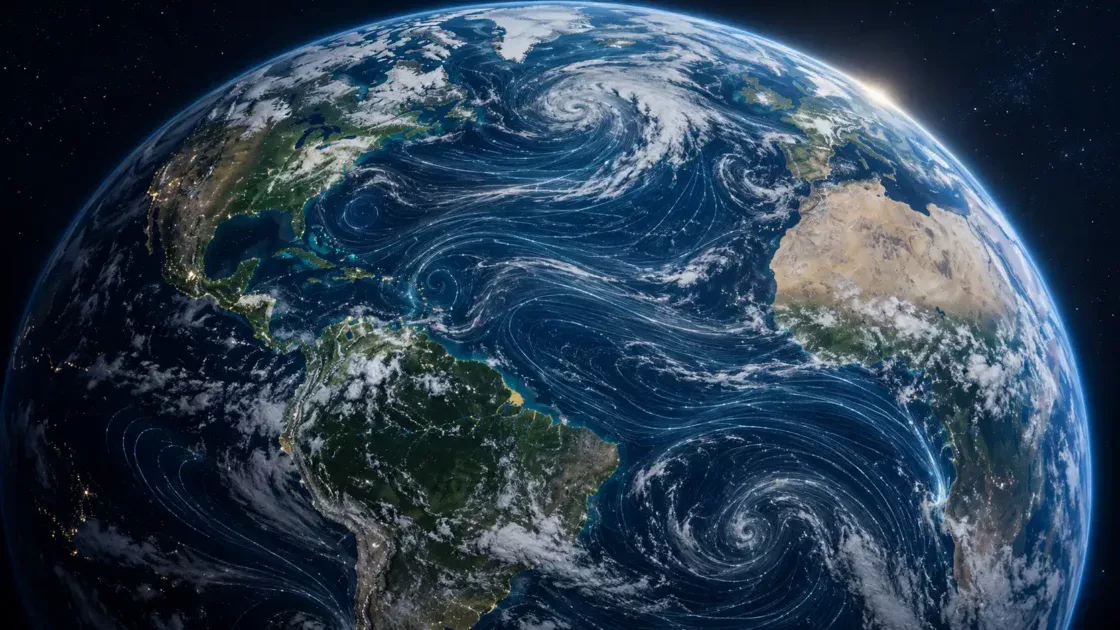

Google Earth’s strangest trick has always been making the planet feel both enormous and clickable. You open it for one place, usually a house, a city, a coastline, a memory, and then the interface quietly pulls you into a different scale of thinking. A neighborhood becomes a drainage basin. A road becomes a border. A beach becomes a climate story. For years, that was enough. Google Earth was the web’s great overhead view: part atlas, part toy, part portal for people who like falling through geography.
Table of Contents
The newer Google Earth is more interesting because it no longer stops at looking. The product now pushes harder toward creation, collaboration, importing files, annotating places, presenting spatial stories, and sharing work across devices. Google’s own Earth pages describe mapmaking tools, collaborative features, high-resolution satellite imagery, 3D terrain and buildings in hundreds of cities, and Street View’s 360-degree perspectives as part of one package.
That shift sounds small until you use it with a real question in mind. A map becomes an argument when someone chooses what to mark, hide, label, connect, and present. Google Earth is no longer only the place where you check whether a hotel is close to the beach. It is becoming a browser-based place where teachers, planners, researchers, local historians, journalists, campaigners, students, designers, and curious obsessives build visual evidence around the real world.
The best way to understand the new Google Earth is to forget the old habit of treating it as a prettier Google Maps. Maps is for moving through the day; Earth is for thinking with distance, terrain, history, and scale. Maps tells you where the café is. Earth lets you build a story about why the café district exists there, how the neighborhood sits against a river, where development has pushed outward, which streets form a barrier, and what the place looks like from above.
That is why earth.google.com belongs in Web Radar. It is familiar enough to be overlooked and strange enough to reward another visit. Most people already know the name, which is exactly why they miss the change. The surprise is not that Google Earth still exists. The surprise is that it has been quietly rebuilt around making, sharing, and collaborating on spatial stories.
The old globe grew a working layer
The original magic of Google Earth was controlled vertigo. The interface offered a browser-age fantasy: rise above the planet, then plunge down to any place you could spell. It felt like a machine built for curiosity before curiosity was measured as retention. You could roam across Siberia, hover above Manhattan, skim mountain ranges, or check the roof of your childhood home. Nothing needed a task.
The new Earth keeps that emotional engine, but places a working layer over it. The globe is still the stage, yet the product now cares about what you add to it. Google’s creation-tools announcement explained that users could draw placemarks, lines, and shapes, attach custom text, images, and videos to locations, arrange material into a narrative, collaborate with other people, share the finished work, and use a Present button to fly an audience from place to place.
That word “present” matters. A map that presents is not just a file; it is a guided experience. It has pacing. It has reveals. It has a point of view. A teacher showing Renaissance architecture in Italy, a local group tracing a threatened river, or a researcher explaining the geography of wildfire risk needs more than pins. They need the viewer to follow a sequence and understand why one place leads to the next.
Most map tools fail this emotional test. They either become too technical too quickly or flatten place into symbols. Google Earth’s advantage is that it begins with wonder before it asks for structure. You already feel oriented by the satellite image, the terrain, and the familiar camera movement. The annotations arrive on top of a world that feels legible.
That makes Google Earth a curious hybrid. It borrows the grammar of slides, the interface comfort of consumer software, and the authority of satellite imagery. The result is not professional GIS in the strict sense, and it should not be judged as if it were. It is closer to a spatial notebook with a dramatic camera. The usefulness comes from being quick enough for non-specialists and visual enough for people who would never open a GIS desktop application.
The browser matters here. A world-building tool that opens in a tab behaves differently from software that demands installation, training, and a file-management ritual. The lower the friction, the more likely people are to use a map early in their thinking rather than at the end as decoration. A student might map a migration route while researching. A journalist might sketch a timeline of locations while reporting. A community group might mark development proposals before a meeting. A designer might test a site in its landscape before making a deck.
The strongest web tools often change when a project starts. Google Earth invites spatial thinking before the final presentation exists. That is a different role from export-only mapping. It lets a user collect places, test relationships, reorder a story, and share it with collaborators while the idea is still forming.
There is also a nice cultural reversal in the product. The early web made maps feel magical because they revealed the world; the newer web makes maps useful when they reveal someone’s interpretation of the world. A satellite image alone is impressive but mute. A satellite image with labels, paths, embedded photos, notes, and a narrative begins to show attention. It answers the quiet question every good map asks: why am I looking here?
Google Earth’s current positioning leans into that. The official versions page now describes Earth as a place to create and collaborate from anywhere, including phone or tablet work, placemarks, and swipe-based annotation. That is a far cry from the older mental picture of a desktop globe you launch for a few minutes, admire, and close.
The word “anywhere” has product meaning, not only marketing meaning. Maps become fragile when they live on one person’s machine. Earth’s current project model, Drive integration, cloud-based projects, and import paths make the thing less lonely. A spatial story starts behaving more like a shared document.
That is the quiet upgrade. Google Earth has moved from spectacle toward authorship. The spectacle is still there, and it is still the hook. But the authoring layer is what makes the product worth revisiting now.
The quiet magic is authorship
Most people do not think of themselves as mapmakers. They think of maps as finished objects made by governments, companies, cartographers, or navigation apps. Google Earth changes the mood by making a map feel like a thing you can draft. A placemark, a line, a shape, a caption, an imported file, and a camera move are simple elements, but together they turn observation into a piece of communication.
This is where Earth’s web version becomes more than a nostalgia product. The act of drawing on the globe gives ordinary web users a way to make spatial claims without pretending to be specialists. A teacher can show why a volcano sits where it does. A neighborhood group can mark where traffic feels dangerous. A travel writer can build a route that is more honest than a generic itinerary. A climate communicator can connect heat, water, vegetation, and housing patterns in a way that text alone struggles to carry.
The difference between a saved place and a mapped story is editorial. A saved place says “look here”; a mapped story says “follow this relationship.” Google Earth’s creation tools sit in that relationship space. They let the user move from isolated locations into sequences, clusters, contrasts, routes, boundaries, and visual evidence.
Google’s own launch post framed creation around placemarks, lines, shapes, custom text, images, videos, narratives, collaboration, sharing, and presentation. That list is simple on the surface, but it covers most of what a non-technical spatial story needs. You need to mark. You need to draw. You need to explain. You need to add supporting media. You need to order the viewer’s attention. You need to share.
The strongest part is not any one feature. The strength is the way the features sit on a globe that people already trust visually. The satellite image gives the story weight. The terrain gives it shape. Street View, where available, pulls the viewer down into the ground-level experience. The jump between scales lets a creator show both pattern and detail.
A written article about coastal erosion has to spend time forcing the reader to imagine a shoreline. A Google Earth project can show the shoreline first and then let the explanation arrive inside the visual frame. That does not make it automatically more accurate, but it does make the argument easier to grasp. Spatial claims often need spatial media.
The web is full of content that mentions place while barely showing place. Google Earth fixes that mismatch. Instead of describing a region as if it were a flat backdrop, a creator can put the reader above it, tilt the camera, draw the boundary, add the note, and move to the next location. The viewer sees the claim in context.
The risk, of course, is false authority. Satellite imagery can make a weak argument look more serious than it is. A polished map still depends on the quality of its labels, sources, and judgment. Google Earth lowers the barrier to making persuasive spatial media, which means the user has to bring discipline. A beautiful flyover does not prove anything by itself.
That caveat matters, but it does not weaken the recommendation. The best tools give serious people more expressive power and casual people a lower-risk way to learn. Google Earth sits in that middle zone. It gives enough structure for useful work without burying the user under technical menus.
The authorship layer also changes the feeling of browsing. A blank globe invites wandering; a project invites intention. When you open Earth with a project in mind, the product becomes less like a scenic flight and more like a spatial desk. You collect, compare, label, and arrange. You use the planet as the canvas, not the subject.
That framing is what makes Earth unusual among web tools. Most browser apps ask you to create inside a rectangle; Earth asks you to create on the world. It sounds grand, but the practical effect is modest and useful. Your notes are not floating in an abstract board. They are attached to actual coordinates, terrain, roads, rivers, buildings, and distances.
The experience also rewards restraint. A good Earth project does not need dozens of pins or cinematic sweeps. Often the best version is a clean path, five strong locations, clear labels, and a short explanation at each stop. The temptation is to over-map. The better move is to let the visual context do some of the work.
A web editor would recognize the craft immediately. Google Earth projects have pacing, hierarchy, cropping, captioning, and sequencing problems just like articles do. Which location opens the story? Which view proves the point fastest? When should the camera stay wide? When should it drop closer? Which note is too long? Which image earns its place?
That is why Earth feels more editorial than it first appears. It is a place where geography becomes a publishing format. Not publishing in the old CMS sense, but publishing as in “here is what I saw, here is where it is, here is how the pieces connect.”
Where a map becomes a shared object
Collaboration is the part of Google Earth that sounds least glamorous and may matter most. A map becomes more useful when it stops being one person’s private file. Shared access changes the social life of the project. A planner can ask a colleague to add notes. A teacher can let students co-author a local history map. A journalist can share a draft with an editor. A nonprofit can send a map to volunteers before fieldwork.
Google’s current Earth capabilities page describes team collaboration, immersive map presentations, project sharing, cloud-based work, and Google Drive-based access across devices. That puts Earth closer to the everyday collaboration model of Docs and Slides than to the older world of isolated geospatial files.
The shift is subtle because it hides inside project management. Saving, sharing, importing, copying, and viewing from different devices are not glamorous features, but they decide whether a tool gets used in real work. A map locked on one laptop tends to become a screenshot. A map that lives in Drive has a better chance of staying alive as the project changes.
Google’s documentation explains that KML files can be imported from a device or Google Drive into cloud-based projects saved in Drive, while local KML files can remain on the device rather than being loaded into Drive or a cloud project. That distinction matters for people moving between older Google Earth habits and the newer shared-project model.
KML and KMZ are still part of the story because the mapping world is full of old files, agency downloads, exported boundaries, route data, and inherited project material. A modern Google Earth needs to speak both “quick web project” and “bring this existing geographic file.” The import docs show both paths: large data as a layer, and KML or KMZ files with up to 10,000 features imported as project features.
That number is useful because it reveals the product’s intended middle ground. Earth is not only for three pins on a travel map, but it is not trying to replace heavy GIS pipelines either. It handles enough structure for serious public-facing work, field planning, education, and early analysis. For large-scale technical modeling, users still move into specialized tools.
The best part of this middle ground is that it respects how many projects actually begin. People often start with a rough set of places, not a clean database. They have screenshots, field notes, a Drive folder, a KML from an old project, a few locations from a spreadsheet, and a question. Google Earth gives that mess a visual home.
The collaboration layer also makes Earth more democratic inside teams. A project lead does not have to translate every spatial thought into a static slide. Other people can enter the shared map, add or review locations, and see the geography directly. The map becomes a common object rather than a screenshot trapped in someone’s presentation.
There is still a learning curve, but it is not the kind that scares off normal users. The hard part is usually deciding what the map should say, not figuring out how to place the first marker. That is a healthy kind of difficulty. The tool gets out of the way enough for the editorial problem to become visible.
What stands out at a glance
| Feature area | What it gives you | Best fit | Watch out for |
|---|---|---|---|
| Projects | A saved map story with places, lines, shapes, notes, and media | Teaching, reporting, planning, local research | Too many pins make the story muddy |
| Collaboration | Shared viewing and editing through Google’s cloud model | Teams, classes, nonprofits, agencies | Sharing settings need care |
| KML and KMZ import | A bridge from older geographic files into Earth | Existing routes, boundaries, field files | Large or messy files need cleanup |
| Present mode | A guided flight through selected locations | Public explanation and storytelling | Cinematic movement should serve the point |
| 3D and Street View context | Scale, terrain, city form, and ground-level perspective | Urban stories, travel, design, education | Coverage and imagery freshness vary |
| Professional plans | Larger data, specialized layers, AI features, and project support | Planning, real estate, sustainability, operations | Availability and terms differ by region |
The table matters because Earth’s value depends on the job. It is strongest when the user needs a visual, shared, place-based explanation. It is weaker when the task demands rigorous spatial analysis, heavy data cleaning, or a fully controlled cartographic workflow.
A good Web Radar find usually has a “try this in five minutes” quality. Google Earth passes that test better than most big-company tools. Open the web app, search for a place you know well, tilt the camera, add a placemark, draw a line to another place, write a short note, then imagine explaining that relationship to someone else. The product’s appeal appears quickly.
The more serious test takes longer. Bring in a real file, add collaborators, structure a project, and see whether the map survives actual team use. That is where Google Earth’s current direction becomes clearer. It is not only a viewer. It is a lightweight spatial workspace.
Shared maps also change the ethics of explanation. When a project has co-authors, the map can include local knowledge instead of only outside observation. A community organizer might know which underpass floods first. A teacher might add student research. A field team might mark what satellite imagery misses. The visual base comes from Google, but the meaning comes from people.
That is the difference between a globe and a project. The globe is Google’s; the project is yours. The most interesting Google Earth work begins when those two layers meet.
The professional layer changes the audience
Google Earth still carries a consumer-memory brand, which makes its professional turn easy to miss. The same product family that lets someone revisit a holiday coastline now speaks to teams evaluating sites, visualizing data, planning buildings, studying solar potential, and sharing project evidence. That is a serious expansion in audience.
Google’s Earth capabilities page presents the product as no-code geospatial evaluation and analytics, with collaboration, presentations, project organization, access across devices, and Google Drive-based sharing and editing. That language points toward planners, real estate teams, sustainability analysts, government users, nonprofits, education, infrastructure, and early-stage project evaluation.
The plans page makes the shift even clearer. Google now lists Standard, Professional, and Professional Advanced tiers, with differences around data layers, project scale, design limits, AI-powered insights, data storage, historical imagery, Street View, import size, and support. It also notes that “Ask Google Earth” is available only on web in the United States and in English, with access level depending on plan.
For Web Radar readers, the interesting point is not pricing. The interesting point is that Google Earth has crossed from public curiosity into a business and analysis surface. Once a product has team plans, data layers, storage, import quotas, and AI features, it is asking to sit inside decisions rather than after them.
That move creates a strange double identity. Google Earth is still emotionally accessible, but its newer professional skin speaks the language of site selection, design, risk, and collaboration. This is not a contradiction. It is the product’s advantage. A stakeholder who would never understand a GIS layer table may understand an Earth project because the visual base is familiar.
The professional audience also changes what “immersion” means. For casual users, immersion means feeling like you are flying. For teams, immersion means seeing the project inside its physical context. A proposed building is not just a footprint. It sits near roads, parcels, slopes, shade, water, neighbors, transit, and terrain. A solar design is not just an efficiency calculation. It belongs to roofs, blocks, seasons, and regulations.
The official plans page mentions building and solar designs per month, design-site acreage limits, public data layers, specialized layers such as elevation contours and flooding history, and advanced modeling data layers such as cycling trips, driveway counts, EV charging, zoning, and congestion. That list reveals where Google thinks Earth belongs: early spatial judgment before a team commits to deeper modeling or fieldwork.
The phrase “early-stage” is doing real work in Google’s Earth AI positioning too. Google’s AI page describes Earth as a place to create, analyze, and collaborate with imagery, global knowledge, cloud infrastructure, and community-scale generative building and solar designs, aimed at faster early-stage decisions without GIS training.
This is where the product becomes culturally interesting. Earth is turning geospatial work into something closer to a browser-native office task. That does not mean every office worker becomes a geographer. It means more decisions get a spatial sanity check before they harden into budgets, documents, or campaigns.
The danger is overconfidence. A no-code geospatial tool can make early evaluation feel cleaner than reality. Terrain, imagery, imported layers, regional availability, legal boundaries, and local conditions all carry limits. Google Earth gives context and speed; it does not replace professional survey, engineering, legal review, or local field knowledge.
The product is most powerful when people understand that boundary. Use it to see, compare, explain, and align; do not use it as the only source of truth for decisions that need verification. That is not a weakness specific to Google Earth. It is the normal rule for any map with real-world consequences.
The business version also changes collaboration politics. A shared Earth project gives different stakeholders a common visual room. Engineers, designers, clients, officials, community members, and marketers rarely use the same technical language. A map can reduce that gap because everyone can point to the same location and discuss what they see.
That is why Earth’s professional layer may matter more than its AI layer. AI features attract attention, but shared spatial context solves a daily communication problem. People disagree less wastefully when they can see the exact parcel, route, slope, boundary, or neighborhood being discussed.
The new Google Earth also fits a larger shift in how software handles expertise. The web keeps pulling specialist formats toward lighter, collaborative, browser-based tools. Video editing, design mockups, dashboards, documents, coding, and analytics have all moved closer to the browser. Earth brings part of geospatial thinking into the same pattern.
Still, Earth’s appeal depends on not becoming too heavy. If it turns into a professional platform that forgets its casual magic, it loses the thing that made it special. The product needs the first five seconds to remain delightful: the planet, the search, the drop into place, the instant feeling of scale. Without that, it becomes just another work tool.
For now, the mix is compelling. Google Earth has enough professional structure to be useful and enough old wonder to keep people exploring. That is rare. Most tools are good at one side and awkward at the other.
The best use cases are oddly human
The web has plenty of map products that promise analysis, routing, APIs, visual layers, and location intelligence. Google Earth stands out when the task has a human story attached to a real place. The product is at its best when someone needs to bring another person into a geography they cannot visit, do not understand, or have never seen from the right scale.
Education is the obvious starting point. A geography lesson becomes different when students move from a textbook map to a tilted satellite view of the terrain. Rivers stop being blue lines. Mountain passes look like decisions. Cities reveal edges, density, sprawl, ports, airports, parks, and scars. A student can see why a settlement sits where it does instead of memorizing the fact.
History also fits beautifully. Historical events often become abstract because the map disappears from the telling. A migration route, a trade corridor, a battlefield, a colonial boundary, a railway, or a port city all make more sense when the viewer can travel between points. Google Earth’s narrative project format gives historical explanation a route, not just a paragraph.
Local journalism is another strong fit. Many civic stories are spatial long before they are political. A proposed highway, a contaminated site, a school closure, a flood zone, a warehouse district, a heat island, a transit gap, or a housing development becomes easier to understand when readers can inspect the geography themselves. A static screenshot rarely gives enough context. A guided Earth project can.
Environmental communication may be the richest category. Climate, land use, water, extraction, forests, fires, coastlines, and agriculture all depend on scale. A local damage pattern might be invisible at street level and obvious from above. A regional pattern might look abstract until it is tied to a familiar town. Google Earth’s zoom and tilt let the communicator move between those scales without changing medium.
Travel is the more playful version. A good travel map is not a list of places; it is a feeling of route, distance, terrain, and arrival. Google Earth lets a writer or traveler show why a drive feels dramatic, why a village sits below a ridge, why an island chain is hard to grasp from a flat map, or why a walking route changes mood from one block to another.
Real estate and urban development are more commercial but still revealing. A building is never only a building; it is a relationship to light, access, noise, green space, views, slope, and neighboring form. Google Earth’s professional pages now speak directly to site work, building and solar design, project sharing, data layers, and collaboration. Used well, it gives non-technical stakeholders a clearer sense of place before glossy renders take over.
Architecture and film people have a related but different use case through Earth Studio. Earth Studio is Google’s browser-based motion tool for creating professional content with Google Earth imagery, including keyframe animation, quick-start projects, animatable camera attributes, and Adobe After Effects camera export. It is not the same as Earth’s everyday project tool, but it sits beside it as part of the broader Earth ecosystem.
The distinction matters. Earth projects are for interactive explanation; Earth Studio is for controlled motion output. One is closer to a shared spatial document. The other is closer to a camera system for cinematic geography. People often confuse those jobs. The right choice depends on whether the audience should explore or watch.
Genealogy is an underrated use case. Family history becomes more vivid when places are not treated as footnotes. A project can connect birthplaces, migration routes, workplaces, cemeteries, ports, and neighborhoods. Even when imagery is contemporary, the spatial relationships help a family story escape the spreadsheet.
Fieldwork is another quiet use. Researchers, volunteers, and site teams need maps that hold rough knowledge before it becomes formal data. Earth is useful for planning visits, marking observations, comparing route options, attaching notes, and sharing visual context with people who were not there. It gives the project a common frame without requiring a full technical workflow at the first step.
Museums, cultural organizations, and educators can also build public-facing stories. A map of an artist’s life, a city’s architectural eras, a river’s industrial history, or a community’s memory sites becomes more engaging when the visitor moves through geography. The map is not a decoration. It is the exhibition structure.
The product even suits private curiosity. A person can build a project around places in books, films, family memories, hikes, abandoned railways, border oddities, or personal travel dreams. That may sound small, but the web needs more tools that reward curiosity without requiring performance. Earth lets people make something for the pleasure of understanding where things are.
The best use cases share one quality. They need the viewer to care about spatial relationships. If location is incidental, use a document. If the story needs scale, distance, terrain, proximity, boundaries, or movement, Earth becomes interesting.
The product’s limits also appear inside those use cases. Imagery freshness varies, Street View coverage varies, 3D building quality varies, and imported data needs context. A map may look precise while hiding outdated or missing information. Responsible users mention uncertainty, source their overlays, and avoid pretending that the satellite view is the whole truth.
That responsible use is not a burden. It makes the map better. A note saying “imagery date may not reflect current construction” or “boundary imported from public KML file” does not weaken a project. It tells the viewer how to read it.
Google Earth’s emotional power means creators should be careful with drama. A flying camera can make any place feel consequential. The craft is knowing when to let the movement breathe and when to stop. Too much cinematic motion turns a serious map into spectacle. Too little spatial motion misses the point of Earth.
The sweet spot is guided restraint. Move the viewer only when the movement explains something. Fly from watershed to town because the relationship matters. Tilt the view because terrain matters. Drop to Street View because street-level reality changes the interpretation. Draw a line because distance is part of the story. Add a shape because the boundary is the argument.
That is where Google Earth becomes a real creative tool. It teaches the creator to think spatially and editorially at the same time. Not every web tool does that. Most make you choose between making something look good and making something make sense.
Why it feels different from ordinary maps
Google Maps is a brilliant utility, but it is built around immediacy. Its default question is “where do I go?” Google Earth’s better question is “what am I looking at?” That difference changes the tempo. Maps wants to solve. Earth wants to reveal.
A navigation map strips the world down so movement becomes easier. Google Earth adds visual complexity back in so understanding becomes richer. Terrain, satellite texture, 3D form, Street View, and custom annotations all slow the eye. The slowness is the feature. It gives the viewer time to notice.
This makes Earth closer to a visual essay tool than a navigation tool. The user creates a sequence of attention. The places matter, but the transitions matter too. If a map jumps from a port to a warehouse to a highway interchange, the movement carries meaning. It shows a system. If it jumps from an old town center to a ring of suburbs, it shows growth. If it moves from a mountain catchment to a floodplain, it shows consequence.
The sense of scale is the product’s deepest asset. Flat maps often force the viewer to imagine scale; Earth lets scale hit the eye. A desert settlement, a container port, a glacier, a mining operation, a river delta, a highway interchange, or a suburban edge all carry a different weight when viewed from above and then approached.
Google Earth’s use of 3D terrain and buildings in many cities also changes perception. Height matters, and flat maps often hide it. A hillside neighborhood, a mountain pass, a dense urban core, or a coastal skyline is not only a set of coordinates. The vertical dimension affects movement, views, risk, and feeling. Google Earth gives non-specialists a way to sense that without reading contours.
Street View adds another hinge. The overhead view shows pattern; the street-level view shows lived texture. A neighborhood can look green from above but hostile on foot. A road can look simple from a map but dangerous at human scale. A public space can look generous in satellite view but empty or cut off on the ground. Moving between those views creates a better reading.
That overhead-ground tension is one reason Earth works for civic storytelling. Public decisions often fail when people argue from only one scale. A planner may think in parcels and corridors. A resident may think in crossings, noise, shade, and daily routes. Earth does not solve the politics, but it gives both scales a shared screen.
The product also has a memory quality. Satellite imagery carries time even when the interface is not explicitly historical. You see land uses that replaced other land uses. You notice scars, clearings, expansions, half-built roads, old industrial edges, and new roofs. Where historical imagery is available, the time layer becomes more direct.
The professional plans page lists historical imagery and historical Street View among capabilities in the comparison section. That gives teams and researchers a way to place current conditions against previous visual records, though the level of access and suitability depends on plan, place, and task.
The web has many tools for looking at charts and documents. Far fewer tools let ordinary users reason visually across space and time. Earth’s interface makes that reasoning feel less specialized. It does not teach cartography by lecture. It teaches by letting the user move, mark, compare, and explain.
There is a tactile pleasure in that. Dragging the globe, tilting the camera, and dropping a placemark still feels good. Software taste matters. A tool that feels pleasant invites exploration. A tool that invites exploration gets used for questions people did not know they had.
This is why Google Earth remains culturally sticky. The product satisfies curiosity before it monetizes workflow. Even the professional direction still depends on that first fascination. Nobody opens a spreadsheet to feel wonder. People open Earth and start somewhere personal.
The personal entry point is powerful. A user who begins with their own street may end up understanding a city pattern. That leap from personal to structural is rare. Earth makes it natural because the zoom gesture physically connects them.
Ordinary maps hide that leap by focusing on labels and routes. Earth keeps the world visually continuous. Your house, your river, your suburb, your city, your region, your continent, and the planet are all part of one navigable object. The interface makes the continuity feel obvious.
That continuity also explains why Earth is such a good teaching tool. Scale is one of the hardest ideas to teach and one of the easiest to feel in Google Earth. Students can see that a village is small, a watershed is large, a mountain range is not a line, and a city edge is not neat. The body understands through movement before the vocabulary catches up.
For professionals, the same continuity supports alignment. A site plan means more when everyone sees the roads, slopes, neighborhoods, waterways, and nearby uses around it. A project stops floating in abstract documents. It lands.
The danger of ordinary map thinking is that it treats geography as background. Google Earth makes geography foreground again. That is its real product idea, old and new at once.
Small things worth knowing before opening it
Yes. The basic pleasure is intact: search, zoom, tilt, roam, compare, and fall into places. The discovery value remains strong because the world is still visually surprising from above. The newer features simply mean that browsing does not have to be the end of the session.
No. Google Maps is still the better daily tool for directions, businesses, transit, traffic, and quick local decisions. Google Earth is stronger for spatial context, terrain, visual storytelling, project work, and understanding how places relate beyond the route from A to B.
Not for serious technical analysis. Google Earth is better understood as a visual, collaborative spatial workspace for non-specialists and mixed teams. It is excellent for early exploration, explanation, public-facing stories, and shared context. It is not the place to pretend complex modeling, legal boundary work, or engineering-grade analysis has been solved.
For many users, yes. The browser version changes the social behavior of the tool. It makes Earth easier to open, share, teach, and revisit. The old desktop mental model was about having a globe on your machine. The newer web model is about having a spatial project that lives with your work.
Start with something narrow and real. Map five places that explain one relationship. A river and the neighborhoods around it. A commute and its hidden barriers. A family route across countries. A development site and its surroundings. A set of public art works. A local heat problem. A clean project teaches more than an ambitious messy one.
The strongest projects have a visible reason to exist. Every marker earns its place. Every movement explains a relationship. Every note adds context that the image alone cannot provide. Good Earth projects are not pin dumps. They are edited journeys through evidence.
Too much everything. Too many pins, long captions, unexplained imported layers, dramatic flights with no purpose, and screenshots pretending to be analysis. The product gives creators a lot of visual authority, so weak editorial discipline becomes visible fast.
Teachers, students, urbanists, local journalists, environmental communicators, researchers, nonprofits, planners, real estate teams, designers, travel editors, and anyone who explains place to other people. The product is especially useful when the audience needs to see the physical context before the argument makes sense.
Create a project rather than only searching. Add a placemark, draw a shape, write a note, and use the presentation flow. The moment you show someone a sequence of places rather than a single view, the product’s newer identity becomes obvious.
A map is never neutral just because it uses satellite imagery. The creator chooses the frame, labels, layers, route, and omissions. Google Earth makes spatial stories easier to build, but the truth of the story still depends on the sources, context, and judgment behind it.
The reason to recommend Google Earth now is not that it is new in the usual product-launch sense. The reason is that an old internet object has found a more useful role. It still gives you the planet. It now asks what you want to say with it.
That makes it one of the rare familiar web tools worth rediscovering. Google Earth is no longer only a place to look down at the world. It is a place to mark it, explain it, and invite someone else into the view.
Author:
Jan Bielik
CEO & Founder of Webiano Digital & Marketing Agency
This article is an original analysis supported by the sources cited below
Google Earth
Official entry point for the Google Earth web experience discussed in the article.
Earth Versions
Official Google Earth page describing the web, mobile, imagery, 3D, Street View, creation, and collaboration experience.
Google Earth capabilities for no-code geospatial evaluation and analytics
Official Google Maps Platform page explaining Google Earth’s collaboration, project sharing, presentation, and team workflow direction.
Google Earth plans
Official plans page used for details on Standard, Professional, and Professional Advanced capabilities, including data layers, historical imagery, import scale, and Ask Google Earth availability.
Import data into Google Earth
Official developer documentation covering KML and KMZ import paths, Drive import, project features, and data-layer import behavior.
Understand data types in Google Earth
Official developer documentation explaining cloud-based projects, local KML files, and how Google Earth handles project and file types.
Create your own maps and stories in Google Earth
Google’s official announcement of Earth creation tools, including placemarks, lines, shapes, media, narrative projects, collaboration, sharing, and presentation mode.
Google Earth Studio
Official Earth Studio page used to distinguish cinematic browser-based animation from interactive Google Earth project work.
| Citing this article? Brief excerpts are welcome. Please credit Webiano.digital, name the author where stated, and include a link to https://webiano.digital and to this original article. Full or substantial republication requires prior written permission. Read our Copyright and Content Use Policy. |
This article was prepared with the assistance of artificial intelligence tools. The content underwent expert human review, and Webiano Digital & Marketing Agency assumes editorial responsibility for its final version and publication.