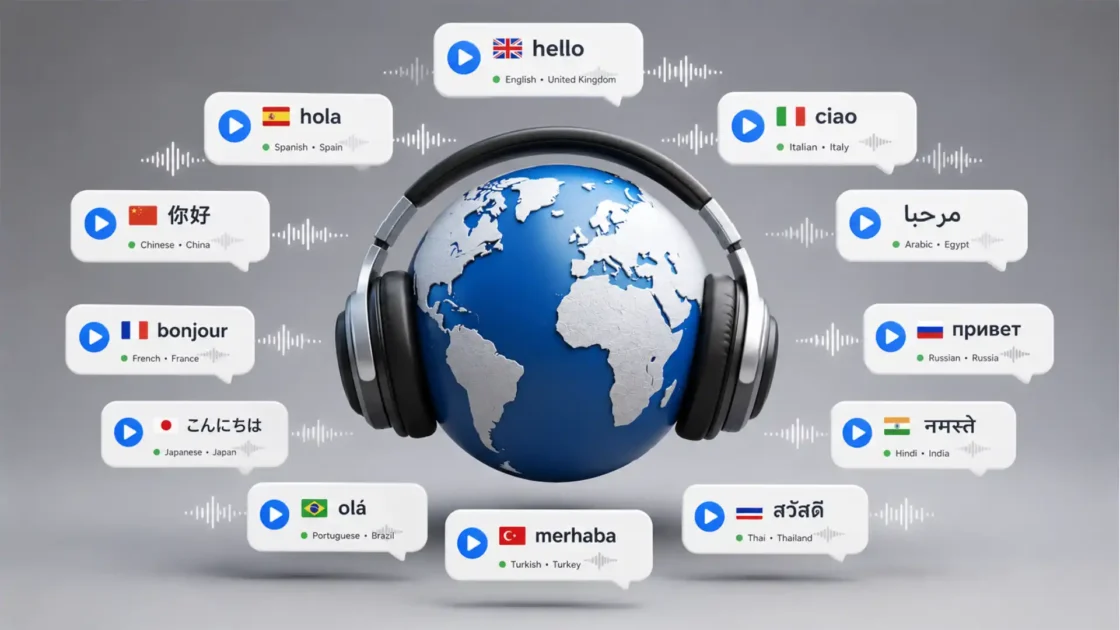
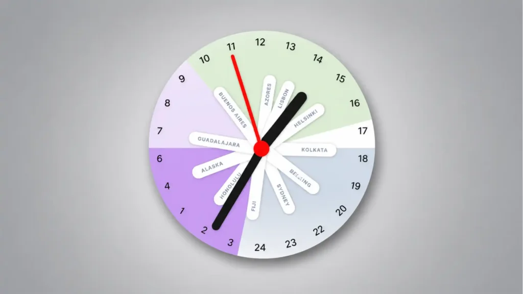
Pole Clock has one of those rare interface ideas that feels obvious only after someone else has made it. Instead of giving you a row of city clocks, each one politely disagreeing with the others, it puts the whole planet on one 24-hour analog dial. The mental trick is sharp: imagine the Earth viewed from the South Pole, with time zones arranged around a circle. Each city gets its own hand. Suddenly, global time stops looking like a list and starts behaving like a shape. Pole Clock’s own site describes it as a 24-hour analog clock that shows all time zones on one dial, built around that South Pole view.
Table of Contents
That is the whole charm. You do not have to read London, Tokyo, Sydney, New York, and your own city as separate facts. You see their distance from one another. You see whether someone is near lunch, deep in sleep, starting work, or sliding toward evening. The clock does not ask you to calculate the difference. It makes the difference visible.
The project comes from Pascal Pixel, who also built Horse Browser, and it carries the same small-web energy: specific problem, visual answer, no fake bigness. The official about page says Pole Clock came from the need to coordinate with team members and clients across time zones, using a more intuitive visual model than the usual world-clock approach. That origin matters because the site does not feel like a productivity dashboard wearing a design costume. It feels like a sketch that survived because the sketch was right.
The “Apple Watch face, please?” reaction is not a joke. Pole Clock belongs on a wrist. Apple already has a World Time face that lets users track 24 time zones, with locations around an outer dial and an inner dial showing the current time in each location. Pole Clock is doing something different, though. Apple’s face is dense and horological. Pole Clock is spatial, colorful, and readable at a glance. It looks less like a pilot’s instrument and more like a living map of the day.
A world clock that stops behaving like a spreadsheet
Most world clocks are technically correct and emotionally useless. They tell you that it is 09:14 in one place, 16:14 in another, and 23:14 somewhere else. Fine. But the brain still has to do the work. You scan the list, subtract the hours, picture the other person’s day, then guess whether your message is rude, urgent, late, early, or perfectly timed.
Pole Clock removes one layer of translation. Its 24-hour circle means a full day fits into one rotation. No second lap. No AM/PM flip. No duplicate positions. The top and bottom of the dial become part of the reading. On the project’s FAQ, the 24-hour analog clock is described as a complete view of the day in one rotation rather than the repeated positions of a 12-hour clock. That is not just a notation choice. It changes the object.
The moment the dial becomes a full day, multiple time zones become easier to compare. A city hand at 18 is not simply “six in the evening.” It is also visibly across the dial from a city sitting at 06. When you add more cities, the clock becomes a cluster of relationships. Some hands gather together. Others fall into lonely night. The interface lets your eye do work that a list normally dumps onto memory.
This is why Pole Clock feels more like an internet find than another utility. Plenty of tools handle time zones. Most of them are calendar-adjacent, appointment-driven, or visually bland. Pole Clock is different because it treats time as a diagram. It is a website you open because you need it, then keep staring at because the idea is satisfying.
The South Pole framing is not a decorative metaphor. The FAQ explains the name by describing the clock as if you are looking at Earth from above the South Pole, with time zones visible around the circular dial like longitude lines radiating from a pole. That point of view is the product. Without it, Pole Clock would be a pretty 24-hour clock. With it, it becomes a small act of cartographic compression.
The best part is how quickly the concept lands. You do not need a tutorial to understand why Buenos Aires and Helsinki are separated, why Sydney sits somewhere else, or why a meeting time that looks sensible for you becomes absurd for someone else. The site gives global coordination a physical shape. That is a harder design problem than it sounds.
There is a quiet critique inside the interface. Remote work tools often treat time zones as a scheduling error to be corrected. Pole Clock treats them as lived context. The question is not just “what time is it there?” It is “where are they in their day?” That difference is small in language and large in behavior.
A normal digital world clock is a table. Pole Clock is a clock, a map, and a social cue at once. It does not replace your calendar. It changes the moment before the calendar invite, when you are still asking whether the invite should exist.
The South Pole idea is the whole product
The cleverness of Pole Clock sits in its refusal to stack information vertically. A standard world-clock app gives every city equal weight in a list. That makes sense for storage, but it does not match the way humans compare time. We compare by offset, rhythm, and distance. A circle handles those comparisons better because the relationship is visible before the numbers are read.
Looking from the South Pole is a neat choice because it turns time zones into spokes. The Earth already has rotational logic. Longitudes already wrap. The day already cycles. Pole Clock lines up those ideas in a way that feels almost physical. Cities become markers on the same rotating object instead of isolated entries in a settings panel.
The project’s homepage says the clock displays all time zones on a single dial and is intended for remote teams, international scheduling, and global contacts. It also lists features such as multi-timezone support, interactive time control with scrolling, friend and team tracking, and display settings. Those features sound ordinary in a list, but the dial makes them feel less ordinary in use.
The visual model also solves a familiar annoyance: the half-understood time difference. Knowing someone is “eight hours ahead” is not the same as seeing their hour hand nearly opposite yours. The first is arithmetic. The second is perception. Pole Clock makes the relationship hard to ignore.
That visual honesty matters for global teams. A calendar invite can make a 7 a.m. meeting look clean because the grid has a nice empty slot. Pole Clock makes the discomfort visible. If one city’s hand is sitting in the purple quiet of early morning while another is mid-afternoon, the cost becomes obvious. It gives empathy a UI.
The clock also has a surprisingly good sense of pacing. A 24-hour dial moves slowly enough to show the whole day without feeling frantic. You are not watching seconds twitch. You are watching the shape of a day roll around the planet. That is why the concept feels calm rather than busy, even when multiple cities are present.
The design has a slight toy quality, and that is a strength. The colored wedges, city labels, and radial hands make it feel approachable. Serious time-zone tools often look like airport software. Pole Clock looks like something you might want open on a second monitor, not because it is mission-critical every minute, but because it gives the day a shared object.
This is also where the “reinvented” claim holds up. Pole Clock does not invent world time. It does not invent the 24-hour analog dial. It does not invent polar projection. Its move is to combine those ideas into a web object that feels instantly usable. Reinvention, in small tools, often looks like choosing the right metaphor and refusing to bury it.
Pascal Pixel’s own Hacker News launch note gives a useful clue to the thinking behind it. He wrote that analog clocks felt easier to read than digital ones for him, while the two-cycle structure of a 12-hour clock felt unintuitive; the 24-hour rotation made the day easier to grasp, with day and night occupying different halves of the clock. That explanation matches the site’s feel. It is not trying to be clever for display. It is trying to make time feel less slippery.
There is a personal edge in that motivation. The launch note also framed Pole Clock as a tool for people who struggle with managing their sense of time. That makes the interface more interesting. It is not only a remote-work gadget. It is also an attempt to make time visible for people who do better with spatial cues than with abstract digits.
The web is at its best when personal friction becomes a public object. Someone hits a problem hard enough, draws a better model, publishes it, and the result feels useful to strangers. Pole Clock is exactly that kind of thing. It has a practical use, but its real appeal is the feeling that a private mental model has been made shareable.
The small interactions make it more than a pretty clock
Pole Clock would be less interesting if it stopped at the static image. The dial is the hook, but the interaction is what makes it a tool. According to the about page, users can scroll to move time forward or backward, add several time zones to the same face, add contacts with their time zones, and configure the display. That means the clock is not just showing “now.” It lets you test possible futures.
The scroll interaction is especially well matched to the idea. Planning across time zones often starts with a proposed time. “What if we meet at 4?” Pole Clock lets the day rotate, and every city moves with it. You are not changing one field and watching a list update. You are turning the whole planet-like dial.
That choice turns scheduling into a visual search. You roll the time forward and look for a shape where the hands make sense. Not perfect, just humane. If three cities sit in workable hours and one city drops into sleep, the answer is obvious. Move the dial. Try again. The tool turns negotiation into motion.
The FAQ says scrolling down moves time forward and scrolling up moves it backward, and a reset button appears when you want to return to the current time. It also says users can add or remove time zones in settings. These are small details, but they keep the concept from becoming a poster. A world clock that cannot time travel is only half useful.
The friend and colleague tracking idea adds a more human layer. Pole Clock lets users add contacts with their time zones and, optionally, working hours, so the clock can show when people are likely to be available. That sounds simple, but it changes the question from “what city is this?” to “is this person likely awake and working?” For remote relationships, that is the question you actually care about.
The appearance settings are not fluff either. The FAQ mentions numeral styles, midnight placement, minute markers, a world map background, and controls for working and sleeping hours. Those options matter because a clock like this lives or dies by readability. If the user cannot tune the dial to match their mental model, the cleverness starts to fight the habit.
The local-storage detail is also very web-native. Pole Clock saves settings and preferences in the browser’s local storage, according to the FAQ. That keeps the tool lightweight. You can set up your cities, return later, and not feel dragged into account creation just to remember that someone lives in Lisbon.
Mobile support makes the project feel less like a desktop toy. The FAQ says Pole Clock works on smartphones and tablets, adapts to smaller screens, and supports touch gestures for scrolling. A radial clock is naturally at home on a touch screen because rotating time with a finger feels closer to the metaphor than typing into a form.
Where Pole Clock earns its click
| Part of Pole Clock | What it does | Why it matters |
|---|---|---|
| 24-hour dial | Shows a full day in one circle | Removes the AM/PM mental split |
| South Pole view | Treats time zones as positions around Earth | Makes offsets feel spatial |
| Multiple city hands | Places each city on the same face | Shows relationships without subtraction |
| Scroll control | Moves all time zones forward or backward | Makes meeting planning visual |
| Friend tracking | Adds people and likely availability | Turns world time into social timing |
| Display settings | Changes labels, midnight, markers, and day-night cues | Lets the clock match the user’s eye |
The table makes the real pattern clear: Pole Clock is not winning because it has many features. It wins because each feature protects the same central idea. Everything pulls back toward the circle. The settings, contacts, scrolling, and labels all serve the same spatial model.
That consistency is rare in small web tools. Many projects start with a neat visual idea and then bolt on controls until the original idea gets buried. Pole Clock does not seem to do that. Its interface logic remains legible: one day, one circle, many places, shared movement.
The Product Hunt listing describes Pole Clock as a 24-hour analog clock for tracking and comparing time zones, with launch tags around time tracking, global nomads, and remote work. It also shows the project launched in 2022 and received a strong day ranking on the platform. Those signals are not the reason to open it, but they show that the idea reached the exact crowd likely to understand it: people whose lives are scattered across calendars, cities, and screens.
The Hacker News response says something similar in a different accent. The launch thread had hundreds of points and a long discussion, and the comments quickly moved into details such as midnight placement, 24 versus 0, polar maps, and how people read 24-hour dials. That is a good sign for a niche tool. People were not merely saying “nice.” They were trying to inhabit the model.
A strong interface invites arguments about details. Where should midnight sit? Should the dial say 0 or 24? Should night be bottom or top? Should the world map rotate? Those are not distractions. They show that the metaphor is concrete enough to be debated.
This is one reason Pole Clock has more staying power than a typical launch-day novelty. It gives users a model they can improve in their heads. Once you understand it, you immediately imagine versions: a desktop widget, a menu-bar app, a wall display, a meeting-room clock, a watch face, a family clock for people spread across continents.
Why remote workers will understand it in seconds
Remote work made time-zone awareness a daily courtesy. It is not enough to know that your colleague is “in Europe” or “on Pacific time.” The difference between 8 a.m. and 6 p.m. shapes how people respond, whether they should be interrupted, and what kind of meeting will work. Pole Clock gives that courtesy a visible form.
The tool is especially good at showing overlap. If you work with people in three or four regions, the hardest part is not finding one city’s time. It is finding a shared patch of the day that does not punish someone. A list of times forces you to compare line by line. Pole Clock lets you look for a cluster.
That cluster can be read almost emotionally. Hands gathered in daytime feel possible. Hands split between deep night and office hours feel unfair. A city label sitting near the edge of someone’s working block has a different meaning from a city label sitting at noon. The clock turns scheduling ethics into visual geometry.
This matters because remote work often hides the body. Messages arrive as if everyone lives inside the same glowing rectangle. Pole Clock reminds you that one person is in morning fog, another is closing the laptop, another is deciding whether to answer from bed. It makes “global” less abstract.
The about page names remote teams, global friendships, international business, and travel planning as use cases. It also frames the clock around checking when people across time zones are working, reachable, or reasonably available. That mix is right. Pole Clock is not only for companies. It is for anyone whose social graph has escaped their local noon.
The friend-tracking feature is quietly important here. A city is not a person. Tokyo could mean a client, a sibling, a game friend, a collaborator, or a person you do not want to wake up. Once Pole Clock lets you attach people to zones, the clock becomes less geographic and more relational.
There is also a cognitive relief in seeing all time zones move together. With digital lists, changing a proposed meeting time makes the user read every row again. With Pole Clock, all the hands rotate in sync. Your eye tracks the pattern, not each number. This is the kind of interaction that feels small until you use it repeatedly.
Calendar tools often aim for automation. Pole Clock aims for judgment. It does not decide the meeting time for you. It gives you a better surface for making the decision yourself. That is why the tool feels calmer than many scheduling products. It assumes the user is capable; it just gives the user a clearer object.
The design also leaves room for ambiguity. A person at 07 might be awake or not. A person at 21 might still be reachable or fully done. Pole Clock does not pretend to know. It shows likely context, especially when work and sleep cues are configured, then leaves the social decision to the human.
That restraint is refreshing. A lot of software turns every human preference into a rule. Pole Clock knows that time-zone coordination is partly math and partly manners. It handles the math. It makes the manners harder to ignore.
It is easy to imagine the tool living in a team ritual. A distributed team could keep it open during planning. A founder working with contractors could use it before sending late messages. A family split across countries could use it to find windows for calls. None of these use cases require a bloated workflow. They require a glance.
The glance is the product. That is the reason Pole Clock works as a web discovery item. You could describe it in a sentence, but the sentence is not the experience. The click matters because the moment of recognition is visual. You see the clock and think, yes, that is how this should look.
The Apple Watch face hiding in plain sight
Pole Clock feels almost suspiciously suited to a smartwatch. A wrist is a tiny, glance-based surface. Time zones are glance-based problems. A circular day with moving city hands is exactly the kind of idea that belongs on a device people already look at to orient themselves.
Apple’s own World Time watch face already confirms the appetite for this kind of display. Apple says the face tracks time in 24 time zones at once, with locations around an outer dial and an inner dial showing the current time in each location. That face is rooted in a long watchmaking tradition, and it has its own charm. It is also dense. Pole Clock feels lighter, more web-born, and easier for non-watch people to read.
The difference is not merely visual style. Apple’s World Time face asks the user to read a packed ring of cities and numbers. Pole Clock gives each selected city a hand, so the user sees chosen relationships rather than a global reference system. One is encyclopedic. The other is personal.
That personal quality would matter on the wrist. Most people do not need 24 zones at all times. They need five: home, partner, team, client, travel destination. Pole Clock’s model suits that smaller set because it gives each city room to breathe. A wrist version could be selective rather than exhaustive.
There is also something satisfying about the analog-digital hybrid. Pole Clock is analog enough to be read by shape, but digital enough to be interactive and customized. That makes it feel like a native smartwatch idea rather than a web page squeezed onto glass.
The request “Apple Watch face, please?” points at a broader problem with smartwatches. Their best faces are not only decorative skins. They are compressed worldviews. A weather face says the day is atmospheric. A fitness face says the body is the center. A lunar face says time is celestial. Pole Clock says time is social and planetary.
That is a strong pitch for a face. Imagine raising your wrist and seeing whether the people you care about are clustered in daylight, scattered into night, or just entering a shared work window. It would be calmer than a notification and more useful than another complication showing one extra city.
There are practical challenges, of course. Tiny labels can become unreadable. Too many hands would clutter the dial. Colors need to survive different watch sizes and always-on dimming. But the core model is strong enough to survive simplification: selected cities, 24-hour sweep, clear day-night zones, maybe a crown gesture to scrub time.
The Digital Crown would be a natural fit for Pole Clock’s scroll behavior. Apple’s World Clock app already lets users turn the Digital Crown to compare time in another city, according to Apple’s guide. Pole Clock’s “rotate the day” concept would feel even more direct with that physical control. Turn the crown, watch every city move, stop when the overlap looks humane.
The site’s mobile support also hints at this direction. Touch scrolling and responsive layout are already part of the project’s official description. A watch face would not be a simple port, but the interaction language is already close to wrist computing: glance, rotate, compare, reset.
Pole Clock would also be a rare watch face with editorial personality. Many watch faces are beautiful but generic. This one has a thesis. It says the day is not a local strip of hours; it is a shared rotating surface. That is exactly the kind of idea that makes people show someone else their wrist.
The catch is that Apple controls its watch-face ecosystem tightly. Users can customize Apple’s faces, but custom third-party watch faces remain a constrained dream for many developers and designers. That makes Pole Clock feel like an idea waiting outside the garden wall, nose pressed against the glass.
Even without an official watch face, the concept has already done its job. Once you have seen time zones arranged this way, a row of digital clocks looks poorer. The web version is enough to alter expectation. That is a real achievement for a small project.
The design works because it trusts the metaphor
Good visual tools do not explain themselves to death. Pole Clock trusts that the user will understand a circle, a hand, a label, a day-night region, and the relative distance between cities. It does not need a heavy onboarding flow because the metaphor is doing the work.
The site’s official copy uses direct language: a 24-hour analog clock, all time zones on one dial, Earth viewed from the South Pole. That plainness helps. The idea is unusual, but it is not mysterious. The product does not bury the concept under brand language.
The interface also has the right amount of visual sweetness. The colored regions make the clock memorable. The rounded labels give it softness. The black hands and red center keep the dial anchored. It looks like a small object, not a SaaS panel. That matters because time is already abstract; the interface needs to feel graspable.
The central circle is doing more than holding the hands. It creates a sense of rotation, like a pin through the planet. The labels radiate outward. The hours wrap around. Everything feels attached to one shared center. The design keeps telling the same story from different angles.
This consistency is why the site avoids the usual world-clock clutter. It does not need separate cards for each city. It does not need flags, weather icons, local dates, and tiny maps competing for attention. It could add all of that, but the restraint is the point. The clock is strongest when the circle remains dominant.
The 24-hour format gives the design a moral clarity. There is no AM/PM ambiguity. There is no repeated 7. There is no “is that morning or evening?” mistake once you learn the dial. For global coordination, the 24-hour cycle is not just cleaner. It is kinder.
The night and day cues deepen that clarity. A number alone says 03. A colored night region says “do not schedule this unless you must.” The emotional reading is instant. That is what makes Pole Clock feel almost like a social interface rather than a time interface.
The project’s Hacker News discussion shows how much detail is hidden in a simple clock. Commenters debated midnight placement, 0 versus 24, and possible map backgrounds, and Pascal Pixel responded in the thread by saying he had added a setting for midnight as 0 instead of 24. That is the small-web loop at its best: launch, listen, adjust, keep the idea intact.
The optional world map background is a telling feature. It could make the South Pole metaphor more explicit, but it is not necessary for the clock to work. That balance is nice. The map can please users who want geography. The clean dial can please users who only want time.
Pole Clock’s design also works because it does not chase photorealism. A literal globe would be less readable. A detailed map would create noise. The simplified circle is more honest to the task. It shows the part of geography that matters here: relative time position.
There is a broader product lesson in that choice. The best interface is rarely the richest representation of reality. It is the representation that preserves the right relationships. Pole Clock preserves the relationship between places in the day. That is enough.
The tool also understands that global time is recursive. You check the time to send a message. The message leads to a meeting. The meeting leads to another meeting. A clumsy tool makes that loop irritating. Pole Clock makes the first check pleasant, and pleasant matters when the task repeats.
That pleasure is not superficial. A tool that people like to glance at is more likely to shape behavior. If Pole Clock makes you check before messaging someone at midnight, the design has done more than display time. It has changed a tiny social action.
Small questions before opening it
No. The official use cases include remote teams, global friendships, international business, and travel planning. The broader audience is anyone who has people, plans, or obligations across time zones. A freelancer, a traveler, a family member abroad, a gamer with friends overseas, or a small international team could all get something from it.
The site is built around a settings panel where users can add or remove time zones, according to the FAQ. The core concept is visual enough that setup should not be the main hurdle. The harder part is deciding which cities deserve space on the dial.
Yes. The FAQ says settings and preferences are saved in browser local storage, so selected time zones, friends, and display choices are preserved when users return. That is the right kind of persistence for a lightweight web tool: enough memory, no unnecessary ceremony.
Yes. Pole Clock supports scrolling forward and backward through time, which lets users test proposed times across all selected zones. This is one of the strongest reasons to open it. The tool is not only a “what time is it now?” clock. It is a “what would this time feel like for everyone?” clock.
The FAQ says the interface is responsive, works on smartphones and tablets, and supports touch gestures for scrolling. That matters because time-zone checks often happen away from a desk: before sending a message, during travel, or while comparing plans in a chat.
It feels like both, in a good way. The official site presents it as a functional clock with settings and saved preferences, while the public discussion around the launch shows a project shaped by user feedback and small refinements. That mix gives it the charm of a live web object rather than a frozen demo.
Because a normal world clock answers the narrow question and leaves the wider pattern hidden. Pole Clock answers the narrow question while showing the shape around it. If you only need one city once a month, a list is fine. If your work or relationships keep crossing zones, the circle earns its place.
It gives the clock a reason to be circular. Without the polar view, a 24-hour dial could feel like a novelty. With the polar view, the circle becomes a compressed planet. The name, the layout, and the interaction all point to the same idea.
The site has a rare kind of interface compression. It takes a messy global problem and turns it into one object you can understand from across the room. That is hard to forget. Many web tools are useful while open and invisible afterward. Pole Clock leaves a mental picture behind.
A small web object with a big sense of time
Pole Clock is worth opening because it changes the shape of a familiar problem. Time zones are not new. Remote work is not new. World clocks are not new. The difference is the composition: one 24-hour dial, viewed like Earth from the South Pole, with city hands moving together. It is a small invention made from old parts.
That kind of project is easy to underestimate. It does not arrive with a giant platform story. It does not need a pitch deck. It does not ask to replace your calendar, your team tool, or your phone clock. It simply makes a common mental operation cleaner. The web needs more things like that.
The site also shows how much taste still matters in utility design. A timezone converter can be accurate and forgettable. Pole Clock is accurate enough for the task and memorable enough to change expectation. The difference is not decoration. It is editorial judgment inside the interface.
The strongest web tools often feel like someone saying, “I kept thinking about this one annoying thing, so I made the version I wanted.” Pole Clock has exactly that feel. The maker’s background note about struggling with time perception and preferring analog readability gives the project an honest center. The result is not generic productivity. It is a personal model that scales outward.
That is why the clock has internet-gem energy. It is specific, visual, slightly odd, and immediately graspable. You can send it to someone with one sentence: “It shows time zones as if you’re looking at Earth from the South Pole.” The person will probably click. The explanation is already a small hook.
The Apple Watch thought refuses to go away because the concept is so wearable. A watch face should not only show time; it should express a relationship to time. Pole Clock expresses a global relationship in a way that feels modern without abandoning the old pleasure of hands on a dial. That is rare.
The project’s most impressive move is making time zones feel less like conversion and more like orientation. Conversion is a task. Orientation is a feeling. Pole Clock gives you that feeling quickly: where you are, where others are, and how the day stretches between you.
There is something quietly humane in that. The internet made it normal to work, talk, and care across distance. It also made it easy to forget that distance has hours inside it. Pole Clock puts those hours back into view. It does not scold. It just shows the shape.
Open it for the clever clock. Stay for the moment your brain stops subtracting. That is the small magic here. Pole Clock makes global time feel like something you can see.
Author:
Jan Bielik
CEO & Founder of Webiano Digital & Marketing Agency
This article is an original analysis supported by the sources cited below
Pole Clock
Official site for Pole Clock, used for the core description of the 24-hour dial, the South Pole viewing metaphor, and the main feature set.
About Pole Clock
Official background page explaining the project’s use cases, interaction model, creator, and origin in coordinating across time zones.
Pole Clock FAQ
Official FAQ used for details on scrolling through time, adding time zones, friend tracking, display settings, local storage, and mobile support.
Show HN: Pole Clock, a single 24h clock with multiple timezones
Original Hacker News launch discussion, used for Pascal Pixel’s explanation of the 24-hour analog model and the public discussion around the interface.
Pole Clock on Product Hunt
Product Hunt listing used for launch context, positioning, tags, and public reception details.
Pascal Pixel
Creator portfolio page used to verify Pole Clock as a Pascal Pixel project and place it among the maker’s other web work.
Apple Watch faces and their features
Apple’s official guide used for comparison with the existing World Time watch face.
Use World Clock on Apple Watch
Apple’s official guide used for the Apple Watch World Clock behavior, including comparing city times with the Digital Crown.
| Citing this article? Brief excerpts are welcome. Please credit Webiano.digital, name the author where stated, and include a link to https://webiano.digital and to this original article. Full or substantial republication requires prior written permission. Read our Copyright and Content Use Policy. |