Designspiration looks like the kind of website that should have been swallowed by algorithmic feeds years ago, yet it still does one job with unusual restraint: it lets you look at visual ideas without feeling like you have walked into a shopping mall. You open it, search a topic, drift through images, save what matters, and leave with a sharper eye than you had ten minutes earlier. That sounds basic until you compare it with the bloated state of visual discovery on the open web, where “inspiration” often means recycled interiors, affiliate links, suspiciously perfect templates, and images chosen less for taste than for conversion. Designspiration feels closer to a working reference desk. It is not trying to be everything. It is trying to be a place where designers can browse without being insulted by the feed.
Table of Contents
That is the first reason Designspiration is worth opening: it treats inspiration as raw material, not lifestyle entertainment. The site describes itself as a place to “save & explore ideas” and promotes its browser extension for saving creative inspiration, colors, links, notes, and screenshots. Its official brand page at SANDOW calls it an image and color search engine for mood boards. The site’s own “What is Designspiration?” post says it was created in 2010 by Shelby White as a hub for collecting and sharing ideas. Those facts matter because Designspiration does not feel like a new productivity wrapper chasing a market trend. It feels like a surviving piece of the older creative internet that still knows what it is for.
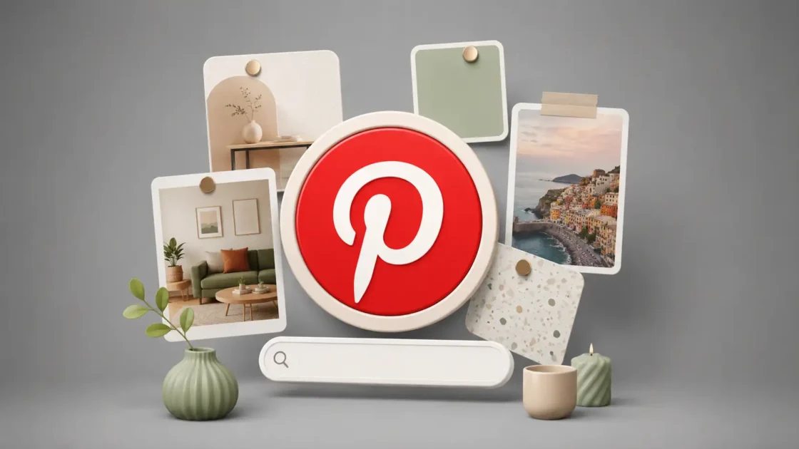
The closest shorthand is obvious: Designspiration feels like Pinterest with a stronger editorial spine and far less commercial fog. That comparison is useful, but only up to a point. Pinterest is a general-purpose visual engine that now mixes hobbies, products, recipes, shopping, travel fantasies, and creator content into one giant behavioral prediction machine. Designspiration is narrower. Its gravity is art direction, typography, poster design, photography, architecture, interiors, branding, color, and visual research. The difference is not only subject matter. The difference is the feeling of intent. On Designspiration, a poster leads to more posters, a palette leads to a color mood, an obscure topic leads to adjacent visual languages. The site wants your eye to stay awake.
Designspiration also has the kind of topic map that rewards wandering. Its Explore page lists community-uploaded topics, including Astronomy, Chinese Graphic Design, App Design, Architecture, Black and White Photography, Beer Packaging, Braun, Business Cards, Calligraphy, and Fonts. The list reads less like a taxonomy written by a growth team and more like a messy studio wall where practical design needs sit next to cultural rabbit holes. That mix is the point. You can search for graphic design and get expected references, but you can also click into Astronomy and stumble into space posters, telescope imagery, galaxies, lunar phases, and cosmic visual language. Good inspiration often appears sideways, and Designspiration is built for sideways movement.
The site is not perfect, and that may be part of why it is interesting. It still carries the texture of an older web tool, not a frictionless SaaS dashboard polished until every corner looks the same. Some pages are sparse in their public text because the real experience depends on JavaScript and image browsing. Some of the topic descriptions are plain and functional. The sitemap is comically deep. The interface has the familiar grid logic of visual bookmarking. Yet the result is not crude. It is calmer than most discovery products because it does not drown the page in explanation. You are not asked to admire the product before using it. You are asked to look.
The site’s strongest use is not finding “ideas” in the vague motivational sense. Its strongest use is building a private visual vocabulary. A designer can search for Chinese Graphic Design before a poster project, scan Astronomy before a science identity, collect rough typographic atmospheres before a magazine layout, or compare color moods before a web concept. A founder can use it to explain visual direction without handing a designer a pile of generic brand adjectives. An art director can make a collection for references that feel darker, stranger, quieter, more institutional, more editorial, or more human. Designspiration works because it does not demand that every search become a finished answer. It gives you enough visual material to ask better questions.
This piece follows the supplied human-style writing standard, especially its preference for concrete wording, direct sentences, and specific observations over filler.
The quiet appeal of a cleaner visual rabbit hole
Designspiration opens with a simple pplore ideas that inspire your creativity**. That line could sound forgettable on another website, but here it describes the product almost too literally. The homepage is not framed around AI, workflow automation, creator monetization, or a heroic claim about changing design forever. It points you toward visual saving and exploration. It also mentions a browser extension for saving creative inspiration, colors, links, notes, and screenshots, which tells you how the site wants to sit inside a creative routine. Designspiration is both a place to browse and a container for the things you find elsewhere.
The calmer feeling comes from the site’s refusal to broaden itself into a general social feed. A narrow website can breathe in ways a giant platform cannot. Designspiration’s public pages revolve around Explore, Popular, Everything, Topics, Collections, People, and Search. That vocabulary is plain, but useful. It does not push a “creator economy” identity onto every visitor. It does not treat every saved image as content waiting to be monetized. It behaves like a visual research shelf. You can browse what is popular, look at recent inspiration, move into topics, or save images into your own collections. The product language stays close to the act of collecting references.
The user experience matters because visual inspiration is easy to ruin. The wrong surrounding material changes how an image feels. A clean poster seen beside a discount rug ad and a recycled motivational quote does not land the same way as a clean poster seen beside other serious visual references. Designspiration’s value is partly curatorial and partly environmental. It puts design-adjacent images in a context where they can be read as design references. A photograph becomes a composition study. A book cover becomes a type experiment. An astronomy image becomes a palette, a texture, or a poster direction. The same image can become more useful when the room around it respects visual thinking.
The site’s age gives it a strange advantage. Designspiration was created in 2010, and that origin shows in the best way: it belongs to the era when the web still believed in personal collections, open-ended browsing, and taste as a craft. The product did not begin as a chat interface, a recommendation engine, or a social video stream. It began as a hub for collecting and sharing creative ideas, according to its own blog. That gives it a different metabolism. It is slower, more visual, less performative. You do not need to post your process or narrate your work. You can simply gather. For designers, gathering is not procrastination when it sharpens the project.
This older-web quality also explains why Designspiration feels more like a library than a trend report. Libraries do not shout at you about what everyone is doing this week. They let you pull one shelf, then another, then another. Designspiration’s Explore page works in that spirit. The topics are not only the obvious buckets such as web design or typography. They include names, movements, materials, visual moods, cultural forms, and odd categories that pull your attention away from the predictable. A topic list with Astronomy near Art and Braun near Business Cards creates a different mental pattern than a site sorted only by “branding,” “UI,” and “illustration.” The best visual research often starts when a category feels slightly wrong for the assignment.
The comparison with Pinterest becomes useful again here, because Pinterest’s scale often works against professional focus. Pinterest is brilliant at abundance, but abundance without taste becomes a chore. Designspiration is not as vast, and that is a relief. It does not solve every visual search. It does not replace museum archives, type foundries, design blogs, studio case studies, Are.na channels, saved PDFs, or screenshots from the wild. It sits in a more specific role: a clean, design-weighted discovery layer where the next click usually remains near the creative problem. That narrower role makes the site easier to trust during the fragile early part of a project.
A good inspiration site should not make you feel finished too soon. The danger of visual platforms is premature certainty. You search “minimal poster,” find a handsome grid, and suddenly your project becomes a copy of the first pleasing thing you saw. Designspiration is better when used against that instinct. Its grids invite comparison rather than worship. You notice that five posters share the same move. You notice that a popular color combination feels tired. You notice that the best image in a topic has nothing to do with the obvious motif. The site rewards looking for patterns, not grabbing one attractive reference and calling it direction.
Designspiration’s public pages also reveal a small but telling stance on quality. The community guidelines say the site is a hub for creativity and a tool for collecting and sharing ideas, then bans spammy content, deceptive material, hate speech, harassment, intellectual-property infringement, and other forms of content that would poison a creative feed. That matters because visual discovery depends on trust. If a site lets the wrong material flood in, the good material becomes harder to see. A cleaner feed is not only a moral or legal issue. It is a design issue. Bad inputs change the taste of the room.
The site’s limitations are visible, too. Designspiration is not a finished research method by itself. It will not explain the history of Chinese graphic design with the rigor of a book or museum archive. It will not replace a client interview, a brand audit, a typographic specimen, or field research. It is strongest as a visual ignition point. That matters because many teams misuse inspiration platforms as final authority. A mood board made from attractive images can hide weak thinking. Designspiration gives you references. You still have to turn those references into choices, arguments, constraints, and work.
Still, the site belongs in a designer’s rotation because it makes the first hour less noisy. The first hour often decides whether a project starts with curiosity or cliché. Search engines are too broad, social feeds are too performative, portfolio platforms are too polished, and marketplace sites are too commercial. Designspiration sits between them. It gives you designed things, photographed things, strange things, archived things, and user-saved things without forcing all of them into a personal-brand story. That looseness is where its charm lives.
The topics are where the site gets interesting
The Explore page is the best doorway into Designspiration because it shows the site’s real personality. The magic is not that it has topics; it is the way the topics collide. You can move from 3D Typography to Aaron Draplin, Abstract Photography, Album Covers, Annual Reports, App Design, Architecture, Arial, Armin Hofmann, Art, Astronomy, Beer Packaging, Braun, Calligraphy, and Chinese Graphic Design. That list is not sterile. It feels like the index of a designer’s browser history after a productive week. It mixes discipline, style, object, person, medium, and mood into one browsing surface.
Astronomy is a perfect example because it is not “design inspiration” in the narrowest sense. A space image can become a poster system, a color story, a texture bank, or a metaphor engine. The Astronomy topic page defines astronomy as the study of celestial objects and lists related tags such as Astronomy Posters, History of Astronomy, Space Telescopes, Galaxies, Star Photography, Observatory, Hubble Space Telescope, Lunar Phases, Nebulas, Planets, and Stars. A designer making a festival identity or editorial opener might not need scientific accuracy at first. They need visual pressure: scale, darkness, light, distance, circles, grain, diagrams, institutional language, cosmic kitsch. The topic gives the eye a place to start without pretending the start is the answer.
Chinese Graphic Design is a different kind of rabbit hole. It pulls the viewer toward calligraphy, symbolism, color, packaging, posters, typography, language, and cultural reference. Designspiration’s topic page describes the field as using elements of traditional Chinese culture and art, including calligraphy, symbolism, and color, across media such as packaging, posters, and digital platforms. The surrounding tag list branches into Chinese Art, Chinese Calligraphy, Chinese Typography, Chinese Characters, Chinese Zodiac, Chinese Tea Packaging Design, Japanese Graphic Design Posters, History of Graphic Design, and more. A good topic page is not a box; it is a set of doors.
Those topic pages are useful because designers rarely know the exact name of what they need at the start. Early visual research is often a search for vocabulary. A client says the work should feel “premium,” “editorial,” “cultural,” “scientific,” or “quiet,” and those words are too blunt to guide design. You need images to refine the language. Designspiration’s topic map gives you a way to test visual words against actual material. Does “astronomy” mean NASA charts, glossy sci-fi, observatory instruments, children’s book planets, or grainy black skies? Does “Chinese graphic design” mean calligraphic brushwork, contemporary poster grids, restaurant nostalgia, red-and-gold packaging, or experimental type? The topic turns vague taste into visible options.
The site becomes more interesting when you stop treating topics as folders and start treating them as prompts. A topic is not a destination; it is a temporary bias. If you are designing a music poster, Astronomy may produce a stronger direction than Music Posters because it changes the reference pool. If you are designing a financial report, Annual Reports may be useful, but Braun might sharpen your sense of restraint. If you are making a food brand, Chinese Tea Packaging Design may reveal composition habits that a generic packaging search would miss. The best move on Designspiration is often to search one step away from the obvious category.
Designspiration’s topic system also trains comparison. You begin to notice how different categories solve the same visual problem. A business card, a poster, an album cover, and an app interface all deal with hierarchy, rhythm, white space, typography, color, and texture. They just do it under different pressures. Browsing across categories keeps the eye from copying surface style too directly. A poster can teach a landing page about tension. A photograph can teach a brand palette about restraint. A vintage book cover can teach a mobile screen about type scale. Cross-pollination is where visual research becomes more than imitation.
The public topic pages are not perfect editorial essays, and they do not need to be. Their job is to gather visual neighborhoods, not to explain design history. Some descriptions feel generic, and some related tags drift widely. That looseness is part of the browsing rhythm. You are not reading Designspiration for scholarship. You are using it to move from one visual cluster to the next until the project’s direction starts to feel less flat. A stronger platform might annotate every image and contextualize every movement, but that would also slow the act of looking. Designspiration chooses speed and adjacency over instruction.
There is a risk in that choice. A site built on visual adjacency can flatten culture if the user is careless. Chinese Graphic Design should not become a decorative grab bag. Astronomy should not become a pile of cosmic clichés. Good designers know the difference between reference and extraction. Designspiration makes discovery easy, which means judgment matters even more. You need to ask where an image comes from, whether you understand the context, whether the form is appropriate, and whether you are using a reference as structure or costume. The tool can open a door; it cannot supply your ethics.
That risk does not weaken the site. It clarifies how to use it. Designspiration is best for expanding the field of view before deeper research begins. You might start there, then move to original sources, archives, studio credits, books, cultural experts, museum collections, interviews, or project-specific references. The site is not the full meal. It is the wall of clippings that tells you which meal might be worth cooking. Used with that discipline, it becomes a sharp early-stage companion.
The topic experience also explains why Designspiration feels less spammy than broader visual platforms. A strong topic page creates a kind of visual accountability. When you click Chinese Graphic Design, the page has to remain close enough to that idea to feel useful. When you click Color Inspiration, the tags orbit palettes, color theory, gradients, schemes, combinations, photography, interiors, logos, and typography. The taxonomy does not remove all noise, but it gives the browse a center. A centered browse is rare enough to feel refreshing.
What stands out at a glance
| Part of Designspiration | Why it matters |
|---|---|
| Topics such as Astronomy and Chinese Graphic Design | They push research beyond obvious design buckets |
| Image and color search | They make visual discovery feel closer to art direction |
| Collections | They turn browsing into an organized memory |
| Browser extension | It lets references come from the wider web, not only the site |
| Pro Visions mood boards | They move saved material closer to presentation and direction |
| Community rules | They protect the feed from some of the junk that ruins discovery |
The table is compact because Designspiration is not complicated. Its appeal comes from a few strong behaviors repeated well: search, browse, save, organize, compare, and return. That simplicity is not a weakness. In a category crowded with bloated tools, a focused loop is the feature.
The more time you spend with topic-driven discovery, the more you see the product’s editorial shape. Designspiration does not force a single definition of design. It understands that design research may include a chair, a type specimen, a dark photograph, a lunar diagram, a piece of packaging, a hand-painted sign, a Swiss poster, a UI screen, or an old book cover. That range would become chaos on a general platform, but here the design context gives it coherence. The site lets visual culture leak into design work without pretending every reference is the same kind of object.
The site’s topic logic also suits people who think through collecting. Some designers do not begin with a sketch; they begin with a pile. They gather references until contradictions appear. Too much black. Too many condensed fonts. Too many centered compositions. Too many sterile grids. The pile starts to argue back. Designspiration makes that pile visible and searchable, especially when collections enter the process. It respects the messy, pre-verbal stage of design work where taste is forming before words arrive.
Search feels closer to reference hunting than social scrolling
Search is where Designspiration becomes more than a pretty grid. The site’s core promise is visual search with a design bias. Its SANDOW brand page calls it an image and color search engine for creating mood boards, and Designspiration’s own pages repeatedly place Search beside Explore, Collections, and People. That combination tells you how the product expects people to move: search for a visual idea, browse the results, save what matters, and organize it into collections. The loop is simple enough to disappear while you work.
Color search is especially important because designers often search with their eyes before they search with words. Color is one of the fastest ways to find mood without naming style. A designer may know a project needs oxidized green, old paper cream, dirty blue, or a sharp orange accent before they know the layout direction. Shelby White’s Dribbble post from 2021 describes improvements to Designspiration’s color search that let users search similar images based on an image’s color palette or a single color. That is a small technical detail with a big creative consequence. It lets research start from sensation instead of category.
Searching by color changes the kind of images you find. A word-based search tends to return what people have named; a color-based search returns what images feel like. That distinction matters when the project is still open. Search “brutalist poster” and you get a known visual language. Search a palette of concrete gray, emergency orange, and deep black and you may find architecture, album covers, signage, editorial spreads, or photographs that share a mood without sharing a label. Designspiration’s color logic makes it useful for art direction because art direction often begins in the space between words. A palette can find siblings that a keyword would miss.
The site’s search also feels less like social scrolling because the images do not constantly ask for your social reaction. You are not there to perform taste. You are there to collect, compare, and move on. That distinction sounds small, but it changes attention. On social platforms, liking an image trains a feed and signals identity. On Designspiration, saving an image into a collection feels more private and instrumental. It is closer to pinning a reference on a studio board than broadcasting approval. The emotional temperature is lower, which makes the work easier.
There is another underrated benefit: Designspiration’s images often carry tags and color palettes that make browsing more forensic. A saved poster can lead to related categories, extracted colors, and the collection where someone placed it. Even when you do not know the original context, those signals give you a way to keep moving. You start by liking one image and end up following its palette, topic, or adjacent tags. The route may be messy, but it is legible. Good discovery tools leave breadcrumbs without turning every breadcrumb into a notification.
Reference hunting needs this kind of legibility because creative search is rarely linear. You might search “typography,” save a poster for its composition, follow a color, land on photography, and then realize the project needs a colder visual atmosphere. That kind of movement looks inefficient from the outside. From inside a design process, it is often the work. The mind is comparing, rejecting, sharpening, noticing. Designspiration gives that movement a stable surface. You can drift, but the drift stays near images, collections, colors, and topics. It is wandering with rails.
The product’s public search pages are not always rich in crawlable text because the visual experience is JavaScript-heavy. That is annoying for readers of pages and useful for understanding the product’s nature. Designspiration is not primarily a text database. It is a visual interface. Search results need to be seen, not summarized. This also means a written review can only describe part of the experience. The actual test is opening a topic, using the search, and noticing whether the images make your eye slow down. For a visual inspiration tool, the proof is the quality of the pause.
Search on Designspiration is also better when the user has a method. Aimless browsing is pleasant, but deliberate browsing is where the site earns its tab. For a branding project, you might search the category, then search a material, then a mood, then a color, then a cultural reference, then a type style. For a website project, you might start with Web Design, then move to editorial layouts, book covers, architecture, and monochrome photography. For a poster, you might search typography, then astronomy, then Chinese calligraphy, then album covers. The site becomes stronger when your search terms come from the project’s tension, not only its deliverable.
There is also a strong case for using Designspiration against trend fatigue. Designers see the same references far too often. The same studio screenshots circulate through LinkedIn, the same UI cards appear on portfolio feeds, the same packaging styles return as mood-board staples. Designspiration is not immune to repetition, but its topic spread makes it easier to break the loop. A category like Braun may pull the eye toward product restraint. Astronomy may pull it toward diagrams and darkness. Chinese Graphic Design may pull it toward calligraphy and symbolic color. A better reference pool does not guarantee original work, but a stale one almost guarantees stale work.
Search also reveals a small philosophical difference between inspiration and templates. Templates promise speed by narrowing decisions; inspiration sharpens decisions by expanding perception. Designspiration belongs to the second camp. It is not where you go when you want a pre-made layout. It is where you go when you want to understand what kind of layout might feel right. That makes it less convenient for people looking for quick surface imitation and more useful for people willing to build direction from fragments. It serves the part of design that happens before execution becomes obvious.
The site’s color and image search also speak to non-designers who work with designers. Clients and founders often struggle to explain visual taste because they reach for weak adjectives. Designspiration gives them images instead. A founder can collect references that feel serious but not cold, expressive but not childish, technical but not sterile. A marketer can show examples of typography that feels editorial rather than corporate. A product lead can gather interface moods without pretending every saved screen is a direct competitor. The site improves the conversation by replacing vague words with visible evidence.
The danger is that visible evidence can become a cage. A collection of references should not become a recipe. If every image on a board has the same grid, same color, same type style, and same photographic tone, the project may start copying before it starts thinking. Search should widen the field, then tighten it. Designspiration gives you the widening. You need to do the tightening with care. That means deleting references, grouping them, naming why they matter, separating mood from structure, and asking which parts belong to the project. A good mood board is edited, not filled.
Collections turn browsing into a working memory
Designspiration’s saving model is the quiet engine of the site. Browsing is temporary, but collections make the browse useful after the tab closes. The official “What is Designspiration?” post says saving is done through a plus button that prompts the user to choose a collection or create one, and it describes collections as helpful for keeping inspiration organized for future browsing. That may sound ordinary, but ordinary is exactly what reference work needs. If saving is too ceremonial, people stop doing it. If it is too loose, the archive becomes a junk drawer. Designspiration’s collection logic sits in the practical middle.
Collections work because creative memory is unreliable. You rarely remember the exact image that changed your thinking; you remember a feeling. A collection gives that feeling a container. “Science identity,” “red packaging,” “quiet typography,” “editorial darkness,” “weird interiors,” “Chinese poster references,” “astronomy diagrams,” “client deck textures” — the names can be rough, but the act of naming matters. It turns a casual save into a future route back to an idea. The collection becomes a map of your attention.
The best collections are not only aesthetic buckets. They are arguments in progress. A weak collection says, “Here are things I like.” A stronger collection says, “Here are the qualities this project might need.” That difference changes how you save. You stop collecting everything attractive and start collecting evidence. This image has the right density. This poster handles hierarchy well. This palette feels serious without going dead. This photograph brings the human texture the design lacks. This type treatment has the right historical pressure. Designspiration becomes much more useful when every save has a reason, even a loose one.
Collections also let teams separate mood from mechanics. A saved reference may matter for color but not layout, for type but not imagery, for tone but not structure. Without notes or careful collection names, teams often confuse the signal. A client points to a poster because they like the atmosphere, and a designer reads it as a layout direction. A founder saves a brutalist building because it feels strong, and the brand team copies the concrete palette too literally. Designspiration’s collection system gives users a chance to organize those signals into clearer groups. A reference needs a label if you do not want it to be misunderstood.
The pricing page says the Basic membership lets users explore Designspiration, save inspiration, create collections, and collaborate on collections, while the Pro membership adds unlimited Visions mood boards, deeper inspiration searches, search-engine hiding, early access to new features, and an ad-free experience. That split is revealing. The free product covers the core reference loop. Pro moves toward heavier creative workflow and presentation. For many users, saving and collections may be enough. For those building boards for clients or teams, the paid layer may make more sense. The product does not hide the basic act of collecting behind a paywall.
Collaboration on collections is especially useful because visual taste is hard to align through chat messages. Teams waste absurd time arguing with adjectives. “Bold” means one thing to a brand strategist, another to a designer, another to a founder, another to a sales lead. A shared collection makes disagreement visible. People can point to images, group them, reject them, and name the pattern. The board becomes a conversation surface. Designspiration’s value is not only discovery; it gives taste a place to become discussable.
Collections also create a private archive of taste over time. A designer’s saved references reveal how their eye changes. Early collections may be full of obvious favorites. Later ones may be stranger, more specific, more disciplined. That record is useful. It shows recurring habits and blind spots. Maybe you save too much Swiss typography. Maybe every identity board leans black and beige. Maybe you avoid illustration. Maybe your references are always polished and never raw. Designspiration does not analyze this for you in public, but the archive itself can teach you. Your collection history is a mirror if you bother to look at it.
A collection also changes the purpose of browsing from consumption to selection. The internet encourages endless intake; collections require a decision. Save or move on. Create a new bucket or add to an existing one. Keep the reference or delete it later. These small decisions train taste because taste is not only what you like; it is what you choose to keep. Designspiration makes saving easy enough that the first pass can be loose, then the second pass can be editorial. The real work often happens when you return and remove half the board.
The site’s browser extension expands this collection habit beyond Designspiration itself. That matters because the best references are not always inside inspiration platforms. They appear in articles, museum pages, obscure studio websites, architecture magazines, product pages, PDFs, screenshots, and old blogs. The extension page describes Designspiration as a visual bookmarking tool for saving creative ideas, inspiration, colors, links, notes, and screenshots from the web. It also lists features such as saving images, bookmarking websites, capturing screenshots, and writing notes. That turns Designspiration from a destination into a reference layer over the wider web.
The extension’s image-saving feature is particularly aligned with how designers actually research. You often find a useful image while doing something else. A layout detail in a magazine archive. A color pairing in a furniture photo. A strange menu system in a restaurant website. A typography treatment on a theater poster. If saving that reference requires too many steps, it disappears into memory and is lost. The extension promises to save images from any website to collections, add tags, edit titles, and find similar images, while extracting colors and palettes from each image. That is the kind of small workflow detail that keeps research alive.
Bookmarks, screenshots, and notes make the extension more than an image clipper. Some references are not single images. A website interaction may need a screenshot. A layout pattern may need a link. An idea may need a note before it evaporates. The extension page says bookmarks are private by default and that screenshots and notes are Pro features. The privacy detail is useful because not every reference collection is meant for public viewing. Competitive research, client direction, unfinished concepts, and messy early thinking often need to stay private. Creative work needs private rooms before it can survive public critique.
This is where Designspiration’s Pinterest comparison breaks in its favor. Pinterest is excellent for mass saving, but it often feels like a public-facing taste machine. Designspiration’s collections, especially when paired with its design-specific search and browser extension, feel more like a working archive. That distinction matters for professionals. A mood board is not a lifestyle board. A client reference set is not a personal fantasy. A type study is not a shopping list. Designspiration’s context keeps the act of saving closer to work than performance.
The collection habit also suits agencies and studios that need to keep their visual research from scattering across private hard drives and forgotten Slack threads. A shared visual memory is a real studio asset. Teams often lose references after a project ends. They sit in one designer’s Figma file, another strategist’s bookmarks, a deck nobody opens, or a download folder named “inspo_final_3.” A collection-based tool does not solve studio knowledge by itself, but it gives the habit a home. The fewer places references hide, the easier it is to build a lasting visual culture.
Collections only stay useful when they are maintained. Without editing, any inspiration archive becomes compost. The fix is not complex: name collections clearly, keep project-specific boards separate from long-term taste boards, add notes when a reference matters for a non-obvious reason, remove duplicates, and avoid saving three versions of the same idea. Designspiration gives the containers. The user brings the discipline. Good tools make good habits easier; they do not create those habits automatically.
The browser extension makes it less of a destination
The browser extension may be Designspiration’s most practical feature because it acknowledges a simple truth: creative references do not live in one place. You may start on Designspiration, but a serious visual search soon spills into studio websites, editorial archives, digital magazines, museum collections, book previews, packaging photos, old blogs, social posts, newsletters, and screenshots of things you were not supposed to notice. A tool that only saves from inside its own feed becomes limiting. Designspiration’s extension gives the product a wider reach without turning it into a heavy research system. It follows the designer back into the open web.
The extension page frames the product as a visual bookmarking tool, and that phrase is more useful than it first appears. Bookmarking alone is too weak for visual work. A normal bookmark stores a URL, but designers need the image, the palette, the note, the screenshot, the reason, and the collection context. The extension’s feature list covers saving images, bookmarking websites, capturing screenshots, and writing notes. It also says images can be saved to collections and that colors and palettes are extracted from each image. That is a more realistic model of how visual evidence gets used.
Screenshots are especially underrated. Some of the best digital references are temporary states. A hover animation, a menu layout, a checkout pattern, a responsive breakpoint, a loading screen, a type scale inside a product page, a strange empty state, a beautiful image crop, a clever caption system. These things may not exist as clean image files, and the page may change later. A screenshot turns a fleeting detail into reference material. The extension’s screenshot feature, listed as a Pro upgrade, makes sense for interface designers, art directors, and anyone building digital mood boards. A screenshot can preserve the part of a website that a bookmark cannot explain.
Notes matter for a different reason. A reference without a note often loses its meaning. You save a brutalist poster at midnight because its tension feels right, but three weeks later nobody knows whether it mattered for hierarchy, paper texture, type, color, composition, or attitude. A short note fixes that. “Use for type density.” “Good cold palette.” “Maybe too aggressive.” “Client likes this kind of editorial restraint.” “Do not copy layout, only tone.” The extension page says Designspiration added notes to keep ideas and inspiration in one place. That small feature protects references from becoming silent decoration.
The extension also points to a broader product idea: Designspiration wants to be a memory system for creative looking. Not a task manager. Not a file manager. Not a design tool in the Figma sense. A memory system. That is why colors, links, screenshots, notes, and collections belong together. They capture different kinds of evidence. A color palette captures mood. A link captures source. A screenshot captures state. A note captures intent. A collection captures relationship. Together, they make the messy act of noticing easier to revisit.
This is a smart place for Designspiration to sit because the design workflow is already crowded. No one needs another giant platform demanding loyalty. Designers already use Figma, Adobe tools, Notion, Milanote, Are.na, Pinterest, browser bookmarks, local folders, Slack, screenshots, camera rolls, and project decks. Designspiration does not need to replace all of them. Its better role is narrower: collect visual references quickly, keep them searchable, and let them become mood boards or collections when needed. A tool earns adoption when it fits into an existing habit rather than asking the user to rebuild their life.
The Pro page shows where Designspiration is trying to grow this idea. It says the team is building tools for cultivating creativity, lists completed work such as the browser extension, upload from desktop, Visions mood boarding, content moderation and cleanup, and lists in-progress or planned items including automatic organizing, personalized recommendations, a weekly newsletter, an iOS app, improved organization, and a Figma plugin. That roadmap is interesting because it points toward a more complete creative reference system while staying anchored in inspiration.
Visions is the clearest step in that direction. Mood boards are where saved references become a presentation language. The Pro page describes Visions as a tool for creating and sharing mood boards and says users can choose templates, discover ideas by color, upload from device, and export as JPEG, PNG, or PDF. It also states that every vision is private by default and that collaboration is coming soon on that page. For art directors and designers, that bridges a gap between raw collection and client-facing board. The workflow moves from search to save to compose to export.
Privacy matters here again. Early direction is fragile and often ugly before it becomes clear. A designer may need to test three clashing atmospheres, gather references from competitors, pull images that are not polished enough for a client deck, or collect visual material that would be misread out of context. The Pro page says visions are private by default, and the pricing page mentions “hide from search engines” as a Pro feature. That kind of privacy is not glamorous, but it is useful. Creative thinking often needs a backstage.
The price also makes the product feel unusually modest. The pricing page lists Basic as free and Pro at $5 per month or $50 per year at the time of this review. That places Pro in a low-friction category for individual designers, students, small studios, and freelancers who already spend far more on design software. Price is not the only factor, of course. The real question is whether Visions, deeper inspiration searches, privacy features, early access, and an ad-free experience fit the user’s routine. For heavy mood-board makers, the upgrade has a clear use case.
The extension also gives Designspiration a way to compete without needing the largest database. A visual tool does not need to own every reference if it can organize the references users find elsewhere. That is a better position than trying to out-scale the biggest image platforms. The web is too large, too messy, and too fast. Instead of pretending everything can be centralized, Designspiration gives the user a way to clip, save, tag, and gather. The product becomes stronger by admitting that inspiration is distributed.
There is a subtle cultural point here. The open web is still full of brilliant visual material, but it is badly organized for creative reuse. Search engines retrieve pages, social platforms retrieve engagement, marketplaces retrieve products, and portfolio sites retrieve polished work. Designers need something else: fragments, moods, references, and partial signals. The browser extension is a bridge between the messy source and the organized board. It lets a designer turn random encounters into a searchable private archive.
That may sound mundane, but mundane tools often shape creative work more than dramatic ones. A saved screenshot at the right moment can change a project. A color extracted from an unexpected image can unlock a direction. A note written while the idea is fresh can prevent a team from arguing later. A collection built across three weeks can reveal the true visual center of a project. Designspiration’s extension lives in that practical zone. It is not glamorous; it is close to the real work.
The catch is that discipline still matters
Designspiration’s strength can become its weakness if the user treats inspiration as an endless feed. A clean rabbit hole is still a rabbit hole. The site is good at keeping you near design-relevant material, but it cannot tell you when enough looking has happened. That decision belongs to the user. A designer can spend a focused hour building a sharp reference set or lose an afternoon chasing beautiful images that never become decisions. The difference is not the tool. The difference is whether the browse has a purpose.
The simplest rule is to enter with a question. Do not open Designspiration only to “get inspired” if a project deadline is real. Open it to answer something: What kind of color temperature fits this identity? How dense should the typography feel? Can a science brand avoid the usual blue-and-white cliché? What happens if a luxury product borrows from institutional graphic design instead of fashion branding? Which visual references feel too obvious for this client? A good question turns browsing into research. Without a question, even the best feed becomes sugar.
A second rule is to save contradictions, not only favorites. A mood board made only of attractive images is often dull. Strong visual direction emerges from tension: warm but severe, technical but human, old but not nostalgic, premium but not glossy, playful but not childish. Designspiration is useful because its topics make contradictions easy to find. Astronomy can sit beside typography. Chinese graphic design can sit beside Swiss style. Black and white photography can sit beside app design. A board gets smarter when the references do not all agree too quickly.
A third rule is to annotate intent. The same reference can mean different things to different people. A designer may save an album cover for its type hierarchy, while a client reads it as a music-industry aesthetic. A strategist may save a telescope image for its sense of precision, while a designer reads it as a literal space motif. Notes, collection names, and careful grouping prevent that confusion. Designspiration’s saving tools support the habit, especially through the extension, but the discipline must come from the user. References need captions when they enter a team conversation.
The fourth rule is to leave the platform. Designspiration is an excellent starting point, not a full source of truth. If a topic touches culture, history, identity, or a specific community, move to stronger sources after the first visual pass. Look for original credits. Find the artist, studio, publisher, museum, photographer, or archive. Read context. Check dates. Learn what the image meant before it became a saved reference. That matters for ethical reasons and for design reasons. Work gets better when the reference is understood rather than merely harvested.
Designspiration’s own legal and community pages reinforce the need for care. The Terms of Service say users retain rights in user content they post, while granting Designspiration and its corporate affiliates a license to use, store, display, reproduce, save, modify, and distribute that content through the services and related offerings. The community guidelines also forbid infringing intellectual property rights, and the copyright page describes a DMCA reporting process. That legal frame is a reminder that inspiration sites are not free image banks.
That reminder is worth repeating because many people use inspiration platforms carelessly. Saving an image for reference is not the same as having permission to use it. A poster can guide hierarchy without being copied. A photograph can inspire a palette without becoming an asset. A type treatment can sharpen taste without being traced. Designers know this in theory, but tight deadlines blur the line. Designspiration makes images easy to collect, which means professional judgment has to remain awake. The site is for reference, not appropriation.
There is also the question of taste loops. Any platform built around saved inspiration risks reinforcing what already performs well. Popular images tend to become more visible, familiar styles circulate, and users save what looks immediately impressive. Designspiration is not immune. A designer who only browses popular material will eventually see the same moves: clean grids, sharp type, moody photography, elegant packaging, tasteful monochrome, retro posters, polished interiors. The antidote is active searching. Use strange topics. Search by color. Browse adjacent fields. Save uncomfortable references. The user has to push against the feed.
Another catch is that Designspiration does not replace making. Looking can feel productive because it resembles work, but design starts when the screen becomes yours. A board can clarify direction, but it cannot solve hierarchy, naming, messaging, product constraints, production limits, or client politics. At some point you need to sketch, write, layout, test, print, prototype, and decide. Designspiration is strongest before that point and occasionally during it, when the work needs a visual reset. It should feed the process, not become a hiding place from it.
The platform’s simplicity may frustrate users who expect a more modern all-in-one knowledge tool. Designspiration is not Notion for images, not Figma for mood boards, not Are.na for conceptual networks, and not Pinterest for every hobby under the sun. It is narrower than those things. Some users will want more metadata, stronger attribution tools, richer editorial context, deeper collaboration, or more advanced board structures. Those requests are fair. They also show why the site’s restraint matters. The product’s charm depends on not turning into a monster.
That tension will matter as Designspiration adds features. The Pro page mentions automatic organizing, personalized recommendations, a weekly newsletter, an iOS app, improved organization, and a Figma plugin among in-progress or upcoming items. Those could make the product more useful, but they also carry risk. Personalized recommendations can sharpen discovery or flatten it into more of the same. Automatic organizing can save time or hide the productive mess of research. A Figma plugin can connect inspiration to execution or encourage too-direct imitation. The challenge is to grow without losing the quiet room.
The community rules also suggest an ongoing cleanup effort. A design inspiration site survives only if the material stays worth seeing. Designspiration’s guidelines ban spammy content and unwanted repetitive behavior, and the Pro page lists content moderation and cleanup as completed work. That is not a side issue. It is central to the product. Visual quality is fragile. Once a platform fills with low-effort uploads, scraped junk, deceptive posts, and irrelevant material, serious users leave. Curation is not decoration; it is infrastructure.
A disciplined user can get a lot from the site by treating every session as a small assignment. Give yourself a constraint before opening it. Fifteen references for color only. Ten references that solve hierarchy. Five references from outside the obvious category. Three references that feel wrong but interesting. One collection for “not this.” That last one is useful. Knowing what the project should avoid can be as clarifying as knowing what it should chase. Designspiration becomes sharper when the user sets rules the platform does not set.
It also helps to separate personal taste from project taste. Designers often confuse what they admire with what the work needs. A poster can be brilliant and irrelevant. A color palette can be seductive and wrong for the audience. A visual language can feel fresh to the designer because they have not used it yet, while the market has already seen it everywhere. Designspiration gives plenty of attractive material. The user must decide what belongs to the project’s problem. Taste is useful only when it submits to purpose.
The final catch is emotional. Inspiration sites can make designers feel behind. Endless good work by other people can trigger comparison, panic, or imitation. The cure is to remember what a reference is. It is not proof that every idea has been done better. It is evidence that visual problems have many answers. The site should make the world feel larger, not make your own work feel smaller. Use it to build appetite, not anxiety. The point is not to worship the feed; the point is to return to your work with a better eye.
A few honest answers before opening it
No. The site is most naturally useful for designers, art directors, photographers, architects, illustrators, brand strategists, marketers, and creative teams, but non-designers can use it well if they need to communicate visual taste. A founder trying to brief a brand identity, a student building a presentation, or a curator shaping an exhibition mood can all benefit from a cleaner reference pool. The Pro page itself names designers, photographers, architects, and interior designers as examples of creatives who use mood boards. The site rewards anyone who needs to think visually with more precision.
For general life browsing, probably not. Pinterest is larger, broader, and more habit-forming. For design-focused reference hunting, Designspiration often feels cleaner and more useful. The reason is not that it has more images. The reason is that its context is narrower, its topics are design-weighted, and its saving model feels closer to mood-board work than lifestyle consumption. Pinterest is the supermarket; Designspiration is the reference shelf in a studio. That shelf will not contain everything, but what it contains is easier to treat as creative material.
For many users, yes. The pricing page lists Basic as free and includes exploring Designspiration, saving inspiration, creating collections, and collaborating on collections. That covers the core behavior most people need from the site. Pro makes sense when users want unlimited Visions mood boards, deeper searches, search-engine hiding, early access, and an ad-free experience. The free layer lets you test the real habit before paying for the heavier workflow.
It depends on how formal your boards need to be, but Designspiration is clearly moving toward that role through Visions. The Pro page says users can create and share mood boards, choose templates, discover by color, upload from device, and export as JPEG, PNG, or PDF. That covers many common presentation needs. Still, some teams will prefer Figma, Milanote, Keynote, or dedicated brand strategy tools for more controlled layouts. Designspiration is strongest when discovery and mood-board assembly need to stay close together.
No. Treat Designspiration as a discovery layer, not a rights-cleared asset library. Its Terms of Service and copyright pages make clear that user content, intellectual property, and takedown processes matter. A saved image is a reference until you have permission or use your own material. That distinction is not paperwork trivia. It is the difference between ethical art direction and lazy copying. Use the site to sharpen your thinking, then create or license the work properly.
Early-stage visual direction is the sweet spot. Brand identities, editorial layouts, posters, campaigns, packaging, interiors, photography directions, UI mood boards, pitch decks, and cultural research all benefit from quick visual comparison. The site is less useful when the project already has a locked system and only needs production. Designspiration is best before the work hardens, when the direction is still flexible enough to be changed by a surprising reference.
Start with Explore, not the homepage grid. The topic page exposes the site’s range and immediately gives you useful sideways routes. Search the obvious category once, then search adjacent topics that might bend the project in a less expected direction. For a science project, try Astronomy, Annual Reports, Typography, and Black and White Photography. For a cultural poster, try Chinese Graphic Design, Calligraphy, Album Covers, and Graphic Design Layouts. The best first click is the one that widens the problem without losing the project.
Avoid saving images only because they look polished. Avoid treating cultural references as decoration. Avoid building boards that are too visually consistent too early. Avoid confusing a reference image with an asset. Avoid presenting a mood board without explaining why each group of references matters. Designspiration makes visual gathering pleasant, but good direction still requires editing. The site gives you a pile; your job is to make the pile think.
Why it belongs in a designer’s tab bar
Designspiration belongs in a designer’s tab bar because it respects a part of the creative process that many modern tools flatten. Before design becomes execution, it is mostly looking, comparing, naming, rejecting, and sensing. That stage is hard to measure and easy to dismiss, but it shapes everything that follows. A strong first reference set can save a project from cliché. A strange topic can open a better metaphor. A color search can reveal a mood the brief did not know how to ask for. The site is useful because it gives early looking a clean place to happen.
The best thing about Designspiration is not one feature. It is the combination of focus and looseness. The focus comes from its design-centered context, its topic structure, its visual search, its collections, and its mood-board direction. The looseness comes from the way categories brush against each other: Astronomy beside art, Chinese Graphic Design beside typography, Braun beside business cards, photography beside app design. That mix keeps the site from becoming a sterile professional directory. It feels like a place where the eye can wander without falling into nonsense.
It also offers a small antidote to the productivity theater around creativity. Not every creative tool needs to promise speed, scale, automation, or output. Some tools are useful because they make attention better. Designspiration does that when used well. It slows you down just enough to compare images. It gives you a place to save what your eye notices. It lets color and topic guide discovery. It keeps references in collections instead of scattering them across devices. It does not make the work for you; it makes you look harder before you make the work.
For students, it is a way to train taste beyond the most obvious portfolio platforms. A student who only looks at finished trendy work learns trends faster than design judgment. Designspiration’s broader visual mix encourages the eye to connect posters, photography, architecture, typography, packaging, and cultural forms. That does not replace books, critique, or history. It does give students a more interesting surface for daily looking. Taste grows through exposure, but only when exposure is varied enough to challenge habit.
For freelancers, it is useful because references often need to be gathered quickly and explained clearly. A small client may not understand design language, but they understand a board of images. Designspiration collections give freelancers a way to move from messy discovery to shareable direction without building a full presentation too early. The free membership covers saving and collections, while Pro Visions adds more formal board-making and export. That makes the site practical for the messy middle between a call and a polished concept deck.
For agencies, the benefit is shared memory. A studio’s taste lives in the references it returns to. If every project starts from scratch, the team wastes time rebuilding the same visual vocabulary. If references are saved and sorted well, the studio builds a private archive of directions, patterns, and constraints. Designspiration is not a complete agency knowledge system, but it can support the habit. A well-kept collection library can become a quiet competitive advantage.
For non-designers, the site is useful because it teaches a better way to brief. Instead of asking for “modern but timeless,” collect ten images and name what works in each. Instead of saying “premium,” show the difference between expensive, restrained, glossy, editorial, technical, handmade, and institutional. Instead of asking a designer to “make it pop,” show the kind of contrast, scale, color, or rhythm you mean. Designspiration gives non-designers a cleaner place to find those examples. A better brief often begins with better references.
The site’s restraint is also a lesson in product thinking. Designspiration does not need to dominate the user’s day to be useful. Many modern products behave as if attention captured is value created. Designspiration is better when it is opened, used, and closed. Search a topic. Save a set. Build a board. Move back to the work. That rhythm is healthier than the infinite-feed model because it treats attention as something to spend carefully. The product’s usefulness does not depend on addiction.
There is something almost unfashionable about that. A website that exists for visual discovery, collections, and mood boards feels modest beside the louder claims of current creative software. Yet modest tools often survive because they solve a real recurring need. Designers will always need places to gather references. Teams will always need ways to discuss taste. Visual projects will always need early direction before production begins. The formats change, but the behavior remains. Designspiration survives because looking is still part of the job.
The article could end by saying Designspiration is underrated, but that word is too lazy. The better claim is that Designspiration is correctly sized. It is not trying to be a universal creative operating system. It is not pretending to be a rights-cleared archive or a historical authority. It is not a substitute for original research or design skill. It is a focused visual discovery tool with collections, color search, topics, a browser extension, and a growing mood-board layer. That is enough because the problem it solves is real.
Open the Astronomy topic and you understand the appeal quickly. A design platform that can turn stars, telescopes, galaxies, lunar phases, and observatories into visual research is doing something more interesting than serving another grid of brand mockups. Open Chinese Graphic Design and the site begins to feel like a cultural corridor, though one that should push you toward deeper sources if the project is serious. Open Color Inspiration and the search becomes atmospheric rather than literal. The best sessions on Designspiration make your project feel larger without making your next step less clear.
That is the quiet pleasure of the site. It gives you a place to look before you decide. Not forever. Not passively. Not as an excuse to avoid the blank page. Just long enough to gather better evidence, notice better patterns, and build a board that has some intelligence behind it. The internet still has plenty of visual noise. Designspiration is one of the cleaner rooms inside it. For designers, that is enough reason to keep it close.
Author:
Jan Bielik
CEO & Founder of Webiano Digital & Marketing Agency

This article is an original analysis supported by the sources cited below
Designspiration
The official homepage was used to verify the site’s current positioning around saving and exploring creative ideas, including its browser-extension message.
Explore inspiration on Designspiration
The Explore page was used to verify the site’s topic structure and examples such as Astronomy, Chinese Graphic Design, App Design, Architecture, Braun, and Business Cards.
What is Designspiration?
This official Designspiration blog post was used for the site’s origin details, its 2010 creation by Shelby White, and the explanation of saving images into collections.
Designspiration browser extension
The browser extension page was used to verify features for saving images, bookmarking websites, capturing screenshots, writing notes, extracting colors, and saving material into collections.
Pro membership on Designspiration
The Pro page was used to verify Visions mood boarding, export options, private-by-default visions, feature-development notes, and the broader direction of the product.
Pricing on Designspiration
The pricing page was used to verify the Basic and Pro membership differences, including collections, collaboration, Pro mood boards, deeper searches, and listed pricing.
Community guidelines on Designspiration
The community guidelines were used to verify the platform’s rules around spammy content, intellectual-property infringement, harassment, deceptive content, and other banned behavior.
Terms of service on Designspiration
The Terms of Service page was used to verify the company’s service terms, user-content language, and the legal frame around using the platform.
| Citing this article? Brief excerpts are welcome. Please credit Webiano.digital, name the author where stated, and include a link to https://webiano.digital and to this original article. Full or substantial republication requires prior written permission. Read our Copyright and Content Use Policy. |