
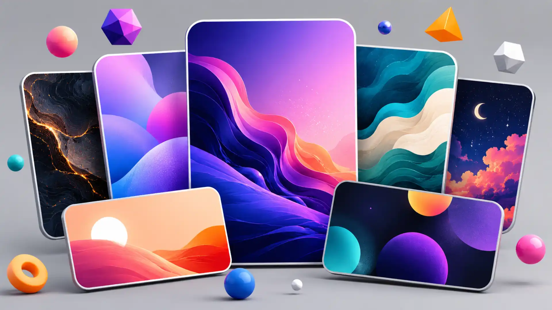
Cool Backgrounds solves a problem that sounds minor until it ruins your afternoon: you need one good background image, not a design system, a mood board, a subscription, or a lecture about branding. You have a blog post, a landing page, a presentation slide, a social banner, a dummy hero section, or a personal wallpaper. The content is ready, the layout has somewhere to go, and the page still looks dead because the empty space behind it has no personality.
Table of Contents
The site’s trick is not that it invents a new visual language. Its trick is that it filters familiar web-background styles into a small set of things that still look usable. Cool Backgrounds presents itself as a collection of tools for making colorful images for blogs, social media, websites, and wallpapers, and its main menu points visitors toward Trianglify, Particles, CSS Gradient, Gradient Topography, and Unsplash.
That line-up tells you almost everything. This is not an infinite generator built to bury you under options. It is closer to a tiny design shelf: low-poly triangles, thin technical particle lines, fresh CSS blends, topographic waves, and photographic backdrops. Each style already has a place in internet design history. Cool Backgrounds turns those styles into a quick decision instead of making you hunt through forums, libraries, wallpaper dumps, and stock-photo tabs.
The appeal is practical, but the page has a personality. It feels like a side project made by someone who has actually had to ship visual work. The copy on the site talks about the awkward moment after writing something, when the hardest remaining task is finding a background image that gives the piece enough visual pull. That is a real publishing pain, not a made-up marketing pain.
The reason Cool Backgrounds is still worth opening is plain: it respects taste better than most quick generators. It does not assume that random equals good. It does not throw novelty at the screen and call it creativity. It narrows the choices to abstract styles that tolerate cropping, text overlays, aspect-ratio changes, and the brutal compression of social platforms. That is why the results often look better than they should for a free, simple web tool.
The site also lands in an odd moment for design tools. The web is now full of AI image systems that can produce almost anything, yet “almost anything” is often too much for a background. For a hero area, a banner, a title card, or a placeholder, you usually do not need a fully rendered scene with hands, faces, product props, and suspicious details. You need atmosphere, color, movement, and restraint. Cool Backgrounds is interesting because it keeps the job small.
The exact problem it solves
Blank space is not neutral when you are trying to publish. An empty hero section can make finished work feel unfinished. A strong headline on a white rectangle may be elegant in the right layout, but most quick projects do not start with that level of typographic control. They start with a deadline, a half-built page, and the sudden awareness that every screenshot, card, slide, and thumbnail needs something behind the words.
Cool Backgrounds understands the messier version of design work. Most people opening it are not making a museum poster. They are trying to finish a blog graphic, give a startup mockup some energy, build a social banner, make a header less bare, or replace the placeholder gradient they have been using for too long. The site names those use cases directly: blog post hero images, social media banners, and desktop or phone wallpapers.
That matters because many design tools overestimate the ceremony people want. They ask users to choose a format, create a project, pick a template, sign in, name a file, select a brand kit, and browse categories before a single decent image appears. Cool Backgrounds works from the opposite instinct. It says: choose a visual family, adjust the thing, save the result. The page is closer to a utility drawer than a creative suite.
The best part is how it handles visual ambiguity. Backgrounds have to be interesting without becoming the subject. That is a narrow lane. A background that is too plain looks lazy. A background that is too detailed fights the headline. A photo can introduce a person, place, object, or emotion the content never asked for. Abstract generators avoid that trap because the image can look finished while staying nonspecific.
This is why the tool’s abstract options still feel useful. Trianglify gives you angular energy without telling a story. Particles gives you the old technical-web feeling of points and connecting lines without requiring a real diagram. CSS Gradient gives you polished color with almost no visual baggage. Gradient Topography gives you layered movement that looks more crafted than a flat blend. Unsplash fills the photographic slot when abstraction is not enough.
There is a quiet intelligence in that mix. The site is not organized around file formats or professional design categories. It is organized around moods that internet workers recognize: startup color, technical precision, soft editorial polish, landscape-like contour, photographic atmosphere. That structure makes sense to the person trying to finish something now, not to the person writing taxonomy for a design database.
The tool also protects people from the ugliest form of freedom: the freedom to make infinite bad choices. Give a non-designer a full image editor and the first result often has too many colors, too much contrast, too much texture, and no breathing room for text. Cool Backgrounds limits the playground. The limitation is part of the taste. It makes the bad path harder to find.
That does not mean every output is perfect. Some combinations still look like 2017 SaaS wallpaper, some particle scenes feel overfamiliar, and some gradients need a careful eye. Yet the floor is higher than expected. You can refresh, tune, crop, and usually arrive at something usable. For a tool this small, that is the win.
The practical use is immediate. A writer can turn a dull tutorial into a shareable hero image. A founder can put a gradient behind a product screenshot. A student can make a presentation cover less sterile. A developer can fill a demo page without stealing art from search results. A designer can use it as a quick placeholder that is not embarrassing in front of a client.
What makes Cool Backgrounds more than a convenience is the way it exposes a design truth: backgrounds are often the most undervalued part of a digital composition. They rarely get the credit. The headline, product screenshot, or call-to-action gets the attention. The background sets the temperature. It decides whether the whole thing feels cold, loud, elegant, cheap, playful, technical, soft, or alive.
A good background does not need to announce itself. It needs to give the foreground somewhere to belong. That is the job Cool Backgrounds keeps returning to. It gives you images that sit behind things. That sounds simple, but many tools fail because they produce images that demand center stage. Cool Backgrounds often succeeds because it remembers the back of the stage still needs craft.
The background generator that behaves like a curator
Cool Backgrounds is called a generator, but its strongest quality is curation. The homepage says the initial launch exposed five favorite background tools and that the long-term intention was to act as a curated repository for strong background-image tools on the web. That is an important distinction. The site is not only making images; it is saying these five approaches are worth your time.
That curatorial layer gives the site its personality. A pure generator asks, “What shall we render?” A curator asks, “What should not waste your attention?” Cool Backgrounds has already cut away dozens of possible visual gimmicks. No fake marble, no cheesy bokeh, no low-resolution wallpaper landfill, no endless icons, no novelty texture packs that look dead after one use. The site chooses a handful of internet-native styles with proven utility.
The first style, Trianglify, taps into a visual language that became everywhere because it works. Low-poly triangles give flat screens a sense of structure without demanding realism. Trianglify’s own page describes it as a tool for generating low-poly triangle patterns for wallpapers and website assets, which is exactly the lane Cool Backgrounds uses it for.
The reason that style survives is not mystery. Triangles create motion without animation. They imply facets, light, depth, and direction. A dark triangular field can look technical. A bright one can look celebratory. A muted one can look editorial. The geometry is abstract enough to stay out of the way, but patterned enough to avoid blandness.
Particles works from a different internet memory. Dots joined by thin lines still read as “network,” “system,” “data,” or “technology” even when they represent nothing specific. The particles.js page describes the library as a lightweight, dependency-free, responsive JavaScript plugin for particle backgrounds, with options for particle count, size, speed, color, distance, and connecting lines.
That style can become cliché in the wrong hands, but Cool Backgrounds gives it a more controlled job. It is useful when you need a technical mood without building a fake interface. A cybersecurity slide, developer landing page, research post, automation tool, or analytics demo all benefit from a background that says “system” quietly. A real data visualization would be dishonest if there is no data. Particles gives the feeling without pretending to be evidence.
CSS Gradient is the cleanest option. It proves that two or three colors, blended well, can do more than a busy image. The CSS Gradient site describes itself as a free gradient-background generator and shows direct CSS output, including linear and radial options. It also explains gradients as CSS image data that transition between colors and work well as background elements.
That is where Cool Backgrounds feels most useful for non-designers. Gradients hide many layout sins. They can soften a blocky composition, create depth behind a screenshot, make a title card feel intentional, and turn a boring rectangle into something with atmosphere. They also survive resizing better than most images, which matters when the same visual might be used as a website hero, LinkedIn banner, YouTube thumbnail, and phone wallpaper.
Gradient Topography brings in a more specific texture. The contour-line look suggests maps, altitude, terrain, and layered surfaces without becoming a real map. Cool Backgrounds credits its own Gradient Topography tool as a response to work by the Codrops crew, and the linked Codrops demo presents a Gradient Topography Animation inspired by a topographic-gradient project.
That style has become a favorite for startups and creative decks because it gives depth with discipline. Contour lines feel organic and precise at the same time. They can look like geography, sound waves, heat maps, or folded paper depending on color and scale. The effect is decorative, but not silly. It gives a background a drawn quality without turning it into illustration.
Unsplash is the exception in the set because it is not a generator in the same sense. It brings real photography into a tool built mostly around abstract generation. Cool Backgrounds calls Unsplash one of the internet’s great image resources in its colophon, and Unsplash itself positions the service as a source for visuals powered by creators everywhere.
The inclusion makes sense. Sometimes abstraction is too evasive. A travel story wants a place. A food newsletter wants texture. A portfolio may need architecture, nature, desk scenes, or objects. Unsplash also comes with generous usage terms: its license page says images may be downloaded and used free for commercial and non-commercial purposes, with no permission required, though attribution is appreciated.
Put together, these five options form a clever little ladder. You can move from pure abstraction to photographic specificity without leaving the page. Need color only? Use CSS Gradient. Need structure? Use Trianglify. Need technical energy? Use Particles. Need depth and rhythm? Use Gradient Topography. Need a real-world image? Use Unsplash. That is a better mental model than searching “cool background” and drowning.
What each background style is really good for
| Style | Best use | Why it works | Watch out for |
|---|---|---|---|
| Trianglify | Startup heroes, tech blogs, title slides | Angular structure adds energy fast | Loud palettes can feel dated |
| Particles | Developer tools, data products, event graphics | Thin lines suggest systems and networks | Too many dots can look generic |
| CSS Gradient | Product screenshots, clean banners, social cards | Smooth color gives instant polish | Weak contrast can bury text |
| Gradient Topography | Editorial covers, decks, wallpapers | Contours create depth and rhythm | Busy lines need breathing room |
| Unsplash | Human, travel, lifestyle, nature, architecture | Real images add context quickly | Photos can steal attention from copy |
The useful thing about this table is not that it ranks the tools. It shows why Cool Backgrounds works as a small decision system. Each option has a job, a mood, and a failure mode. Good background choice is less about finding the prettiest image and more about choosing the least distracting way to support the foreground.
Why the results look better than template sludge
A lot of generated backgrounds look cheap because they are built around novelty instead of composition. A tool can make a thousand patterns and still fail if none of them leave room for a headline, a button, a portrait crop, a screenshot, or a logo lockup. Cool Backgrounds avoids some of that because its styles are already compatible with web layouts. They were born around screens, not imported awkwardly from print or stock art.
The strongest outputs share a few traits. They have texture, but not too much detail. They have color, but not too many competing focal points. They create a field rather than a scene. They tolerate being covered. They can be cropped from the edges without losing the whole idea. That makes them useful in the messy places where backgrounds actually get used.
This is where abstract backgrounds beat many AI-generated images. A perfect-looking generated scene can be terrible as a background. Faces create ethical and visual baggage. Hands go wrong. Objects imply stories. Fake products confuse the message. Photoreal scenes demand attention. A well-made gradient or contour field does less, which is exactly why it works behind content.
Cool Backgrounds also benefits from the durability of older web aesthetics. Low-poly art, particle fields, gradients, and contour lines are not new, but they are still legible. They have survived because people understand them quickly. You do not need to decode a metaphor. You know what kind of page you are on within a second: technical, soft, premium, playful, editorial, analytical, atmospheric.
There is a risk in familiar styles, of course. The wrong particle background can make a page feel like a blockchain pitch from the previous decade. The wrong low-poly gradient can smell like an abandoned startup landing page. Cool Backgrounds does not fully escape that history. Its charm comes from making those styles easy to tune into something less embarrassing.
The site’s better outputs usually have enough restraint to avoid the trap. They feel like background material, not portfolio pieces. That is rare. A lot of design tools want every export to look impressive on its own, because impressive previews sell tools. Real backgrounds are often less impressive alone and more useful inside a composition. Cool Backgrounds seems to understand that difference.
Color is the biggest reason the tool feels better than a random wallpaper search. Good color makes simple geometry look expensive. A triangle pattern with ugly colors is just math on a screen. A triangle pattern with a careful palette becomes a credible hero image. A contour field with poor contrast looks noisy. With the right dark gray, blue, green, or warm accent, it suddenly feels like a finished surface.
The CSS Gradient connection matters here. The same maker network behind Cool Backgrounds also built CSS Gradient, which focuses directly on gradient backgrounds and code output. CSS Gradient’s page shows editable stops, RGBA controls, linear and radial choices, and copyable CSS, which explains why Cool Backgrounds treats gradients as a serious design material rather than decoration.
There is also a useful separation between “image people” and “code people” hidden inside the site. A designer may see mood and texture; a developer may see a quick asset pipeline. The tool bridges those worlds without making either person feel out of place. You can use the output as an image, a wallpaper, a social graphic, or a background in a web layout. That flexibility is practical without becoming bloated.
The site’s homepage says generated images can be used for blogs, social media, websites, desktop wallpapers, or cropped for mobile wallpapers. That cross-format thinking is not decorative copy; it is the whole design constraint. A background that only works at one exact rectangle is fragile. Cool Backgrounds is most useful when its images can move between formats and still hold together.
The reason many template libraries fail at this is that they treat background choice as an afterthought. Templates often ship with a fashionable blob, pattern, or photo that only works because the demo content was built around it. Swap in real copy, a longer title, a darker screenshot, or a different crop, and the whole thing collapses. Cool Backgrounds starts with reusable surfaces instead of complete compositions.
That difference changes how the tool feels. You are not choosing someone else’s finished design. You are choosing raw atmosphere for your own design. That makes the output easier to own. It does not scream “template.” It does not bring a complete layout language with it. It simply gives the project enough visual gravity to stop looking unfinished.
There is a small psychological benefit too. Using a generated abstract background feels less like stealing taste from a stock library. The result may be based on familiar algorithms and libraries, but the specific colors, shapes, density, and crop belong to your project. That slight ownership matters when you are trying to make a small page, post, or slide feel intentional.
Cool Backgrounds is not the only tool in this space, and it is not the most modern by feature count. Its advantage is that it does not confuse power with usefulness. Many newer background generators include dozens of categories, video export, animated blobs, mesh gradients, glass effects, noise controls, and AI prompts. Those tools are useful for some projects. Cool Backgrounds wins when the user wants a tasteful result before the deadline eats the day.
The old web trick hiding inside it
Cool Backgrounds feels current enough, but its spirit belongs to the older web of small maker tools. The site is not a giant app pretending to be a simple utility. It is a utility. It grew from the maker noticing demand around wallpapers and background images after working on CSS Gradient, then wrapping useful JavaScript-powered background methods for non-technical users.
That origin story gives the project texture. A designer-maker builds one tool, notices a neighboring problem, and spins up a second tool around it. That is how many good web curiosities happen. Not through a grand platform thesis. Through irritation, observation, and taste. Someone sees a repeatable task, packages the trick, and lets strangers use it.
The site also shows how small web tools borrow from open and semi-open creative infrastructure. Cool Backgrounds sits on top of libraries, image sources, code experiments, and visual conventions made elsewhere. It credits Trianglify, particles.js, CSS Gradient, Codrops inspiration, Unsplash, and Rellax in its colophon. That credit list is almost a map of the creative web around 2017 and 2018.
This is part of what makes it interesting. The site is not pure invention; it is assembly with taste. It gathers things that already worked, places them in a friendlier frame, and gives them a publishing purpose. That is a deeply web-native act. The web has always rewarded people who take powerful but awkward tools and make them approachable without flattening their character.
Particles.js is a good example. The library documentation is clear, but it is still developer territory. It talks about adding a canvas element, including the script, initializing the plugin on window load, and setting options such as maxParticles, speed, color, minDistance, and responsive breakpoints. Cool Backgrounds turns that into a visual outcome for someone who may never touch the code.
That translation matters. Many visual techniques spread only when they leave developer documentation and become playful interfaces. A person does not need to know the setup behind canvas particles to understand whether the result suits their banner. The technical layer stays available for builders, while the visual layer becomes usable for everyone else.
Trianglify works the same way. Low-poly generation is algorithmic, but the user experience can feel like choosing a fabric. You refresh, adjust, judge, save. The math disappears into the texture. The result is not less interesting because the technical layer is hidden. It becomes more useful because the user gets to stay focused on whether the image belongs in the project.
The Unsplash connection adds another layer of old-web generosity. Unsplash’s license allows free use for commercial and non-commercial projects, with no permission required, while attribution is appreciated. That licensing model changed how many web makers thought about images, especially when the alternative was awkward stock-photo licensing or low-quality free-photo directories.
Cool Backgrounds benefits from that culture. It assumes useful visual material should be reachable without a procurement ritual. No one opening the site for a quick hero image wants to read a licensing puzzle, negotiate usage, or download a watermarked comp. The tool sits inside a broader history of free creative resources that made the web more visually literate.
There is also a subtle maker ethic in the site’s colophon. It names the people and projects behind the components. That is not just politeness. It keeps the page from pretending it materialized from nowhere. It tells the reader that the web is layered. A polished little tool can depend on another person’s library, another team’s photo community, another experiment’s visual trick, and another side project’s code.
This layering is exactly what makes small web tools culturally rich. They are not isolated products; they are knots in a network of craft. A single background generator touches JavaScript libraries, CSS syntax, open photography, maker blogs, product-launch culture, and the everyday labor of people publishing on the internet. That is a lot of web history hidden behind a button that makes a pretty shape.
The downside is that the site shows its age in places. Some copy feels very 2018, some styles feel tied to the startup web of that period, and the broader design world has moved toward mesh gradients, AI-generated scenes, procedural 3D, glassy interfaces, and branded illustration systems. Yet age is not the same as uselessness. A well-tuned gradient still works. A restrained contour background still works. A clean particle field still works when used carefully.
That durability is the point. Cool Backgrounds is not chasing the newest visual trick. It gives you background styles that survived because they perform a basic job well. That job has not vanished. People still need surfaces behind words, products, photos, and interfaces. The fact that the tool feels slightly old-web makes it more appealing, not less, because it refuses to bury the simple task under modern tool drama.
The site is also refreshingly unconcerned with turning every action into a growth loop. You are not forced to create an account before seeing the thing. You are not asked to build a workspace. You are not pulled into a template marketplace. You are not nudged to invite a team. That restraint makes the tool feel generous in a way many contemporary web apps do not.
There is a lesson here for makers: a small tool can survive by being exactly useful enough. It does not need to become the center of a workflow. It can live as a tab you open once a month when a page needs a background. It can be the thing a designer sends to a founder who keeps using terrible screenshots. It can be a quiet helper rather than a platform.
A tool for people who are not trying to become designers
The hidden audience for Cool Backgrounds is not only designers. It may be most useful for people who need design results but do not identify as design people. Writers, marketers, developers, founders, teachers, students, community managers, newsletter operators, and indie makers all need images constantly. They may not need Photoshop. They may not need Figma. They need something that prevents visual embarrassment.
The site gives those users a safer path. It reduces the chance of choosing a terrible stock image. That alone is a service. Bad stock photography can wreck a piece faster than dull typography. A smiling stranger in a headset, a fake handshake, a laptop with meaningless charts, a city skyline used for no reason: these images drag the work into cliché. Abstract backgrounds avoid that kind of accidental storytelling.
For a writer, Cool Backgrounds can turn a plain post into something more shareable without changing the substance. This is especially useful for technical writing, tutorials, company updates, and explanatory posts where the subject does not naturally produce a beautiful image. The site itself mentions the problem through the example of tutorials about HTML code, where abstract generated art offered a better hero image than the dry subject suggested.
For a developer, the tool is a fast way to make a demo feel less skeletal. A demo with a blank gray hero looks like homework. A demo with a tasteful gradient behind the interface suddenly feels intentional enough to show. Developers often underestimate how much a background changes perceived polish. Cool Backgrounds does not turn a weak product into a strong one, but it removes one obvious source of amateur feeling.
For a marketer, the appeal is speed without total sameness. Social banners and campaign graphics do not always require bespoke illustration. Many need a decent field of color, a text-safe area, and enough visual interest to avoid disappearing in a feed. A tuned gradient or contour image can carry that role cleanly, especially when combined with strong copy and a screenshot.
For teachers and students, the site is a simple way to escape default slide boredom. A presentation cover does not need a complicated illustration. It needs a surface that signals care. Gradient Topography, Trianglify, or CSS Gradient can give a title slide an identity without consuming time better spent on the actual material.
For founders, the tool offers a way to make early-stage pages look less naked. Many early websites are not suffering from the absence of advanced branding. They are suffering from bare sections, timid color, and visual dead zones. Cool Backgrounds supplies enough energy to make an unfinished brand feel less exposed while the real identity catches up.
For designers, the site is less a final answer and more a sketching shortcut. A designer may use it to test color mood, fill a placeholder, generate a quick deck surface, or hand a non-design teammate a safer option. The outputs are not sacred. They are materials. A good designer can crop them, blur them, darken them, overlay them, mask them, or use them as texture inside a larger system.
The tool’s accessibility is not only technical. It lets people make visual decisions in plain language. You do not need to know the difference between vector noise, mesh gradients, SVG contours, canvas animation, or photographic licensing. You choose what looks right. The interface keeps the decision at the level most users actually operate: does this feel like my project?
This is why the site’s small number of categories is an advantage. Non-designers often suffer when a tool gives them too much vocabulary. They do not want to classify their aesthetic. They want to get unstuck. Cool Backgrounds gives them recognizable visual families instead of a maze of creative-direction terms.
There is a quiet dignity in that. The tool does not shame the user for needing help with taste. Many design platforms subtly imply that if you just choose the right template, you too will be a brand genius. Cool Backgrounds is humbler. It says: here are some decent backgrounds. Make one. Use it. Move on.
That makes it fit a very specific internet behavior. People open it at the end of a task, not the start of an identity project. They are not rethinking their brand. They are not inventing a campaign universe. They need the missing visual layer. Good tools understand when they are playing a supporting role. Cool Backgrounds does.
The site’s biggest limitation for non-designers is that it cannot judge contrast for them in the final composition. A generated image may look good alone and fail once a white headline sits on top. Users still need to test text over the result, darken or lighten the image, and crop carefully. A background generator solves the image problem, not the full composition problem.
The second limitation is taste drift. Some outputs may look dated if used straight, especially in tech contexts where certain gradients and particle fields have been overused. The fix is not complicated: choose quieter palettes, lower visual density, use overlays, and avoid making the background the loudest part of the design. Cool Backgrounds gives the material; judgment still matters.
That tension is healthy. A tool should not replace judgment; it should give judgment something better to work with. Cool Backgrounds does exactly that. It does not guarantee a great graphic. It gives users a better starting point than search-engine wallpaper roulette.
The design culture it quietly captures
Cool Backgrounds is a small artifact of a broader internet shift: the moment when everyone became a publisher and needed images constantly. Blogs needed headers. Twitter accounts needed banners. Facebook groups needed covers. Startups needed hero sections. Newsletters needed social cards. Product Hunt launches needed thumbnails. Side projects needed some kind of visual face. The web became visual faster than most people became visually trained.
The site names that pressure directly through its use cases. It talks about blog post hero images, social media banners, and wallpapers because those are the daily surfaces where taste gets exposed. A person may be comfortable writing, coding, or organizing information, then suddenly they need a graphic that looks acceptable in public.
That is the cultural pocket Cool Backgrounds lives in. It is a tool for the design-adjacent majority. These are people who do not want to become professional designers, but still need the outcomes of design culture. They need a sense of color, visual hierarchy, texture, and mood. They need to avoid the worst clichés. They need things that look finished enough.
The site also captures the startup-web taste of its era. The ingredients are familiar: gradients, abstract geometry, thin network lines, parallax-friendly shapes, and premium-feeling photos. This was the visual language of maker projects, SaaS homepages, tutorials, and launch graphics. It suggested technical optimism without requiring a custom illustration budget.
Some of that language now feels overused, but it still has practical force. A good gradient remains the shortest path between blankness and mood. A clean abstract background remains safer than a random photo. A subtle particle field still communicates technicality faster than a paragraph. Designers may roll their eyes at familiar motifs, but users understand them instantly.
The more interesting point is that Cool Backgrounds treats these motifs as tools, not identities. It does not force a complete visual worldview onto the user. That is different from many template-driven design platforms, where choosing a template often means inheriting a whole style: fonts, icons, layout habits, button shapes, stock photos, and color rules. Cool Backgrounds gives one layer. The rest is yours.
That single-layer quality is underrated. A background is one ingredient, and the site leaves it that way. This is why its outputs can fit many projects. They do not come with a loud brand voice. They do not carry a full template personality. They can be absorbed into other compositions without taking them hostage.
The site also reminds us how much visual work is actually environmental. Design is not always about making a focal object. Sometimes it is about setting a field, choosing a temperature, creating depth, or making the foreground easier to read. Backgrounds are environmental design for screens. They affect everything without being the thing people name.
That is why the site’s title is more honest than it first sounds. “Cool backgrounds” is not a sophisticated phrase, but it is the phrase people use when they need the thing. The web is full of plain-language needs. People search for “cool background,” “blue background,” “gradient background,” “website background,” and “phone wallpaper” because they are not filing a design brief. They are trying to finish.
The site’s color-specific pages, including black, white, blue, and red background pages, point to that search-driven reality. People often begin with a color, not a concept. They know the page should feel blue, dark, clean, warm, or bold before they know which visual style should carry that feeling. Cool Backgrounds sits between search behavior and design output.
That middle position is useful because raw search results are noisy. A search for backgrounds returns wallpapers, stock images, phone lock screens, corporate texture packs, Pinterest boards, low-resolution downloads, and suspicious ad-heavy sites. Cool Backgrounds narrows the hunt to a set of generative and curated paths. It is not perfect, but it reduces the junk.
The site also belongs to the “small tools made by maker networks” era. Cool Backgrounds identifies itself as a Visual project, while the same network connects to CSS Gradient and other utility projects. Visual’s current site has moved toward AI design agents for revenue teams, which makes Cool Backgrounds feel like an older, lighter artifact from the same lineage.
That shift is telling. The market moved from tiny public tools toward larger workflow products. Cool Backgrounds still represents the small-tool phase: make a thing that answers a narrow need and leave it open. Visual’s current positioning represents a newer phase: automate assets, presentations, brand consistency, and go-to-market materials inside a bigger system. Both reflect real needs. The smaller one is more charming.
The charm matters because charm lowers friction. A user is more likely to play with a tool that feels light. Heavy tools produce pressure. They make every decision feel like part of a serious project. Cool Backgrounds invites experimentation because the stakes are low. Make a background. Hate it. Make another. Save the third. That is often how visual taste develops.
The small flaws that keep it honest
Cool Backgrounds is good, but it is not a magic taste machine. The site still depends on the user’s eye, and the output can go wrong in predictable ways. Bright colors can turn childish. Dense particles can become visual noise. Triangle patterns can look dated. Photos from Unsplash can feel generic if chosen without a reason. Contour lines can fight text. Every style has a failure mode.
The site’s age is visible in its aesthetic defaults. Some of the visual language belongs to the startup web of the late 2010s. That is not automatically bad, but it means users should avoid taking the first output as final. The tool is best when treated as material for further composition: crop it, dim it, blur it, mask it, overlay it, combine it with typography, or use it as a base layer.
The interface could be more transparent about export behavior and usage guidance. A background generator becomes far more useful when it gives clear advice about size, contrast, safe zones, and text overlays. Cool Backgrounds gives examples and use cases, but a modern version could go further without becoming bloated. It could offer presets for common formats, preview text overlays, and simple contrast warnings.
The site could also make source relationships clearer in the tool flow. The colophon credits the underlying libraries and projects, but the average visitor may not see that context. A small credit line inside each generator would make the site feel more respectful and more interesting. “Powered by Trianglify.” “Inspired by Codrops.” “Photos from Unsplash.” That kind of transparency adds texture without slowing the user down.
The Unsplash integration also needs careful framing because free does not mean consequence-free. Unsplash’s license is generous, but the site itself notes restrictions against selling images without enough modification or compiling them to build a competing service. For ordinary blog headers, decks, and website backgrounds, the license is permissive. For productized collections and resale, users need more care.
Another flaw is that the site’s strongest promise sits inside a subjective word: “cool.” Taste changes. What felt cool in 2018 may feel generic now if used without adjustment. Yet that subjectivity is also why the site works. It does not promise timeless design. It promises a fast route to a background that looks good enough for many digital jobs. That is a fairer promise than most design tools make.
The bigger issue is discoverability of the best output. A generator can produce good results, but users still need to recognize them. Non-designers may choose the loudest version because it seems more impressive. They may miss the quieter background that would support their text better. A stronger interface could teach through examples: “good for white text,” “good behind screenshots,” “good for dark mode,” “good for social banners.”
That kind of teaching would fit the project. Cool Backgrounds already acts as a curator, so it could become a better coach without becoming a course. Tiny hints would be enough. A background does not need a long tutorial. It needs practical guardrails: keep contrast high, avoid busy centers behind text, use dark overlays when placing copy, choose quieter colors for professional pages, crop around the focal area.
The site’s reliance on older visual libraries is not a flaw by itself. The flaw would be treating those libraries as the whole future of backgrounds. The web has moved toward mesh gradients, noise textures, procedural 3D, animated SVGs, WebGL effects, AI-generated abstract art, and brand-specific illustration systems. A refreshed Cool Backgrounds could add a few of those without sacrificing its small-tool identity.
The danger would be expansion for its own sake. The site should not become a giant background marketplace. Its taste comes from constraint. Add too many styles and the user is back in the swamp. The best version would add only the styles that meet the original standard: good-looking, easy to use, exportable, text-friendly, and broadly useful across web and social surfaces.
That is the fine line. Cool Backgrounds needs freshness, not sprawl. More presets are not automatically better. A better color engine would matter more than fifty new categories. Better export sizes would matter more than animated stickers. Better contrast previews would matter more than a prompt box. The tool’s purpose is narrow, and its upgrades should respect that.
The current site still earns the click because its core judgment remains sound. It picks background types with practical staying power. It keeps the experience light. It understands the publishing moment. It gives non-designers a safer route than search. It gives designers quick material. Those strengths matter more than the dated edges.
Useful questions before opening it
No. Its best audience may be people who are tired of pretending they are designers for one annoying task. Writers, developers, teachers, marketers, founders, students, and community managers all need backgrounds from time to time. The site is friendly because it does not require professional vocabulary.
It generates or surfaces backgrounds through a small set of styles and tools. Some options are algorithmic, some are based on JavaScript libraries, and Unsplash brings in real photography. The homepage frames Cool Backgrounds as a collection of tools rather than a single engine, which is the right way to understand it.
Yes, with judgment. They are strongest as supporting surfaces for blog headers, social banners, slide covers, wallpapers, demo pages, and product screenshots. They are weaker when treated as complete brand identity. A background is not a brand. It is one layer.
Avoid choosing the loudest image just because it pops in preview. The best background is often the one that gives text room to breathe. Test your headline on top of the image. Check mobile crops. Darken busy areas. Lower contrast when the pattern fights the foreground. Exporting the image is only half the job.
Cool Backgrounds is narrower and often better for this specific task. AI image generators are powerful when you need a scene, object, illustration, or concept image. Backgrounds often need the opposite: color, texture, and quiet. Cool Backgrounds keeps the image from becoming too specific.
Unsplash is excellent, but photography often adds more meaning than a project needs. A photo of mountains makes a page feel outdoorsy whether you intended that or not. A photo of a desk makes it feel like office culture. A gradient or contour background gives atmosphere without forcing a literal subject. Cool Backgrounds keeps both paths nearby.
Start with the job, not the style. For a technical demo, try Particles or a darker gradient. For a blog hero, try Trianglify or Gradient Topography. For a product screenshot, use a smooth CSS Gradient. For a human story, try Unsplash. Then crop and adjust for your exact layout.
Yes, because small tools remain faster when the need is narrow. A large design platform may be better for campaigns, templates, teams, and brand systems. Cool Backgrounds is better when you need one decent backdrop and do not want the ceremony.
The best upgrade would be practical rather than flashy. Text overlay previews, common export sizes, contrast hints, source labels, and a few newer abstract styles would make the site stronger without changing its nature. The wrong upgrade would be turning it into another oversized design platform.
The quiet case for opening it before your next blank page
Cool Backgrounds is worth saving because it solves a real design nuisance without making the user feel trapped inside a design product. That is rarer than it should be. The site gives you enough creative material to move forward, then lets you leave. It understands that many people do not want to “explore their visual identity.” They want a background that does not look awful.
The strongest thing about the site is taste under constraint. It picks the right level of abstraction for the job. Backgrounds need to support, not dominate. They need to survive cropping, overlays, compression, and context changes. They need to look intentional without becoming the message. Cool Backgrounds keeps returning to that zone.
It also reminds us that the web’s best tools are not always the largest ones. A small page that does one visual task well can be more useful than a giant platform at the wrong moment. Cool Backgrounds has that old-web directness: open, generate, save, use. The lack of ceremony is part of the product.
The site is not perfect. Some styles carry the smell of their era, and some outputs need a better eye than the tool can provide. Yet the basic idea remains strong. Give people a short path from blank screen to usable atmosphere. Hide the technical complexity. Credit the tools. Keep the options sharp. Do not drown the user.
The best way to think about Cool Backgrounds is as a visual first-aid kit. It will not design the whole page for you, but it can stop the page from bleeding blandness. A gradient, a contour field, a triangle texture, a particle scene, or a strong photo can give a project enough presence to be shared, shown, shipped, or refined.
That is why the site belongs in Web Radar. It is simple, useful, and quietly tasteful in a category full of noise. It does not need a grand claim. It just needs to be opened the next time a page looks empty and the deadline is closer than your taste is ready for.
Author:
Jan Bielik
CEO & Founder of Webiano Digital & Marketing Agency
This article is an original analysis supported by the sources cited below
Cool Backgrounds
Official website reviewed for the main tool, its five featured background options, use cases, maker notes, colophon, and current project positioning.
CSS Gradient
Official gradient generator reviewed for its CSS controls, gradient explanations, code output, and connection to the same maker network behind Cool Backgrounds.
Trianglify
Official low-poly pattern generator reviewed as the source for the triangular abstract background style used by Cool Backgrounds.
Particles.js
Official documentation reviewed for the particle-background library, its options, installation details, and browser-facing background use case.
Unsplash License
Official license page reviewed for the usage terms that make Unsplash imagery practical for backgrounds, headers, and other visual publishing work.
Visual
Official Visual website reviewed for the current company/project context around Cool Backgrounds and its broader design-tool lineage.
| Citing this article? Brief excerpts are welcome. Please credit Webiano.digital, name the author where stated, and include a link to https://webiano.digital and to this original article. Full or substantial republication requires prior written permission. Read our Copyright and Content Use Policy. |
This article was prepared with the assistance of artificial intelligence tools. The content underwent expert human review, and Webiano Digital & Marketing Agency assumes editorial responsibility for its final version and publication.