
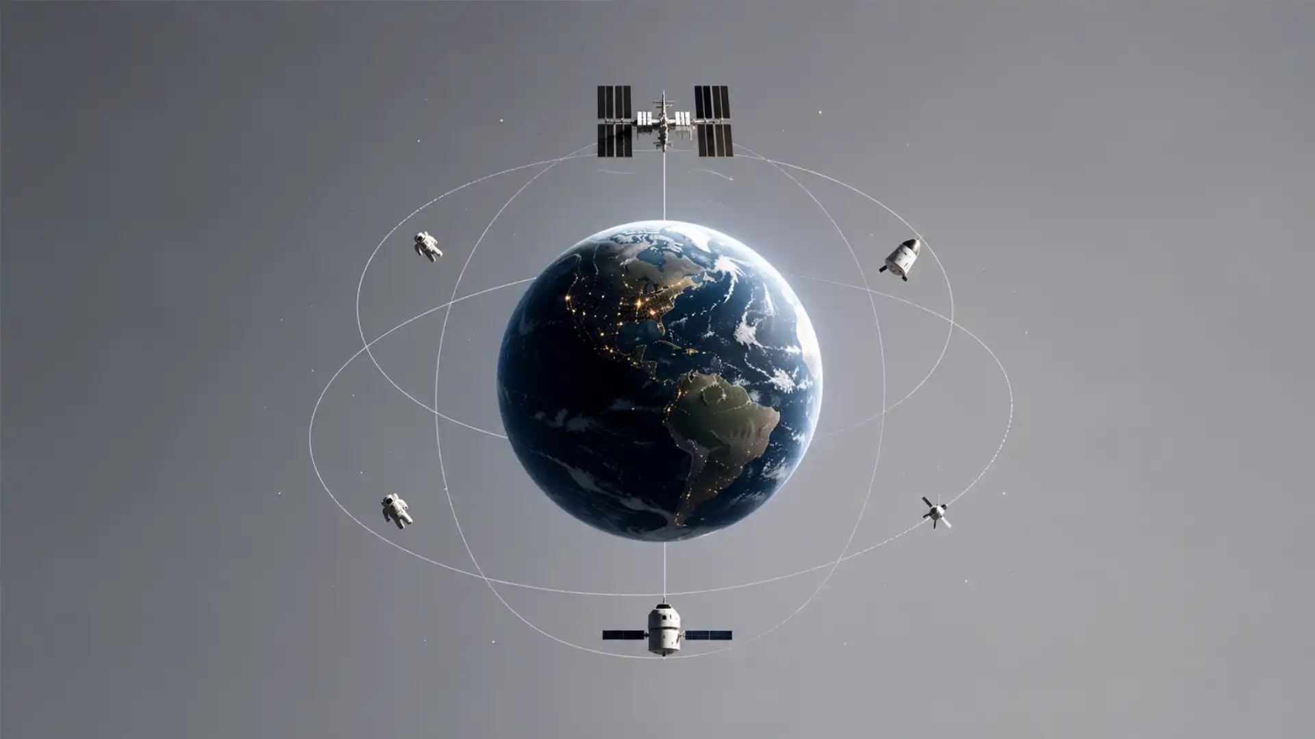
Open How Many People Are In Space Right Now and the whole premise arrives before your brain has time to dress it up. There is a question, a number, and the faintly absurd realisation that the number refers to living people who are not on this planet. That is the hook. Not a mission simulator, not a dashboard, not a glossy aerospace explainer. Just a live census of the most exclusive temporary population group humans have invented.
Table of Contents
The site works because the answer feels both factual and ridiculous. You are not asking how many satellites are in orbit, how much cargo is docked to the International Space Station, or what phase a mission is in. You are asking how many human bodies are currently above Earth, eating, sleeping, checking instruments, exercising, missing gravity, floating through routines that still somehow count as ordinary workdays. A single number does what a long article often cannot: it makes the scale of human spaceflight feel personal.
The name is almost the whole product. Howmanypeopleareinspacerightnow.com is not elegant, but it is perfect. It reads like something typed into a search bar by a person who suddenly needed the answer. That literalness gives the site its charm. It does not try to become a brand. It does not hide the question behind a clever interface. It has the energy of a small internet object made because someone noticed a tiny gap between curiosity and a satisfying answer.
There is a catch, and it makes the site more interesting, not less. A counter like this lives or dies by freshness. On May 26, 2026, the broader spaceflight picture was unusually busy: NASA’s Expedition 74 page listed seven people on the International Space Station, while China’s Shenzhou 23 had just launched three new astronauts to Tiangong, temporarily overlapping with the previous Shenzhou 21 crew. Who Is In Space showed 13 humans in space, while the How Many People Are In Space Right Now JSON feed listed 14 and still included the Artemis II crew, even though NASA’s own Artemis II page marked splashdown on April 10, 2026.
That mismatch is not a reason to dismiss the project. It is the central lesson of the project. The web is full of tiny pages that become beloved because they answer one human question cleanly. The same pages become fragile because the question depends on a changing world. A beautiful little counter can be emotionally right, conceptually right, and temporarily wrong. That is a very internet kind of tension.
The smallest live scoreboard on the internet
The magic of the site is that it turns spaceflight into a scoreboard without making it feel like a sport. Sports pages teach us to scan numbers quickly: score, time, possession, standings. Financial pages do the same with prices. Weather apps do it with rain. This site applies the same glanceable format to human presence beyond Earth. The result is strange because space usually arrives wrapped in awe, engineering, geopolitics, and institutional language. Here it becomes one line of domestic knowledge.
The question has a wonderfully awkward intimacy. “How many people are in space right now?” sounds like a child’s question, but it is not a childish one. It asks for a live relationship between Earth and orbit. It treats space not as a destination in a documentary, but as a place with occupants. That change matters. A rocket launch is an event. A station is infrastructure. A crew list is administration. A headcount is human.
Most space websites ask readers to care about missions. This one asks them to care about presence. That difference is why it belongs in Web Radar rather than in a catalogue of astronomy resources. The site is not trying to teach orbital mechanics. It is not trying to explain the history of the International Space Station. It is not trying to celebrate national space programs. Its core move is much smaller: at this exact moment, some people are elsewhere.
The interface barely needs an interface. A number is the interface. Once you have the count, you can decide whether to click deeper, check names, look at mission details, or leave with the small fact lodged in your head. The best single-purpose websites often work this way. They do not try to own your attention. They give you one clean answer and trust the answer to be sticky.
There is also an old-web pleasure in the domain itself. The URL is a complete sentence. It belongs to the same internet family as pages that answer one tiny thing: whether the LHC destroyed the world, whether Mercury is in retrograde, whether a train is running, whether a public webcam shows a cat. The joke is not separate from the utility. The joke is that the utility is so narrow and so specific that it becomes memorable.
The site’s homepage, in its current public form, is almost comically bare. The page shows a huge numeral, pushes visitors toward an iOS app, and credits Brad Eshbach with design and code by Joshua Hathaway. It also points to a NASA Johnson Space Center Earth photography source, a nice little detail that gives the background image more weight than a generic space wallpaper would have.
That minimalism gives the project its emotional power. The page does not lecture the visitor into caring. It relies on the visitor already carrying a little pocket of curiosity. You arrive with the question. The site meets you with the count. Nothing about that exchange needs a “mission statement.” A surprisingly large part of good web design is knowing when the premise is already strong enough.
The site also understands something that many larger products forget. A page can be memorable without being expansive. It does not need accounts, onboarding, achievements, community, comments, feeds, or notifications to justify itself. The homepage mentions an iOS app with notifications, photos, videos, and astronaut profiles, but the web experience still feels like the core idea stripped to bone.
That restraint feels especially refreshing because space coverage often defaults to spectacle. Rockets, suits, capsules, countdown clocks, mission patches, renderings, launch towers, flames, control rooms: the visual language is huge by default. How Many People Are In Space Right Now moves in the opposite direction. It makes orbit feel close by making the page small. The less it performs, the more the number has room to land.
The count is funny because it is real
The first laugh comes from the phrasing. “How many people are in space right now?” has the plain rhythm of a question nobody prepared for. It sounds like something asked at dinner, during a pub quiz, or while watching a launch stream with half the facts missing. That is part of why the site works. It does not turn curiosity into homework. It lets the question stay a little odd.
The second laugh is quieter. The answer is usually small enough to fit in one elevator. Humanity has cities of millions, airports moving hundreds of thousands of people a day, and online platforms with billions of accounts, yet the number of people off Earth at any given moment can be counted on fingers and toes. The contrast is absurd. We talk about humans as a spacefaring species, but the current off-world population is often smaller than a classroom.
That smallness is not disappointing. It is what makes the count powerful. When the number is six, seven, ten, thirteen, or temporarily higher during crew handovers and private missions, it reminds you how rare the experience remains. Every person in that count has passed through training, risk, logistics, international politics, mission schedules, launch windows, spacecraft systems, and a thick column of flame. The number is tiny because the achievement is still hard.
The site turns that difficulty into something you can grasp instantly. It replaces the abstract phrase “human spaceflight” with a headcount. The phrase sounds official. The headcount feels physical. You imagine individuals strapped into seats, floating through modules, sharing meals, getting medical checks, watching Earth pass beneath them. The number becomes a door into those lives.
There is a pleasing emotional wobble in checking it. You expect a fact and get a mood. If the number is lower than you thought, space feels lonely. If it is higher, space feels suddenly busy. During a crew handover, when one crew has arrived and another has not yet returned, the number jumps and Earth’s orbit feels like a crowded hallway. A static Wikipedia page cannot deliver that small shift in feeling.
The project also benefits from a lovely asymmetry. The number is easy to read, but hard to maintain. Behind the count sits a messy real world: launches, dockings, splashdowns, delayed departures, emergency spacecraft issues, private missions, overlapping crews, national programs, and different definitions of what counts as “in space.” A visitor may see a single numeral. The data steward has to decide what the numeral means.
That question has edges. Does “in space” mean above the Kármán line, in orbit, docked to a station, beyond low Earth orbit, or aboard any spacecraft currently outside the atmosphere? Suborbital flights complicate the count. Lunar flybys complicate it more. Crew rotations make it temporarily jump. A person can be in a capsule for minutes, days, or months. The simple question is only simple on the surface.
This is where the site becomes more than a novelty. It exposes how much editorial judgment hides inside “live data.” Every small counter on the web has a definition behind it. A weather widget decides which station to trust. A COVID tracker decided what counted as a confirmed case. A stock app decides which market feed to show. A space headcount decides what “right now” means and who qualifies for the list.
The site’s JSON feed makes that hidden layer visible. It does not only return a number; it lists names, countries, launch dates, titles, locations, biographies, flags, photos, and profile links. That feed is where the simple web object becomes a little database of current human presence off Earth. It is also where mistakes become easier to spot, because the names reveal whether the count still reflects the present.
The current discrepancy around Artemis II is a perfect example. The feed listed Reid Wiseman, Victor Glover, Christina Koch, and Jeremy Hansen aboard Orion on Artemis II, but NASA’s Artemis II page marked that mission as launched on April 1, 2026, and splashed down on April 10, 2026. The concept is still beautiful. The data needs care. A live counter becomes trustworthy only when the machinery behind it keeps moving with the world.
A tiny page with a hidden data problem
The site’s biggest strength is also its weakness. It looks final. A large number on a quiet page carries a kind of visual authority. It feels like the answer. It feels as if the internet has reduced a complicated matter into one clean truth. That feeling is seductive. It is also dangerous when the truth changes with launches and landings.
The best way to read the site is as a beloved object with a maintenance burden. It deserves affection, not blind trust. The idea is too good to throw away because the data gets messy. A live census of humans off Earth is exactly the kind of thing the web should have. The challenge is that “live” is not a design style; it is an operational promise.
There is a small resurrection story around the concept. A GitHub reimplementation by Daniel Bolan says the original site had stopped updating, which broke a desktop MagTag display built around it. The README explains that the project used Supercluster’s astronaut database to parse a smaller daily feed and “get things up and running again,” with updates once a day.
That detail is wonderfully Web Radar. Someone liked the counter enough to build a physical object around it. When the feed stopped updating, the problem was not abstract. A tiny desktop display went stale. The web object had crossed into a room, become part of someone’s daily peripheral awareness, and then failed in a way that made its owner sad. That is the lifecycle of small internet tools at its most human.
The reimplementation also reveals why small data projects are harder than they look. The visible experience can be one number, while the maintenance job includes parsing large datasets, filtering active astronauts, reducing payload size, scheduling updates, and handling names correctly. A small page does not mean a simple system. It often means complexity has been hidden on purpose.
Open Notify belongs to the same world of tiny space APIs. Its People in Space endpoint was built to return the current number of people in space and, where known, their names and spacecraft. That sounds almost exactly like what this kind of website needs. The fact that such an API existed at all says something about developer culture: people enjoy data that is official-ish, playful, live, and easy enough to wire into a weekend project.
The fragile part is that these APIs and feeds are not permanent public utilities in the way people imagine. A tiny API can become a dependency for classroom projects, hobby displays, coding tutorials, personal dashboards, and novelty websites. Then one day it slows down, changes, stops updating, or quietly falls out of sync with mission reality. The web remembers the interface longer than the maintenance plan.
That fragility does not make the project less worth opening. It makes the project more honest about the web. The internet is full of small pages that answer tiny questions better than any large platform would bother to. Some are maintained by one person. Some run on forgotten scripts. Some are half-broken and still loved. Their weakness is part of their character, but it also asks the reader to keep a little skepticism alive.
The ideal version of How Many People Are In Space Right Now would show the number, names, spacecraft, last updated time, and source trail. A timestamp would change the whole trust relationship. The visitor would know whether the count is current to the hour, the day, or some forgotten mission era. A counter without a timestamp has charisma. A counter with a timestamp has credibility.
The source trail matters because spaceflight is now more distributed than the old ISS-only mental model. Current human spaceflight can involve the ISS, China’s Tiangong station, short private missions, lunar flybys, suborbital flights, and overlapping station crews. NASA’s Expedition 74 page covers the ISS crew, while Chinese human spaceflight updates often arrive through Chinese state media and international wire coverage. No single friendly counter can stay accurate without knowing which sources it trusts.
That is the editorial challenge beneath the toy-like surface. The site is not merely counting people; it is choosing a worldview of space activity. Does it privilege NASA? Does it include China’s Tiangong crews promptly? Does it count lunar flyby crews only while they are aloft? Does it include private visitors? Does it separate suborbital space from orbital space? Every answer changes the count.
Where the site earns its click
| What you notice | Why it works | Where it strains |
|---|---|---|
| One huge number | It gives instant satisfaction | It can look too authoritative when stale |
| Plain-language domain | The URL is the exact question | It depends on users remembering a long name |
| Crew-level detail in JSON | Names turn the count into people | Data errors become easy to detect |
| Tiny interface | Nothing distracts from the fact | Missing timestamps weaken trust |
| Old-web charm | It feels made, not packaged | Maintenance can disappear from view |
The table captures the whole bargain. How Many People Are In Space Right Now is strongest when treated as a wonderfully focused doorway, not as a final authority. It earns the click because the question is perfect. It strains because the answer changes with real rockets.
What it gets right by refusing to become bigger
The most admirable thing about the site is that it does not inflate the idea. A weaker version would bury the count under mission cards, animated planets, SEO text, a newsletter box, a “learn more” funnel, and a pile of related content. This one understands that the first moment is the product. The whole thing exists to satisfy a sudden spark of curiosity.
That restraint is harder than it looks. Most digital products slowly acquire explanations. Someone asks for more context. Someone wants a retention loop. Someone suggests social sharing. Someone adds profile pages, related facts, launch calendars, sponsor slots, alerts, and badges. None of those are automatically bad. The problem is that each addition competes with the original feeling: I asked a weird question and the internet answered it instantly.
The page’s sparseness also gives it emotional room. A big counter lets the visitor do the imaginative work. You supply the wonder. You picture the people. You decide whether the number feels high or low. That is more powerful than forcing a motivational paragraph onto the page. The site trusts the fact to carry itself.
The domain name deserves its own praise. Long descriptive domains are unfashionable until they are unforgettable. This one is basically impossible to misunderstand. It is bad in every conventional branding sense and excellent in every human sense. It is not sleek. It is not short. It is not abstract. It is exactly the sentence you needed.
There is a kind of product wisdom in that. The best name for a single-purpose tool is often the user’s question. Search behavior already reveals what people want. When the domain repeats the question, the site feels less like a destination and more like the missing answer. This is why tiny pages like this spread through chats, classrooms, and side conversations. You do not need to explain the link before sending it.
The site also resists the usual trap of educational web design. It does not confuse learning with volume. People often learn through small facts that stick. A number, repeated over time, can teach more than an overbuilt lesson. Check the site once and you learn the count. Check it over months and you begin to feel the rhythm of spaceflight: handovers, launches, returns, delays, and rare spikes.
That rhythm matters. Space becomes less mythical when you can watch its population change. A launch is not just spectacle; it is an addition to the count. A splashdown is not just recovery footage; it is a subtraction. A station handover becomes visible as a temporary bulge. The site makes the living structure of human spaceflight easier to sense.
It also lowers the barrier to caring. You do not need prior knowledge to understand a headcount. Mission names can be confusing. Agencies can be confusing. Spacecraft names can blur together. A number is democratic. A child can understand it. An engineer can still appreciate it. A casual visitor can walk away with something real.
That is why the site has such broad appeal despite its narrow function. It answers a question almost anyone can feel. You may not follow NASA, ESA, Roscosmos, CNSA, SpaceX, Axiom, or private spaceflight. You may not know which expedition is active. You may not remember the difference between Soyuz and Shenzhou. The count still works because the human category comes first.
The best web curiosities often have this quality. They are niche in subject but universal in entry point. A site about ISS crew rotations sounds niche. A site that tells you how many people are off Earth right now is instantly legible. The difference is not content depth; it is framing. The question has already done the hard work.
The current space count makes the site feel more complicated
The present moment is a good stress test for the idea. As of May 26, 2026, the live human-spaceflight picture was not a simple ISS-only count. NASA’s Expedition 74 page named seven ISS crew members: Sergey Kud-Sverchkov, Chris Williams, Sergei Mikaev, Jessica Meir, Jack Hathaway, Sophie Adenot, and Andrey Fedyaev.
China’s Tiangong station made the count more crowded. Shenzhou 23 launched on May 24, 2026, carrying Zhu Yangzhu, Zhang Zhiyuan, and Lai Ka-ying, while the prior Shenzhou 21 crew had not yet returned. That overlap created six people aboard Tiangong for a short handover window. AP reported the Shenzhou 23 launch and crew, while Who Is In Space listed both Shenzhou 21 and Shenzhou 23 crews under Tiangong.
Add those two stations and the current defensible count becomes 13 people in space: seven on the ISS and six on Tiangong. This is exactly the kind of moment where a tiny counter should shine. A reader does not want to assemble station rosters from scattered mission pages. The whole value of the site is that it should absorb that complexity and return the clean answer.
The problem is that How Many People Are In Space Right Now’s feed gave a different answer. Its JSON returned 14 and included four Artemis II astronauts aboard Orion. The feed named Reid Wiseman, Victor Glover, Christina Koch, and Jeremy Hansen as being on Artemis II with a launch date of April 1, 2026. NASA’s Artemis II page, however, marked the mission duration as 9 days, 1 hour, 32 minutes, with splashdown on April 10, 2026.
That discrepancy is fascinating because it reveals the difference between a good idea and a good live source. The site’s premise is still excellent. The feed’s current state needs correction. In a way, the mismatch gives the article a sharper point: small web tools are only as alive as their update logic. A live counter that misses a splashdown becomes a time capsule by accident.
The more human spaceflight expands, the harder the count becomes. The old mental model was simple: count the ISS crew. That is no longer enough. China’s station is permanently crewed in its own rhythm. Private astronaut missions can temporarily add visitors. Lunar missions introduce crews beyond low Earth orbit. Short suborbital flights raise definitional arguments. The site’s question remains simple because the user’s curiosity is simple; the answer pipeline is not.
A strong version of the site would embrace that complexity lightly. It would still lead with the number, but it would let readers inspect the count by vehicle or station. Seven on ISS. Six on Tiangong. Zero currently on lunar trajectory. Last checked at a specific time. Sources used. That would preserve the magic while making the answer resilient.
The best precedent here may be Who Is In Space. It displays the total, then groups people by spacecraft and station, including launch dates and mission pages. Its page currently says there are 13 humans in space and separates the ISS crews from Tiangong’s Shenzhou 21 and Shenzhou 23 crews. That structure is less minimal than a single numeral, but it gives the count enough scaffolding to survive a busy week.
Still, the original site has a stronger title and a stronger emotional click. Who Is In Space is clearer as a roster; How Many People Are In Space Right Now is stronger as an internet object. One feels like a reference page. The other feels like a thought you had at 11:42 p.m. and needed answered before you could move on. That difference is exactly why the flawed little site remains memorable.
The lesson for makers is not “never make a live counter.” The lesson is to respect the implied promise. A single number looks simple, but it carries a contract. When a visitor opens the page, the word “right now” does the heavy lifting. It promises presence, not archive. It promises current reality, not a best-effort list. If the data falls behind, the design’s confidence works against it.
Why this belongs in the canon of tiny useful websites
There is a long tradition of websites that feel too small to pitch and too good to forget. How Many People Are In Space Right Now belongs in that lineage. It is a web object, not a platform. It does not need to become a startup. It does not need to expand into a “space awareness ecosystem.” Its value is in the precision of the curiosity.
The web used to be full of these little affordances. Someone had a question, built a page, and left it online. The page might be ugly, charming, half-maintained, or perfect. It might answer one civic question, one scientific curiosity, one joke, one local need, or one personal obsession. Search engines made those pages findable. Social sharing made them contagious. Bookmarking made them part of people’s routines.
Many of those pages are now buried under platform logic. The modern internet often tries to turn every answer into a feed. Search results are crowded with summaries. Social platforms trap links inside timelines. Apps ask for accounts before delivering basic utility. Against that background, a page that answers one question cleanly feels almost radical. It is not radical because the technology is advanced. It is radical because the intention is narrow.
The site also reminds us that not every digital experience needs depth on first contact. Some experiences need exactness. A kitchen timer does not need a magazine. A unit converter does not need a community. A live space headcount does not need a cinematic scroll. If the first answer is satisfying, depth can be optional. The page can be a dot, not a maze.
That dot can still have cultural weight. A headcount of humans in space compresses a century of ambition into a number. The site does not tell the story of Sputnik, Gagarin, Apollo, Mir, Shuttle, ISS, Tiangong, commercial crew, or Artemis. It does not need to. Those histories hum behind the number whether the page names them or not. The count is small because the story is hard.
The site’s charm also comes from how calmly it treats a miraculous situation. People are in space, and the page says so like it is checking bus arrivals. That flatness is funny. It is also moving. Human beings have a talent for turning impossibilities into logistics. Once a station is crewed, someone has to schedule meals, maintenance, sleep, experiments, exercise, waste management, and calls home. A simple counter accidentally honours that ordinariness.
The best tiny websites often do this: they make the extraordinary routine and the routine extraordinary. A tide chart turns the ocean into a schedule. A lightning map turns storms into dots. A plane tracker turns sky noise into named aircraft. A space headcount turns orbit into a neighbourhood with a very small population. The transformation is not dramatic. It is cognitive. You suddenly have a handle on something distant.
That handle is useful even when the site needs repair. The idea is bigger than its current implementation. If the counter is wrong today, the right response is not to sneer at it. The right response is to wish for a maintained version that keeps the same restraint. The web needs more small public instruments, not fewer. It also needs those instruments to show their source notes.
There is a practical reason to care about such instruments. They make public knowledge feel accessible without flattening it into trivia. A person who checks the count may then click a crew member, read about an expedition, look up Tiangong, learn about a lunar flyby, or follow a launch. The small fact becomes a trailhead. That is better than forcing every reader through a lecture before giving them the answer.
The project also has a quiet educational value. It teaches that space is inhabited continuously, but not by many people. That balance is hard to communicate. Saying “humans live in space” can sound grand. Saying “13 humans are in space right now” feels exact and fragile. The number makes the achievement real without exaggerating it.
The design lesson hiding in the number
The design lesson is blunt: a perfect question can carry an entire website. Many teams spend months searching for a visual system before they have found a question worth answering. Here, the question is so strong that the design can nearly disappear. That is not laziness. It is alignment.
A site like this also shows the power of literal language. The title does not posture. It does not say “Orbital Presence Monitor” or “Human Spaceflight Live Population Index.” It says the thing a normal person would say. That is why it travels. People remember plain phrasing when the phrasing matches their own curiosity.
There is a product strategy lesson in the lack of surplus. The site does not ask the visitor to learn its structure. No navigation is needed for the first reward. No category names need decoding. No onboarding explains the premise. The visitor arrives, receives the answer, and leaves slightly changed. That is a complete interaction.
The emotional lesson is subtler. The smaller the site, the more room the subject has to feel large. A maximalist space interface can accidentally compete with space itself. The giant rocket renders, star fields, parallax effects, and cinematic fonts all shout at once. A number on a quiet page lets the visitor supply awe instead of being told to feel it.
The trust lesson is the sharpest. If your interface is minimal, your data hygiene must be visible somewhere. Minimal pages remove context by design. That makes the remaining details carry more weight. A wrong headline on a dense news page can be corrected by the article beneath it. A wrong number on a single-number page is the whole experience. That is why timestamps, sources, and update notes matter.
The site also illustrates a difference between usefulness and stickiness. Useful pages solve the immediate problem; sticky pages leave a residue. This one does both when it works. You get the count, but you also carry the image of those people. The number can haunt the edge of your day. Somewhere, while you answer email or make coffee, a handful of people are circling Earth.
That residue is not sentimental by default. It can be funny, humbling, nerdy, or oddly lonely. On a normal day, the count reminds you how few people experience space directly. During a handover, it reminds you that orbit is a workplace with shift changes. During a lunar mission, it reminds you that human presence can stretch far beyond the usual station routes. The mood changes with the number.
There is a publishing lesson here too. The site is a headline that never stops updating. Most articles about space become dated. A live counter remains evergreen only if the data stays alive. The domain itself is evergreen because the question will keep being asked. The implementation must earn that evergreen quality day by day.
That makes the site a good example of what I would call a “public curiosity service.” It is not critical infrastructure, but it serves a real human impulse. People want to know small truths about the world. They want a number, a map, a status, a count, a yes or no. The best web tools respect that impulse without trying to trap it.
If rebuilt today, the site should resist the temptation to become huge. The right upgrade would be small: accurate count, grouped roster, last updated time, sources, and a short note on counting rules. That would be enough. The page should still open with the number. It should still feel like a clean answer. It should just give the answer a spine.
The questions it leaves in your head
Yes, because the concept is still one of the cleanest examples of single-purpose web design. The caveat is that the word “right now” deserves verification when the count matters. Treat the site as a great doorway, then check a roster such as Who Is In Space or official mission pages if accuracy is important.
The count is memorable because it creates a direct comparison between all of Earth and a tiny off-world population. Billions of people live here. A handful live or travel above the atmosphere. That scale difference is instantly understandable and emotionally strange.
The biggest improvement would be a visible “last updated” timestamp. After that, the site needs source labels and a count broken down by location: ISS, Tiangong, spacecraft in transit, or other qualifying vehicles. The page should keep its simplicity, but the data should show its work.
Space fans will care first, but the appeal is wider than that. Teachers, designers, developers, journalists, trivia people, children, and anyone who likes small factual curiosities can enjoy it. The site does not ask visitors to be experts. It asks them to be curious for ten seconds.
It shows that the web is still good at tiny answers when someone cares enough to make them. It also shows how brittle those answers can become without maintenance. The best version of the internet is full of small, generous tools like this, but they need stewardship as much as charm.
The web should have more little instruments like this
How Many People Are In Space Right Now is worth remembering because it makes a distant fact feel near without making it shallow. That is a rare trick. The page does not explain space to death. It does not wrap the count in institutional grandeur. It lets the question stay plain and lets the answer do the work.
The current data issue should not be ignored. A site built around “right now” cannot afford to drift quietly. When NASA marks Artemis II as splashed down and a feed still counts its crew as being aboard Orion weeks later, the trust problem is real. The cleanest interface in the world cannot rescue a stale live claim.
But the site’s underlying editorial instinct is excellent. It knows that a small fact can carry wonder. The number is not a gimmick. It is a compact way of seeing human ambition, risk, routine, and scarcity. You do not need a thousand-word explainer before you can feel the oddness of it. You only need the count.
The better future for this project is not a redesign in the usual sense. It needs maintenance, transparency, and restraint. Keep the blunt domain. Keep the giant number. Keep the quietness. Add a timestamp. Add source notes. Fix the roster. Let the site remain what it always wanted to be: the internet’s smallest census office for humans off Earth.
That is why it belongs in Web Radar. It is simple, oddly compelling, and more revealing than it first appears. A tiny website about people in space becomes a story about trust, data, design, attention, and the fragile beauty of single-purpose web tools. You click for a number. You leave thinking about everyone currently not standing on the planet.
Author:
Jan Bielik
CEO & Founder of Webiano Digital & Marketing Agency
This article is an original analysis supported by the sources cited below
How Many People Are In Space Right Now
Official website reviewed for the core Web Radar subject, homepage experience, app prompt, credits, and the minimal counter interface.
How Many People Are In Space Right Now JSON feed
Public JSON feed reviewed to inspect the underlying count, roster fields, astronaut names, locations, launch dates, biographies, and current data mismatch.
NASA Artemis II
Official NASA mission page used to verify the Artemis II launch date, mission duration, and splashdown date.
NASA Expedition 74
Official NASA mission page used to verify the active International Space Station expedition and listed crew.
Who Is In Space
Current roster site used as a comparison point for the live human spaceflight count and grouping by station and spacecraft.
Open Notify People In Space API documentation
API documentation used as supporting context for the older ecosystem of simple public space data endpoints.
Daniel Bolan GitHub reimplementation
Repository used for context on the original counter no longer updating, a daily reimplementation, and the small-maker maintenance story around the idea.
Xinhua report on Shenzhou 23
News report used to verify the Shenzhou 23 launch, crew details, and China’s current Tiangong activity.
| Citing this article? Brief excerpts are welcome. Please credit Webiano.digital, name the author where stated, and include a link to https://webiano.digital and to this original article. Full or substantial republication requires prior written permission. Read our Copyright and Content Use Policy. |
This article was prepared with the assistance of artificial intelligence tools. The content underwent expert human review, and Webiano Digital & Marketing Agency assumes editorial responsibility for its final version and publication.