you touched it. A television spot could be watched or skipped by leaving the room, but it could not lead you to a microsite. The banner joined exposure to action. That connection remade advertising and also warped it.
Table of Contents
What stands out when you open it
| Detail | Why it matters |
|---|---|
| The copy asks about the click itself | The ad sells the new web behavior before the brand message. |
| The page keeps a 1994 feel | The crude frame makes the artifact easier to understand. |
| The AT&T link led to an experience | The click promised travel through the web, not only a sales pitch. |
| The CTR was wildly high | The number captures a moment before users learned defensive looking. |
| The “first” story is slightly messy | Several banners launched together, which makes the myth more human. |
The table matters because the artifact is easy to flatten into one statistic. The 44 percent click-through rate is the hook, but the site is memorable because several forces meet in one rectangle: new behavior, brand futurism, a crude page, a measurable action, and a commercial model still figuring out its manners.
That is why The First Banner Ad feels less like trivia than product archaeology. It gives you the product thinking of 1994 in miniature. Ask for the action. Reward the action. Measure the action. Report the action. Sell the next placement. That loop now sits beneath much of the web, but the first public version looks almost harmless because the machinery is not yet hidden.
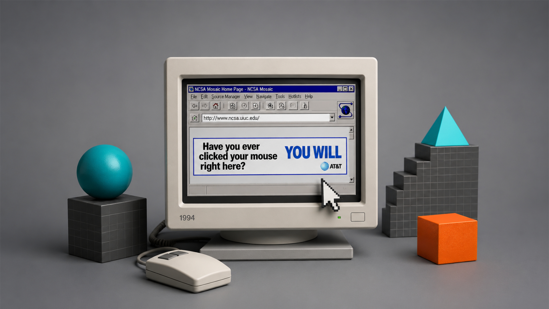
The 44 percent click was not magic
The number survives because it offends every modern instinct. Forty-four percent is not a banner benchmark. It is not even a great banner benchmark. It is a different species of number. Guardian published McCambley’s account that the first banner went live on HotWired on October 27, 1994, and that for more than four months, 44 percent of viewers clicked it. He contrasted that with a much lower rate for then-current banners, saying only four out of every 10,000 viewers clicked many modern banners.
A number like that tempts people to draw the wrong lesson. The lesson is not that banner ads used to be good and then creatives got lazy. The lesson is that novelty, context, trust, and user intent were completely different. McCambley’s own explanation is sharper than the usual folklore. He argued that the ad worked because it belonged to AT&T’s larger “You Will” campaign, because it delivered an experience instead of a flat message, and because it was not built around hostility toward the user.
The campaign link is easy to miss if you only look at the banner image. The phrase “You Will” already had cultural weight from AT&T’s futuristic campaign. The banner compressed that promise into a native web action. Have you ever done this web thing? You will. In print, that sentence would be nonsense. On television, it would be a demonstration. On the web, it became an instruction disguised as prophecy. The medium made the copy literal.
The museum tour also changes how the ad should be judged. The click did not dump the user onto a corporate brochure. It led to a small, sponsored act of exploration. McCambley later described the idea as using the internet to take people to museums they might not otherwise visit. The exact execution now feels tiny beside high-resolution museum collections and virtual tours, but the emotional logic was right. Show the medium by letting the user move through it.
The ad also benefited from the fact that early users were not yet annoyed by the category. One Internet History Podcast oral history quotes people involved in the early banner era describing users as curious and willing to click around because conventions had not settled. One participant says people did not necessarily know it was an ad. Another says users were not yet “inured” to ads and not yet angry about them. That is the cleanest explanation for the 44 percent number: the web had not taught users what to resent.
The primitive measurement itself deserves a little humility. A 1994 click-through rate should not be compared too neatly with a modern programmatic dashboard. Definitions, logging, audience scale, repeat visits, bots, caching, ad serving, attribution windows, and campaign structure were not standardized in the way digital marketers now expect. The number is still useful because it comes from the people close to the campaign and has been repeated by credible histories, but it belongs to an early, rough measurement culture. It is a flare, not a laboratory result.
That roughness is part of the charm. The web ad business did not arrive fully formed with dashboards, demand-side platforms, viewability vendors, fraud detection, brand-safety filters, and attribution arguments. It began with publishers and agencies inventing units, naming placements, selling space, counting responses, and trying to persuade clients that a page on the internet was a place where advertising could happen. Wired wrote that HotWired’s launch made marketers confront something new: a clickable ad needed somewhere to send people, and clients were not always sure online interaction was a good idea.
That is the hidden product lesson of the first banner. The ad unit was not just a rectangle. It forced an ecosystem around it. Someone had to create the ad. Someone had to sell it. Someone had to place it. Someone had to count it. Someone had to build the landing page. Someone had to explain the result to a client. The banner looks small, but it required a new chain of labor. Modern digital advertising is that chain multiplied until it became hard to see the page underneath.
AT&T’s banner also arrived when the web still had a strong sense of destination. People clicked because a link promised travel. You went somewhere. A page loaded slowly, and that delay made arrival feel like an event. Today, many clicks feel more like traps inside the same feed. The destination may be a tracking redirect, a thin landing page, an app prompt, a paywall, or a conversion funnel. The old web click carried more mystery because the map was emptier.
That emptiness gave brands a chance to behave like guides. The AT&T ad did not only occupy space on HotWired. It pointed outward. It suggested that the company understood the internet as a vehicle for reaching remote places. That is a better brand fit than many later banners managed. A telecommunications company sponsoring a museum tour on the early web had narrative sense. The infrastructure brand gave you a demonstration of distance collapsing.
The exact phrase still works because it is not burdened with offer language. No discount. No deadline. No exclamation pile. No keyword stuffing. No “limited time.” No mock urgency. It does not even name the company in the famous text. The ad asks a behavioral question and answers it with a brand promise. You will. The copy has nerve because it trusts the novelty of the click.
That nerve is hard to recreate because the act is no longer novel. A modern banner asking “Have you ever clicked your mouse right here?” would be camp, not conversion. The user would suspect irony, malware, or a retro marketing stunt. The line only works before the behavior becomes boring. The site lets you see an ad that was perfectly timed to its medium’s childhood, which is why copying its surface would miss the point.
The 44 percent figure also marks the birth of a dangerous obsession. Once advertisers learned that a web ad could be clicked and measured, the click became both evidence and temptation. It gave digital advertising a seductive promise: proof. Not just reach, not just impressions, not just recall, but a recorded action. The click was clean enough to sell and simple enough to misunderstand. Soon an ad could be judged by the tiny fraction of users who acted, even if most exposure worked differently or not at all.
The web has spent three decades arguing with that first measurement gift. Marketers still fight over whether clicks matter, which clicks are accidental, which clicks convert, which clicks were caused by the ad, which ads were viewable, which impressions were human, which exposures shaped memory, and which placements merely caught a thumb. The first banner did not create every later mess, but it introduced the intoxicating idea that an ad could report back immediately.
The recreated site is funny because it lets you see measurement before measurement became oppressive. The banner asks for one click. It does not show the auction behind it. It does not trail a cloud of pixels in the visitor’s imagination. It does not feel optimized against you. It is a simple commercial prompt before commercial prompts grew smarter, faster, and more manipulative. That simplicity makes it easier to study.
Banner blindness was the user’s immune system
The web did not become hostile to banners because users suddenly became irrational. Users learned. Nielsen Norman Group’s work on banner blindness describes a behavior many people now recognize in themselves: users ignore page elements they perceive as ads, and they may also ignore nearby or ad-like content. Its 2018 review says banner blindness remains prevalent across mobile and desktop, with people avoiding content that resembles ads, sits near ads, or appears in locations associated with ads.
That is the brutal contrast with the AT&T banner. In 1994, the banner benefited from being visually distinct. Distinction made it interesting. Later, distinction became the warning label. Big rectangle at the top of the page? Ignore. Flashing object? Ignore. Right rail block? Ignore. Sponsored-looking card? Ignore. Top result with ad styling? Maybe ignore that too. What once attracted attention became the exact signal people used to save attention.
Banner blindness is not just dislike. It is a scanning strategy. Users do not need to consciously mutter “ad” each time they skip a zone. Their eyes learn the page. The brain routes attention toward navigation, headlines, search boxes, body copy, product images, comments, maps, or whatever supports the current task. Advertising slots become low-yield territory. The more often they disappoint, the faster they disappear from conscious view.
NNGroup’s older research makes the pattern feel almost tragic. Jakob Nielsen wrote in 2007 that users rarely look at display advertisements, and he also noted that by 1997 regular banners were already being ignored enough that fake dialog-box ads drew more clicks precisely because they exploited user expectations. The web learned to ignore banners quickly, and bad actors learned to fight that avoidance by making ads look like interface controls.
That move changed the tone of the commercial web. Once ads began imitating system messages, download buttons, play buttons, pagination, recommendations, or editorial units, the user’s stance hardened. The relationship shifted from curiosity to suspicion. The banner was no longer a paid signpost; it was a possible trick. Banner blindness was the mind’s answer to visual pollution.
The AT&T banner sits before that arms race. It is paid, but it is not pretending to be a Windows dialog. It is not hiding the fact that it wants a click. Its trick is conceptual, not deceptive: it asks about the action it wants. That distinction matters. The banner’s invitation was clean enough that the user could accept it without feeling conned. Later formats often treated the user’s attention as something to be captured before consent arrived.
The tragedy is that every successful attention hack teaches users to look less. A flashing banner may win today’s click and train tomorrow’s blindness. A fake close button may earn a visit and destroy trust in the page. A recommendation widget may move traffic and make the whole bottom of an article feel contaminated. Bad advertising does not only damage the advertiser. It teaches the user to distrust the surrounding web.
That is why banner blindness is not only an advertising problem. It harms interface design and content design too. NNGroup notes that legitimate content can be ignored if it has ad-like traits or sits near promotional material. The poison spreads. A useful callout can vanish because it looks too much like a promotion. A navigation card can be skipped because it lives in the right rail. A publisher can damage its own work by selling too much visual territory around it.
The first banner helps explain the origin of that poison. The web learned that rectangular attention could be sold. Publishers learned that every page had regions that might earn money. Advertisers learned that users could be asked to leave. Users learned that not every bright object deserved trust. Each side adapted. The resulting page became a negotiation between content, revenue, patience, and defense.
The most depressing part is that banner blindness is rational. Users are not failing to appreciate design. They are protecting themselves from low-probability interruptions. If ninety-nine rectangles waste your time, skipping the hundredth is not laziness. It is pattern recognition. That is what makes the AT&T artifact so poignant. It belongs to a moment before users had enough evidence to defend themselves.
Still, the old banner should not be romanticized too much. It was also the beginning of a bargain that never became fully comfortable. Free pages needed revenue. Advertisers wanted attention. Publishers needed models that did not require every reader to pay. Banners offered a clean enough bridge at first: the user could keep reading, the advertiser could pay for exposure, the publisher could fund work. The trouble came as the bridge widened into a toll system with too many booths.
The First Banner Ad gives us a calmer way to look at that bargain. Instead of starting with disgust at modern ad clutter, it starts with a single honest rectangle. From there, you can see both the necessity and the damage. Ads funded much of the open web. Ads also made large parts of the web slower, uglier, less private, and less pleasant to use. Both things are true, and the old AT&T strip sits at the fork where they began to travel together.
The site also makes modern “attention” talk feel less mystical. Attention is not a resource floating in the air. It is made of tiny decisions: look here, skip there, click this, close that, scroll past, trust, distrust, return. The first banner captured one of those decisions while it was still fresh. Banner blindness is what happens after millions of bad requests turn freshness into fatigue.
That is why the contrast with the 44 percent click-through rate still lands. The number is not only a marketing curiosity. It measures a vanished user state. Not stupidity. Not naivety alone. A different emotional relationship with the page. The early user approached the web as a place where unexpected objects might reward attention. The mature user approaches the web as a place where unexpected objects usually want something.
A better ad because it sent people somewhere
The AT&T banner looks like an ad, but its landing idea made it feel closer to a doorway. That is the part modern marketers often miss when they repeat the story. The banner did not become famous only because people clicked it. People clicked because the web itself was new, but the experience after the click gave the action a reason to be remembered. McCambley’s museum-tour explanation matters because it turns the ad from a trick into a demonstration.
A doorway is different from a funnel. A doorway invites you into a place. A funnel narrows your options until a business goal is satisfied. The first banner’s after-click experience sounds closer to a place. You could visit art collections. You could feel distance shrink. You could connect the action of clicking with AT&T’s broad promise about technology. The company still benefited, of course, but the user received a glimpse of what the web could do.
That makes the artifact surprisingly relevant to product people, not only ad historians. The banner understood onboarding. It did not explain the web with a paragraph. It taught the web through action. Click here. Travel there. Notice what just happened. Good digital products often work the same way. They make a new behavior feel natural by giving the user a reward immediately after the action. The AT&T ad was crude, but the loop was elegant.
The copy also respected the user’s curiosity. It did not assume the user was ready to buy. It did not force a claim. It turned uncertainty into momentum. Have you ever done this? You will. That is almost a product prompt. The user is not being told that AT&T is great. The user is being asked to join a small experiment, with AT&T attached to the wonder of the result.
The campaign’s broader futuristic frame made the banner easier to believe. AT&T’s “You Will” commercials described technologies that later became ordinary in some form: video calling, remote access to information, electronic tolls, on-demand media, networked life. The banner brought that language onto the web and made one prophecy instantly testable. You will click your mouse here. Unlike the bigger campaign promises, that one could come true now.
The landing page after the click has its own charm. The Atlantic describes the response page as answering the question with a playful “You did” before sending users onward. That is an elegant piece of early interaction writing. It acknowledges the user’s action. It turns the click into a tiny event. It makes the user feel the page noticed what happened. Modern interfaces do this constantly, but in 1994 the gesture had novelty.
The ad also understood a fact that later performance marketing often forgot. A click is not the end of the story. It is the start of a promise. If the click leads to something dull, manipulative, slow, or irrelevant, the ad has burned trust. If the click leads to a small reward, the next invitation becomes more credible. The first banner’s high click-through rate gets the attention, but its more useful lesson is post-click generosity.
That generosity did not become the default. Too many later banners turned the click into a punishment: pop-up windows, heavy landing pages, bad targeting, forced registration, thin affiliate pages, fake prize flows, malware, auto-downloads, and pages that seemed built only to trap a conversion metric. Users learned from the punishment. Banner blindness is partly memory. The body remembers wasted clicks.
The First Banner Ad lets you imagine an alternate lineage. What if more ads had treated the click as a chance to give the user a genuine web experience? What if the ad industry had held onto McCambley’s later argument that brands should do something useful instead of merely selling against attention? That is not a fantasy of pure goodness. Brands would still want business results. But the relationship could have been less extractive in more places.
Some of the best later web sponsorships did follow that path. Useful tools, calculators, archives, maps, explainers, games, diagnostic widgets, and sponsored cultural projects all belong to the better branch of the banner’s family tree. They do not ask for attention only to consume it. They give the user something to do, learn, test, or keep. The AT&T museum tour belongs near the root of that branch.
The darker branch grew faster because measurement rewarded cheap action. If the dashboard celebrates clicks without caring enough about the click’s quality, the system learns to chase motion. Make the button brighter. Place the unit near the thumb. Interrupt the scroll. Use a fake affordance. Promise more than the landing page gives. Buy cheaper inventory. Retarget harder. The click becomes a number severed from experience.
The old banner still works as a reminder that the first click had wonder attached to it. That is not sentimentality. It is design analysis. When people clicked the AT&T banner, they were testing a medium. The ad’s job was not only to move traffic. It was to make the web feel capable. A commercial message that makes its medium feel capable is rare. Most ads merely occupy their medium.
That is why this little site is better than a screenshot in a marketing deck. A screenshot freezes the artifact. The site lets the artifact behave. Even if the surrounding reconstruction is partial and plain, the act of opening it places you in the user’s posture. You look at the rectangle. You understand the dare. You can feel why someone in 1994 would click. A static image cannot quite supply that muscle memory.
The more time you spend with the old banner, the less it feels like an ad story and the more it feels like an interface story. The banner was a button before users had strict button expectations. It was a link before users had a settled map of link behavior. It was a paid media unit before ad tech turned paid media into a hidden auction. It was a little rectangle teaching people that web pages were not only to be read but acted upon.
The web learned the wrong lesson and the right one
The first banner gave the web a business model with a visible edge. A publisher had attention. An advertiser paid to appear near it. A user could click away. A report could show whether that happened. The arrangement was easy to understand. It also scaled into something nobody on that first page could fully control. Wired later wrote that banners became a pillar of the free web and helped fuel a huge online advertising industry, even as click-through rates fell sharply by 2012.
The right lesson was that the web could make advertising interactive. A print ad could invite a phone call or a store visit, but the web collapsed the gap between message and response. The user did not need to remember a number. The user did not need to mail a card. The user could click. That directness changed how advertisers thought about media. It also changed how publishers thought about their pages. Every visit could contain a possible exit sold to someone else.
The wrong lesson was that every measurable action was inherently better than every unmeasured effect. Clicks were easy to count, so clicks became overvalued. Attention that did not click became harder to defend. Brand memory, trust, usefulness, mood, and timing were harder to fit into early dashboards. The banner’s measurability was a breakthrough, but it also narrowed imagination. If the system can count only footsteps through a door, it may start building uglier doors.
That tension still shapes the web. Sites need revenue. Users need pages that do not feel booby-trapped. Advertisers need proof. Designers need usable layouts. Privacy advocates need limits. Publishers need bargaining power. The first banner sits before the vocabulary of those fights, but the fights are already latent inside it. A clickable ad is simple until it becomes a market.
HotWired’s experiment also helped establish the page as a surface to be divided. Header, rail, body, footer, interstitial, native slot, module, takeover, skin. Once a page could carry paid zones, layout became financial. The banner was the first visible rent line on many people’s version of the web. That does not make it evil. It makes it foundational. Rent lines shape architecture.
The AT&T strip also reminds us that early web ads were closer to sponsorship than surveillance. The ad did not depend on a detailed profile. It depended on context, novelty, and broad campaign recognition. The sponsor wanted association with a new medium and a curious audience. Modern advertising often wants prediction. It wants to know who you are, what you want, what you nearly bought, where you might go, and which message may push you next. The shift from sponsorship to prediction changed the emotional temperature of ads.
The site’s retro ugliness cuts through that complexity. You look at the old rectangle and see the bargain before the machinery got buried. That is useful because modern ad debates often become abstract: programmatic, identity, attribution, viewability, consent, first-party data, clean rooms, brand safety. The first banner is wonderfully literal. A company paid to put a clickable strip on a web magazine. People clicked it. The web noticed.
That literal quality is why the object still works as a teaching tool. You could use it to explain CTR to a student, but you could also use it to explain the emotional cycle of internet formats. First, a format feels novel. Then people exploit it. Then users defend against it. Then the format mutates or gets disguised. Then the disguise creates new fatigue. The banner went through that cycle early and loudly.
The same cycle has repeated across the web. Email newsletters, push alerts, social notifications, app badges, recommendation feeds, influencer sponsorships, cookie pop-ups, chat widgets, and AI answer boxes all begin with some promise of usefulness or relevance. Then incentives crowd in. The user learns which signals to trust and which to mute. The first banner is not only the ancestor of display ads. It is a case study in how the web burns through attention conventions.
The artifact also shows why “people hate ads” is too blunt. People hate being tricked, slowed down, followed, interrupted, misled, and treated as inventory with no reciprocal benefit. The AT&T banner was an ad, and people clicked it at an astonishing rate because it offered curiosity and context at the right moment. The dislike came later, after the category taught users that most invitations were not worth the cost.
That distinction matters for anyone building digital products. Users do not reject every prompt. They reject prompts that seem misaligned with their goal, their trust, or their time. A notification can be useful or rude. A modal can be clarifying or obstructive. A banner can be a doorway or debris. The shape alone does not decide the user’s reaction; history decides it with help from placement, timing, copy, and reward.
The First Banner Ad captures the moment before history hardened the shape. That is what makes the site a pleasure. You see a banner before “banner” meant something tired. You see a click before “click” meant acquisition funnel. You see an advertiser before the advertiser was assumed to know too much. You see a commercial web before its worst habits became default expectations.
The preserved slogan also has a wonderfully accidental double meaning. “You will” was AT&T’s promise about future technology. For the web, it became a prediction about user behavior and industry behavior. You will click. The web will sell the click. Marketers will chase the click. Users will stop clicking. Designers will disguise the click. Regulators will ask what followed the click. Browser makers will block parts of the machinery behind the click. The tiny line contains a whole cycle.
That is why the banner remains one of the cleanest symbols of internet culture. It is not just the beginning of online advertising. It is the beginning of the web asking ordinary people to participate in its economics through a gesture. Before subscriptions, likes, shares, affiliate links, creator codes, app installs, and one-tap purchases became common user actions, there was this small invitation to press a mouse button.
Why it still deserves a tab in your browser
The First Banner Ad is a small site with a large aftertaste. It does not need much of your time. That is part of its strength. You open it, look at the old strip, maybe click through its related pages, and then every modern banner you ignore for the rest of the day feels slightly less invisible. The site restores the shape’s history for a moment. It makes the ignored thing visible again.
It also rewards people who like the web as a cultural object, not only a technical system. The site is about code, advertising, publishing, design, copywriting, measurement, and user behavior at once. That mix is exactly what made the web strange in the first place. A tiny design decision could alter business models. A line of copy could teach a behavior. A crude page could become a revenue experiment. A click could become the seed of an industry.
For designers, the site is a reminder that context beats surface. The banner is ugly by modern standards, yet it worked because the timing, user state, campaign memory, and destination aligned. Many modern ads look better and feel worse because they arrive in hostile contexts or lead to poor experiences. The first banner proves that design quality cannot be judged only by polish. Sometimes the rough thing wins because it understands the moment.
For marketers, the site is a warning against worshipping old numbers. Nobody should look at 44 percent and think the past offers a repeatable trick. The number belongs to a one-time collision between novelty and curiosity. The better lesson is that the ad made a promise the medium could immediately fulfill. It did not ask people to admire a brand in the abstract. It let them use the brand’s idea of the future.
For publishers, the site is a reminder of the bargain they inherited. Ads funded the open web, but every ad slot trains user behavior. A page overloaded with paid units may earn money while teaching people not to see parts of it. The first banner had the advantage of scarcity. Modern pages often have the burden of abundance. The old rectangle asks a publisher’s question that still stings: how much commercial surface can a page carry before the page itself becomes harder to trust?
For ordinary internet users, the site is simply funny. It is funny that the first famous banner got a click-through rate modern advertisers would frame in gold. It is funny that the copy predicted the behavior it caused. It is funny that a format now treated as visual background began as a thrilling little door. It is funny that the first banner can feel more honest than many ads engineered with far more data.
The site is also useful because it stops nostalgia from getting too soft. The early web was not a paradise. It was slow, uneven, inaccessible in many ways, and already commercializing quickly. Yet it did have a kind of legibility that has since been lost. A paid rectangle looked like a paid rectangle. A click felt like travel. A page’s machinery was closer to the surface. The First Banner Ad brings back that legibility for a minute.
The best Web Radar finds tend to reveal a hidden hinge. This one reveals a hinge so familiar that we stopped noticing it. The banner ad is boring until you meet it at birth. Then it becomes a compressed story of how the web learned to pay for itself, how users learned to defend attention, and how a single design pattern can move from novelty to nuisance.
There is also something generous about preserving an ad most people would otherwise treat as trash. Internet culture often saves the wrong things and loses the right ones. We keep screenshots of drama and forget the interface objects that shaped daily behavior. The first banner is one of those objects. It deserves preservation because it changed how pages were built, sold, measured, and read. The site gives it a small, fitting home.
The artifact is especially good because it does not ask you to love banners. You can still hate them. You can use blockers. You can resent the clutter. You can believe the ad industry degraded large parts of the web. The site does not require absolution. It only asks you to look at the beginning before judging the ruins. That is a fair request.
The contrast with banner blindness also makes the site feel unexpectedly current. We are surrounded by newer versions of the same fatigue: prompt blindness, notification blindness, cookie-banner blindness, subscription-modal blindness, sponsored-content blindness. Each starts as a request for action and ends as something users close before reading. The first banner is a clean ancestor of that entire family.
That is why opening the site feels sharper than reading another anniversary post about digital advertising. The object itself does the work. It lets you see the naïve click and the weary non-click in the same frame. You know too much to see it as a 1994 user did, but you can still understand why they clicked. That half-recovered understanding is the pleasure.
The banner’s lasting lesson is not that users are hard to reach. Users are reachable when the request respects the moment, the reward is real, and the format has not been poisoned by abuse. The first banner had all three. Most modern banners have none. That is why the old strip still looks alive while so much newer display advertising feels like wallpaper.
The First Banner Ad deserves a tab because it makes a dead format briefly strange again. That is enough. Not every web discovery needs to be a tool you will use every day. Some are better as tiny museums of behavior. This one is a museum of the first commercial click many people remember, and of the moment before the web learned to look away.
Small questions before opening it
Is the AT&T ad truly the first banner ad? The clean answer is that it is the banner most widely remembered as the first. The more careful answer is that HotWired launched a batch of clickable banners on October 27, 1994, and AT&T’s is believed to have been the first seen online or at least the one that became the defining artifact. Guinness World Records and Wired both describe the launch as a group of ads, with AT&T occupying the legendary spot in the story.
Was the click-through rate really 44 percent? The famous number comes from Joe McCambley’s account. He wrote that for more than four months, 44 percent of viewers clicked the first banner. It is best read as a credible early-web milestone rather than as a directly comparable modern ad benchmark, because the measurement environment was young and the user context was radically different.
What happened after someone clicked? McCambley says the click led to a web experience tied to art museums, turning AT&T’s “You Will” promise into a small demonstration of remote access and online exploration. The Atlantic also describes the landing experience as playfully acknowledging the user’s click before moving them further into AT&T’s web presence.
Why does the site look so plain? The official recreation presents itself as intentionally old-looking, matching the feel of web pages around October 27, 1994. That choice is the point. A modern redesign would make the artifact less legible because the banner belongs inside an early-web frame.
Why does this matter if banners barely work now? The collapse from curiosity to blindness is the story. Nielsen Norman Group’s research shows that users learned to ignore ad-like elements and even nearby legitimate content. The first banner sits at the opposite end of that learning curve: before users had enough bad experience to filter the shape automatically.
Author:
Jan Bielik
CEO & Founder of Webiano Digital & Marketing Agency

This article is an original analysis supported by the sources cited below
The First Banner Ad
Official recreation site for the AT&T “You Will” banner and its related early-web pages. It is the central site recommended in this Web Radar piece.
The first ever banner ad why did it work so well
Joe McCambley’s first-person account of the AT&T banner, the 44 percent click-through rate, and the museum-tour experience behind the click.
Oct. 27, 1994 Web gives birth to banner ads
Wired’s retrospective on HotWired, the October 27, 1994 launch, the early batch of advertisers, and the role banners played in the commercial web.
Long ago and far away the banner ad was born
Wired’s shorter anniversary piece placing the AT&T banner inside the later decline of banner click-through rates and the rise of the online ad industry.
First banner ad
Guinness World Records entry describing HotWired’s first clickable banner ads, the October 27, 1994 date, and AT&T’s place in the launch batch.
The first web banner
Web Design Museum entry preserving the first web banner as a design-history artifact and noting its museum-tour destination.
Banner blindness the original eyetracking research
Jakob Nielsen’s NNGroup article on early banner-blindness findings and the way users learned to ignore regular banners.
Banner blindness revisited users dodge ads on mobile and desktop
NNGroup’s later review explaining how users ignore ad-like elements, traditional ad locations, and content placed near ads.
| Citing this article? Brief excerpts are welcome. Please credit Webiano.digital, name the author where stated, and include a link to https://webiano.digital and to this original article. Full or substantial republication requires prior written permission. Read our Copyright and Content Use Policy. |