
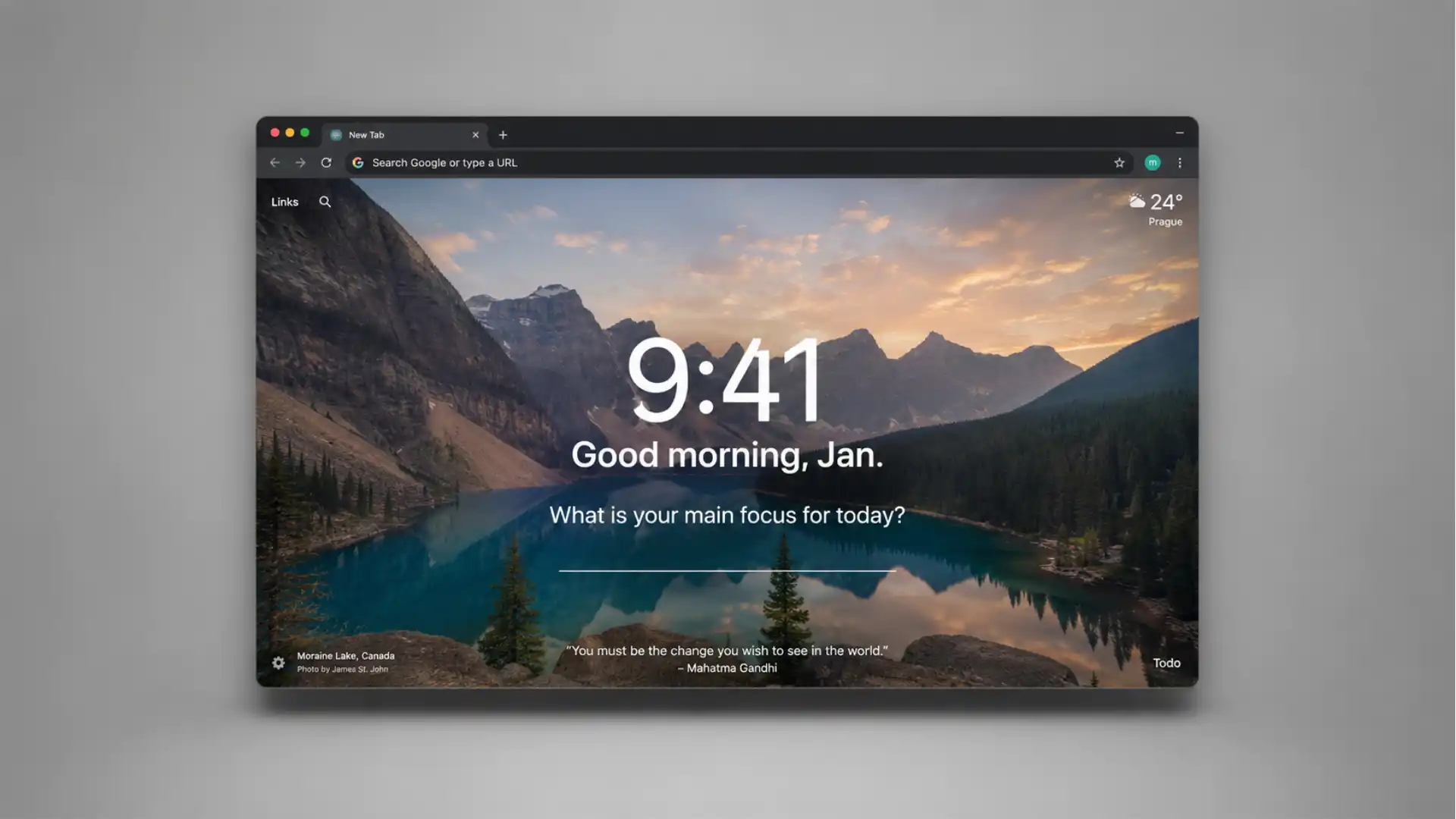
Momentum is built around a tiny interruption: before Chrome lets you sprint into another search, another shortcut, another half-remembered task, it asks what you are actually here to do. That sounds almost too modest to matter. A clock, a landscape photo, a greeting, a short prompt, a to-do list, weather, a few links. Nothing in that list feels radical. The trick is where Momentum places it. It takes the blandest screen in the browser, the new tab page, and turns it into a pause with a point. Momentum’s own site describes it as a focused, productive, inspiring dashboard for the New Tab page, while the Chrome Web Store listing frames it as a tab that aims to keep you calm, focused, and energized.
Table of Contents
The best Chrome home screen is not the one with the most widgets. It is the one that catches you in the split second before drift begins. Momentum understands that strange browser moment better than most productivity tools. You open a tab because you need a document, a calendar, a search, a dashboard, a banking page, a video, a half-urgent reply. Before muscle memory takes over, Momentum puts one question in front of you: what is your main focus for today? That question is not a productivity system. It is not a philosophy. It is a speed bump, and sometimes a speed bump is exactly what a browser needs.
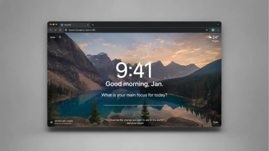
The reason Momentum still deserves attention is that it does not try to become your operating system. Many work tools want to pull the whole day into their orbit. Momentum does the opposite. It occupies one surface, Chrome’s home screen, and uses that surface with surprising restraint. The default experience is almost cinematic: large photography, a big clock, clean type, weather tucked away, a small task area, and the focus prompt sitting in the middle. It feels less like a dashboard and more like a room you briefly step into before returning to work.
There is a small contradiction at the center of the product, and it makes Momentum interesting. It is both decorative and behavioral. The photos matter because they make the tab feel like somewhere you want to land. The focus prompt matters because it makes that landing slightly more honest. The to-do list matters because it gives your next action a place to live. None of those pieces is new on its own. Together, inside the most repeated browser gesture of the day, they become harder to dismiss.
Momentum also has the rare quality of an internet product that has been around long enough to become almost invisible. It belongs to the older web tradition of browser extensions that quietly change a habit rather than launching a whole new platform around it. The Chrome Web Store listing currently shows Momentum as a Featured extension in Workflow & Planning, with a 4.5 rating, 13.8K ratings, and 2,000,000 users, while Momentum’s own homepage claims 3+ million active users and 13,000+ Chrome Store reviews. The exact public count differs by source and rounding, but the pattern is clear: this is not a tiny side project.
The new tab page is more powerful than it looks
A browser home screen is easy to underrate because it appears between things rather than as the thing itself. People judge tools by the window they work in: Gmail, Notion, Docs, Slack, Figma, Linear, Shopify, WordPress, whatever sits at the center of the job. The new tab page looks like plumbing. It is the hallway between rooms. Momentum’s sharpest idea is treating that hallway as a behavioral surface.
Chrome’s default new tab page is useful enough, but emotionally blank. It gives you search and shortcuts, then gets out of the way. That makes sense for speed, but speed is also how people slide into noise. The browser is not neutral. It remembers every shortcut, autocompletes every old habit, and rewards half-formed intention with instant motion. Momentum does not fight Chrome’s speed. It inserts one moment of friction where the default page has none.
The focus question works because it is asked at the exact moment when intention is most fragile. You do not see it after a weekly planning session or inside a separate app you promised yourself to check every morning. You see it when your hand has already pressed the shortcut for a new tab. That timing changes the weight of the question. It arrives close enough to action that it feels practical, not ceremonial.
Momentum’s homepage shows the central pattern plainly: daily focus, to-do list, links, bookmarks, weather, and search arranged on a calm visual surface. The product does not need to explain itself for long because the use case is visible at a glance. You open a tab, see the time, see the photo, see the focus, and move. That is the whole bet.
The photography is not an afterthought. Momentum uses beauty as a form of attention management. A gorgeous landscape is not inherently productive, and that is the point. It softens the tab enough that the focus prompt does not feel like another demand. The product wraps discipline in atmosphere. Less spreadsheet, more open window. That choice will feel too sentimental for some people, but it explains much of Momentum’s staying power.
Most productivity software speaks in terms of control: inboxes, queues, lists, boards, states, automations. Momentum speaks in terms of return. It assumes you will wander, then gives you a pleasant way to come back. That is a more forgiving model of work. It does not pretend the user is a perfectly rational machine. It assumes the user is a browser user, which means distracted by design, surrounded by tabs, and constantly one keystroke away from something easier.
The home screen also changes how small tasks feel. A tiny to-do list inside a new tab has a different personality from a full task manager. It is less intimidating. It does not ask you to sort everything into projects and contexts. It asks what needs to be remembered now. For people who already live inside Todoist, Asana, ClickUp, or Trello, Momentum Plus connects to those task systems. For everyone else, the built-in list is enough to keep the browser from becoming a fog machine.
The best part is that Momentum does not require a grand workflow conversion. You do not have to become a Momentum person in the way people become Notion people or Obsidian people. You install it, open a tab, and decide whether that new feeling is better than the default. The product’s pitch lives or dies in that first minute. Few tools are that easy to judge.
There is also something slightly old-school about it, in a good way. Momentum comes from the era when browser extensions felt like small acts of personal tuning. You found one, installed it, and your browser felt more like yours. Not every tool needed a public profile, a social layer, a collaboration model, or an enterprise narrative. Momentum has grown beyond that simple origin with Plus, Teams, integrations, and AI features, but its core appeal still sits in the old promise: make this one repeated part of the internet better.
Momentum’s trick is calm, not minimalism
Minimalism is often mistaken for emptiness. Momentum is not empty. It is carefully quiet. The page has widgets, but it does not shove them forward. The clock is large. The focus prompt is central. The task list is accessible without dominating the screen. Weather is present but not noisy. Search remains available. Links sit close enough to use, far enough not to steal the mood. The interface is calm because the hierarchy is clear.
That hierarchy gives Momentum its particular flavor. The photo owns the mood, the clock owns the moment, and the focus prompt owns the purpose. Everything else behaves like supporting furniture. This is why Momentum feels more polished than many new-tab replacements that simply collect widgets. A calendar widget, quote widget, task widget, weather widget, bookmark widget, and background widget do not automatically make a home screen. They often make a dashboard that looks like a control panel for a spaceship nobody asked to fly.
Momentum’s daily question is almost comically plain. That plainness is the feature. “What is your main focus for today?” avoids elaborate self-improvement language. It does not ask for your mission, your goals, your purpose, or your deepest priority. It asks for today’s focus. The phrasing lands because it is small enough to answer. You can type “finish proposal,” “call Martin,” “ship landing page,” “study,” or “rest.” The screen then repeats that answer back to you whenever you open a new tab.
That repetition is where the tool earns its place. A focus written once in a dedicated planning app disappears unless you go looking for it. A focus written into Momentum reappears at the moment your attention is about to scatter. You might still ignore it. You might open YouTube anyway. You might search for something unrelated. But the reminder has done its work: it made the drift visible.
Momentum’s free feature set covers the essentials: daily background, mantra and quote, Focus Mode, easy to-do lists, shortcuts, local weather, search options, and show-or-hide customization. That free layer is strong enough that Momentum does not feel like a demo pretending to be a tool. The Chrome Web Store listing also says the extension is private and secure, stating that user data is not shared or sold.
The Plus layer adds more serious machinery: unlimited Focus Mode, a vision board, Tab Stash, Notes AI, Ask AI, Soundscapes, task manager integrations, Metrics, unlimited to-do lists, Countdowns, World Clocks, and richer weather. The paid version is where Momentum shifts from a beautiful new tab into a lightweight personal command center. That shift is useful, but it also changes the personality of the product. The more you add, the harder the product must work to preserve its quiet.
The good news is that Momentum seems aware of that danger. Most of the heavier features sit behind choice rather than appearing by default. Soundscapes, Pomodoro, task integrations, Metrics, and AI tools are there if you want them. They do not have to crowd the first impression. This matters because the central appeal of Momentum depends on not feeling like another app begging for attention.
The visual polish also carries a hidden function. A beautiful page creates a tiny emotional cost to cluttering it. When your home screen looks deliberate, you are more likely to notice when your session becomes messy. That is not magic. It is environmental design. People behave differently in a clean room than in a room covered in cables and paper. Momentum gives the browser a clean room, at least for a few seconds at a time.
The product also knows when to leave practical features visible. Weather, search, bookmarks, and links prevent the dashboard from becoming pure mood board. It is still a browser page. You still need to get somewhere. Momentum’s restraint would be less useful if it forced users to admire a lake before allowing them to search the web. The best version of the product is not anti-speed. It is speed with a breath before it.
That balance is why Momentum feels better than many “aesthetic productivity” tools. It does not confuse prettiness with work. The photography draws you in, but the focus prompt gives the page teeth. The task list gives it memory. The links give it utility. The clock gives it urgency. The result is not a wallpaper app. It is a small attention ritual disguised as a wallpaper app.
What stands out at a glance
| Part of Momentum | Why it matters |
|---|---|
| Daily focus prompt | Turns a new tab into a reminder of intent |
| Large photography | Makes the browser feel calmer without removing function |
| To-do list | Keeps small tasks close to the place where work begins |
| Links and search | Preserves the speed people expect from Chrome |
| Plus integrations | Connects the tab to outside task systems when needed |
| Privacy posture | States that data is not sold and describes encryption and transport safeguards |
The table matters because Momentum is not one clever feature but a set of small choices stacked in the right browser moment. The product is easy to dismiss when each part is viewed alone. Together, those parts turn the new tab from dead space into a useful pause.
The product grows without losing the original idea
Momentum has expanded, but its best pitch remains unusually simple. Open a tab and remember what you meant to do. The official Plus page now includes Focus Mode, Pomodoro, Tab Stash, Ask AI, Autofocus, Notes with AI, Soundscapes, custom photos, task integrations, unlimited task lists, and Metrics. Momentum’s help documentation also lists Countdowns, custom schedules for Balance Mode, extra weather, font and theme customization, Tab Groups, World Clocks, and more.
The danger for any long-running productivity product is feature gravity. Every useful addition risks making the original calm feel heavier. Momentum’s newer features are not bad ideas. Pomodoro fits the focus theme. Tab Stash fits browser clutter. Soundscapes fit the calm-work mood. Notes fit the new-tab capture moment. Task integrations fit people who already use outside systems. Ask AI fits the current appetite for quick drafting and brainstorming. The question is not whether those features belong in a productivity tool. The question is whether they belong on a home screen.
Momentum’s answer seems to be: yes, but only if the home screen still feels like a home screen. The product’s center cannot become a toolbox drawer. Once the first view feels crowded, Momentum loses the advantage that made it special. Based on the current public pages, the brand still leads with simplicity, focus, photography, and the central daily prompt, not with a giant feature matrix. That is the right order.
Focus Mode is the natural paid feature because it deepens the product’s original promise instead of distracting from it. Momentum describes it as a one-click way to close out distractions and get into a deep-work routine. The Plus page adds that Focus Mode pairs with sounds, timers, and focus apps. This is exactly where a new-tab dashboard has permission to grow: from a reminder into a working posture.
Tab Stash is another smart fit. Chrome tabs are the visible wreckage of unfinished attention. Everyone knows the feeling of keeping 40 tabs open because each one represents a possible future self who might need it. Momentum’s Plus page describes Tab Stash as a way to stash tabs in one click and revisit them later. That is a good home-screen idea because it treats the browser’s mess as part of the attention problem, not as a separate housekeeping chore.
Task integrations are more complicated, but still sensible. A new tab is not the best place to run a complex project, but it is a strong place to surface the next task. Momentum’s Tasks Integrations documentation says Plus members can connect Asana, Basecamp, ClickUp, GitHub, Google Tasks, Microsoft To Do, Todoist, and Trello, then view, add, and update third-party tasks from Momentum. The documentation is careful about limits too: some actions still belong inside the native task apps. That is healthy product thinking.
Metrics are a more niche but intriguing addition. They turn the home screen into a tiny scoreboard. Momentum’s help article says Metrics can display personal or professional data at the top right of Momentum, added manually, through integrations, or via API address. For solo founders, creators, salespeople, students, or fitness-minded users, that could be useful. It could also become a distraction if abused. A number on the home screen is powerful because it keeps showing up. Choose the wrong number and the product becomes a stress loop.
The AI features are the newest-feeling part of the offer, and they sit in a delicate spot. Ask AI and Notes with AI make sense if they reduce blank-page friction inside the same surface where a user is already deciding what to do next. They make less sense if they pull Momentum toward generic AI assistant territory. The Plus page frames Ask AI around brainstorming, getting started on reports, and making progress from the dashboard, while the help article describes brainstorming, outlines, journal prompts, and fleshing out ideas in notes.
The strongest version of Momentum’s AI is not “AI everywhere.” It is a small creative nudge at the moment of focus. A user opens a tab, sees “finish article,” opens Notes, asks for an outline, and moves. That workflow belongs. A giant chatbot living on top of the home screen would not. The product’s future depends on keeping that distinction clear.
Balance Mode is one of the more underrated ideas in the help documentation. A dashboard that knows when not to show work is more thoughtful than one that worships output all day. Momentum’s Plus overview describes Balance Mode as a way to hide features such as Todo, Focus, and Notes during downtime, using a visual reminder of when it is time to rest or focus elsewhere. That is a healthier reading of productivity than the usual “always see your tasks” approach.
This is where Momentum’s tone matters. The product sells focus, but its best quality is gentleness. It does not feel like a manager. It feels like a quiet page asking whether you are still on track. That distinction sounds soft until you compare it with tools that turn every moment into a performance dashboard. Momentum is better when it remembers that people open tabs not only to work, but also to breathe, check, wander, recover, and return.
The Chrome extension trust question
A browser extension deserves more skepticism than a normal website. Extensions sit close to the browser, close to habits, and sometimes close to sensitive information. A new-tab extension in particular becomes part of the user’s daily environment. It may handle account data, tasks, links, notes, weather location, and integrations. Momentum’s charm does not remove the need for basic trust checks.
The Chrome Web Store listing gives Momentum several useful trust signals. It says the publisher has a good record with no history of violations, that the extension follows recommended practices for Chrome extensions, and that it is Featured. It also lists version 2.26.6 and an update date of May 14, 2026. Those details matter because an abandoned extension, even a pretty one, would be harder to recommend.
The listing also states that Momentum handles personally identifiable information and authentication information. That does not automatically mean something is wrong; it means users should know the extension is account-based, not just a local wallpaper switcher. Momentum’s help center confirms that a free account lets users access Momentum data such as Todos, Links, and Favorites across devices and prevents data loss if a device or browser has problems.
Momentum’s privacy policy gives more detail than many casual users will read. It says users can access and amend their own data, including account details and Momentum data such as to-dos, links, notes, countdowns, and daily focuses. It also describes account deletion, a 90-day grace period for deleted accounts, an expedited hard-delete request path, and encrypted backups that may retain deleted data for up to an additional 35 days.
On security, the privacy policy states that Momentum uses Microsoft Azure, secures data in transit with HTTPS/TLS, has HSTS enabled for Momentum domains, and encrypts databases and associated backups at rest. Those are the kinds of details a serious extension should publish. They do not make the product risk-free, but they give users something more concrete than vague promises.
The Chrome Web Store listing also says Momentum’s developer declares that user data is not sold to third parties, not used or transferred for purposes unrelated to the item’s core function, and not used or transferred to determine creditworthiness or lending eligibility. For a new-tab tool that could become deeply woven into daily work, those declarations are relevant.
A fair recommendation should still include a boundary. Do not put secrets into a browser home screen just because the interface feels calm. Momentum Notes may be useful for drafts, thoughts, checklists, and prompts. It is not where I would store passwords, legal secrets, client-confidential material, private keys, medical details, or anything that belongs in a dedicated secure system. That is not a criticism of Momentum. It is good hygiene for any browser extension.
There is also the matter of permissions and integrations. The more services you connect, the more you should care about the data path. A basic Momentum setup with local-feeling tasks and links is one thing. Momentum connected to Todoist, Trello, GitHub, Asana, or Google Tasks is another. The integration may be worth it, especially for people who already trust those services, but every connection deserves a quick glance at what is shared and what can be changed inside each native app.
Momentum’s public posture is stronger than the average throwaway extension. The Chrome Web Store listing is current, the support docs are maintained, the privacy policy has a recent update date, and the company publishes support and contact channels. The developer information on the listing points to Momentum Dashboard in Victoria, British Columbia, and the privacy policy lists Momentum Dashboard Corp. in Victoria as well.
Still, the best way to use Momentum is deliberately. Install it because you want the new tab changed, not because an extension seems harmless. Try the free version first. Check the settings. Hide anything you do not use. Avoid turning the screen into a junk drawer. Keep sensitive notes elsewhere. If the tool earns its place after a week, it is probably doing the thing it was built to do.
Who will actually like Momentum
Momentum is not for people who want Chrome to feel untouched. It changes a basic browser surface, and that change is visible every time a new tab opens. Some users will hate that immediately. They want speed, search, and nothing else. For them, the default Chrome page is better. Momentum works for people who want a tiny moment of orientation before the internet floods back in.
The first group that will like it is people who open tabs compulsively. Momentum turns that compulsion into a chance to reset. Every new tab becomes a repeated cue: time, place, focus, task. If the user opens fifty tabs a day, Momentum gets fifty chances to remind them. That repetition would be unbearable if the page were ugly or aggressive. Because it is soft, it survives repeated exposure.
The second group is people who want a task system but keep bouncing off heavy tools. Momentum’s built-in to-do list is small enough to use without ceremony. You do not need a productivity doctrine. You write the thing down. You complete it. You move. For people whose main problem is not project architecture but daily forgetfulness, that may be enough.
The third group is visual workers and mood-sensitive workers. Designers, writers, students, marketers, founders, and remote workers often care about the feeling of their workspace, even when that workspace is just a browser. Momentum gives the browser a nicer front door. That sounds superficial until you spend all day inside Chrome. The first screen can set a tone.
The fourth group is people who already use task apps but want less friction. Momentum Plus turns the new tab into a front-facing layer for Todoist, Asana, Trello, ClickUp, GitHub, Google Tasks, Microsoft To Do, and Basecamp. That is useful when the task manager is too easy to ignore in its own tab. Bringing the next task into the new-tab surface makes the task more visible without requiring the user to live inside the task app all day.
The fifth group is people who use the browser as their whole workspace. For them, the new tab page is not a minor surface; it is the doorway to almost everything. Momentum becomes a lightweight office lobby. Calendar elsewhere. Documents elsewhere. Chat elsewhere. Planning elsewhere. But the first screen of the browser becomes calmer and more directed.
The people least likely to enjoy Momentum are power users who already have strict systems. If your browser opens into a custom local dashboard, a terminal workflow, a pinned workspace, or a carefully scripted start page, Momentum may feel ornamental. It may also frustrate users who dislike motivational quotes, landscape photography, or any whiff of self-improvement language. Even when handled tastefully, Momentum’s mood is not neutral.
Teams are a separate case. Momentum Teams may suit groups that want a shared focus layer, but the product’s soul still feels personal. A new tab is intimate in a way a project board is not. It sits between private intent and public work. For organizations, the risk is turning a gentle ritual into another management surface. For small teams with a thoughtful culture, that might work. For surveillance-hungry environments, it would be a poor use of the product.
Students may get particular use from it. A daily focus prompt plus Countdowns, to-dos, and a clean start page fits study life well. The danger is using Momentum as a substitute for deeper planning during exam periods. It should sit above the plan, not replace it. A dashboard is good for cues. It is not a syllabus, a calendar, or a study method.
Writers may also enjoy it, especially with Notes and AI features. The new tab often appears at the exact moment a writer is avoiding the sentence they need to write. A focus reminder that says “finish section two” is annoyingly useful. Ask AI could help with a prompt or outline, though writers should be careful not to turn every moment of uncertainty into an AI detour. Sometimes the tab should point back to the draft, not generate another path around it.
Founders and freelancers may like Metrics, Countdowns, and Focus Mode. The screen can become a quiet cockpit for a self-directed day. A revenue target, launch countdown, client follow-up list, or focus block may sit close enough to be seen without becoming a full analytics dashboard. The risk is turning Momentum into pressure wallpaper. Use one or two visible metrics, not ten.
The strongest recommendation is for people who feel that Chrome has become mentally loud. Momentum does not fix the internet, but it improves the doorway into it. That is a narrower claim than most productivity tools make, and a more believable one. A calmer doorway will not rescue a chaotic workflow by itself. It may still be the one change you notice fifty times a day.
The small doubts before opening it
It is best understood as a browser extension and dashboard service. Momentum’s site is where the product is presented, but the core experience lives in the browser’s New Tab page. The Chrome Web Store listing is the cleanest place to install the Chrome version, and Momentum’s download page points users to Chrome, Safari, Firefox, and Edge options.
For many people, yes. The free version gives the basic Momentum feeling: photography, focus prompt, to-dos, shortcuts, weather, search, and customization. The Plus plan becomes more attractive when you want deeper focus tools, task app integrations, Soundscapes, Metrics, Tab Stash, Notes, AI features, Countdowns, or richer customization. Momentum’s Plus page currently promotes pricing “from $3.33/month,” which appears tied to the paid Plus offer.
In the literal sense, any new-tab replacement adds an extra experience where Chrome once showed a plainer screen. The better question is whether that slight pause costs time or saves attention. For users who open tabs with purpose and never drift, Momentum may feel like decoration. For users who often open tabs and forget why, the pause is the product.
Sometimes, maybe. Momentum uses quotes, mantras, beautiful photos, and greeting language. That mood will not suit everyone. Yet the interface avoids the manic cheerfulness that ruins many “positive productivity” tools. The tone is closer to calm than hype. The user can also customize and hide elements, which matters if quotes or mantras start to feel stale.
Momentum publishes a privacy policy, states that data is not sold, describes user rights around access, modification, export, and deletion, and lists security measures such as HTTPS/TLS, HSTS, Microsoft Azure, and encryption at rest. That is reassuring, but serious use still calls for common sense. Use Momentum for focus, tasks, links, drafts, and reminders; keep truly sensitive information in tools built for that purpose.
Placement. A task app waits for you to visit it. Momentum waits where you already go. The New Tab page is the product’s unfair advantage. The feature set matters, but the repeated location matters more. A small reminder seen all day can beat a sophisticated system hidden in another tab.
Momentum has taste, but it also has purpose. Many beautiful start pages stop at wallpaper, clock, weather, and quotes. Momentum’s daily focus prompt gives the page a behavioral role. It is not just making Chrome nicer to look at; it is making the first second of a tab more deliberate.
Carefully. Momentum Teams could make sense for small groups that want shared focus and a calmer work surface. But Momentum’s best experience is personal and reflective. If a company uses it as another way to push tasks at employees, it loses the softness that makes it work.
Why Momentum still feels worth recommending
Momentum stands out because it improves a piece of the web that most people stopped seeing. The new tab page is not glamorous. It is not a social feed, not a publishing platform, not an AI workspace, not a full project hub. It is a blank beat between actions. Momentum turns that beat into something useful without pretending it is bigger than it is.
The product has taste, and taste matters here. A new-tab page seen dozens of times a day must be pleasant enough to survive repetition. Momentum’s landscape photography, large clock, and uncluttered layout give it that durability. A harsher dashboard would become visual noise by lunch. Momentum’s page keeps enough air around the useful parts.
It also has a clear behavioral thesis. People do not need more places to store intention; they need intention to appear closer to action. Momentum moves the day’s focus into the browser moment where distraction begins. That is not a full productivity philosophy, and it does not need to be. It is a smart placement decision.
The product’s maturity is another reason to take it seriously. The current Chrome Web Store listing shows a recently updated extension with large public usage, many ratings, a Featured badge, and recommended-practices language. Momentum’s own site and documentation show an active product with free and paid layers, cross-browser availability, Plus features, task integrations, AI tools, and privacy documentation.
I would not call Momentum the best Chrome home screen for everyone. I would call it one of the few new-tab replacements that understands the emotional weight of a browser. Chrome is where work happens, but it is also where avoidance happens. Momentum does not scold the user for that. It gives the browser a better opening line.
The free version is the right first test. Install it, use it for a week, and watch what happens when you open a tab without thinking. If the focus prompt starts to feel useful, keep it. If the photography makes the browser feel less abrasive, keep it. If you begin using the to-do list because it is simply there, keep it. If it feels like decoration, remove it. Momentum is easy to judge because the product appears in a moment you already repeat.
The paid plan makes sense for users who want Momentum to become more than a pause. Plus is for people who want the new tab to hold deeper focus sessions, connected tasks, tab cleanup, metrics, notes, sound, AI prompts, and richer customization. That is not necessary for the core magic. The core magic is still the first screen: time, photo, greeting, focus, next action.
The web is full of tools that mistake friction for seriousness. Momentum does something subtler. It adds one small friction point, but makes it beautiful enough that you accept it. That is why the product works. It does not slow the browser down to lecture you. It slows the moment down just enough to ask whether the next click matches the day you meant to have.
A good home screen should not feel like another inbox. Momentum feels like a clean desk placed at the entrance to Chrome. You will still make a mess. You will still open too many tabs. You will still wander. But every new tab gives you another chance to return, and that is a better use of the browser’s emptiest page than another grid of shortcuts.
Author:
Jan Bielik
CEO & Founder of Webiano Digital & Marketing Agency
This article is an original analysis supported by the sources cited below
Momentum Dash
Official Momentum homepage used for the core product positioning, main dashboard features, public user claims, and the product’s own description of the New Tab experience.
Momentum on the Chrome Web Store
Chrome Web Store listing used for current extension status, rating, user count, update date, free and Plus feature summaries, privacy declarations, and publisher signals.
Momentum Plus
Official Plus page used for paid feature positioning, Plus pricing language, Focus Mode, Pomodoro, Tab Stash, Ask AI, Notes with AI, Soundscapes, customization, and integrations.
Momentum Plus overview
Official help article used to verify the current Plus feature set, including Ask AI, Autofocus, Countdowns, Balance Mode, extra weather, Metrics, Pomodoro, Soundscapes, Tab Stash, and World Clocks.
Quick Start Guide
Official help article used for browser availability and basic installation context across Chrome, Firefox, Safari, and Microsoft Edge.
Tasks integrations overview
Official help article used for supported task integrations, including Asana, Basecamp, ClickUp, GitHub, Google Tasks, Microsoft To Do, Todoist, and Trello.
Momentum privacy policy
Official privacy policy used for data access, deletion, export, security, encryption, HTTPS/TLS, HSTS, Microsoft Azure, and contact details.
| Citing this article? Brief excerpts are welcome. Please credit Webiano.digital, name the author where stated, and include a link to https://webiano.digital and to this original article. Full or substantial republication requires prior written permission. Read our Copyright and Content Use Policy. |
This article was prepared with the assistance of artificial intelligence tools. The content underwent expert human review, and Webiano Digital & Marketing Agency assumes editorial responsibility for its final version and publication.